This website uses cookies.
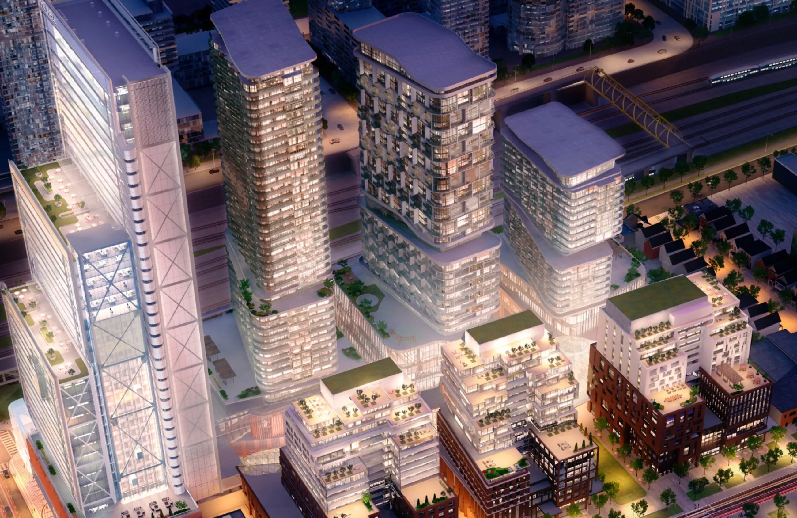
Aerial view of The Well development, featuring modern high-rise buildings and surrounding urban landscape. Aerial view of modern high-rise buildings with balconies and rooftop gardens.

The Well

Services Deliverables
  • Brochure
  • Website
  • Brand Guide Extension
  • Photography Art Direction
  • Video Production

A spirited environment to live, work, shop, and play

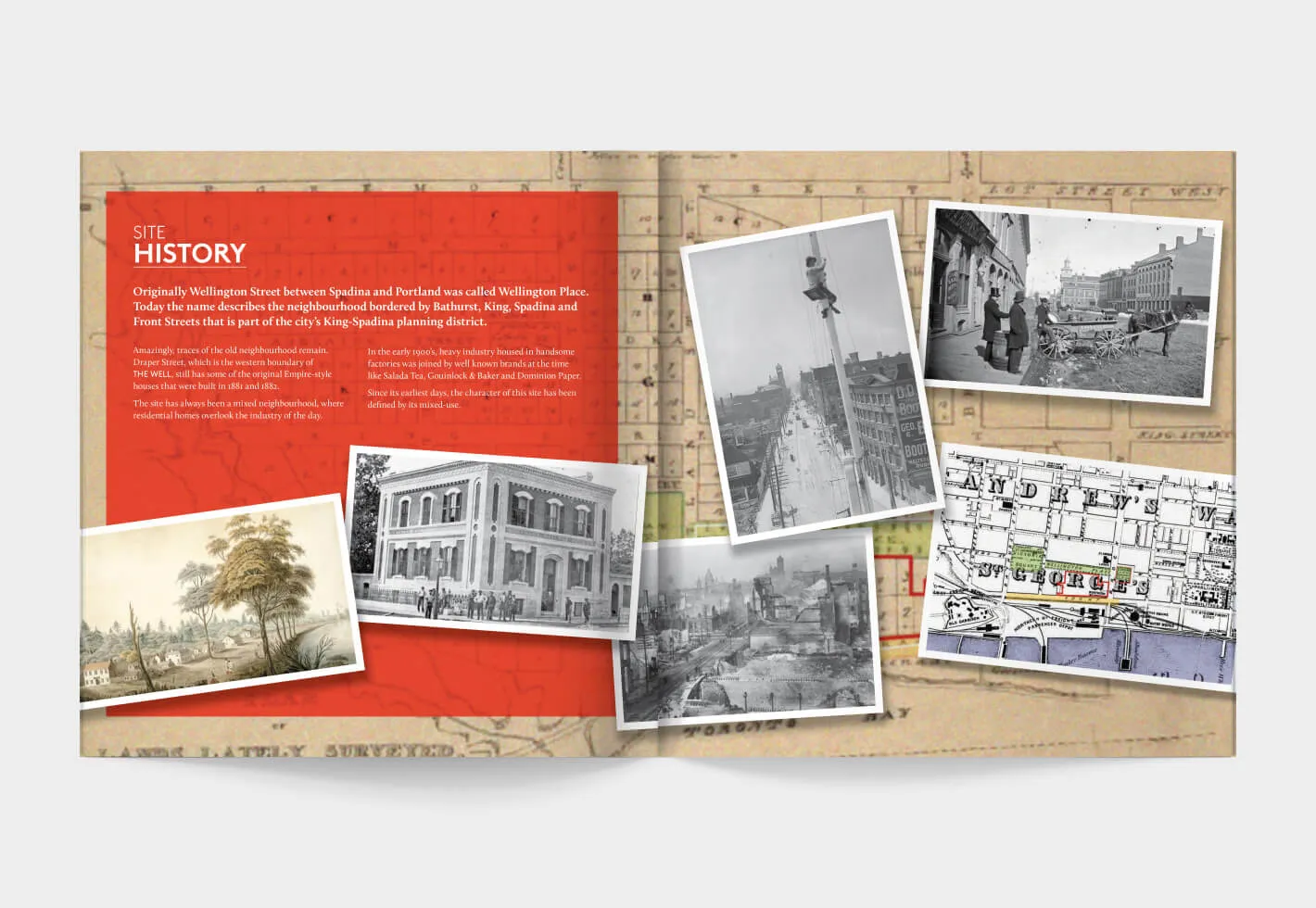
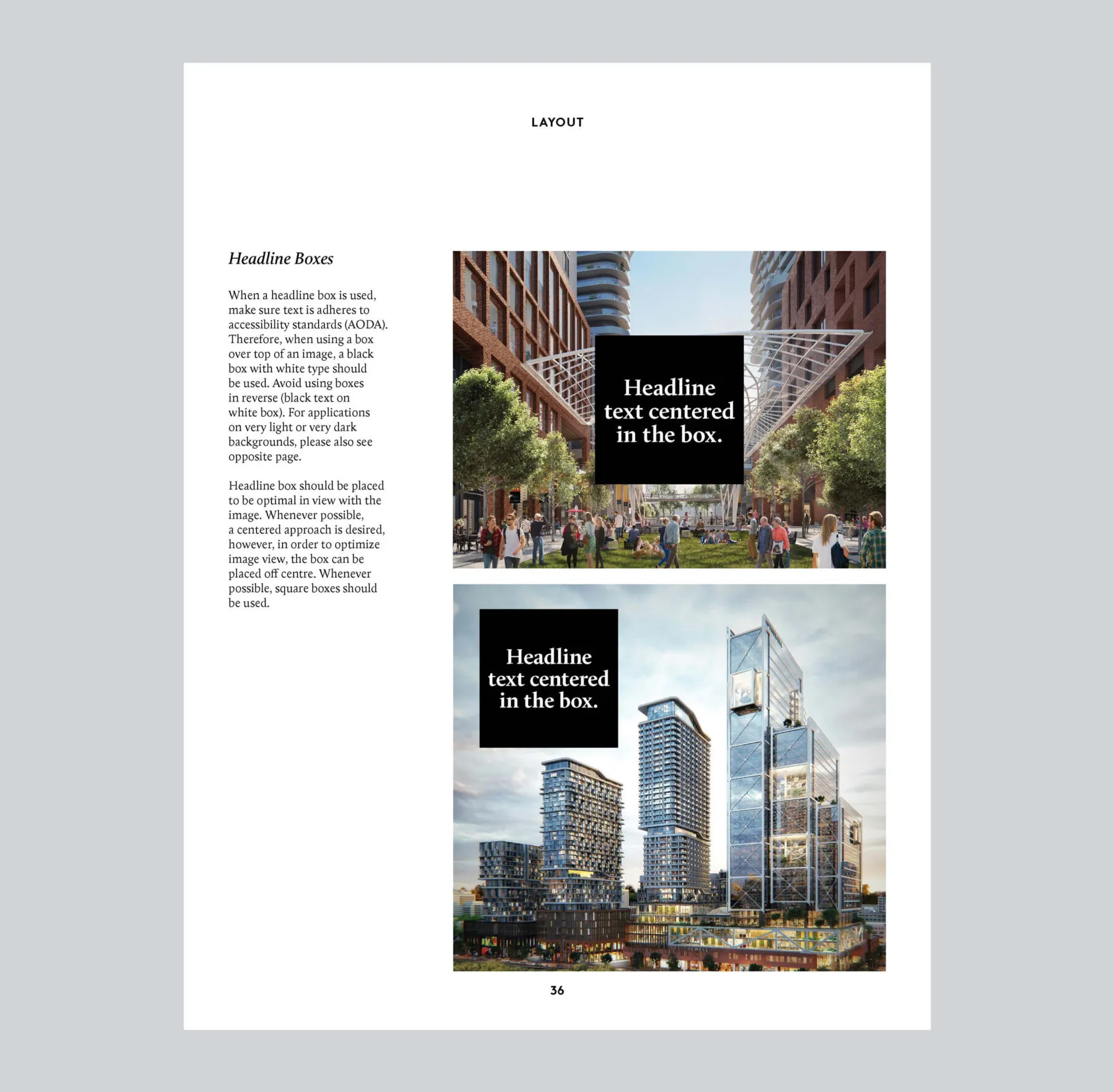
The Well is an innovative mixed-use property development in Toronto’s vibrant King West area where visitors and residents can eat, shop, work, live, and play. To introduce this multimillion-dollar endeavour to the public and generate buzz during a major media push, Forge created various marketing materials and brand assets including brochures with custom photography and vibrant layouts showcasing the properties features and the site’s exciting history.
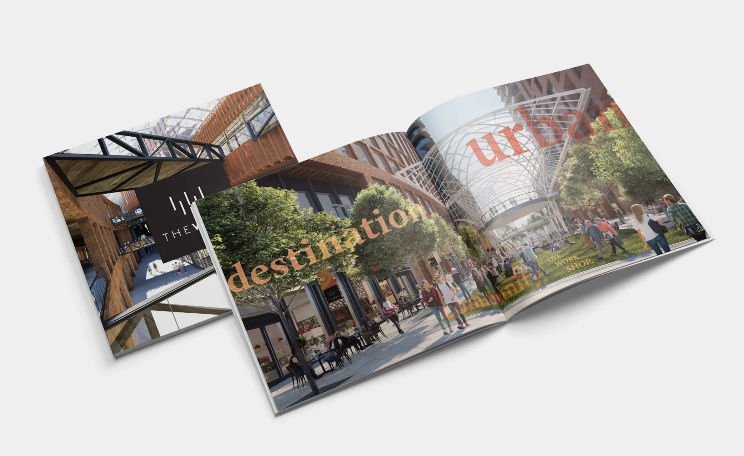
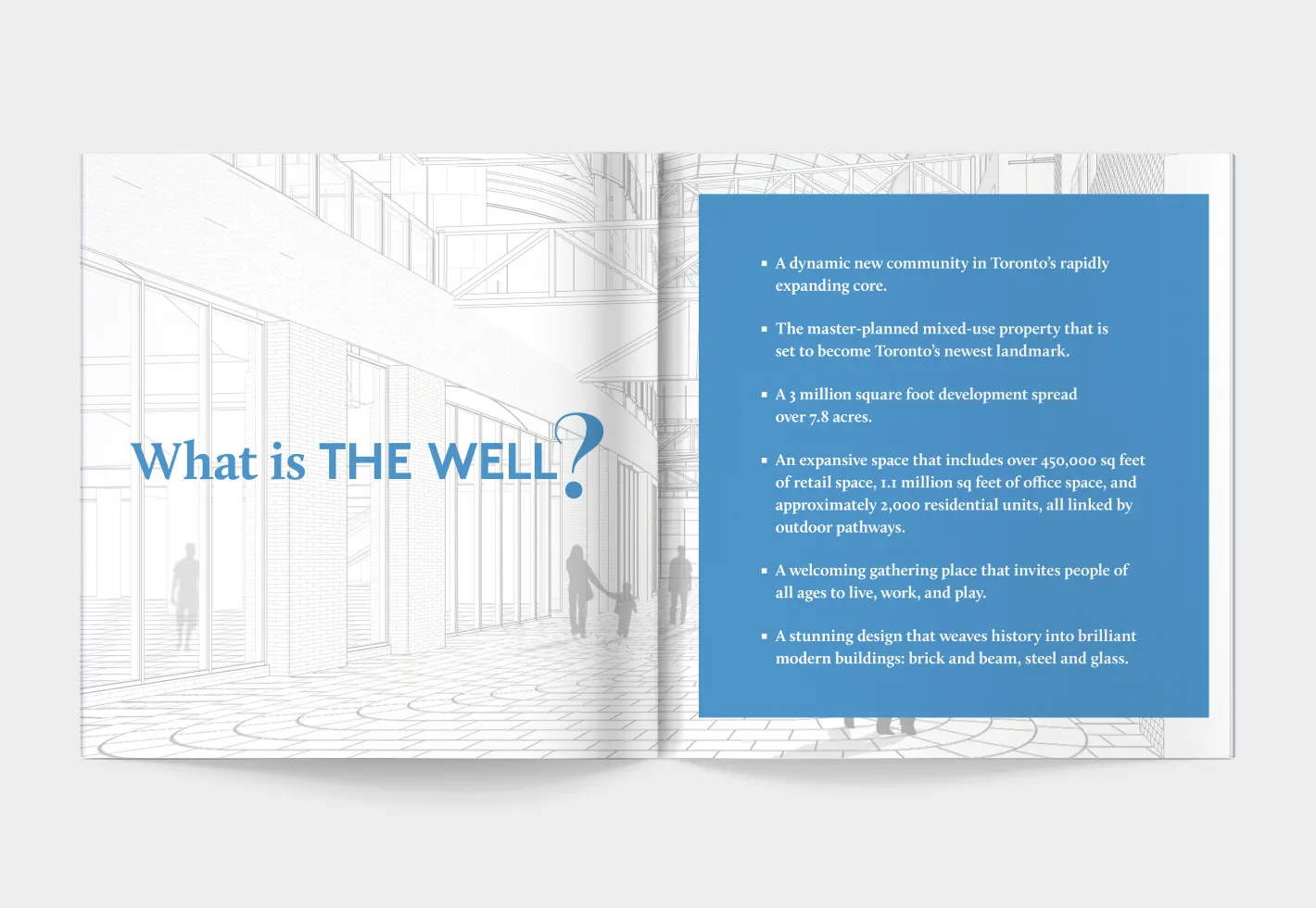
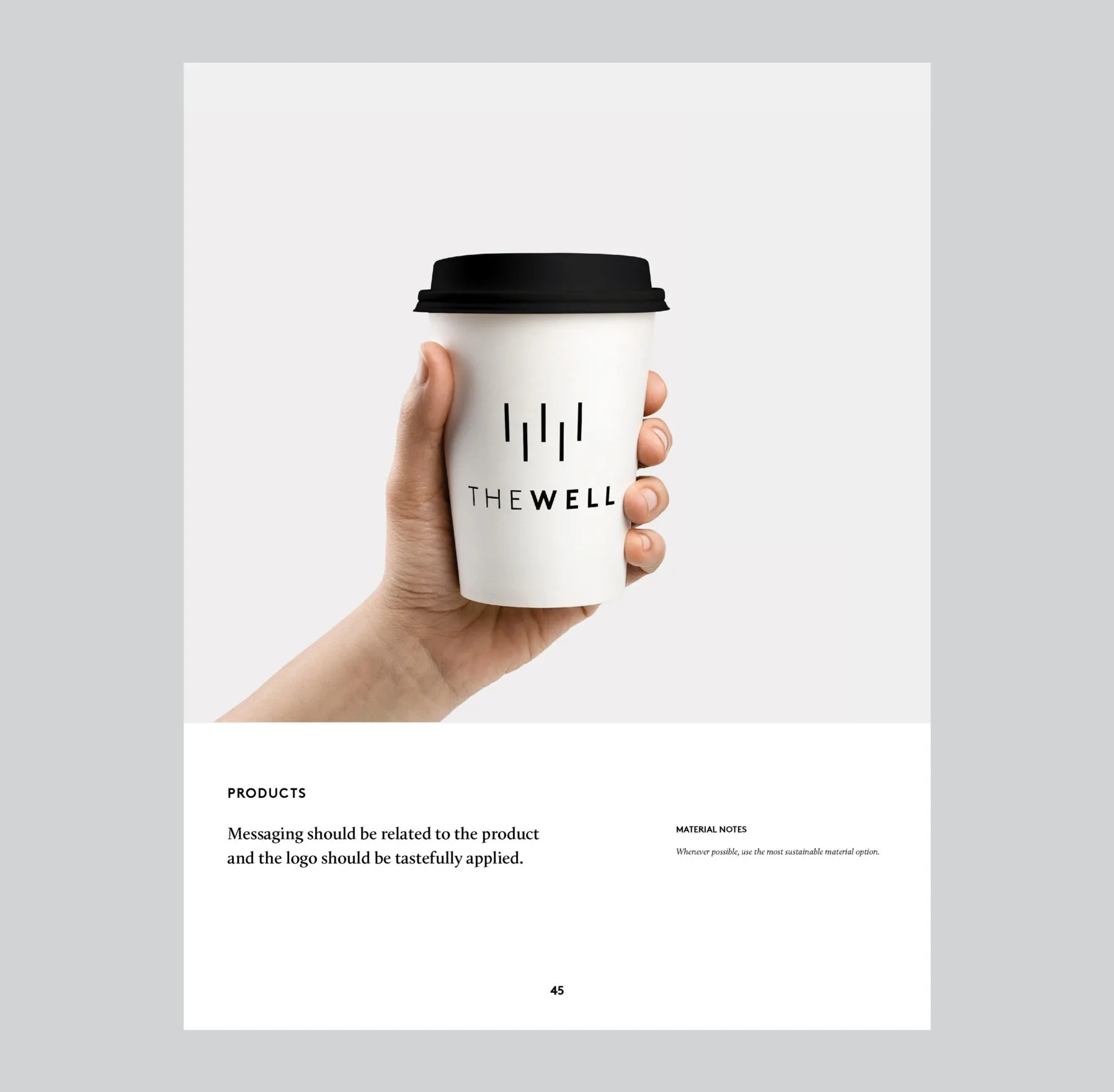
Brochure spread showing urban development with text
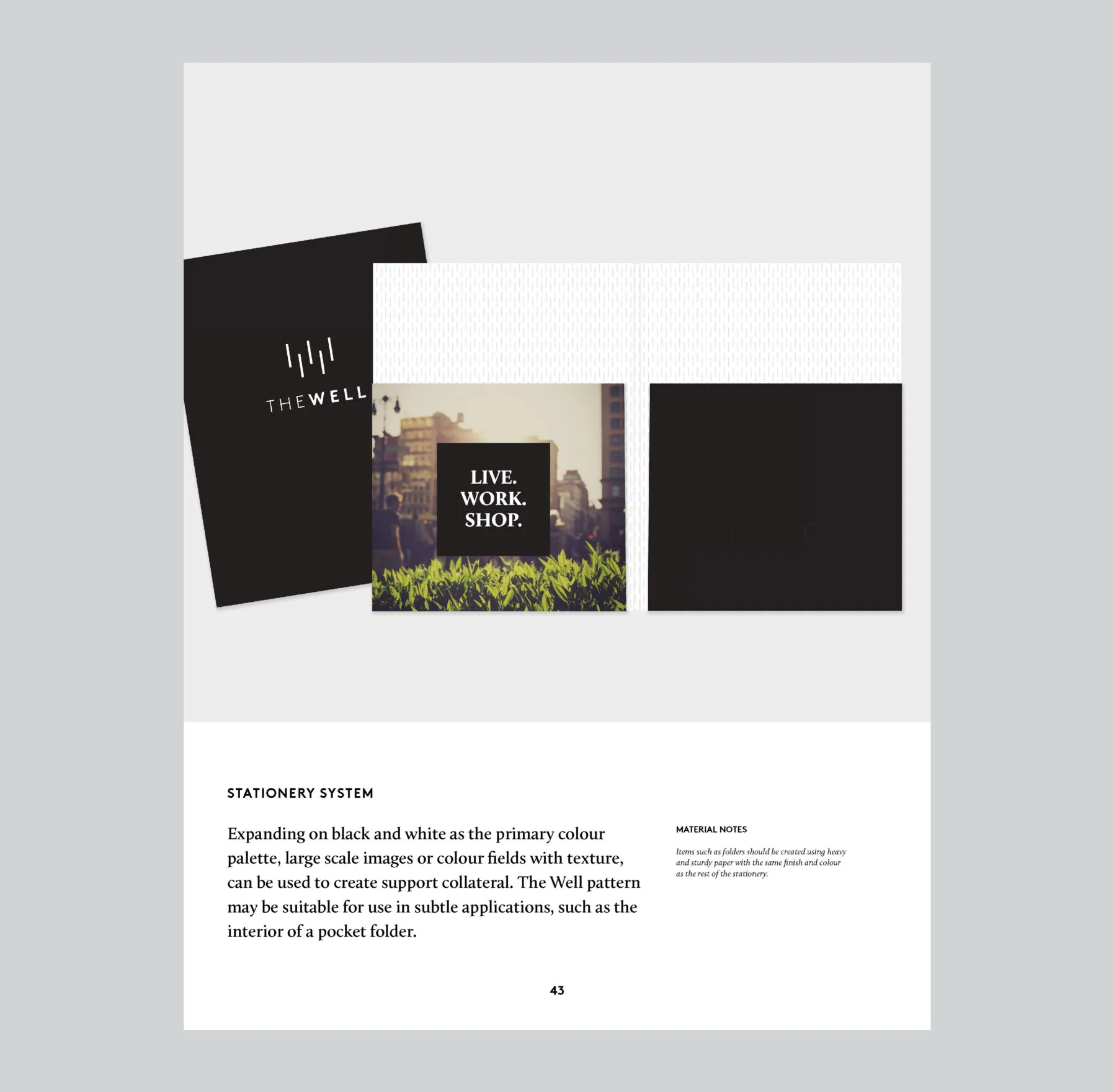
Print collateral to promote offerings and communicate brand values
Illustration of
Site history of Wellington Place, Toronto, with historical images and maps.
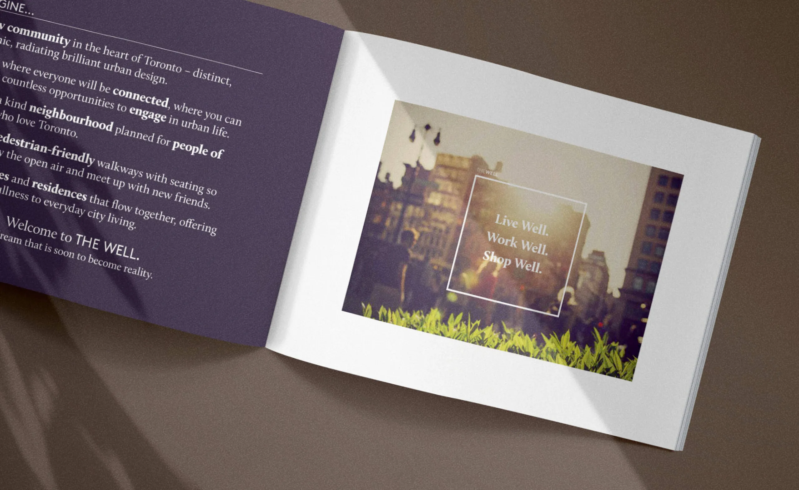
The Well: Live Well. Work Well. Shop Well.
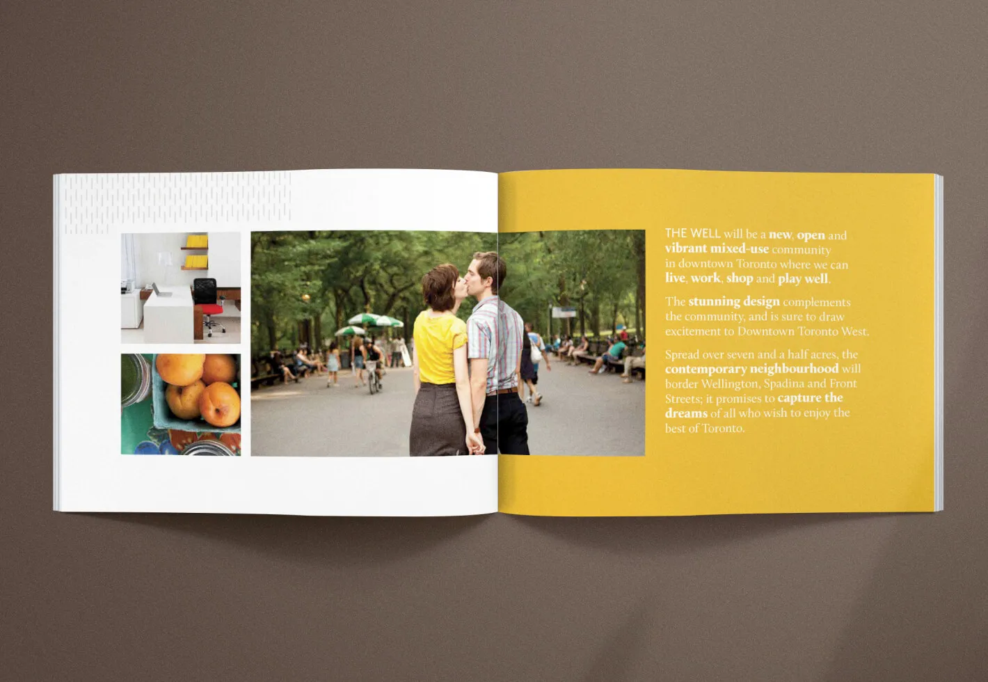
A couple kisses in a park with text about a new community development.
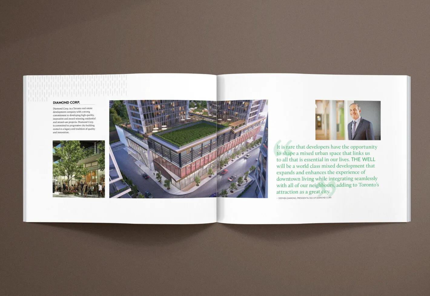
Diamond Corp. brochure featuring a rendering of The Well development and a quote from Stephen Diamond.

Moving the brand forward

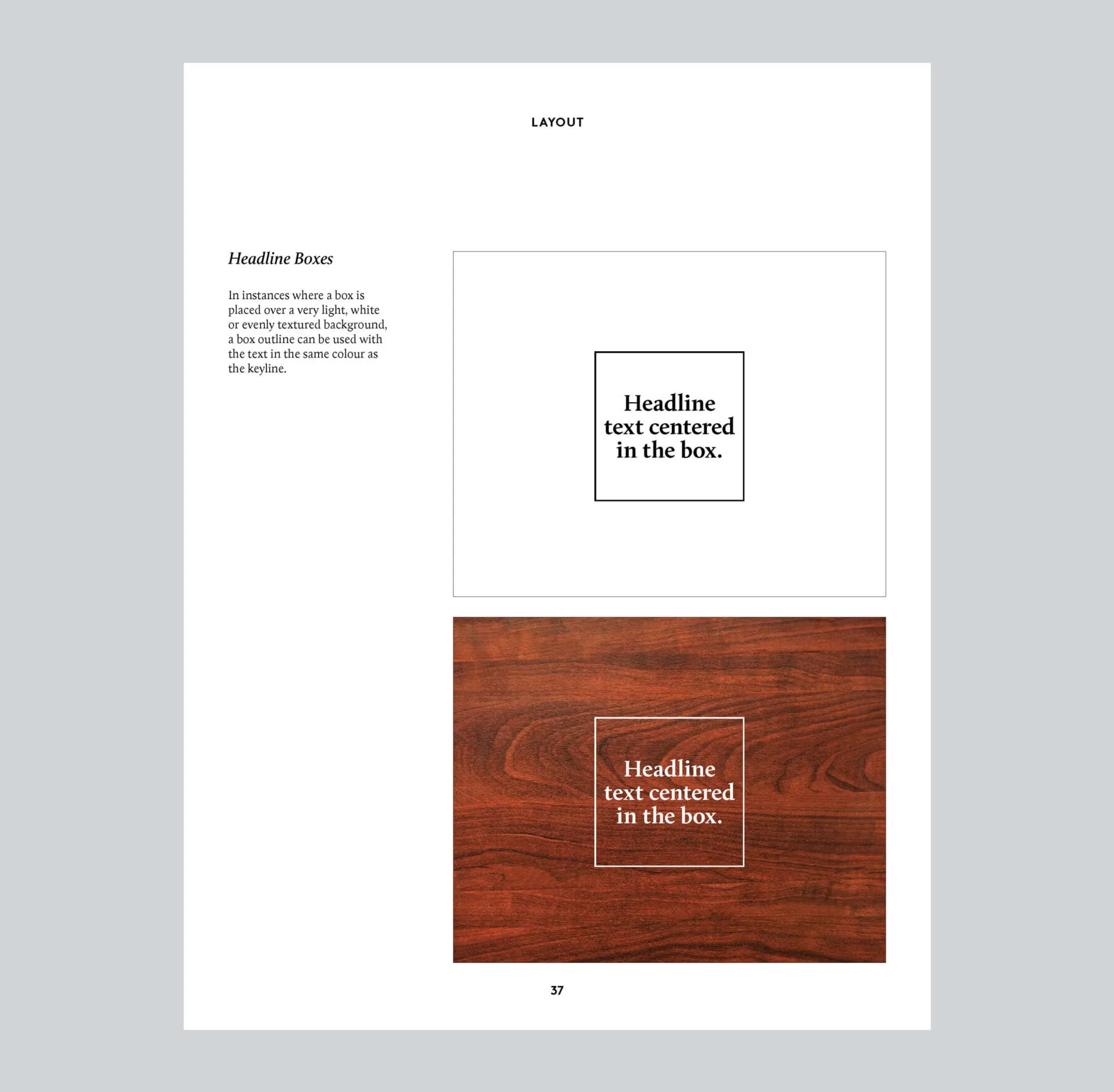
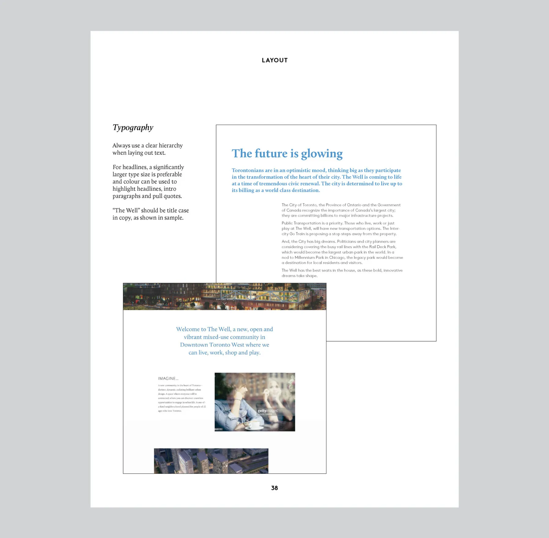
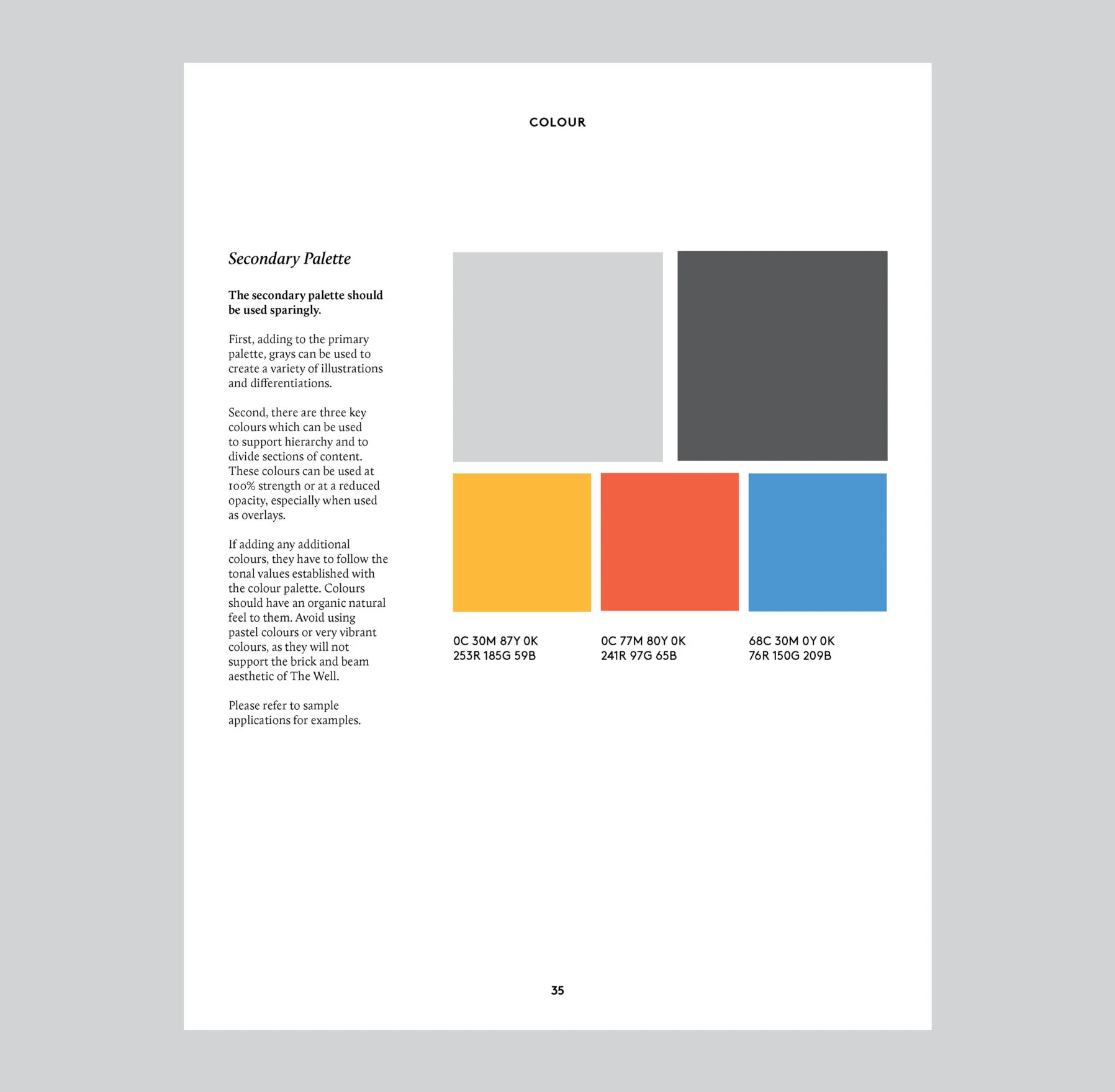
Expanding upon The Well’s existing brand guidelines created by Bruce Mau Design, additional standards were added by Forge, deepening the brand focus and addressing a broader range of brand application scenarios.
Engaging communities from near and far

A website was created to showcase The Well’s various offerings, and provide an in-depth look at their residences, lifestyle amenities, flexible office spaces, retail locations, and the surrounding neighbourhood. Following an initial discovery phase, wireframes were created to determine an optimal strategy in presenting content and to create a dynamic and user-friendly experience.
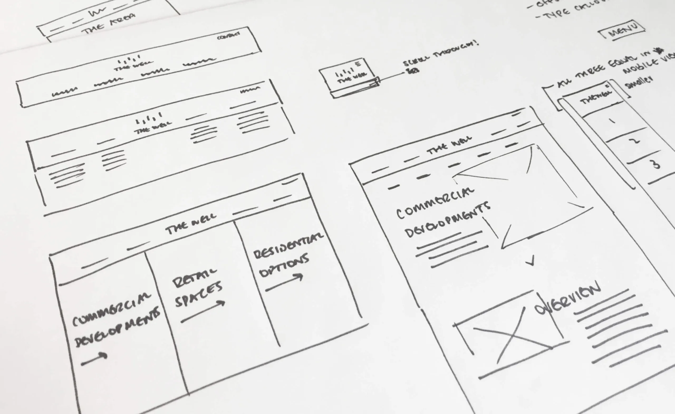
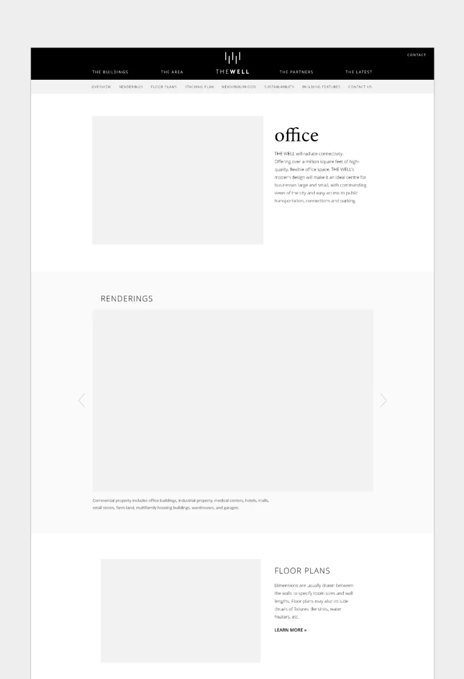
Wireframe sketches for The Well website layouts
Low fidelity wireframing
The WELL office building renderings and floor plans
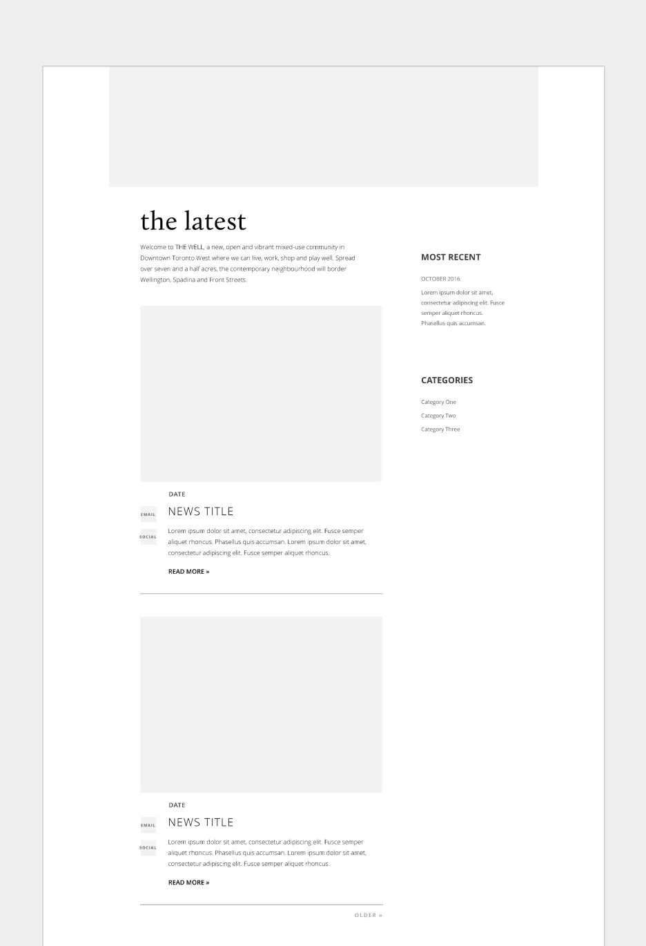
The latest news from The Well community in Downtown Toronto.
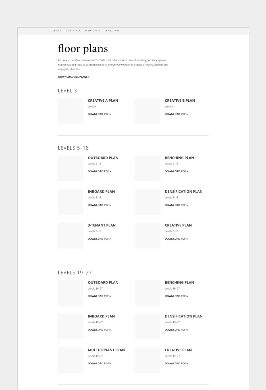
Floor plans for The Well building, categorized by level.
High fidelity wireframing

Creating a foundation for memorable experiences

With a focus on lifestyle photography, architectural renderings, and data visualization, the website welcomes users with a warm, lively, and inspiring look into The Well’s community-focused philosophy. Optimized for various devices, the website is both accessible and intuitive for a modern audience.

Features

Google Analytics integration

WordPress CMS

Custom theme

CRM integrated forms

Video animation

Custom photography

Amenities maps

Data visualization
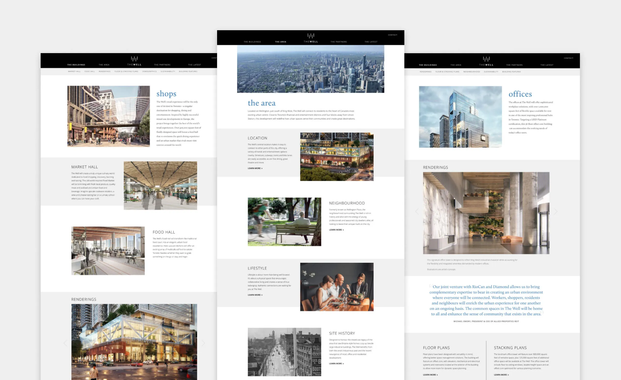
Website flexible for regular content updates
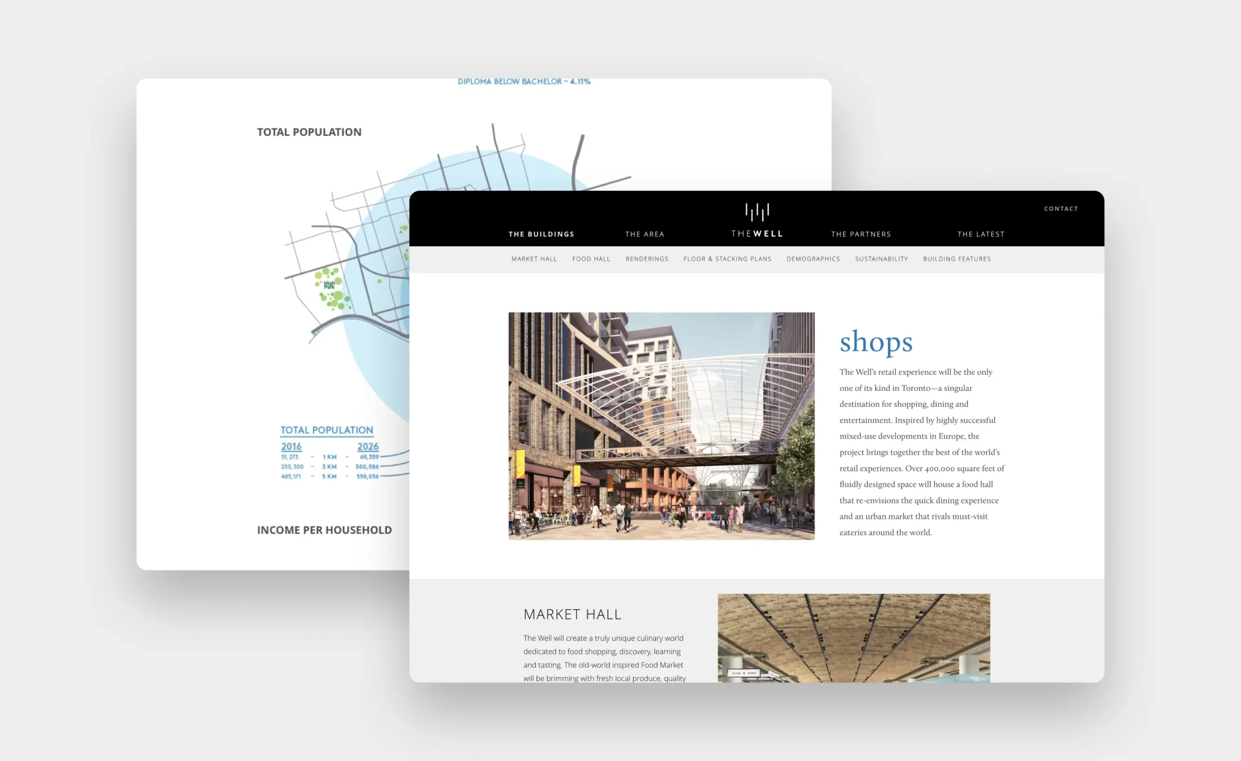
The Well development in Toronto, featuring shops, market hall, food hall, offices and renderings.
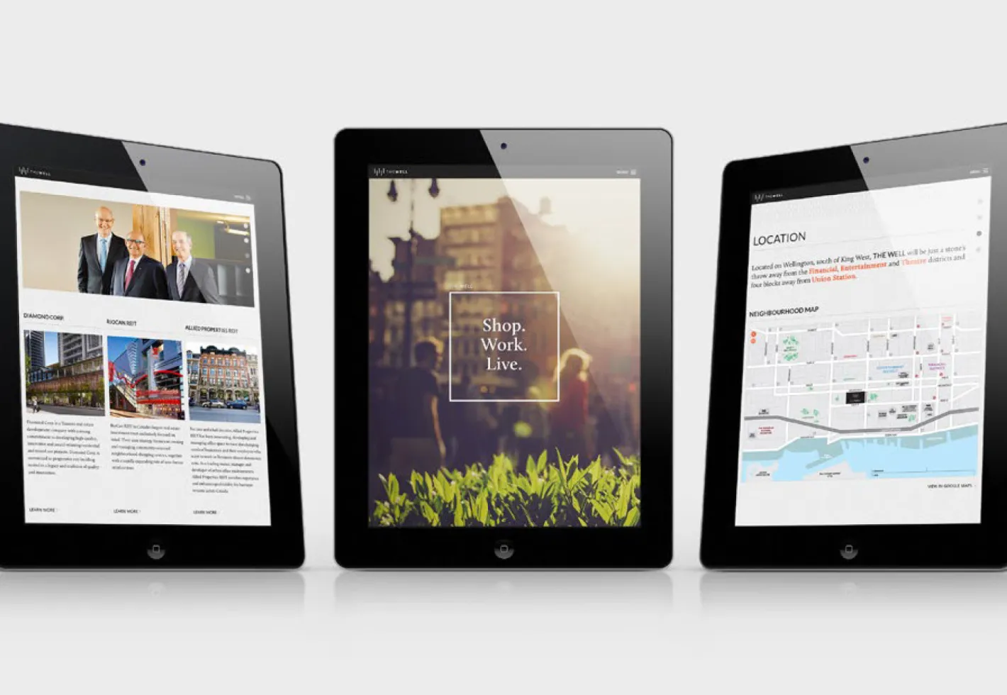
Three tablets displaying website content about The Well development.
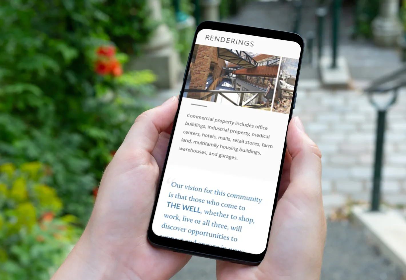
Phone displaying renderings and text about commercial property and community vision.
The Well retail experience in Toronto, featuring shops, market hall and renderings.
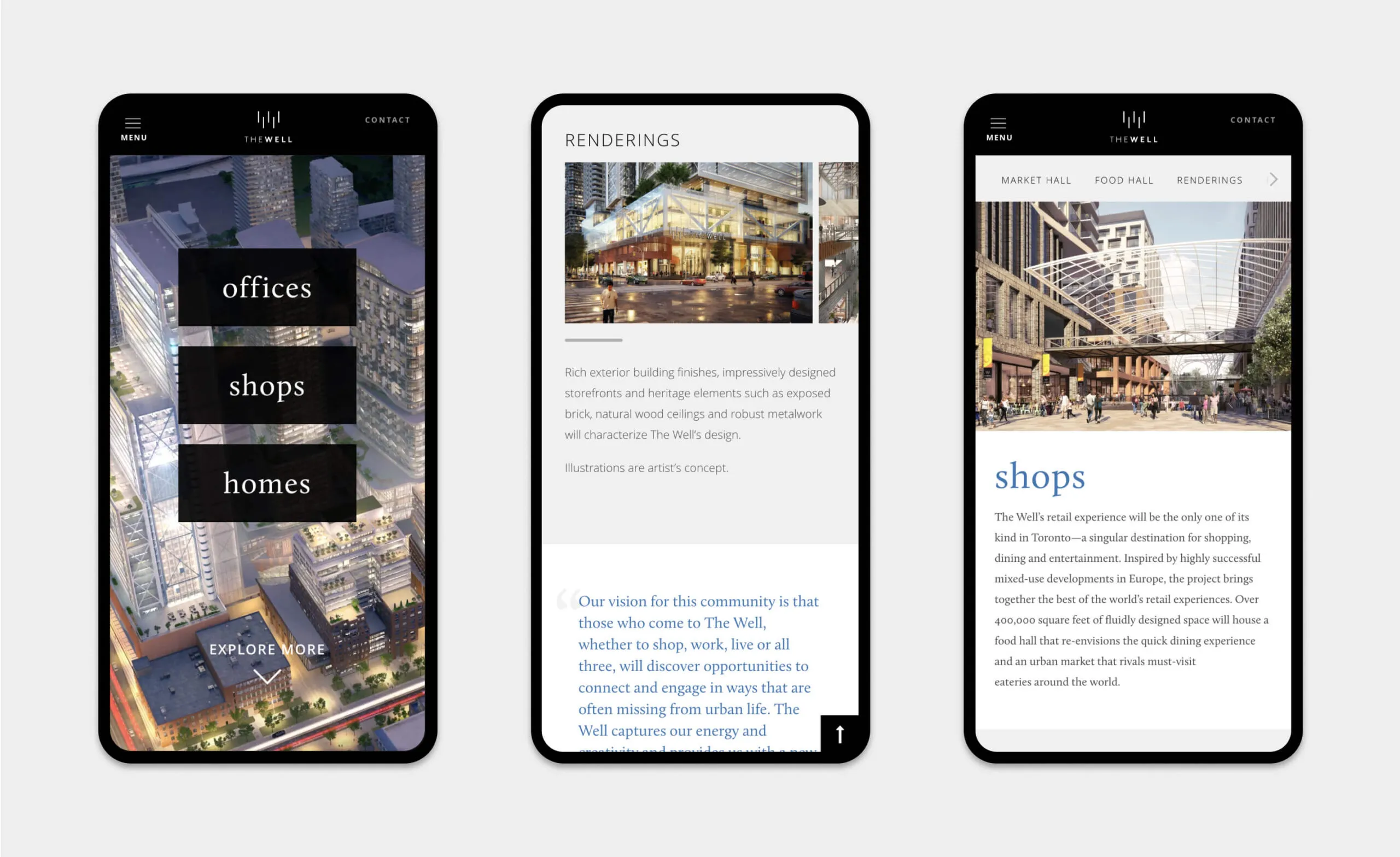
The Well development: renderings of shops, offices, and homes.
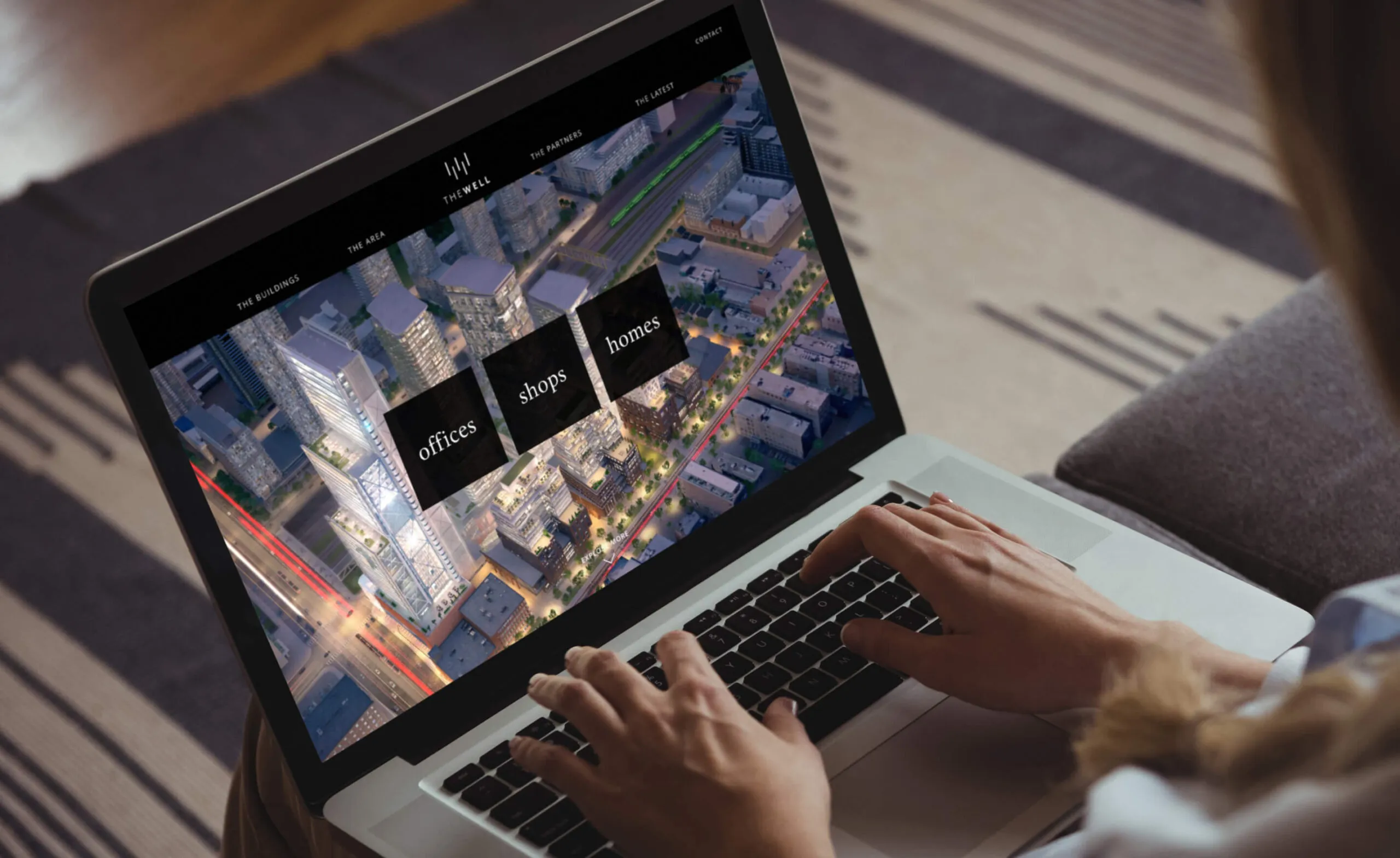
The Well website showing a city aerial view with navigation links for buildings, area, offices, shops, and homes.

Employing motion to amplify the message

To elevate the brand experience at events, our team produced a seamlessly-looping video to be leveraged in various presentation and promotional scenarios, providing The Well with a versatile and powerful marketing tool.

  • 22K daily guests
  • 1.7K premium residential units
  • 320K square feet of retail and food service
  • 1.2M square feet of office space
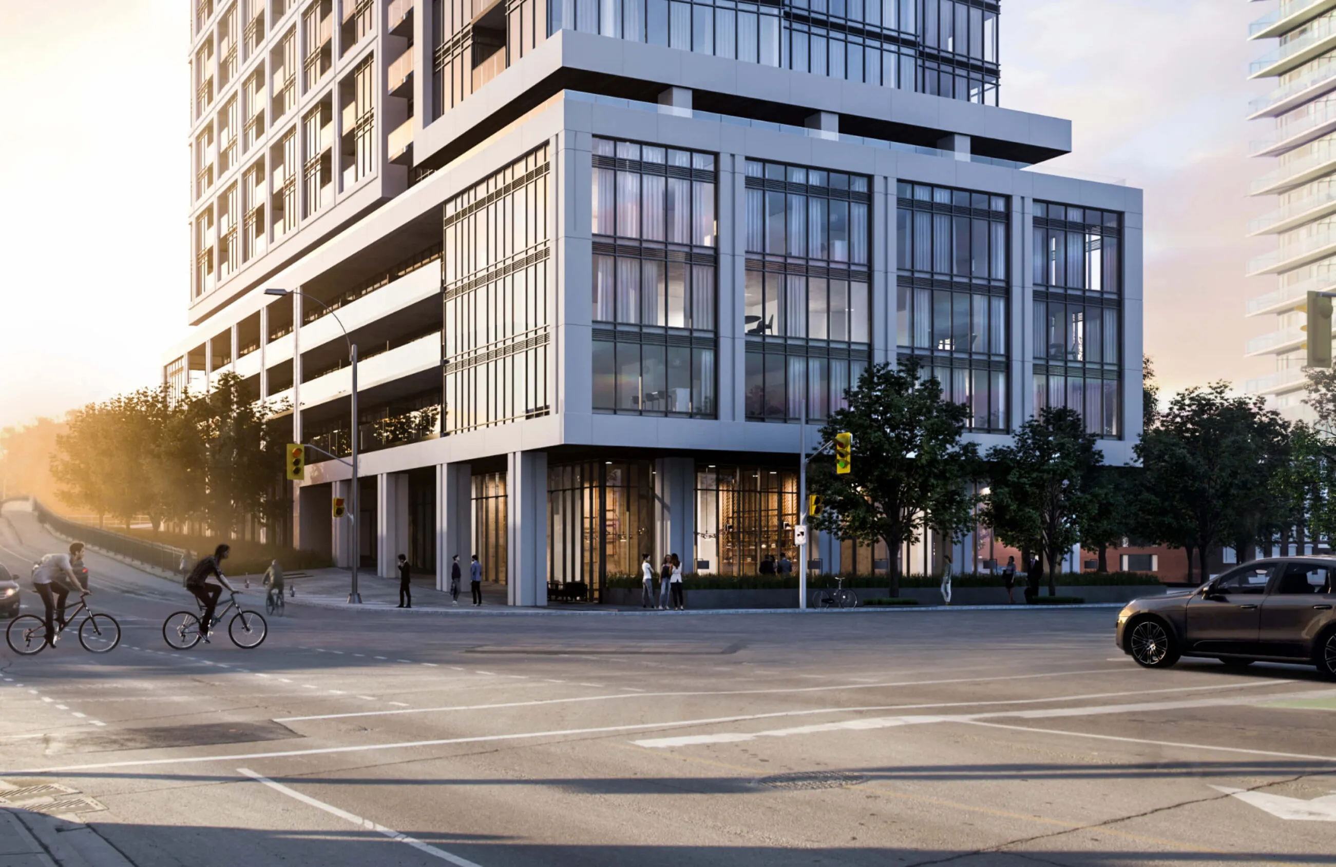
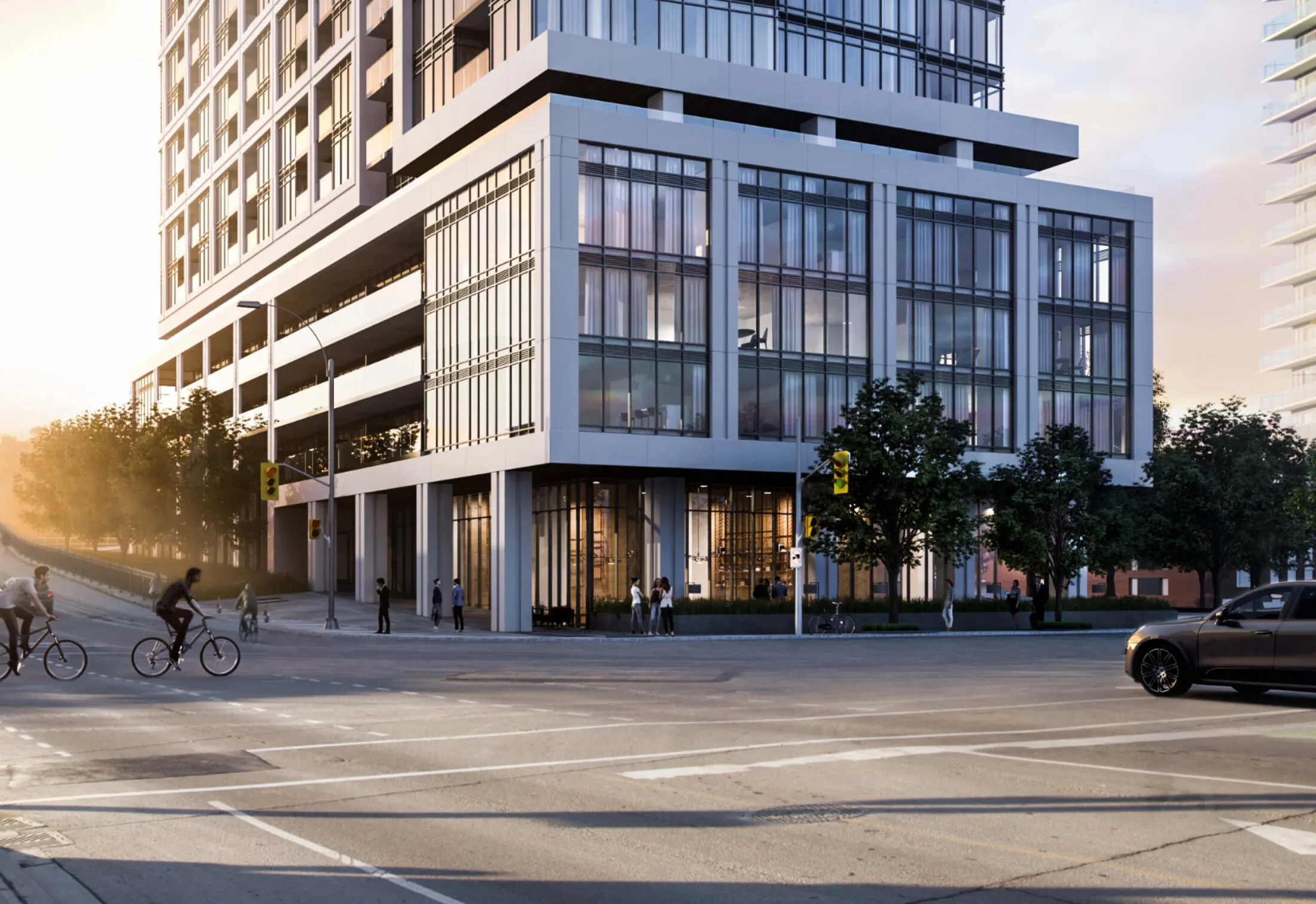
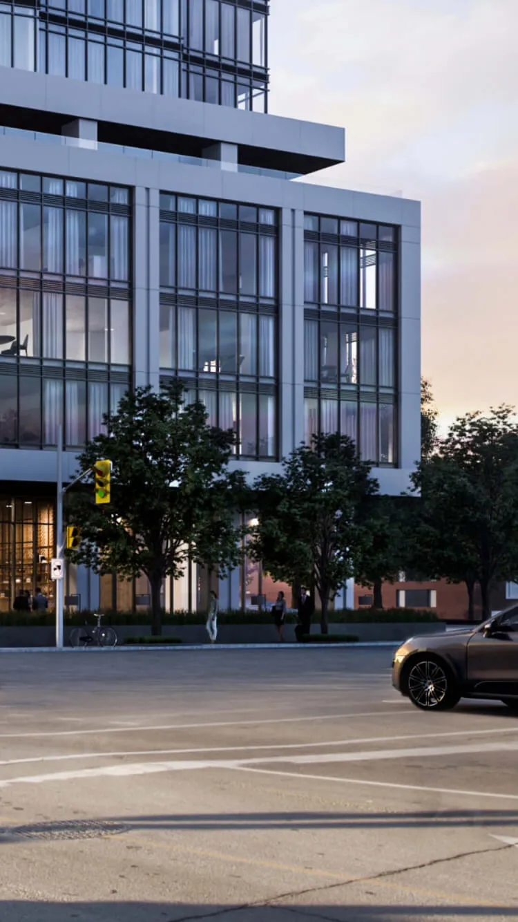
Modern apartment building with people and cars on a sunny street. Modern apartment building with cars and trees on a street.

Liberty House

Services Deliverables
  • Logo
  • Brand Guide
  • Marketing Materials
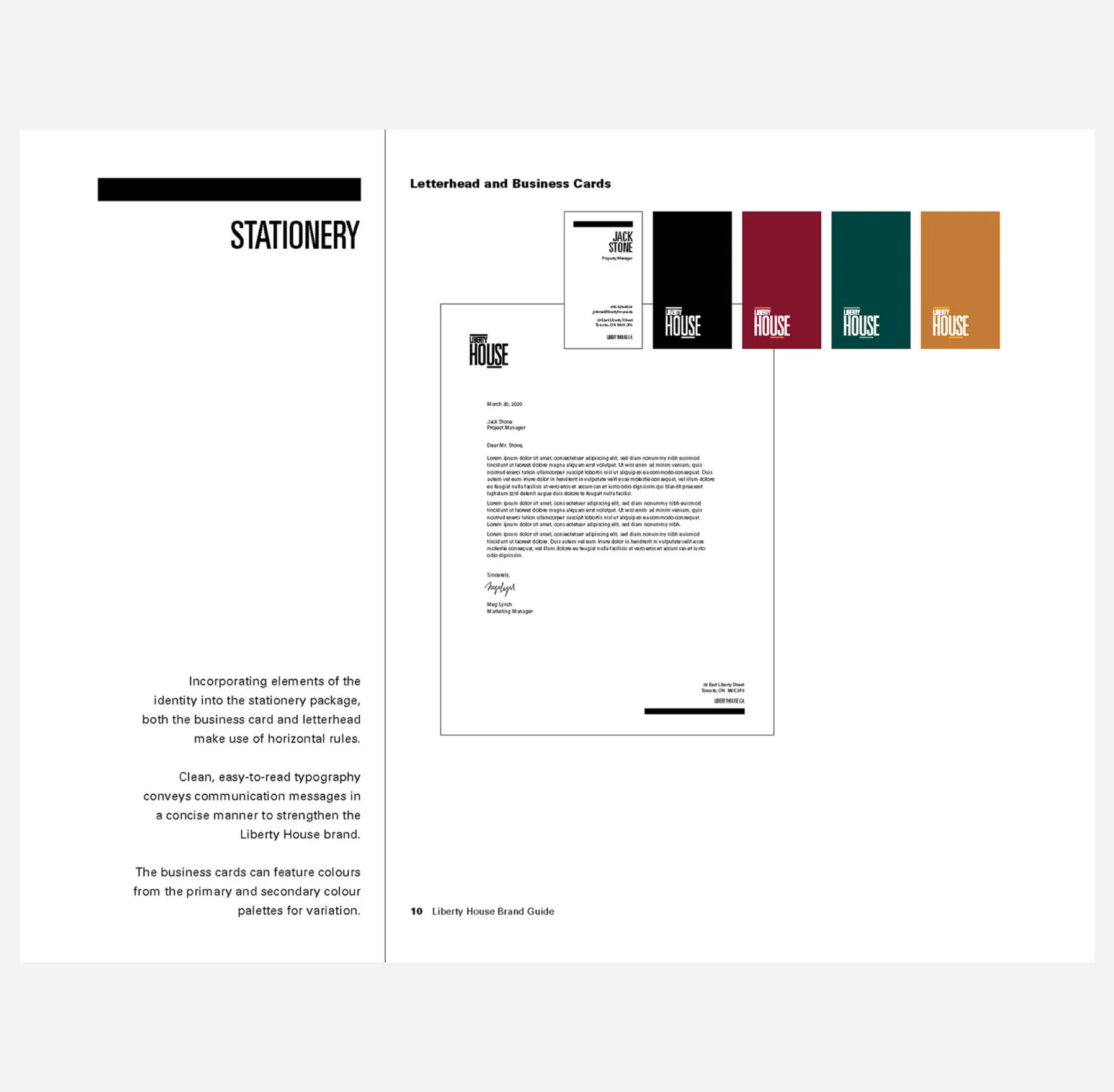
  • Stationery
  • Signage
  • Wayfinding
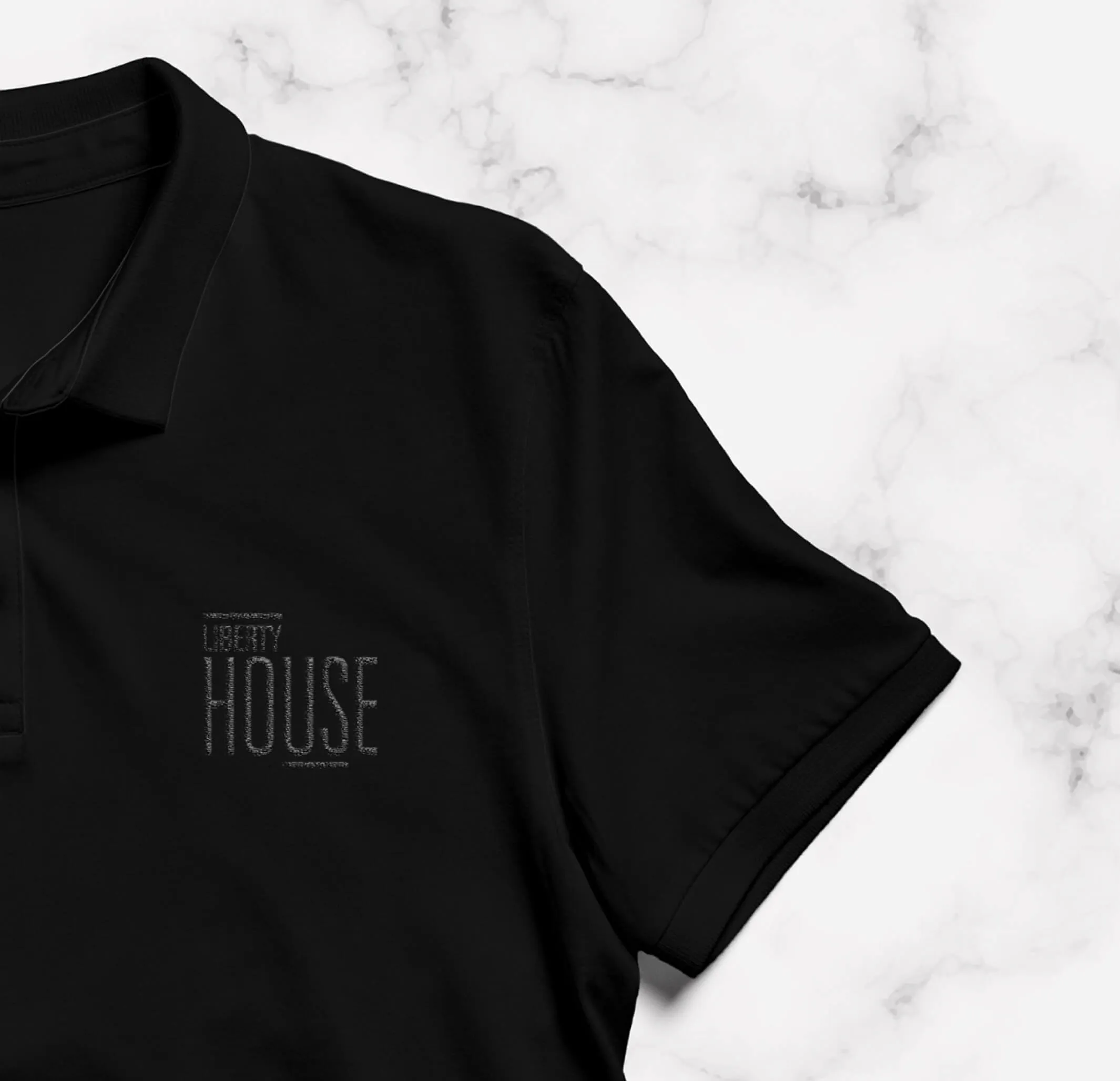
  • Uniforms
  • Placemaking
  • Masterplan

Fostering a culture of community within a community

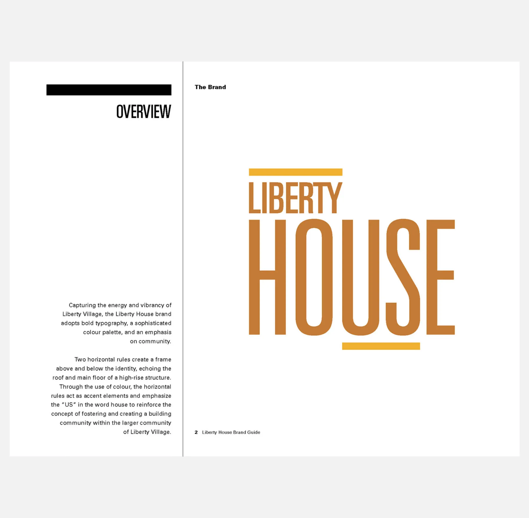
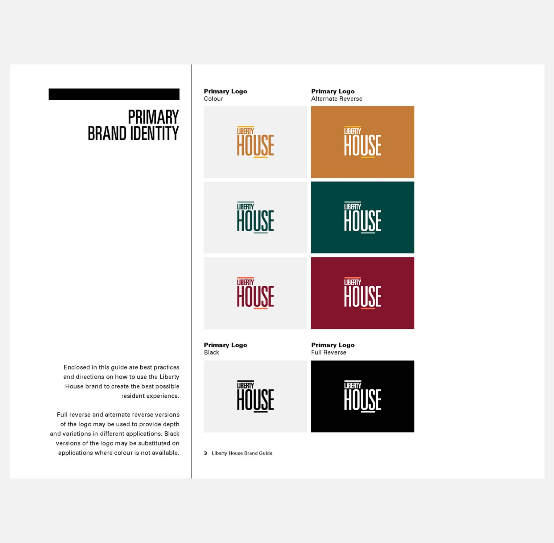
Equipped with luxury amenities and stylish spaces, Liberty House is an elevated rental development that strives to provide a community-focused lifestyle for all residents. To fill a gap in the purpose-built rental space, Fitzrovia aimed to build high-quality rental units with desirable amenity packages marketed to the millennial renter. Forge worked with Fitzrovia Real Estate to define a name and develop a brand for this new property.

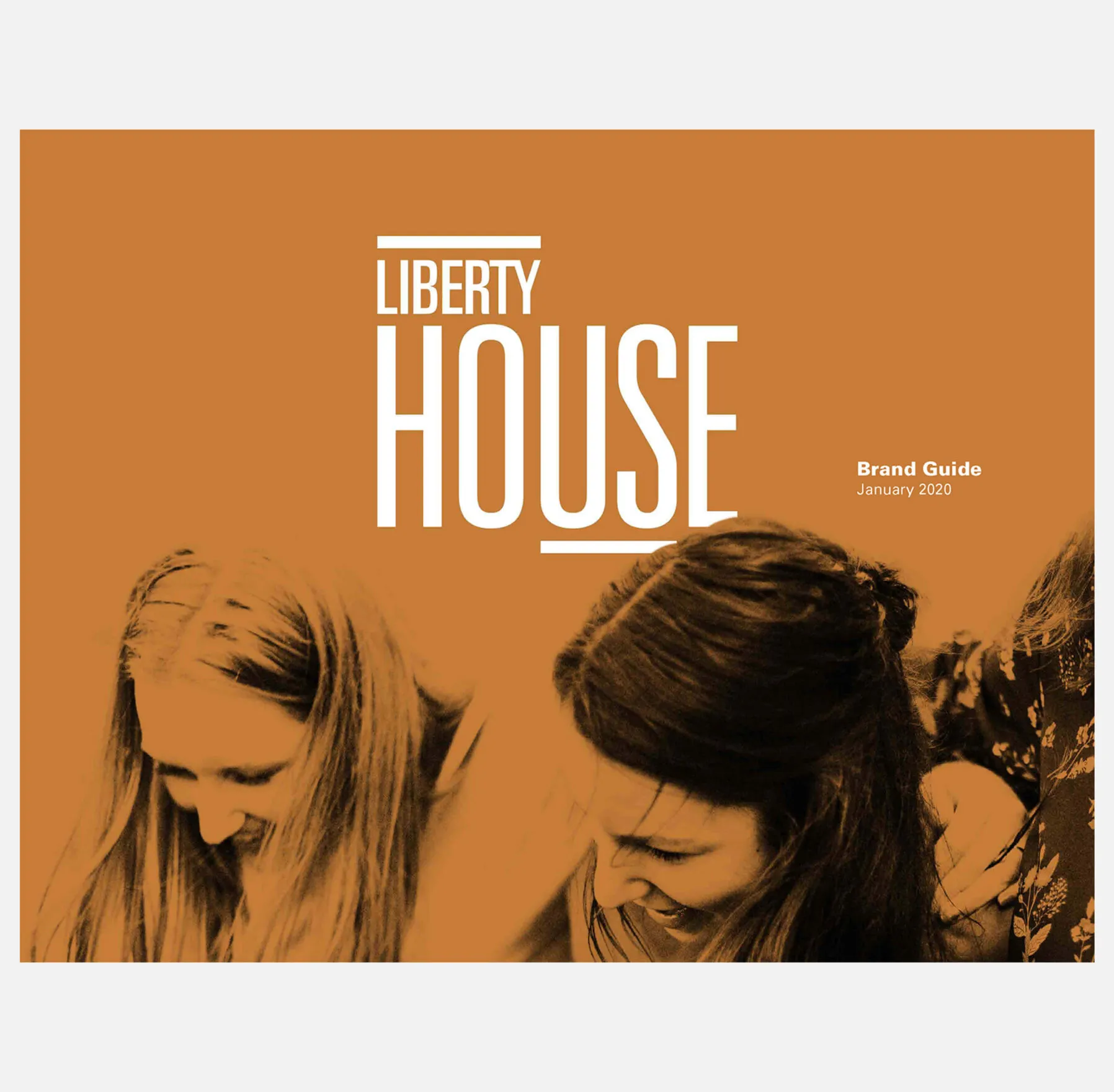
Liberty House logo with two women's faces in silhouette.
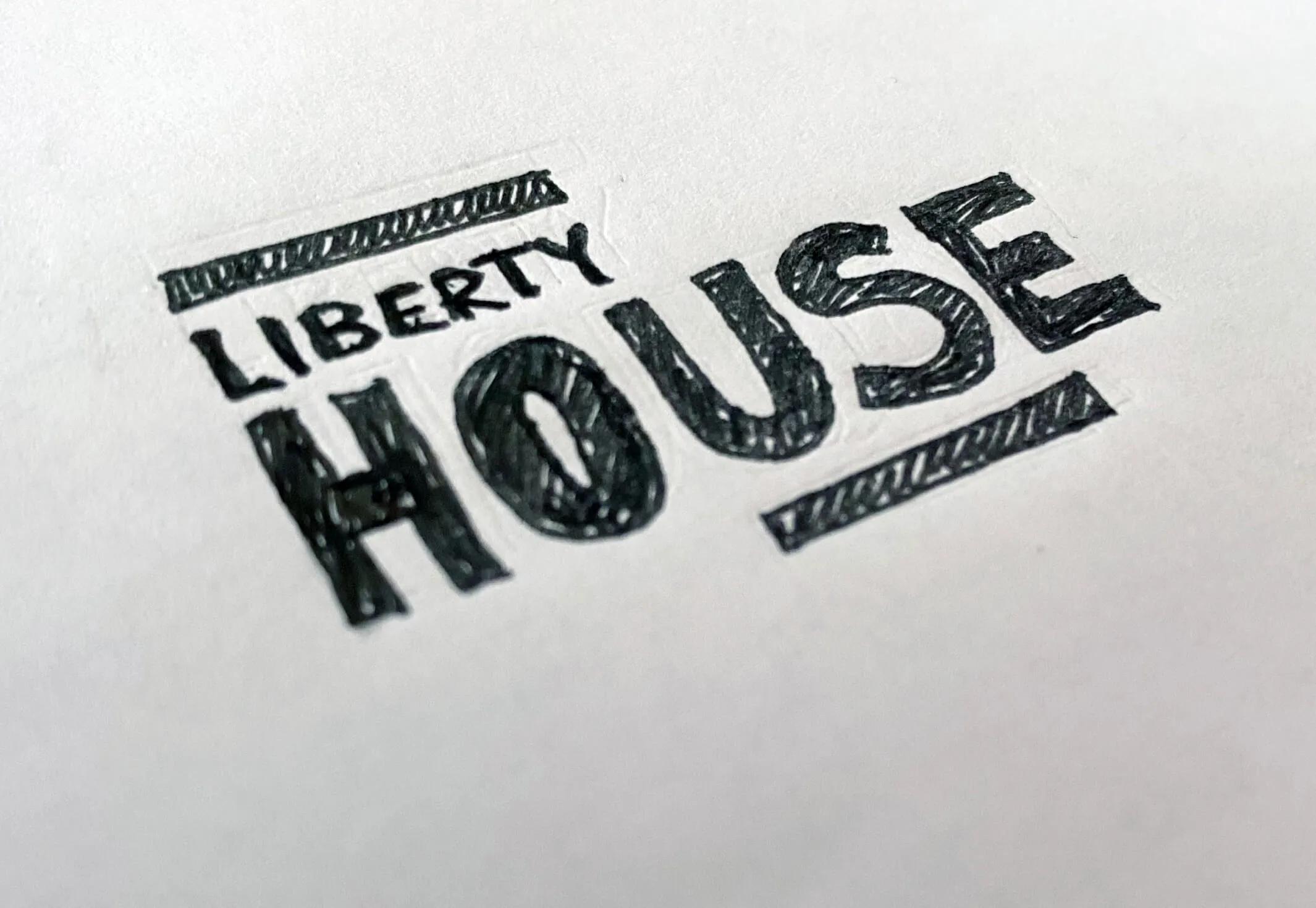
A preliminary sketch for the Liberty House logo
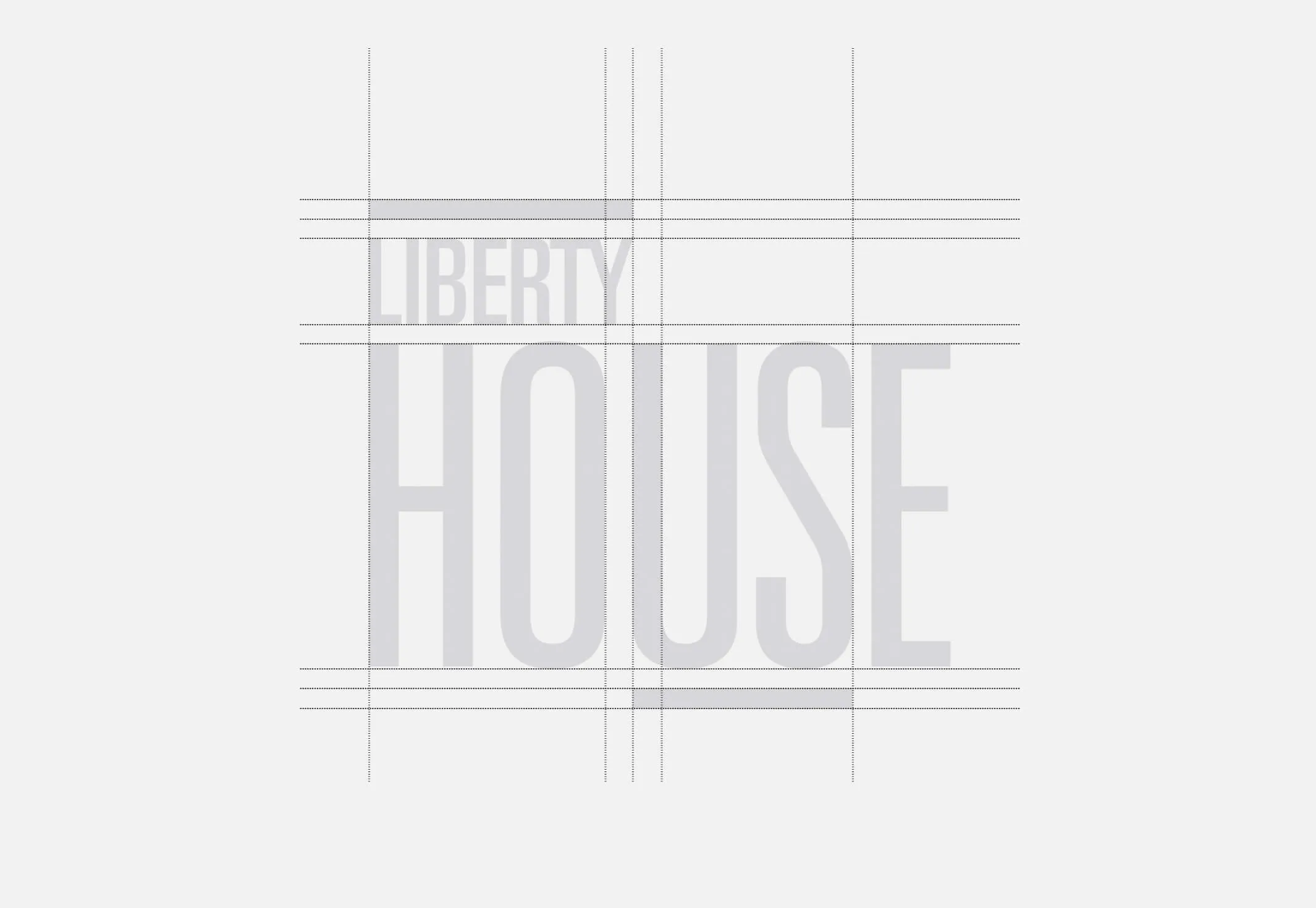
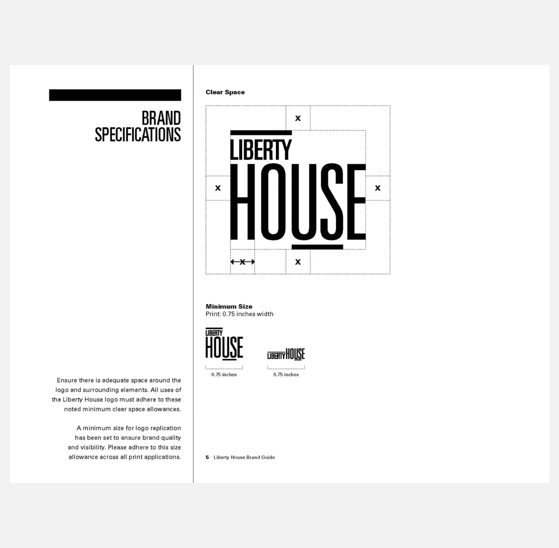
The Liberty House logo seen aligned to a grid
Preliminary sketch and a well structured logo for a fun brand
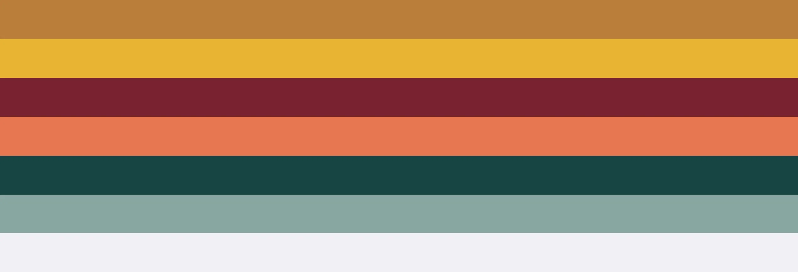
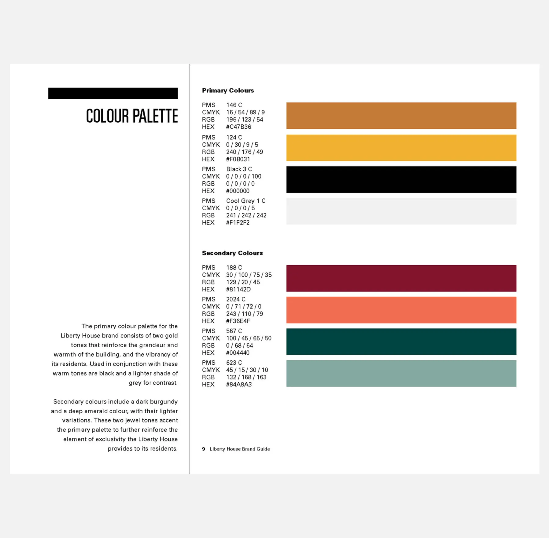
Abstract background with horizontal stripes in warm, earthy tones.
A sophisticated colour palette
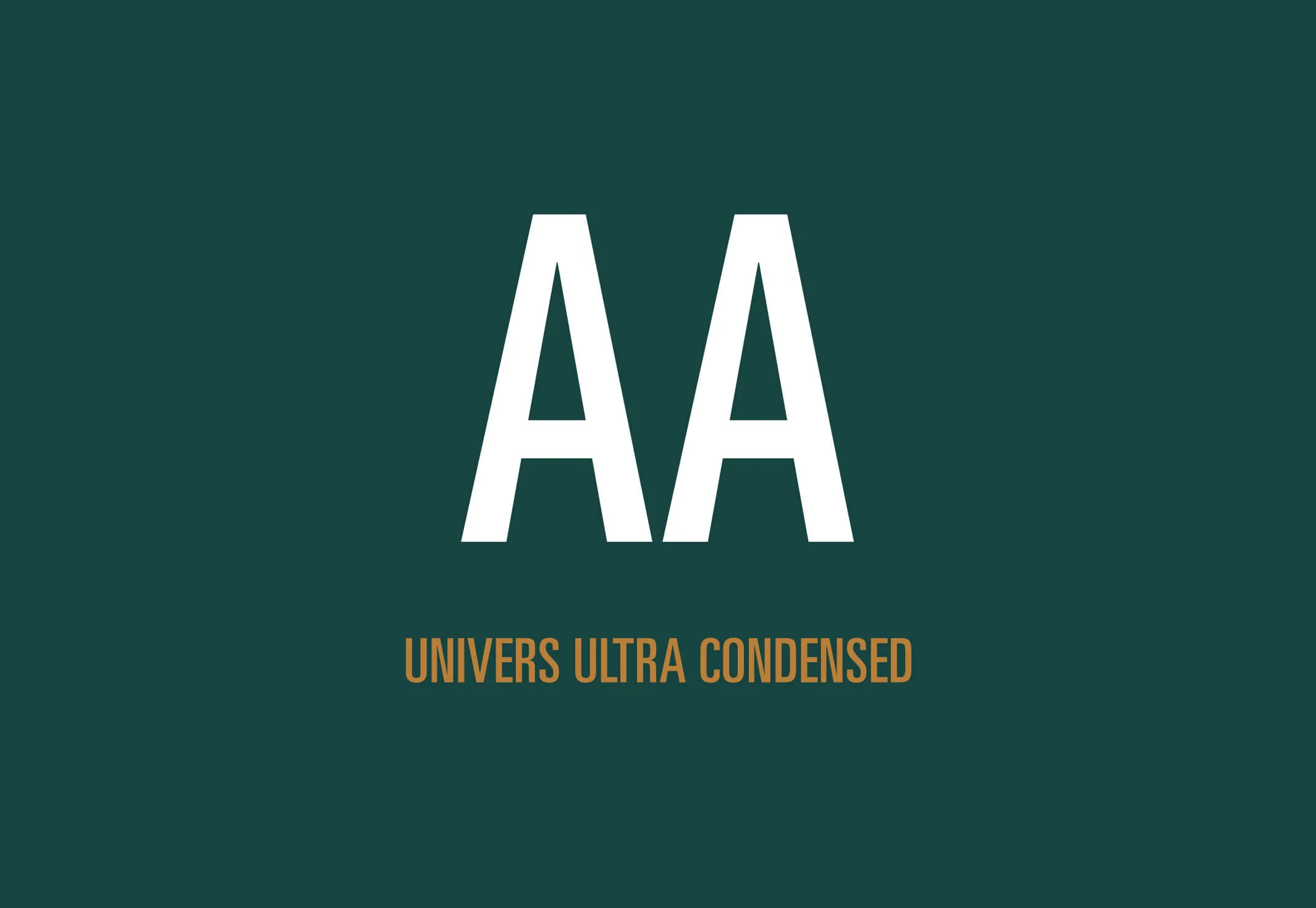
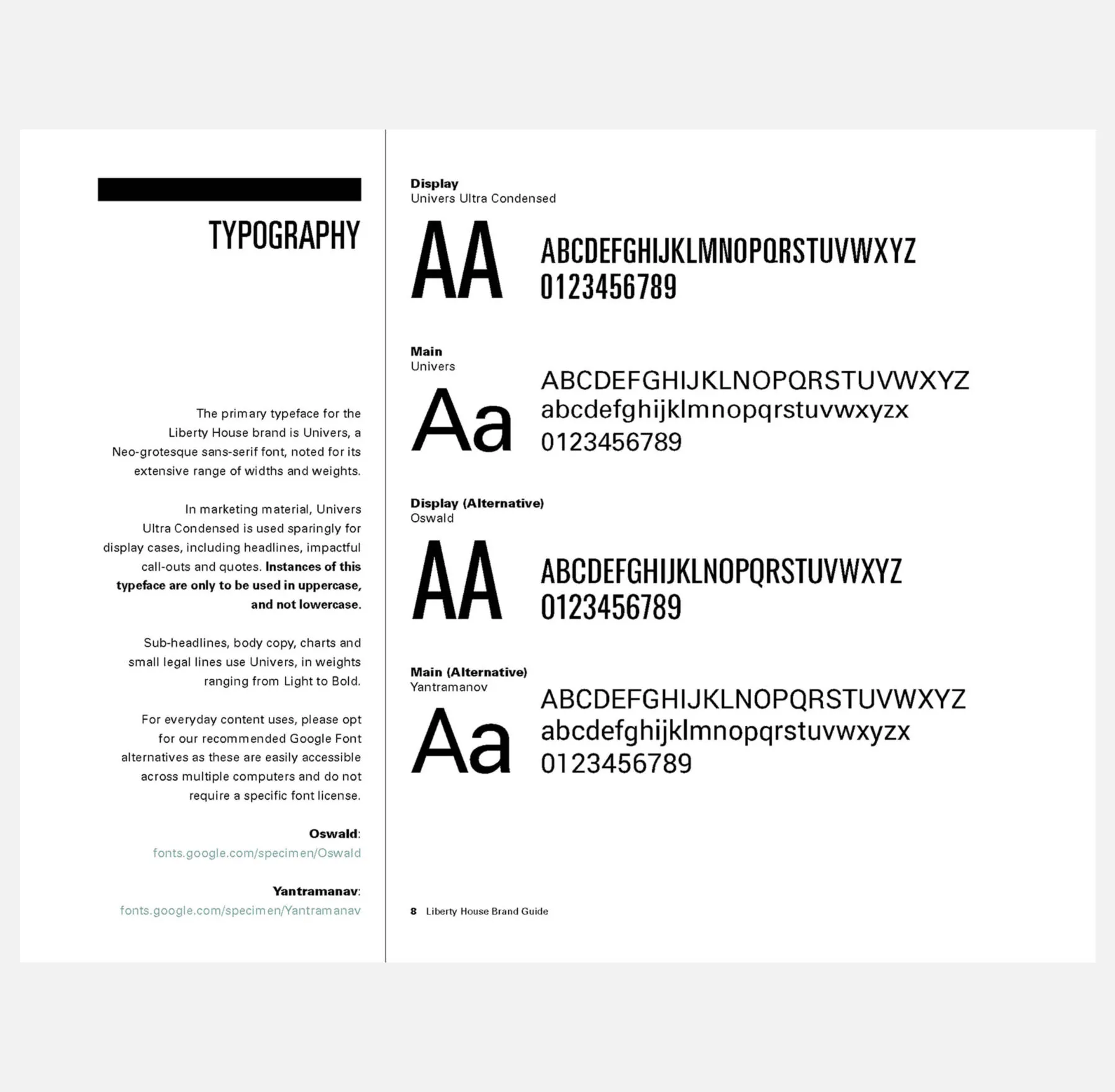
A letterform of the letter A for the font Univers Ultra Condensed.
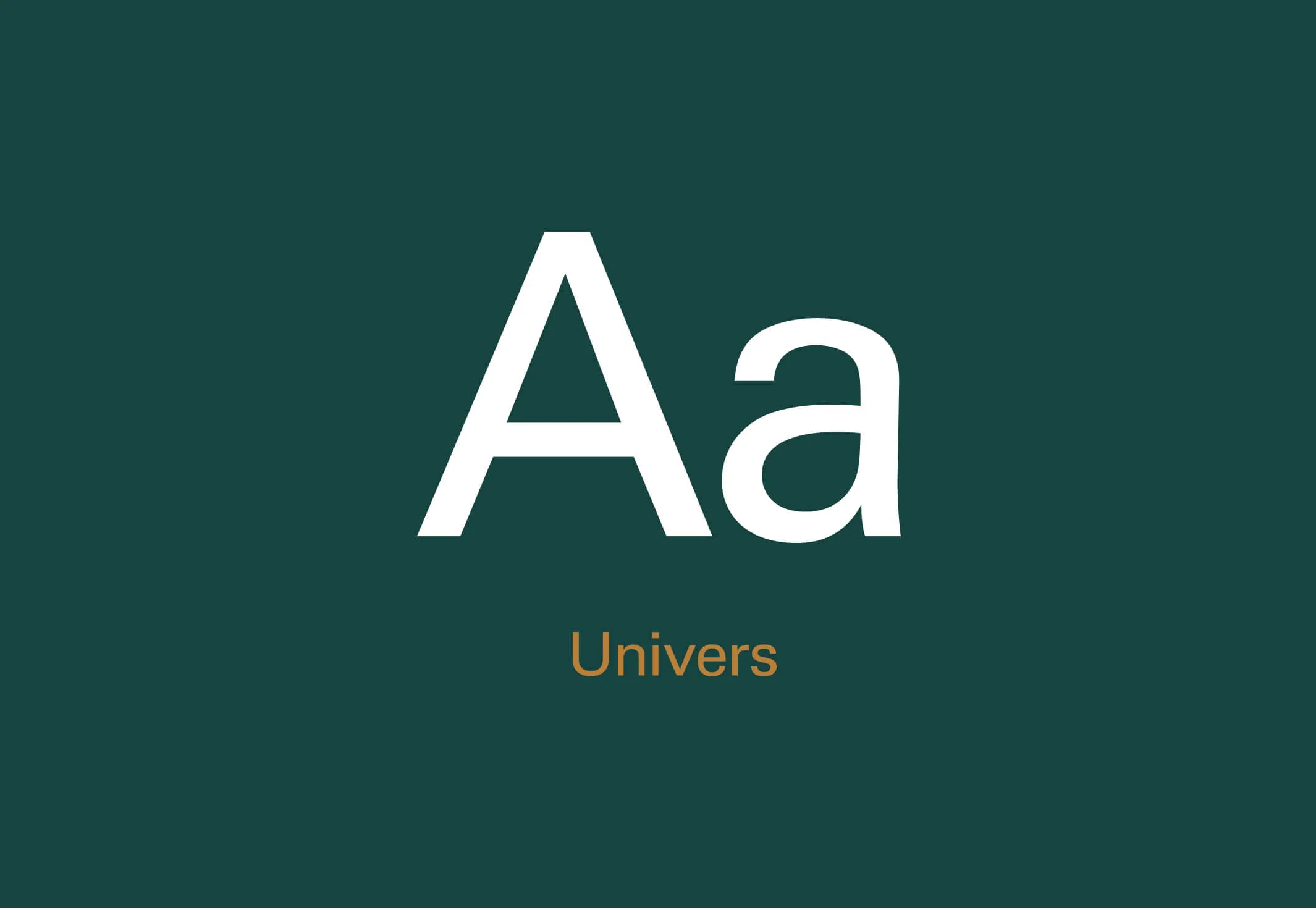
A letterform of the letter A for the font Univers.
Stylistic typography to communicate to the millennial audience

Resonating with the millennial renter

Seeking to evoke the community aspect of the property, the name Liberty House reflects the idea of one’s family all under one roof. The name also echoes the sense of pride and unity created by the development’s unique spaces, program offerings and amenities. Liberty House offers luxury living within reach to its residents.

Black polo shirt with
Liberty House logo
Uniforms
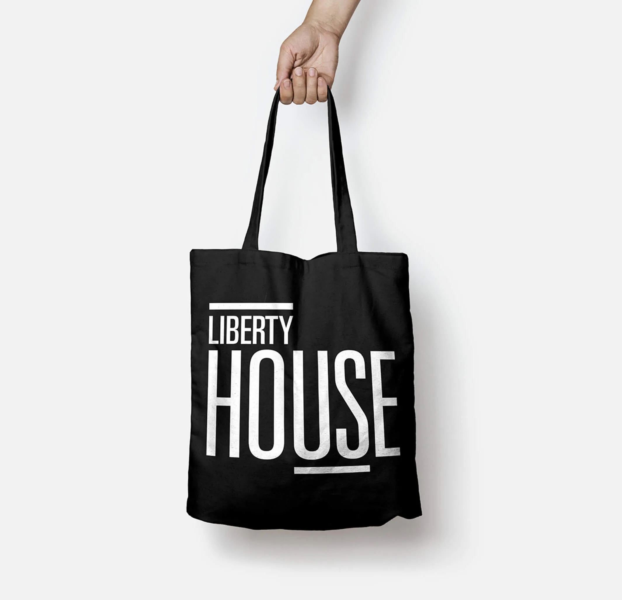
Black tote bag with
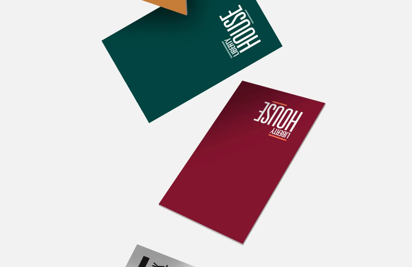
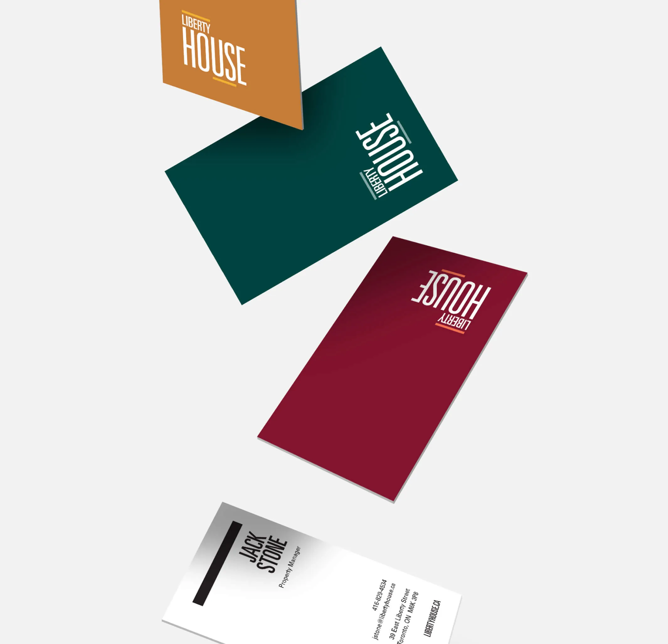
Business cards for Liberty House, featuring the company name and contact information.
Promotional materials and stationery

Luxury within reach

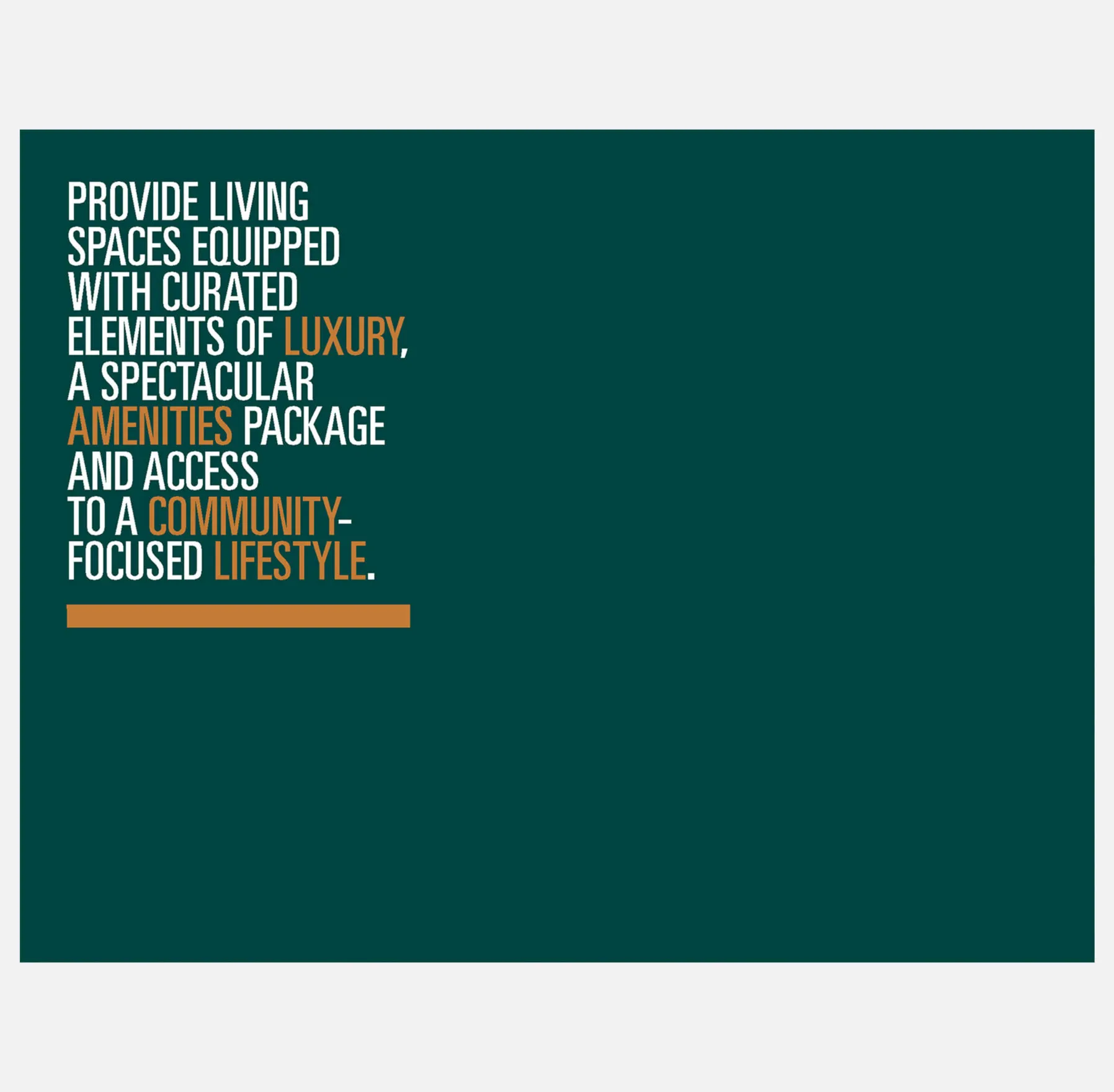
The property speaks to those looking for an aspirational lifestyle while remaining accessible to the young millennial renter. Curated elements of luxury are present in the buildings offerings and mirrored through the use of carefully chosen materials and custom flourishes throughout the signage program.

Restroom icons for men, women, and disabled individuals.
Abstract logo of two figures in an elevator with up and down arrows
Minimalist golden bicycle logo on a white background.
Custom pictograms to add flair to the signage program
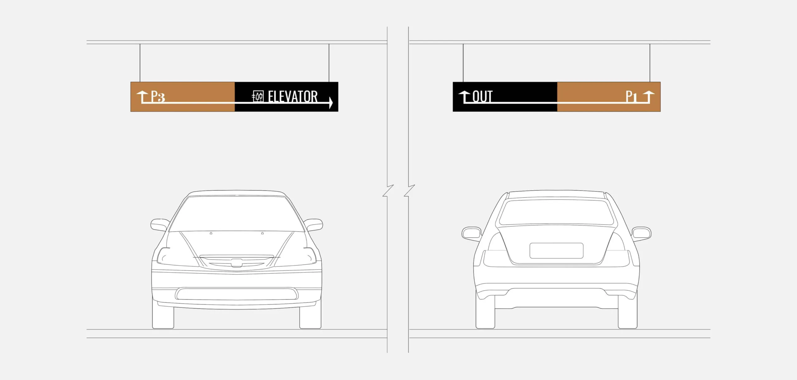
Parking garage signs for P3, Elevator, OUT, and P1 with cars.
Parking signage
Vertical gold frame with white numbers 1542 inside.
Two golden signs with numbers and arrows on a dark green background.
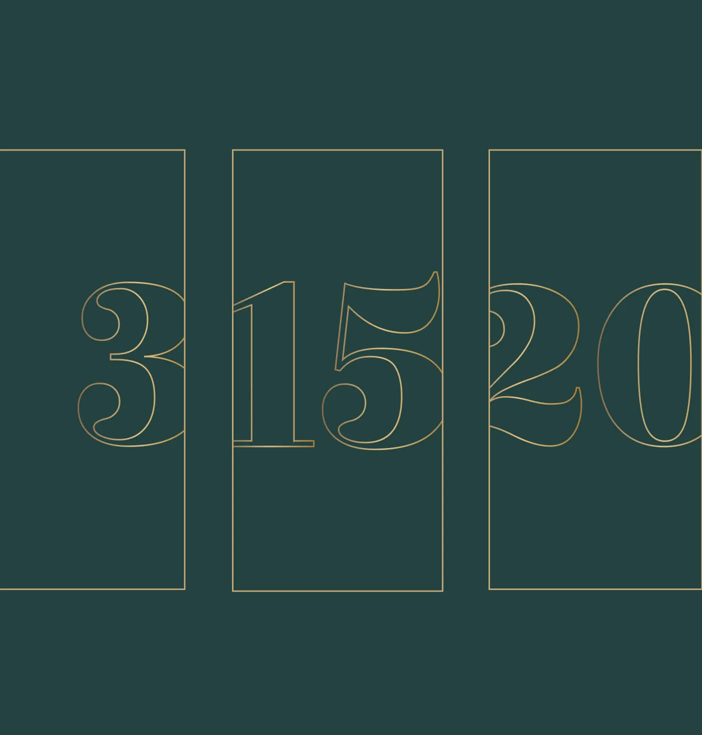
Art deco numbers 3, 15, and 20 in gold outline on a dark teal background.
Room signage, directional signage and floor ID’s
  • 290K sq. ft. of premium rental living space
  • 440 high-end rental units
  • 25 stories tall tower
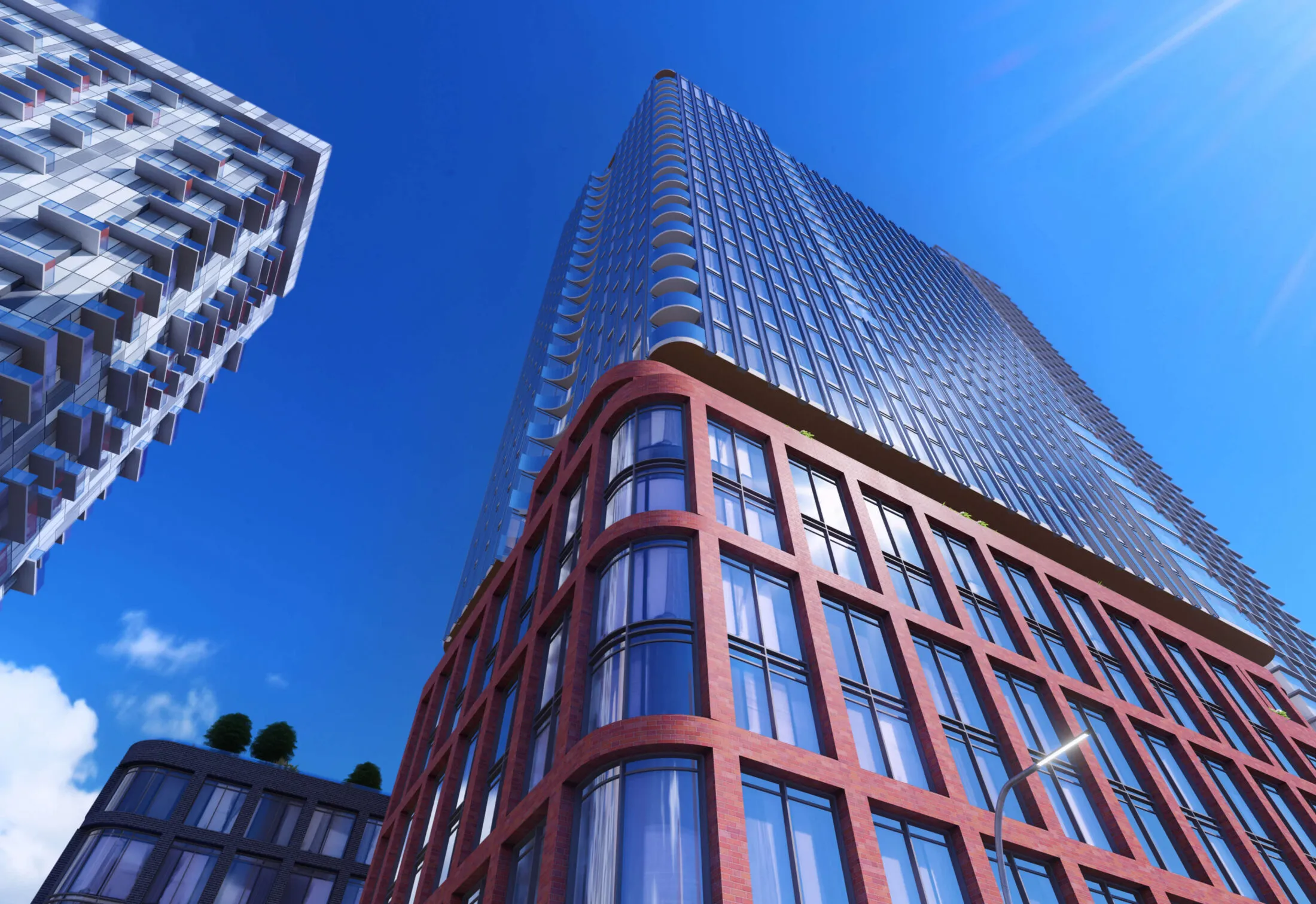
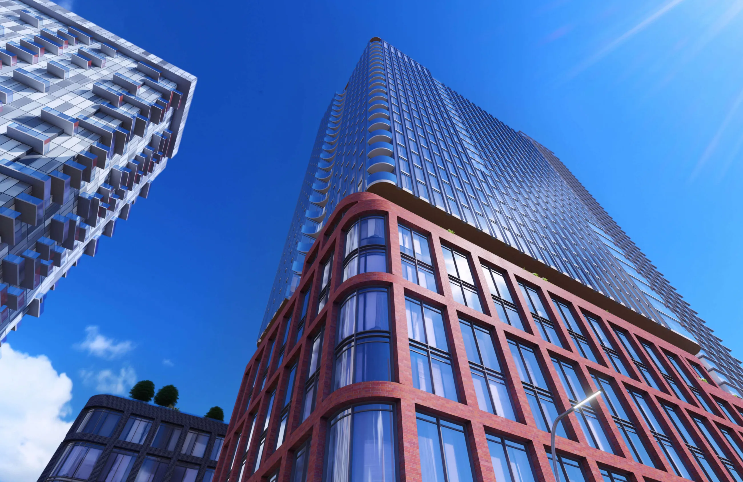
Modern glass and brick skyscrapers against a bright blue sky.

The Mews

Services Deliverables
  • Logo
  • Brand Guide
  • Stationery
  • Marketing Materials
  • Placemaking
  • Signage

Engaging the interconnectivity of people and community

The Mews is an exciting new mixed-use development located in the east end of Toronto’s downtown core, designed and developed by Fitzrovia Real Estate and Hariri Pontarini Architects. Offering more than a place to live, this development features residential, retail and outdoor spaces connected through numerous pathways. The team at Fitzrovia aimed to name, brand and position this memorable community as a trendy destination for both residents and tourists while elevating the surrounding neighbourhood of Toronto’s Queen Street East.
The Mews Queen East logo on a brick patterned background.
Logo design inspired by herringbone courtyard flooring
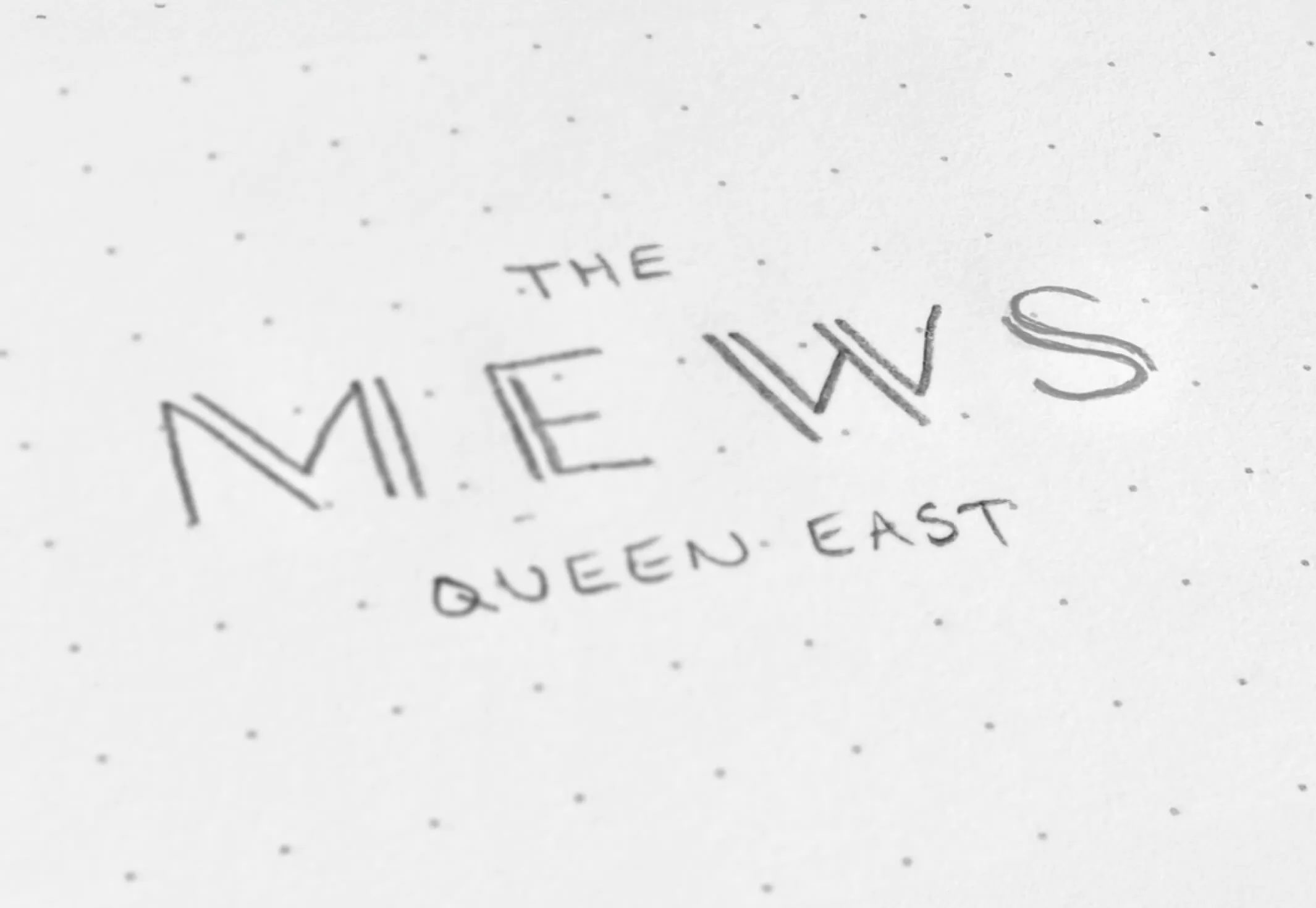
A preliminary logo sketch for The Mews
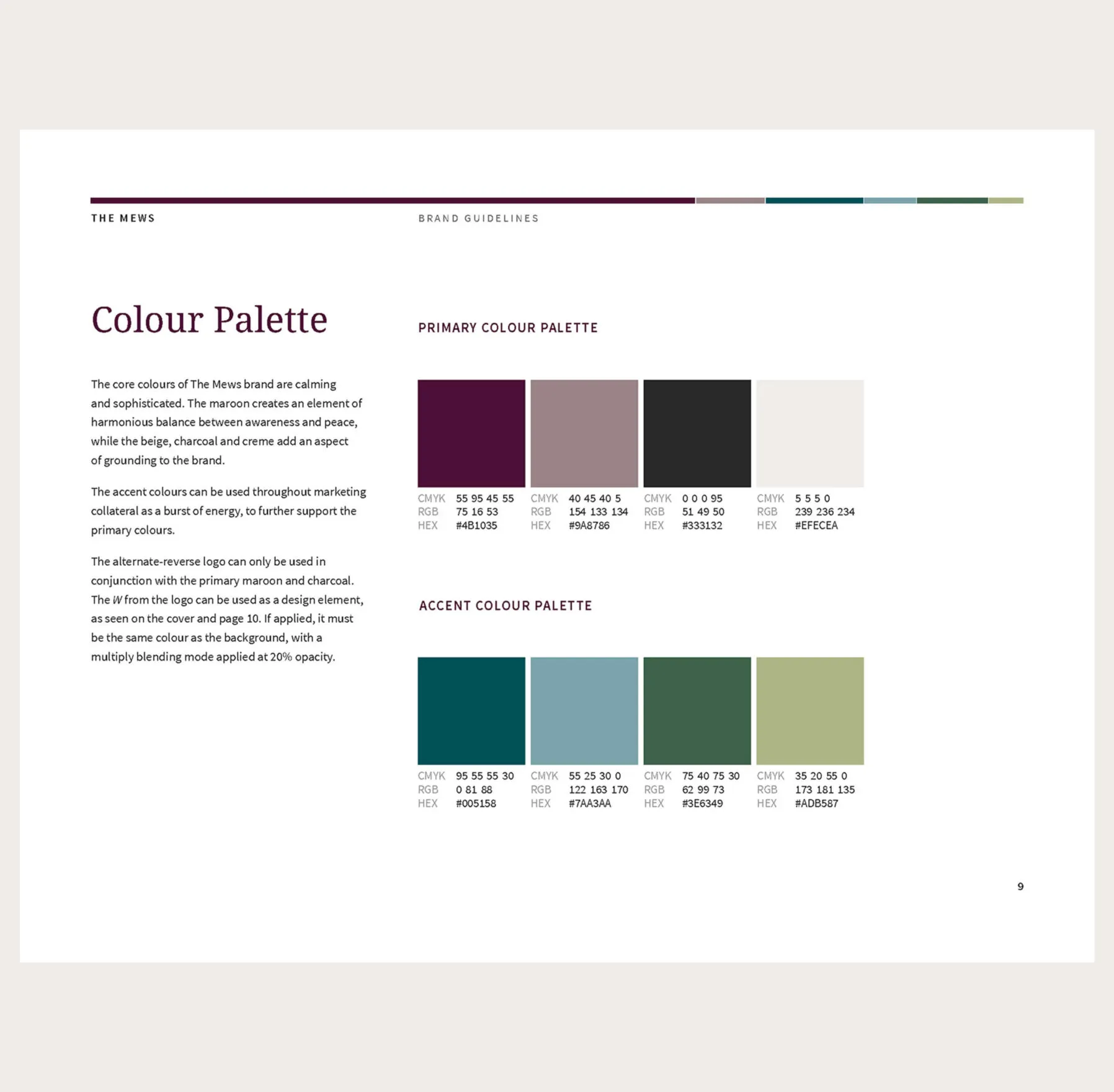
A vertical colour palette with stripes of deep plum, muted taupe, teal, slate blue, forest green and pale olive.
Preliminary sketch and organic colour palette
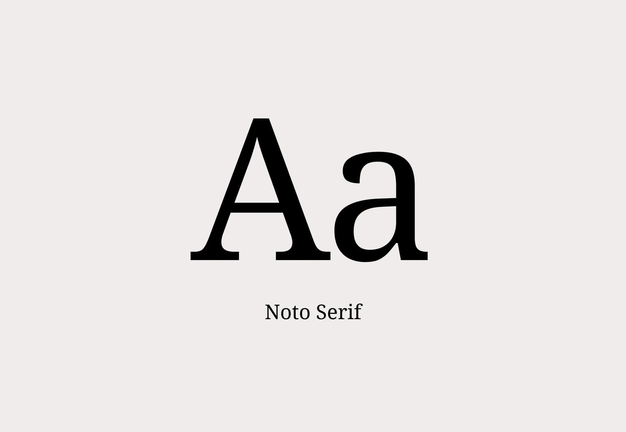
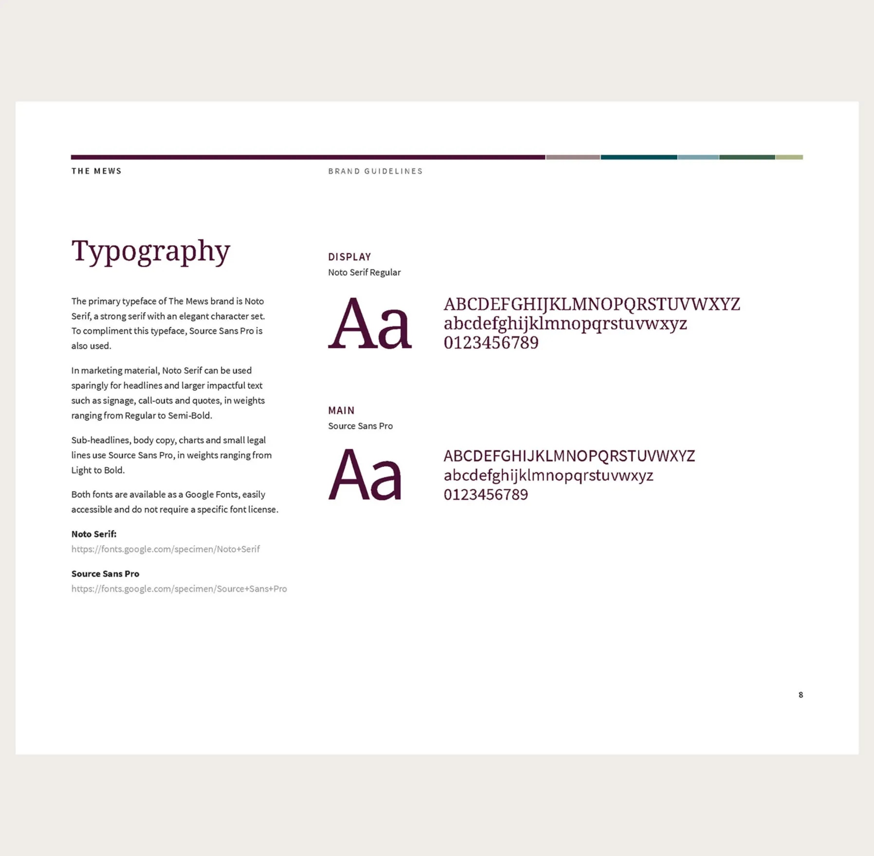
Noto Serif font sample showing uppercase and lowercase A.
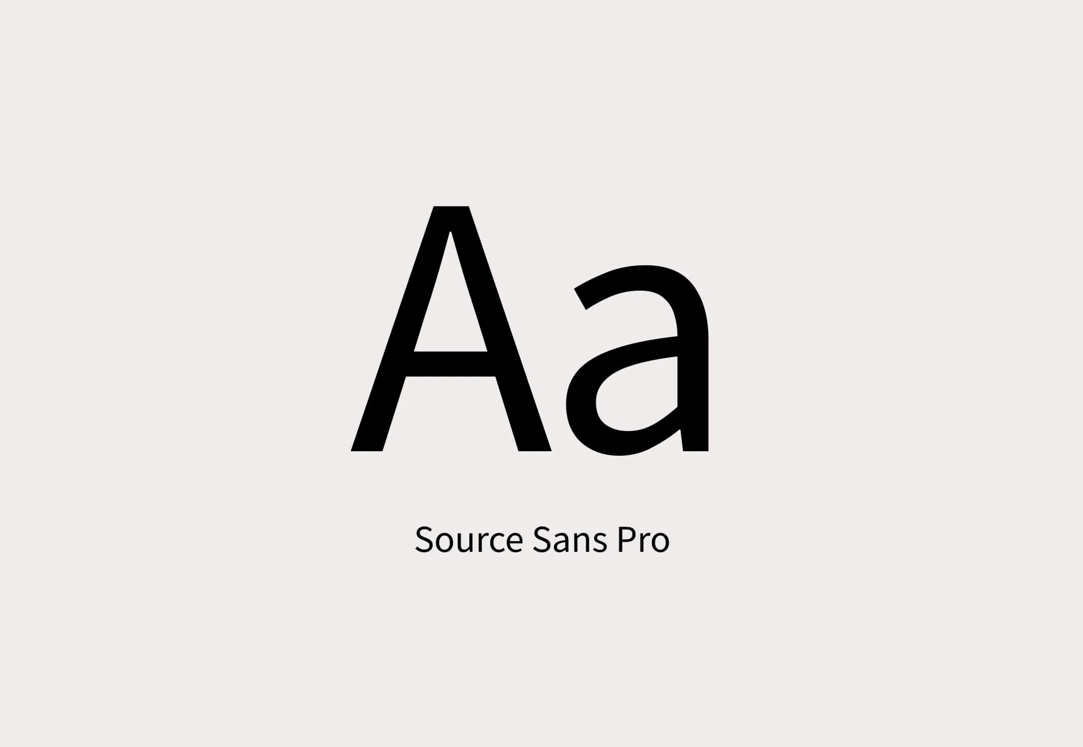
Source Sans Pro font with uppercase and lowercase A.
Typography to support custom logo font

Merging classic with contemporary

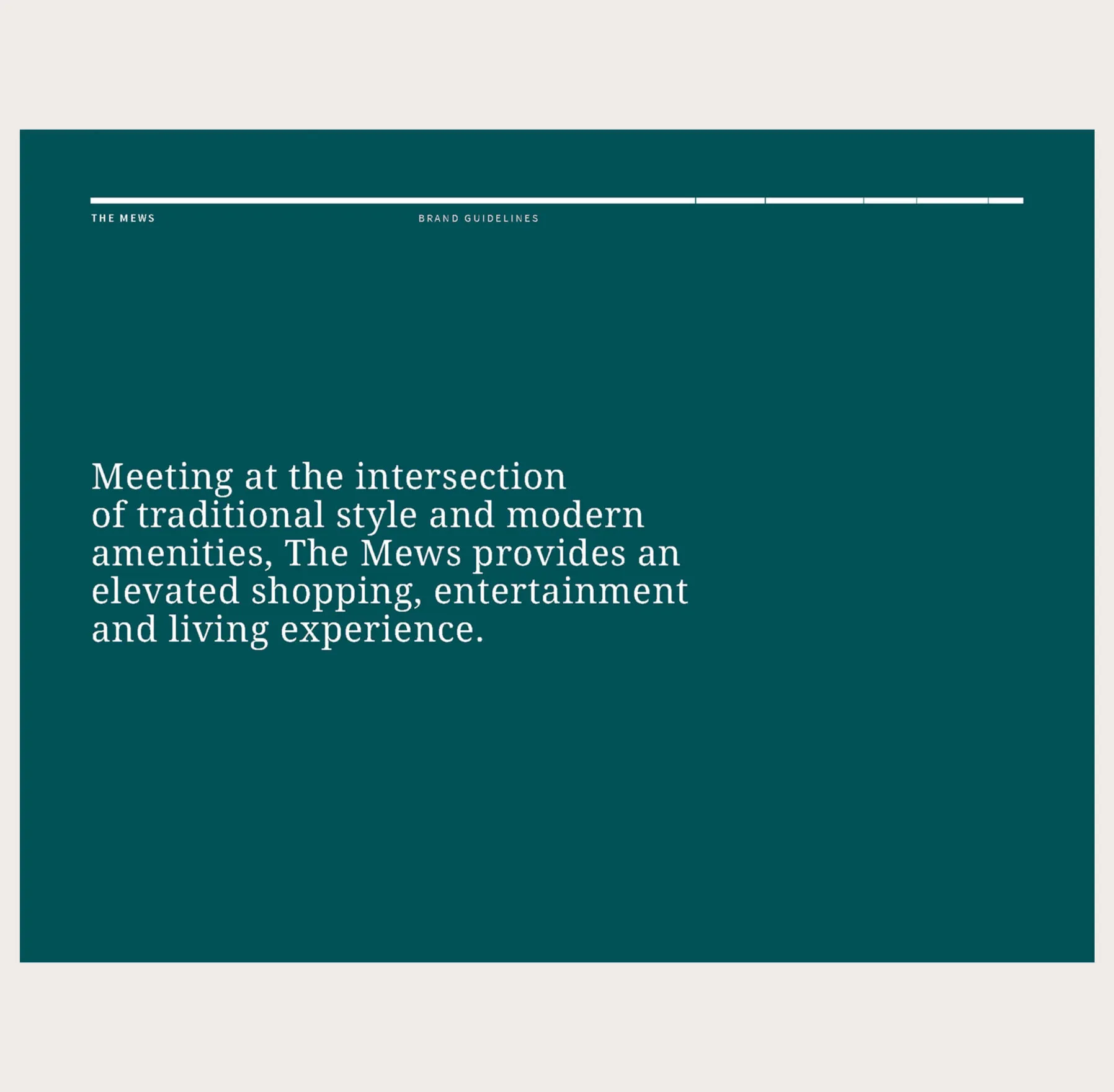
At the outset of the project, Forge worked with Fitzrovia to understand the desired feeling of the brand, ensuring this essence translated seamlessly to the name and visual interpretation of the development’s identity. The selected name, The Mews, reflects the European-style pedestrian pathways once lined with carriage houses or stables.

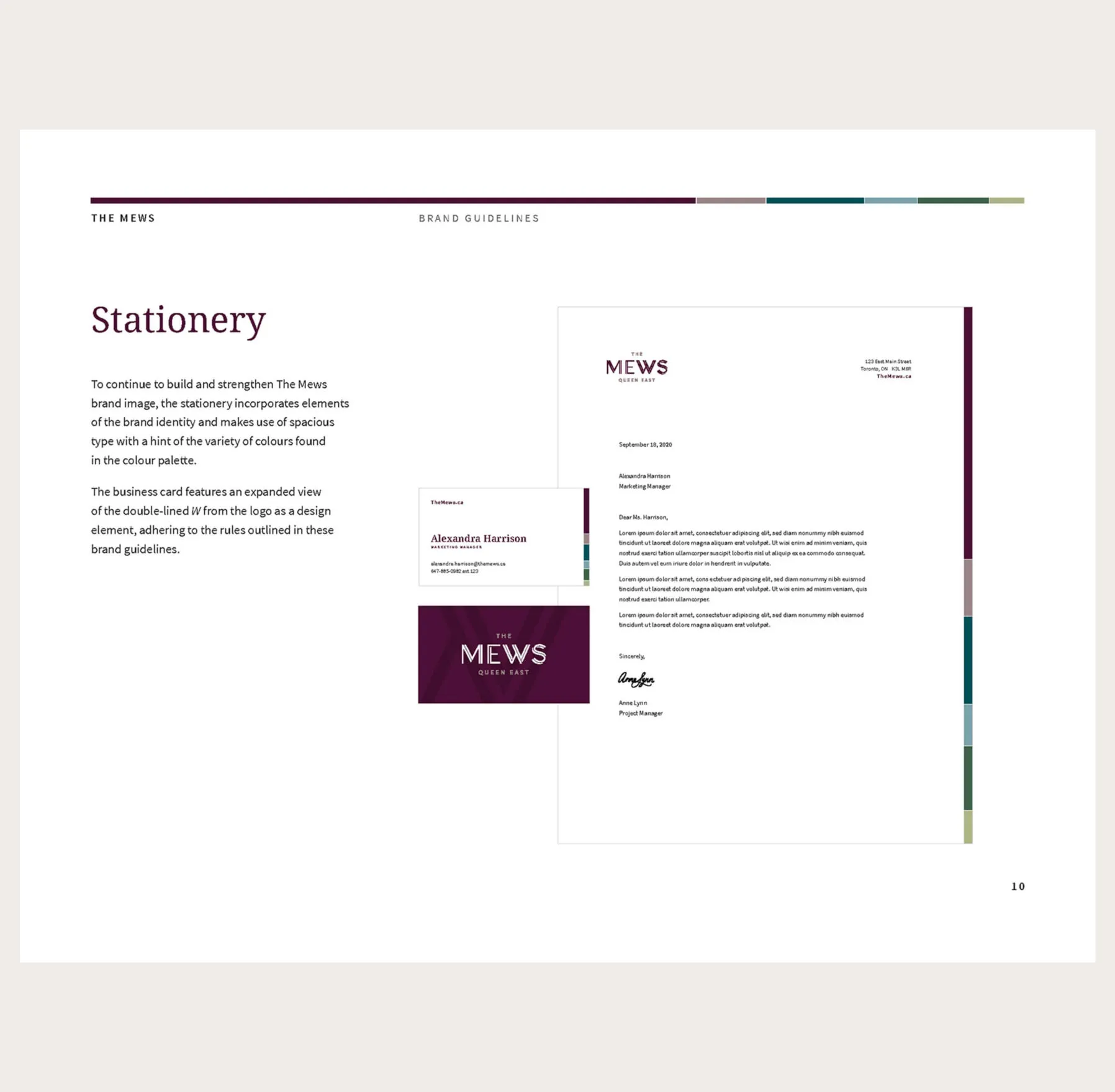
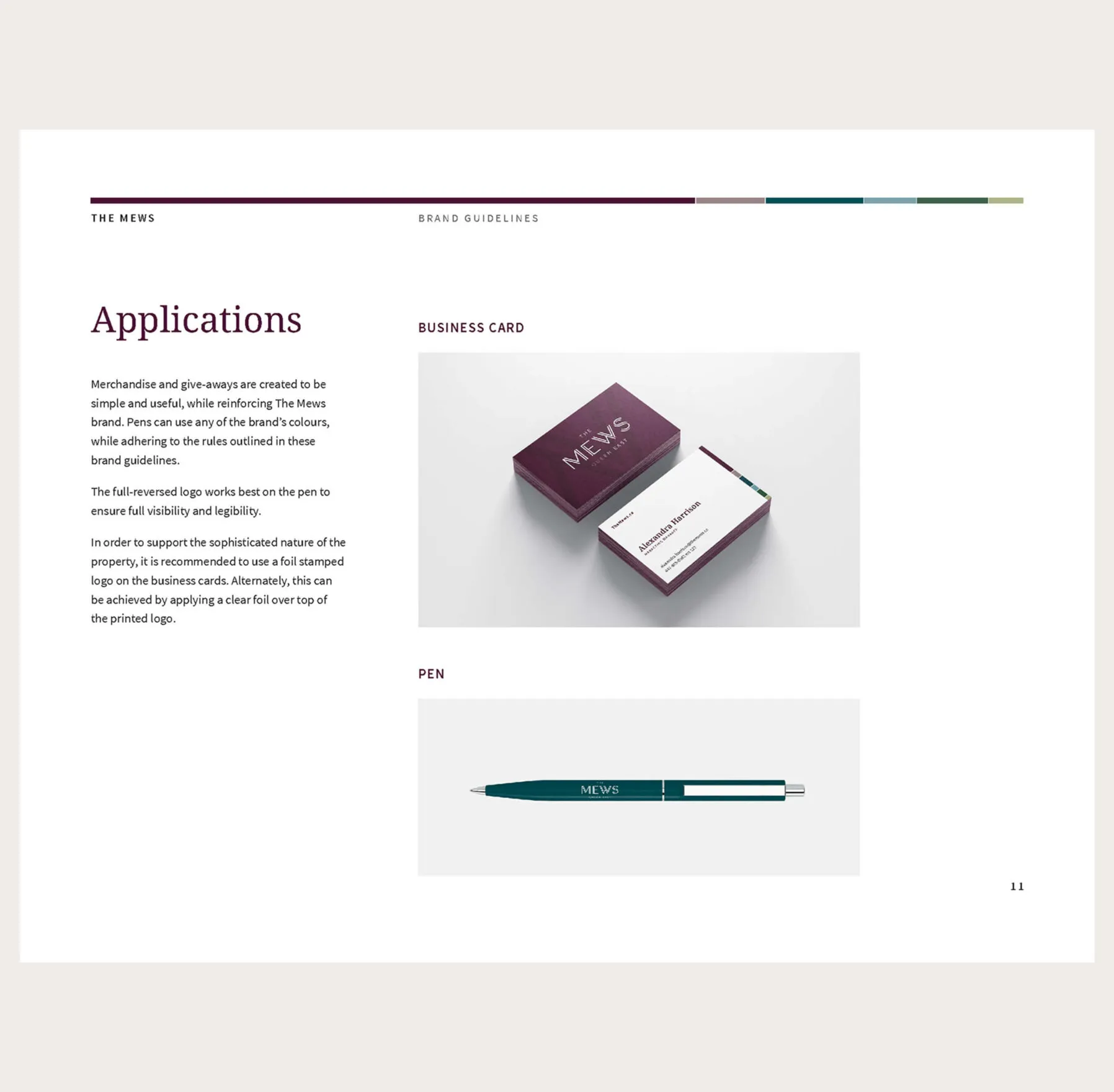
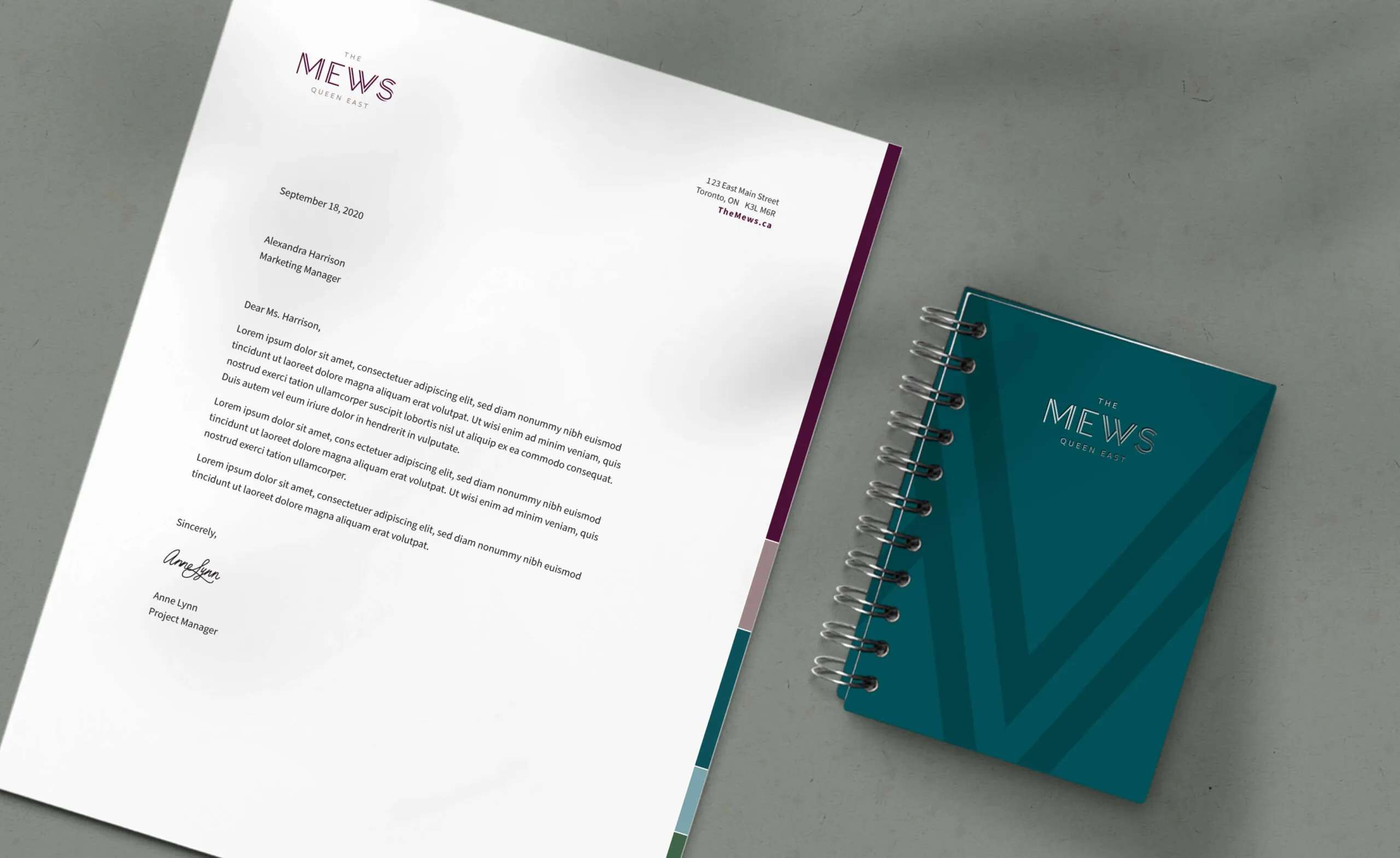
Letterhead and notebook with The Mews Queen East logo
Stationery and promotional material design
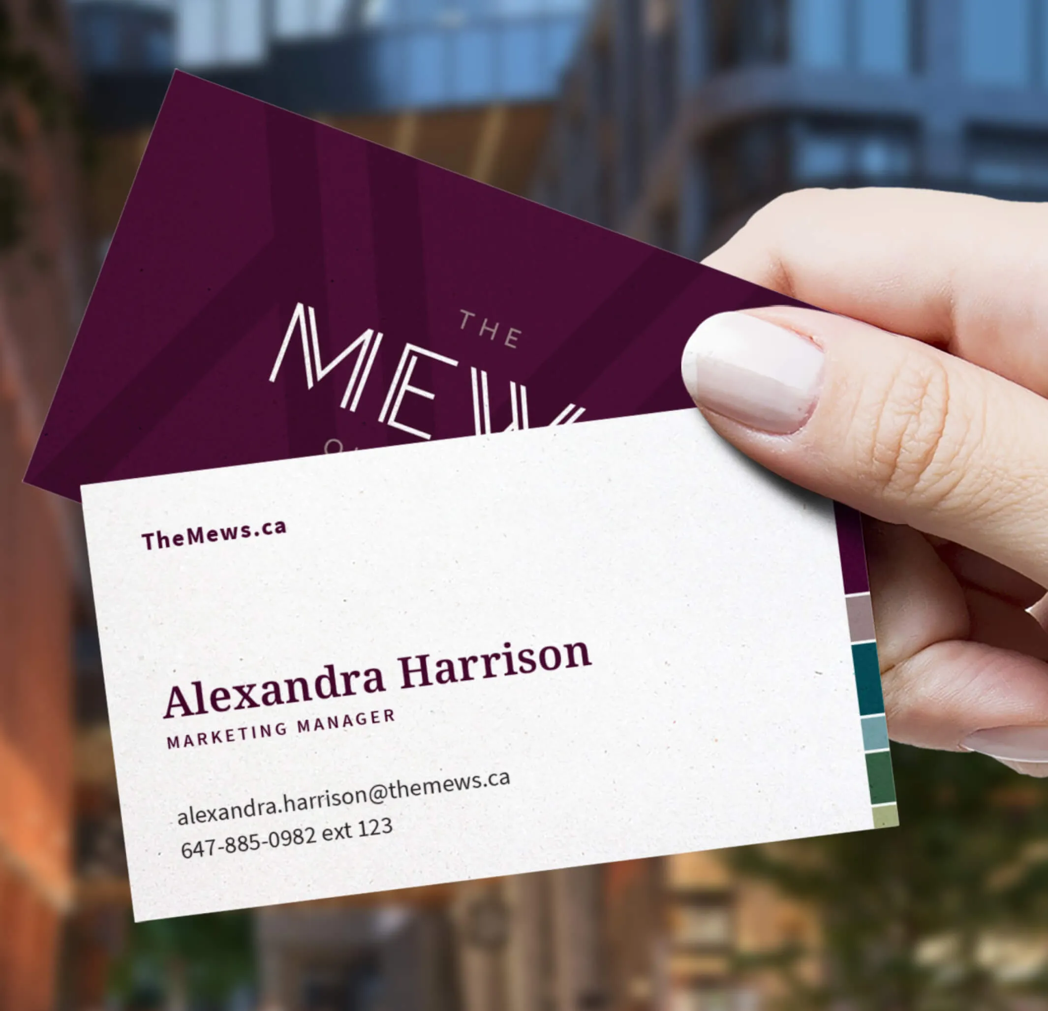
Business card for Alexandra Harrison, Marketing Manager at The Mews.
The Mews Queen East logo