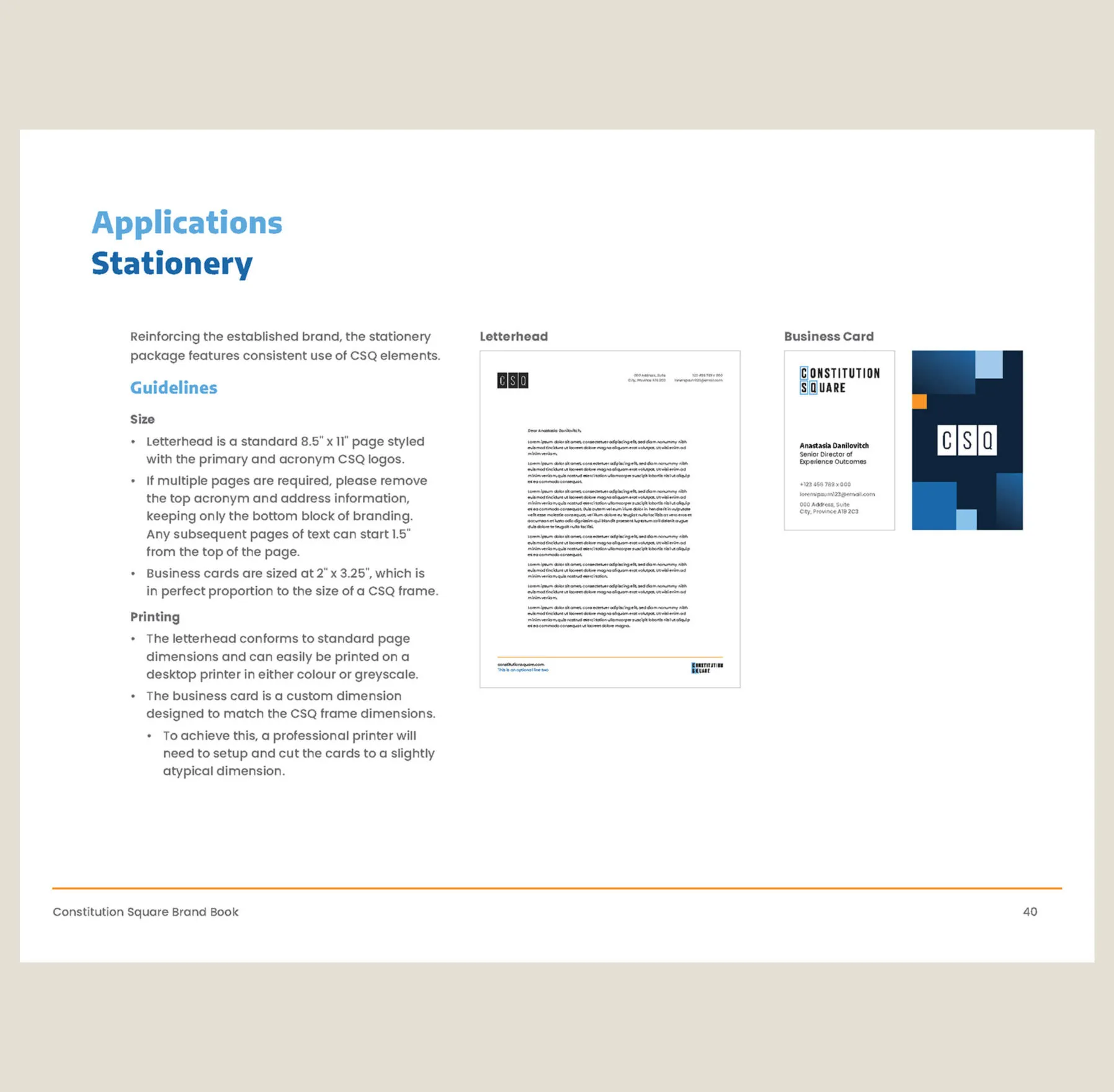
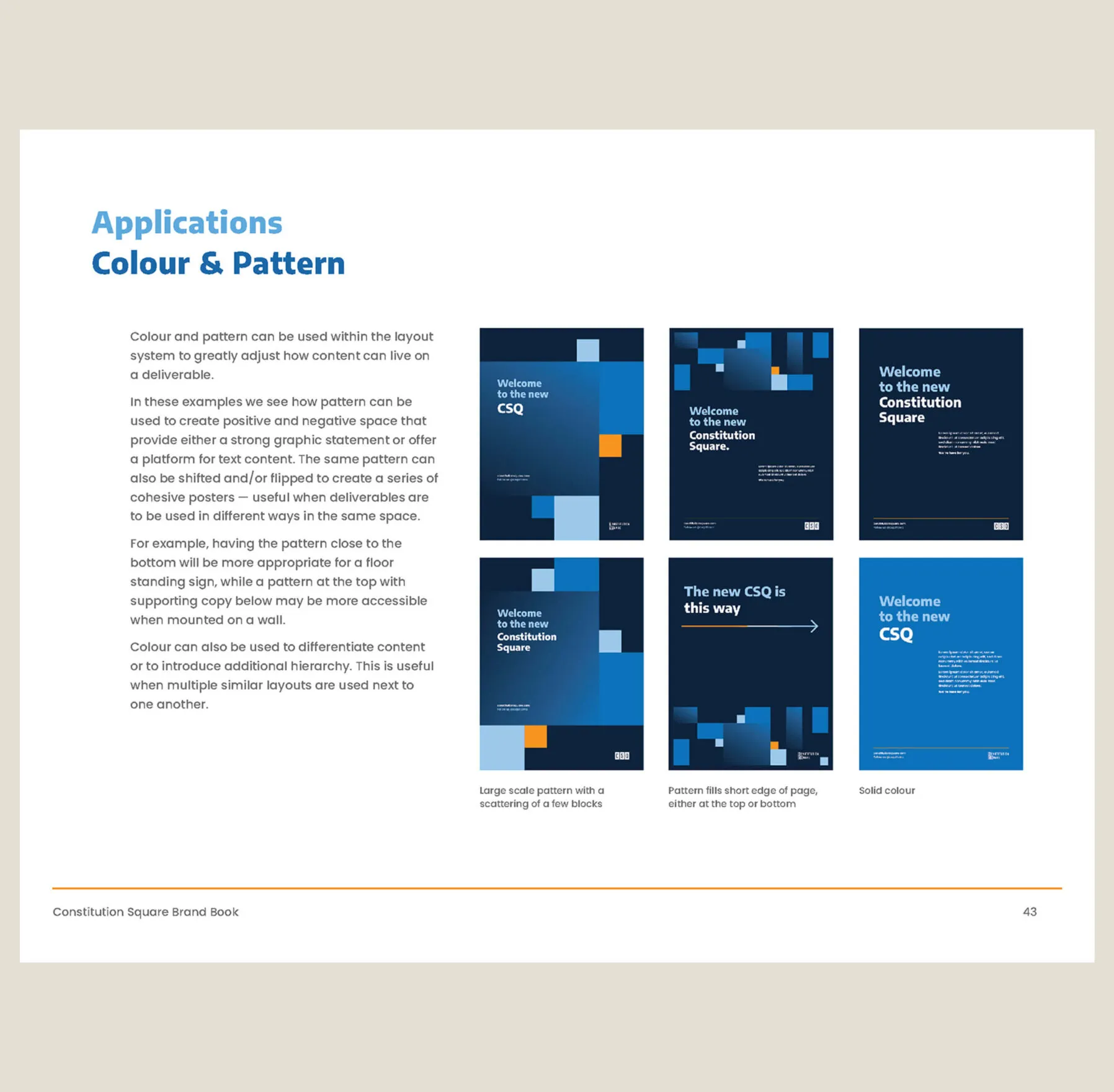
This website uses cookies.
People walk past a series of vertical artworks depicting a colourful abstract cityscape at night. People walking past abstract city paintings in a gallery.

First Gulf

Toronto, ON
Services Deliverables
  • Art Installation
  • Illustration
  • Motion Graphics

Transforming a modern lobby experience

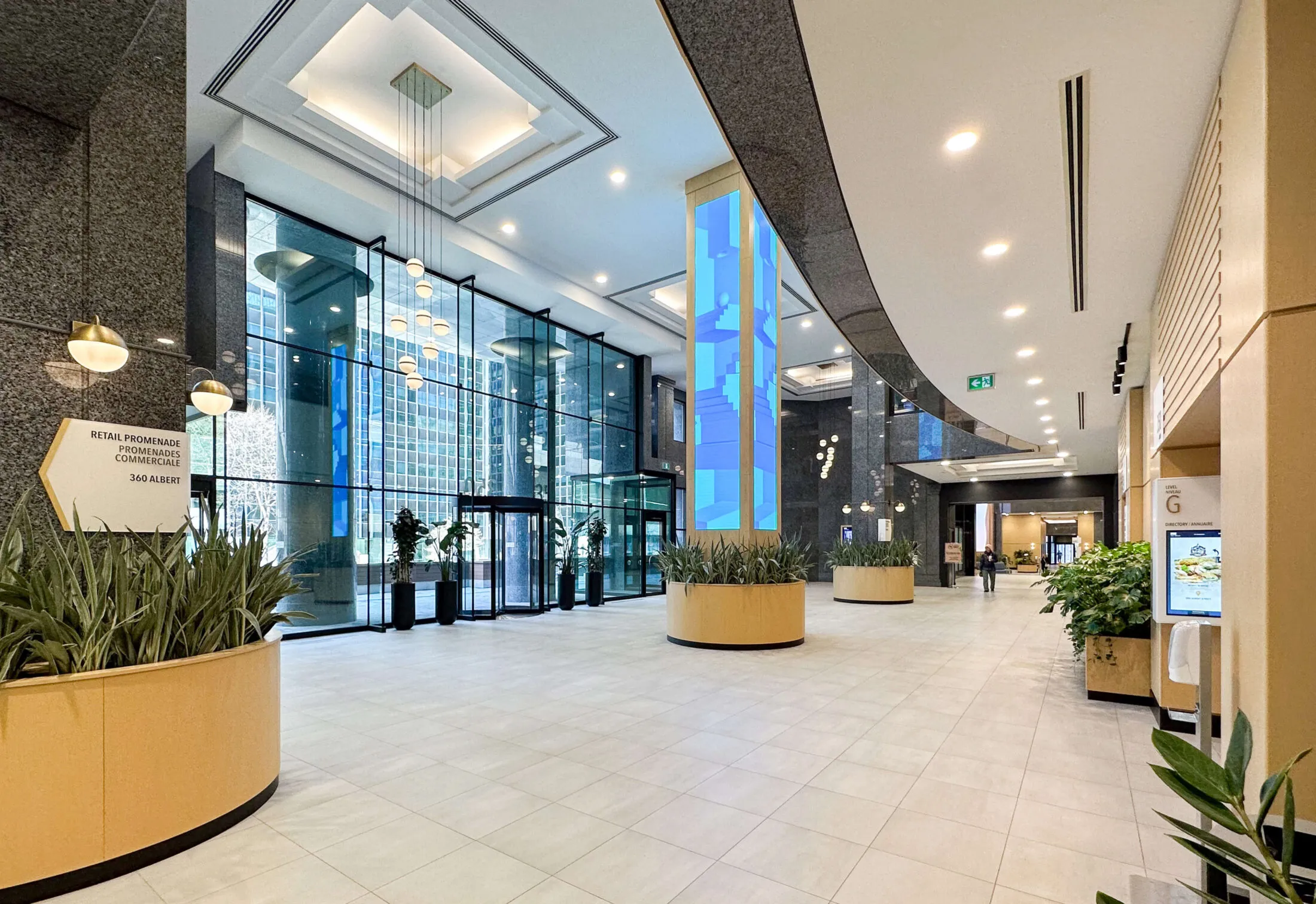
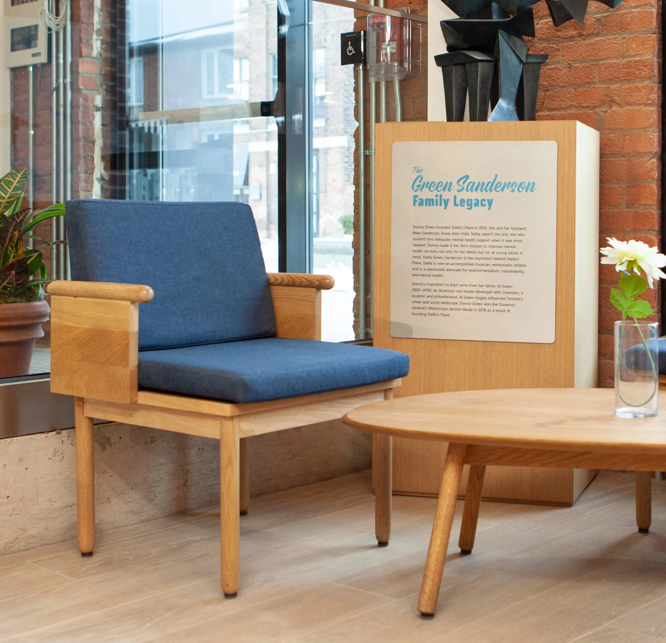
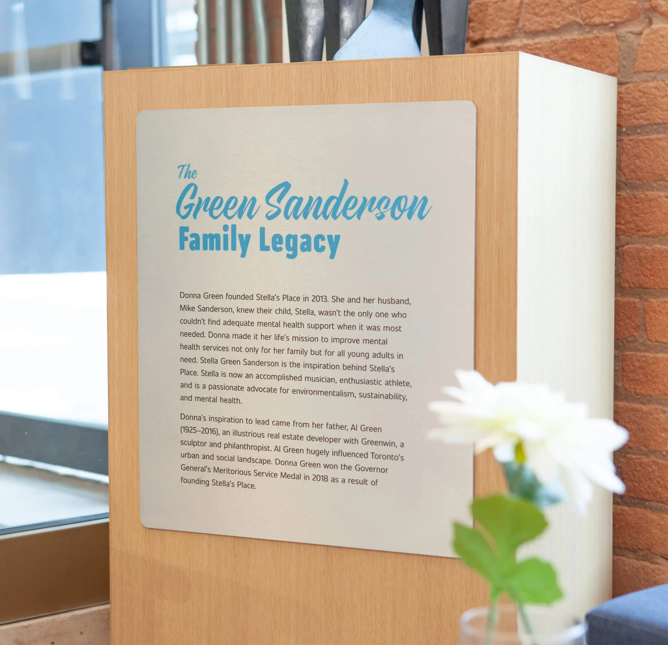
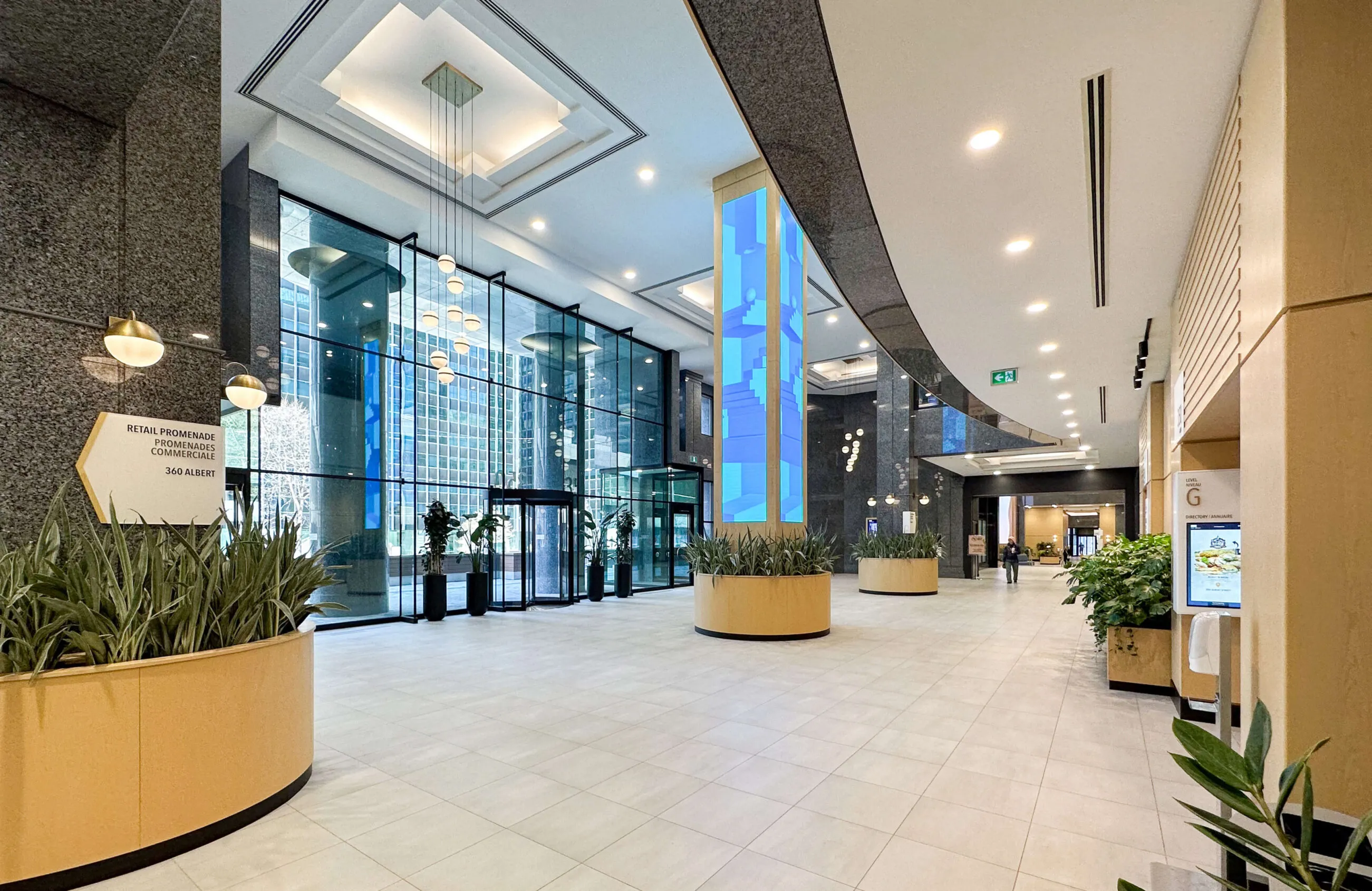
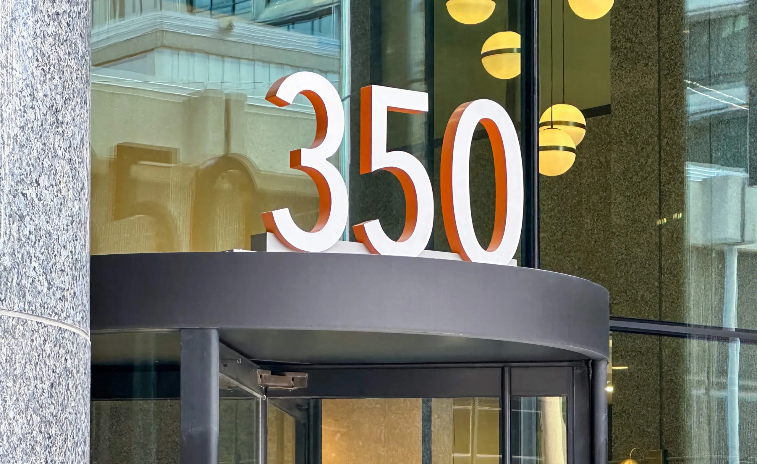
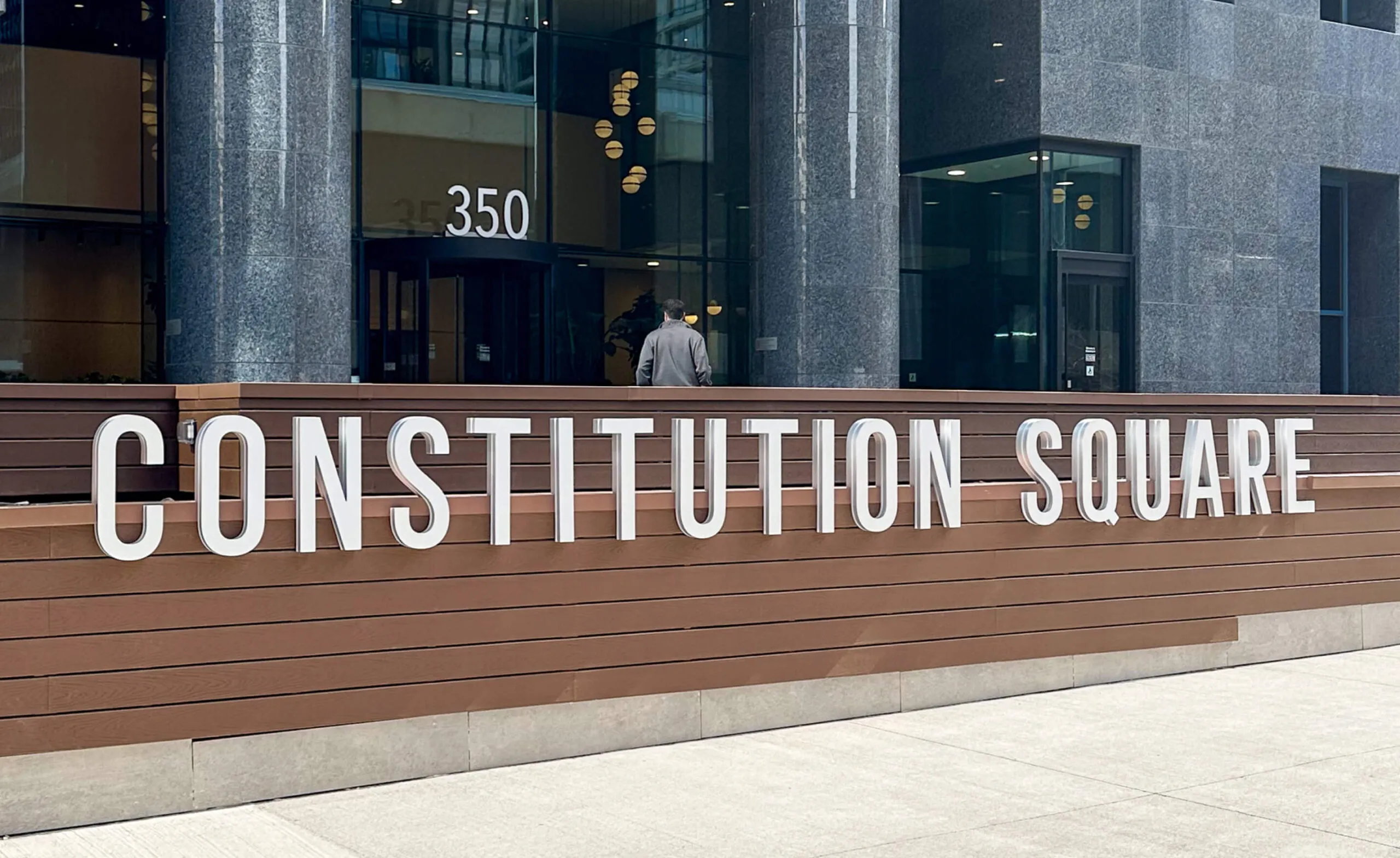
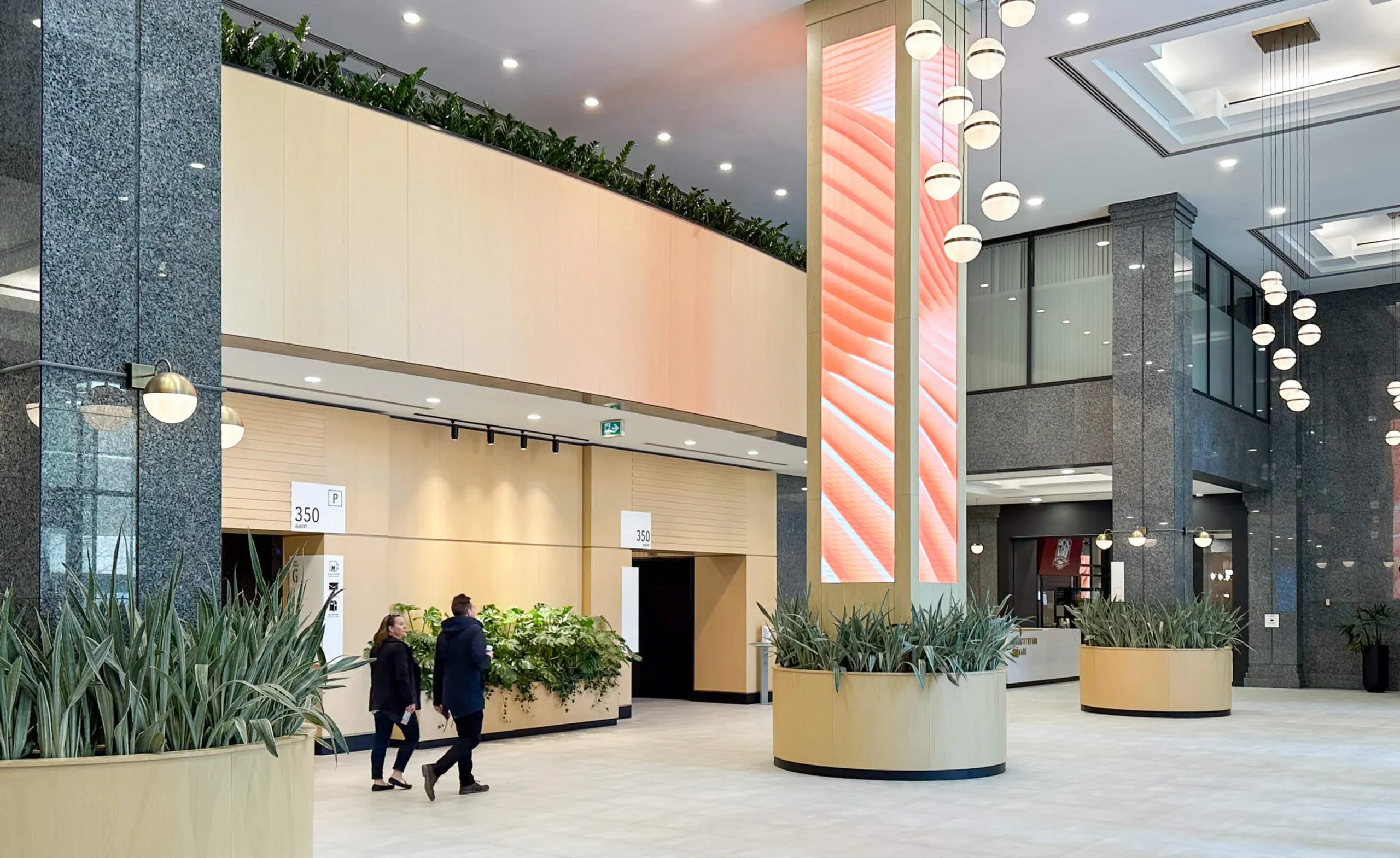
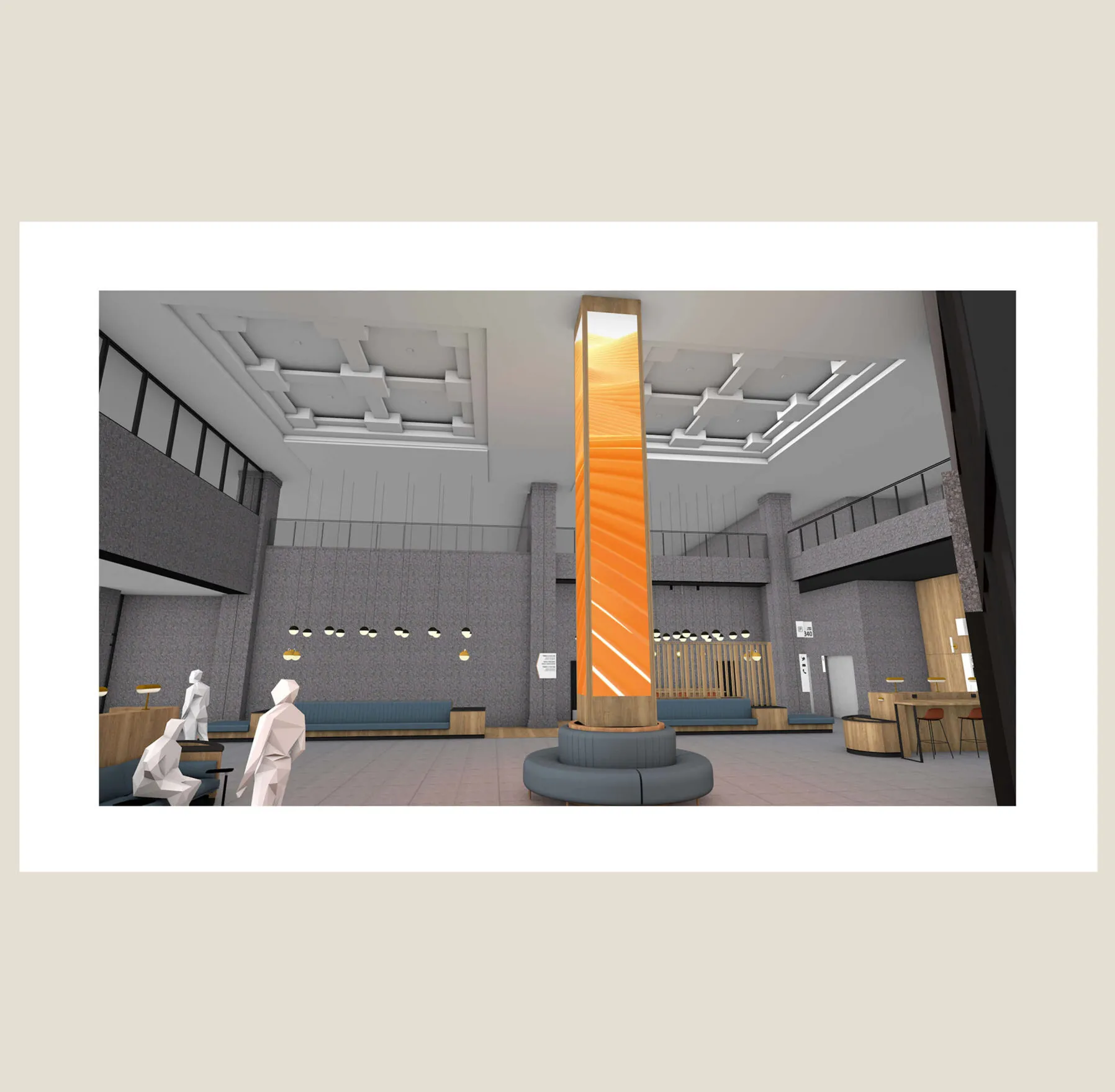
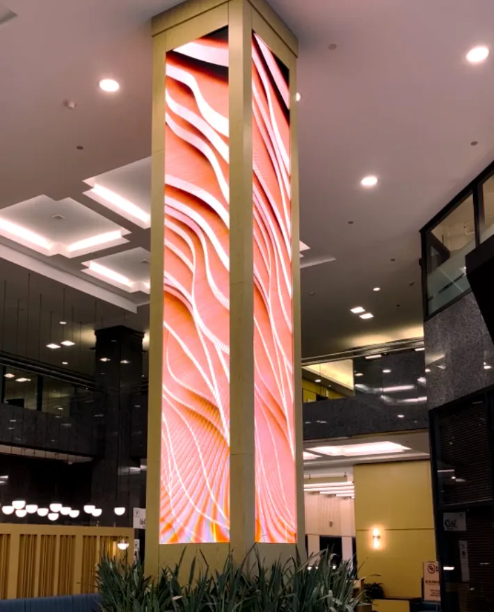
The Globe and Mail Centre is located in Toronto’s St. Lawrence neighbourhood, on one of the original ten city blocks of the Town of York. First Gulf commissioned Forge to create an art installation for their lobby that captures their brand’s essence of growth and enhances the tenant and visitor experience. Over the years, our relationship with First Gulf has evolved from our initial installation to being a dedicated content service. Using the digital screens to tell a story creates an immersive environment that feels more personal, integrated and engaging for everyone passing through.

70 linear feet of interactive digital art installation

Opening windows into new worlds

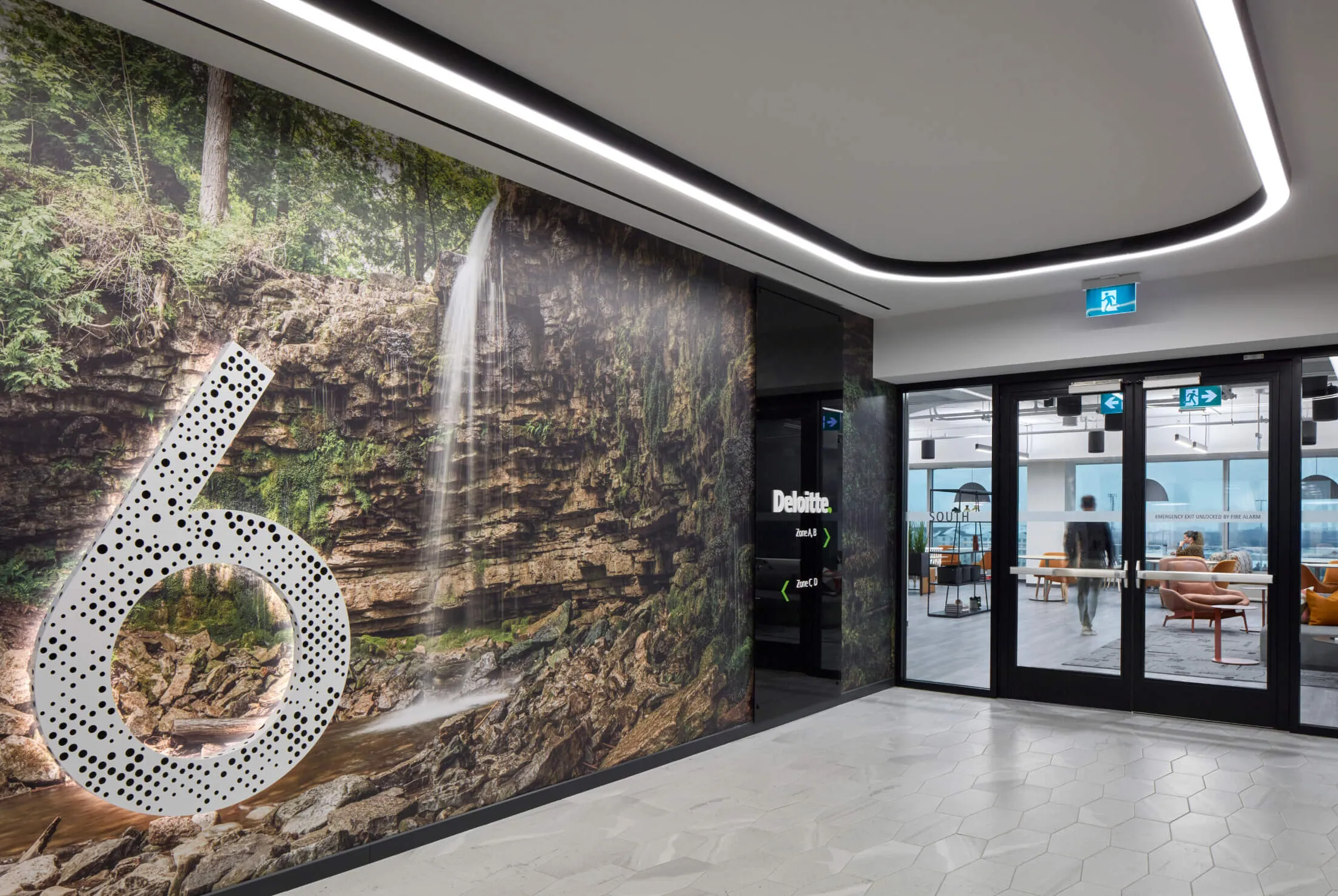
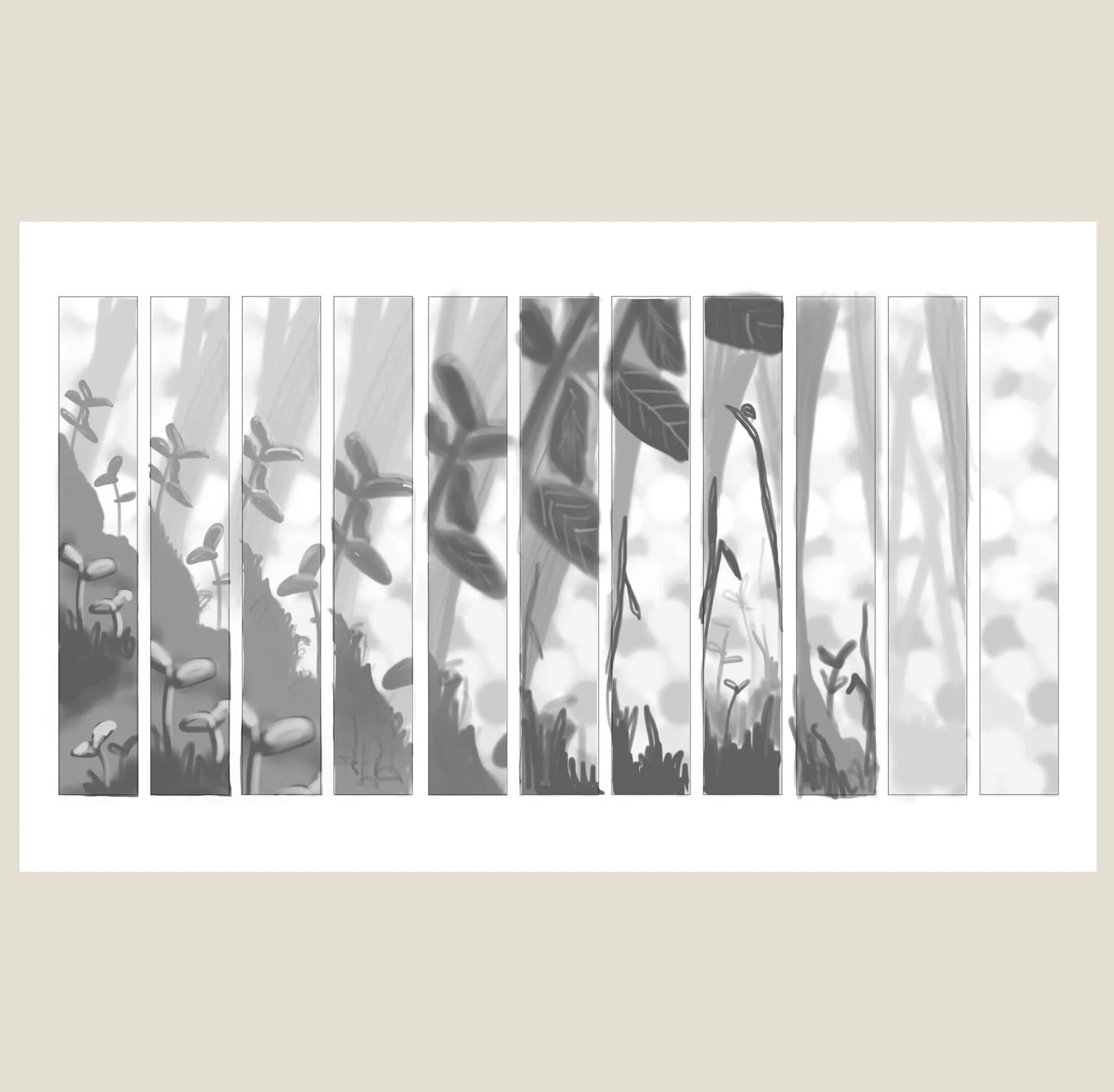
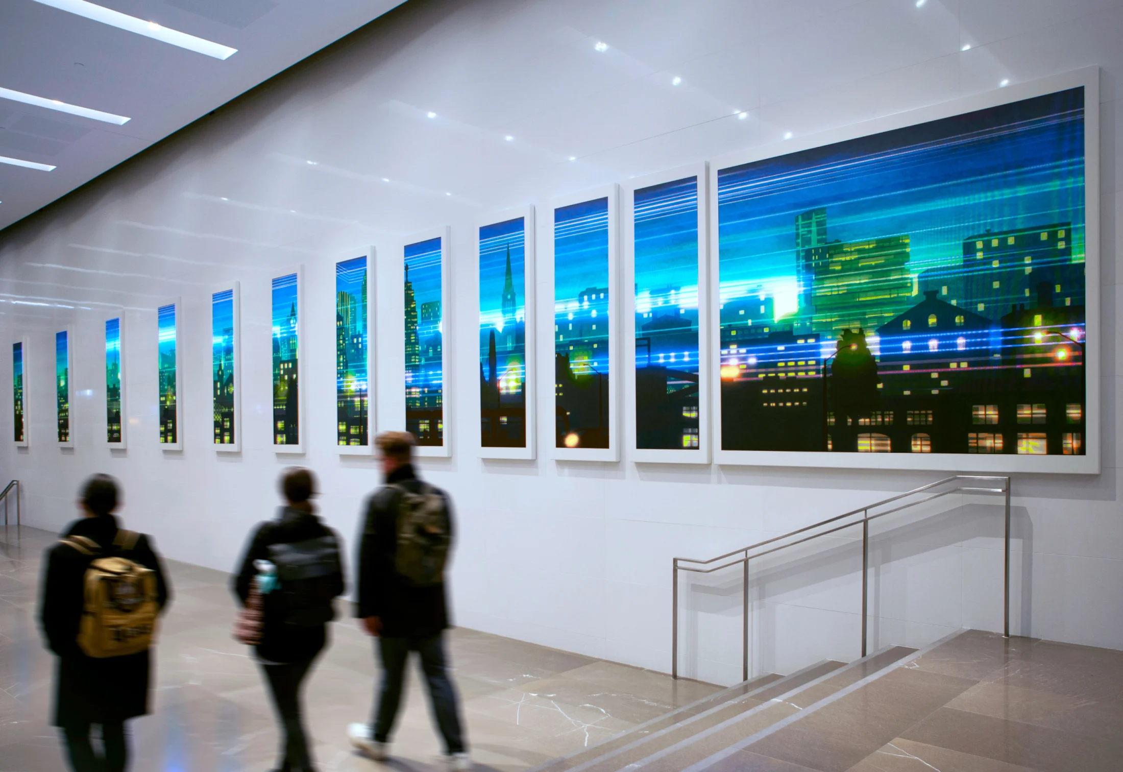
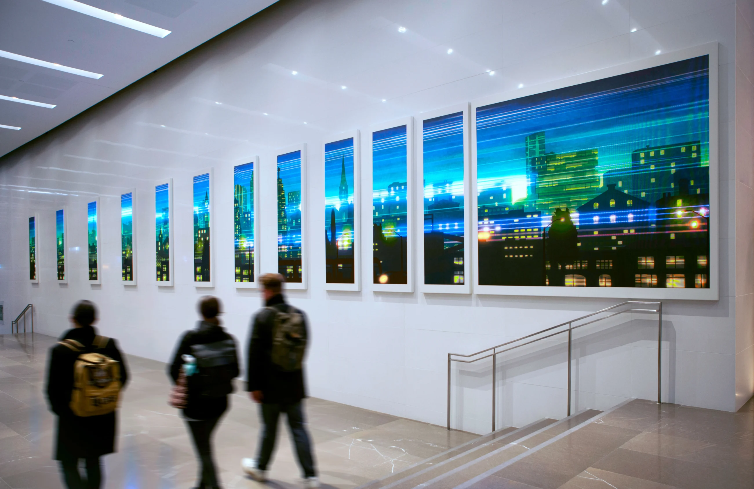
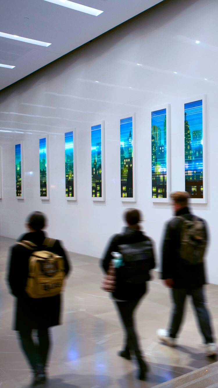
Video content is created and updated throughout the year, with animated illustrations celebrating a number of dynamic themes and continually breathing new life into the space. With each theme, a single, cohesive illustration bridges the physical gaps between 12 vertical LED displays, creating the illusion of window frames and serving as an effective example of humanizing technology and space.

A whimsical meadow scene with butterflies, flowers, and insects in soft green hues.
A couple sits by a pond under a weeping willow tree with a city skyline in the background.
Custom illustrations celebrating various seasons and holidays
Watercolour painting of an autumn forest with a deer by a misty lake.
Santa's sleigh flies over a snowy village at night, with Christmas lights and wreaths on houses.
Interactive spirit animals that follow visitors via motion sensors
Toronto skyline that changes every hour to emulate the time of day

Capturing the natural beauty of the season

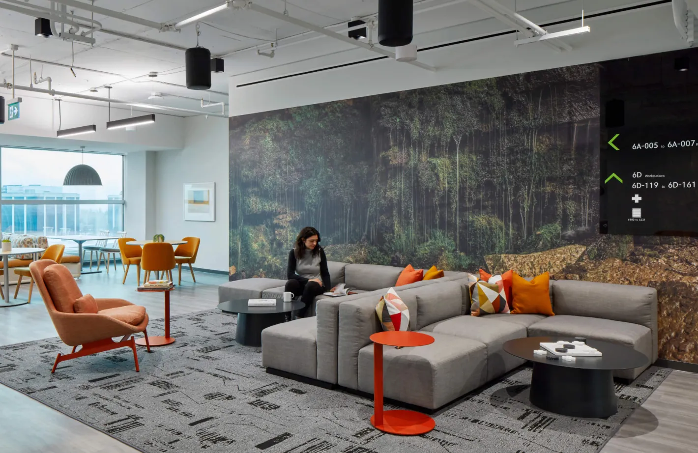
New content filled with expressive, illustrated scenery is created for each holiday season such as Easter, Halloween and Remembrance Day. Rich with depth and texture, environments come alive through gentle, organic motion, while carefully placed details throughout each scene encourage viewers to discover something new at every turn.

Dynamic video content updated with each holiday season
Out at Home text overlayed on a suburban street with a house and trees. Out at Home text with a rainbow flag overlay on a suburban street.

Out At Home

Services Deliverables
  • Video Production

An empowering training tool for home care workers

‘Out at Home’ is an educational video created for the University Health Network in association with the University of Guelph and Western University. Developed for use in training for those who work with the aging LGBTQ+ population in their homes, including nurses, personal support workers (PSWs), and other home care providers. Currently, no formal education exists surrounding the care of individuals from this marginalized and vulnerable community, which has frequently led to substandard and even detrimental treatment.

Sharing heartfelt and emotional stories

We created a brand for the project that appeared throughout the video, including a title introduction and all on-screen graphics. The established brand identity provides cohesion, clarity of information, and a final polish to the finished product that easily extends to further applications.

Courtney Bean, Director, Client Services at VHA Home HealthCare
Shoshana Pellman, Trans Activist and Senior Pride Network member.
Interviews with representatives of the community
We are diverse. with a rainbow stripe.
We just want to be treated respectfully. Rainbow stripe.

Illustrating the importance of good care

The video is an emotionally engaging introduction to this important topic, providing insight into the history and background of the LGBTQ+ community and how this has impacted them as they’ve aged. It shares heartfelt stories of how poor home care has affected them and how it needs to change. It also contextualizes practical information from other care workers in the industry on what should be improved, how to go about it, and how simple it is. Dramatizations directly illustrate what good care looks like and helps to humanize the topic into relatable scenarios. These elements come together to establish an effective training tool that is approachable, respectful and thought-provoking.

Two women sit at a table, one with a cast on her arm, talking.
Awards
  • The Association of Registered Graphic Designers of Canada (RGD) logo.

    So(cial) Good Design (Diversity, Equity and Inclusion) Winner, 2022.

Tablet displaying historical photos and questions about the Holodomor.

Canada Ukraine Foundation

Services Deliverables
  • Bus Wrap
  • Mobile App
  • Video Production
  • Lesson Development
  • Illustration
  • Motion Graphics
  • Logo
  • Website

From darkness to light: shedding light on the Holodomor

To educate students about the 1930’s Ukrainian genocide known as the ‘Holodomor’, Forge helped transform a touring bus into a mobile classroom for the Canada Ukraine Foundation. Its purpose – to raise awareness and deliver a message of hope to high school students across North America, inspiring them to become bastions of truth.

Human rights education for 
a new generation

Forge worked closely with educators to develop an engaging presentation that would articulate this powerful lesson on injustice and human rights in a hands-on fashion. As the students are taught about the horrific events of this historical mass starvation and the reasons behind it, they are given an opportunity to investigate, discover, discuss, and reflect on the topic.

Students disembark from a Holodomor mobile exhibit.
Students visiting the classroom in the bus

Reinventing the classroom experience

The students are fully immersed in the experience from the moment they step onto the bus. A 24’ screen is used to display stirring visuals, while 32 iPads simultaneously respond to the large scale screen. A Mac Pro server and three custom-built applications communicate in real-time to seamlessly run the presentation.

Large screen displaying
Large scale screen to deliver the lesson plan in a theatre style presentation
Students use tablets in a classroom with a large screen displaying presentation slides.
A student uses a tablet with a keyboard and a clipboard with handwritten notes.
Each student is given an iPad to follow the lesson plan and complete exercises
Branding to define the meaning behind the word Holodomor

Creating change for future generations

This fusion of technologies and interactive content defines an entirely new way to conduct a lesson, allowing the facilitator and the students to actively engage with each other, as they share an emotional journey. The tour continues to spread its message, leaving a lasting impression wherever it visits, which will hopefully lead to positive change for the future.

Bus with
A custom bus, configured to expand to allocate space for a full classroom theatre
Awards
  • A’Design Awards (Education and Training) Gold, 2018.

  • Apex Awards (Education and Healthcare) Gold, 2018.

Backside of interactive donor recognition panels.

Stella’s Place

Toronto, ON
Services Deliverables
  • Signage
  • Wayfinding
  • Donor Recognition
  • Video Production
  • Motion Graphics
  • Kiosk
  • Placemaking
  • Masterplan

Young people are 20% of the population, but 100% of the future

Forge had the pleasure of working with Stella’s Place – a not-for-profit organization in Toronto, ON, that helps young adults empower themselves to manage their mental health and wellness. During our inclusive co-design session, a rich diversity of stories from the stakeholders and youth participants revealed the tapestry of the community they are weaving together. This direction became a foundational theme for the project.

Inspirational interior signage.
A place for sharing art

A through-line connection throughout the space

The interconnected concept of community is in all of the project elements, including a colourful thread graphic that weaves throughout the space, intuitively delineating areas that youth participants are welcome to utilize. Every detail of the signage keeps the safety of the participants in mind and features a high level of changeability to allow for future donor recognition of spaces.

Room signage and donor recognition, with a person walking by.
Integrated room sign and donor recognition
Close-up of messaging on an interior wall.
Close-up of donor recognition and room signage.
A connecting thread

Designing an accessible experience

Also integrated into The thread is a tactile surface that distinguishes it from the wall. Braille directional pannels are strategically located at key decision points to help those with vision disability to orient themselves.

A person's hand touching a braille sign.
Close-up of raised signage letters.
Close-up of braille signage.
Close-up of raised signage letters.
Calming design cues

Thoughtfully showcasing personal stories through design

Forge worked closely with Stella’s Place to ensure everyone’s story was carefully told. Choosing where and how those moments were displayed was a collaborative effort between client, interior designers and Forge’s environments team.

A chair and donor legacy sign.
Close-up of interior donor legacy sign.
Founder recognition plaque

Creating a place of their own

The digital donor wall was placed at the heart of the new building, highlighting the importance of the people that provide funding, service, and participation. At the push of a button, video testimonials of donors, participants, peers and staff capture the essence of ‘Why Stella’s Place matters’ and illustrates the strong sense of belonging shared by all who walk through its doors.

Backside of interactive donor recognition panels.
A person interacting with the donor touch screen.
A close-up of a sign describing the community at Stella's Place.
A rendering of the donor wall concept.
  • 12K sq. ft. community space
  • 300+ 1-on-1 counselling sessions in 2022
  • 80% group session retention rate in 2022
Featured
"Forge Media + Design were a pleasure to work with. This project exceeded my expectations of what is possible with donor recognition and placemaking and I’m so proud of the result. I am especially grateful for the process they used to co-design this project with our program participants, staff and Board members. They really listened to our input and our voice is apparent throughout the space. Forge was responsive, engaged and professional for the whole of the process."
Catherine Dyer, Director of Development
Modern office building lobby with large glass windows, plants, and a digital directory.

Constitution Square

Services Deliverables
  • Logo
  • Brand Guide
  • Illustration
  • Hoarding
  • Brochure
  • Motion Graphics
  • Social Media
  • Kiosk
  • Signage
  • Wayfinding
  • Art Installation
  • Marketing Materials
  • Placemaking
  • Masterplan
  • Video Production
  • Stationery
  • Website

Reimagining a workplace experience for a new era

Constitution Square is an upscale office complex in the west end of downtown Ottawa, Ontario. It is an amenity-rich space that promotes connectivity and fosters community while conveying a sense of pride in supporting the ever-changing workplace experience. The Canderel team looked to Forge to bring this vision of a holistic workplace to life through brand, physical and digital signage, interactive displays, and digital public art.

A playful logo for a serious office building
A preliminary sketch for the CSQ logo
Colour palette with dark blue, medium blue, light blue, sky blue, orange and beige stripes.
Logo inspired by the three towers of the building and a simple colour palette to support the brand
The Encode Sans font family, shown with large
The Poppins font displayed with the letters Aa and the word Poppins.
Ownable typography to define all communications

Communicating an evolution to a modern audience

The newly established brand adds a sense of liveliness and forward-thinking reflected in the building’s vision—adopting a more casual tone of voice and a visual identity that is modern, friendly and relatable.

Minimalist illustration of a bicycle with orange frame and blue wheels on a dark blue background.
Abstract illustration of two overlapping chairs in orange and blue outlines on a dark blue background.
Custom illustrations to communicate all things about the brand
A banner with
Bold hoarding to build suspense during construction
Tablet displaying a modern lobby renovation with text
Digital brochure for sales team
CSQ Ottawa social media story ads promoting the new Constitution Square
Two split images advertising Constitution Square, one with a woman at a table and the other with a man holding a jacket.
Social media and poster campaign to promote the changes

Establishing a strong sense of community and space

Our team developed design solutions that ensured an intuitive understanding of the connectivity of the three towers throughout the newly renovated concourse. The foremost opportunity was to create a strong sense of place and clear awareness of which of the three towers you were in, regardless of which entrance was used.

Digital directory sign for Level G at 350 Albert, showing a floor plan and business listings.
Modern building directory and elevators with wood paneling and contemporary lighting.
Interactive building directory integrated into signage program
Building entrance sign with large white numbers
Bold signage to identify each of the three towers
Constitution Square building sign with 350 address and revolving door entrance.
Reception desk with
Sign for Retail Promenades Commerciales at 340 Albert, with plants in foreground.
Consistent signage application throughout the entire building complex

Art as a reflection of brand values

At the heart of each building’s lobby is a 4-sided LED column featuring a series of custom-crafted artwork that ties directly into the brand’s themes of Gather, Grow, Connect, Evolve. The three pillars create a symmetry between the buildings as you walk the concourse, and their impressive presence infuses the space with a sense of palpable energy and vivid life. They further underpin Canderel’s desire to make these public common areas a pleasant place to work and dwell.

Modern office lobby with plants, digital display, and globe lights.
Enhancing the lobby experience through a digital art installation on three centre columns
A tall pillar with a digital display showing abstract orange and white wavy patterns.
Digital art installation in action
  • 1986 year of completion of first tower
  • 1M+ sq. ft. office complex
  • 21 floors of highest tower
  • 3 towers that make up CSQ