This website uses cookies.
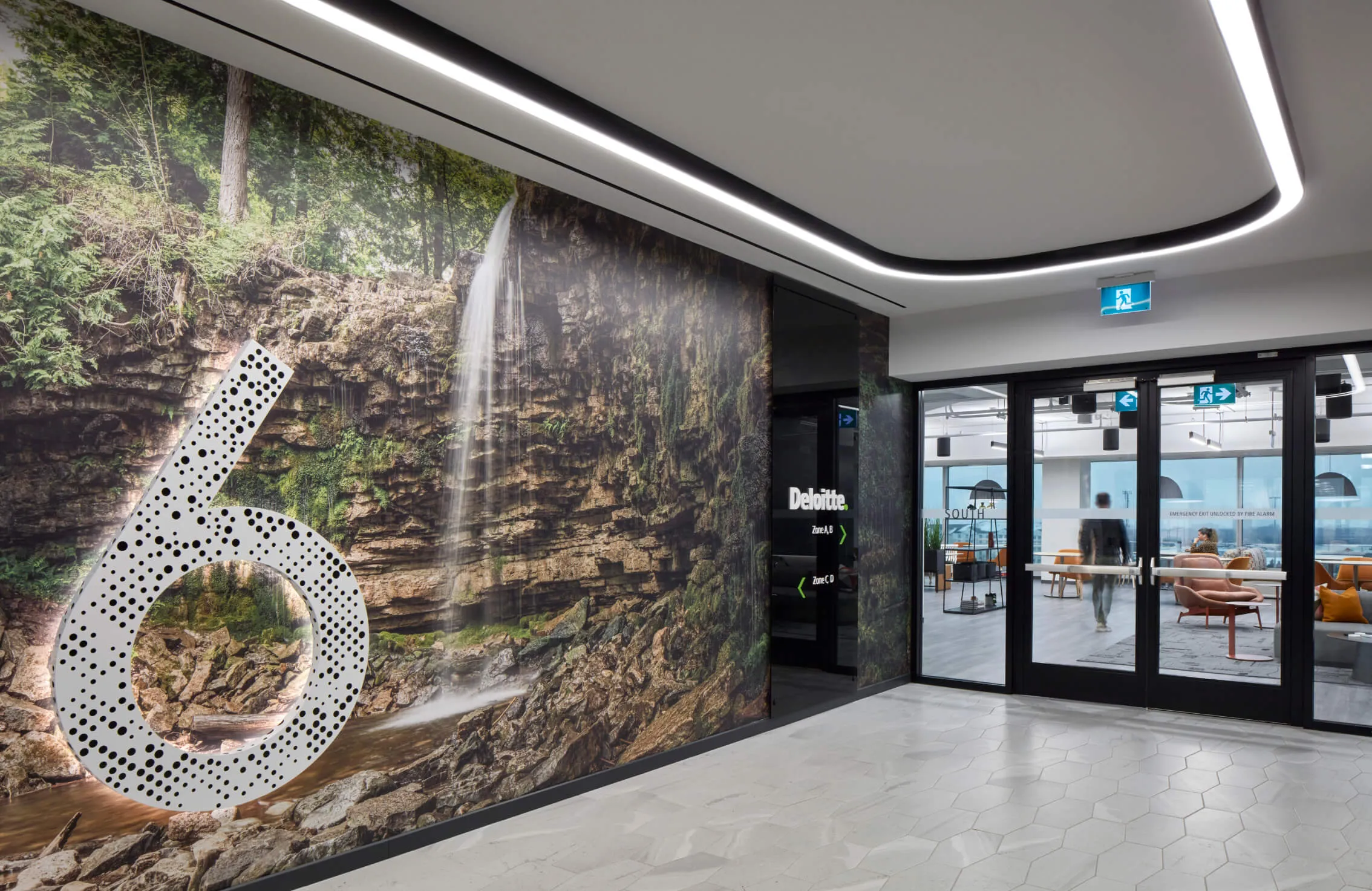
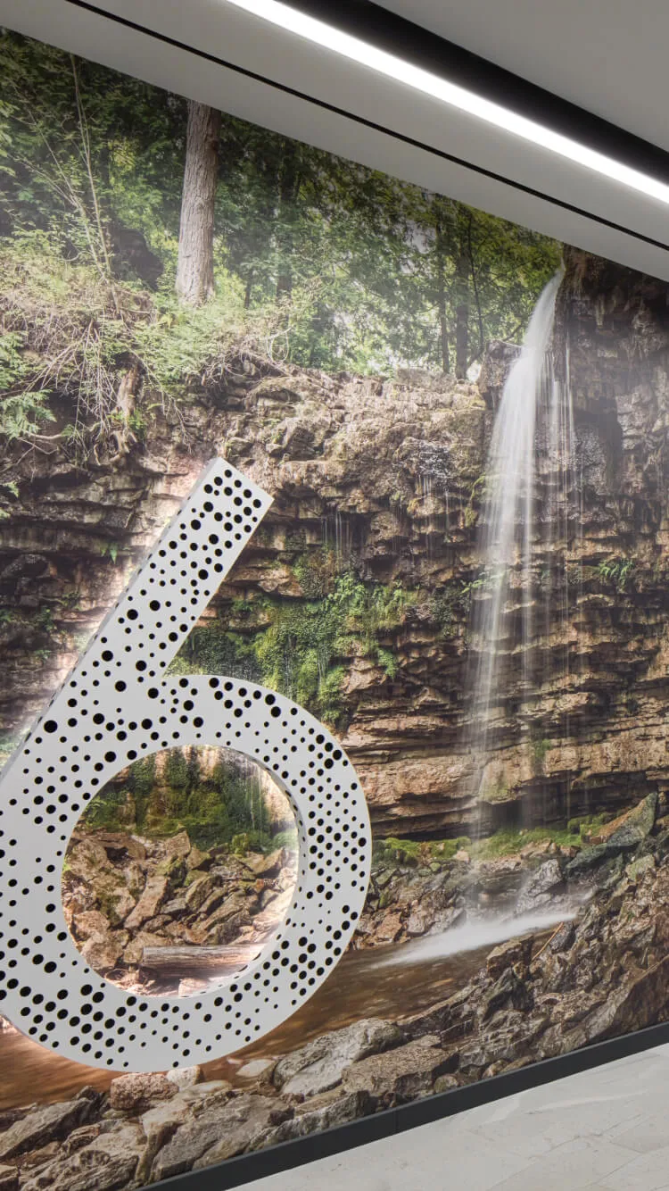
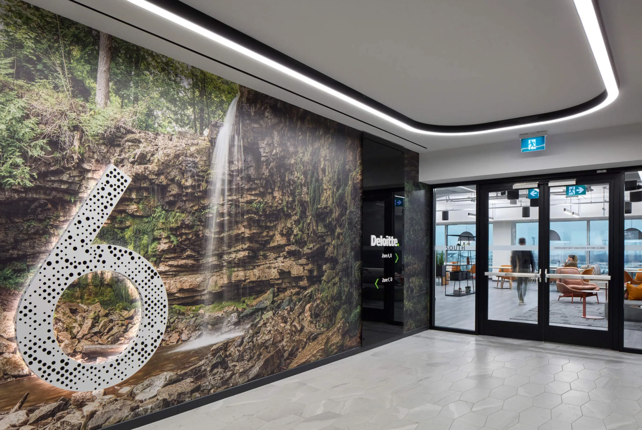
Modern office hallway with a large waterfall mural and the Deloitte logo. A large white number 6 with black dots in front of a waterfall and rocky landscape mural.

Deloitte Burlington

Burlington, ON
Services Deliverables
  • Signage
  • Wayfinding
  • Placemaking
  • Masterplan

Connection to the regional landscape as workplace identity

Team identity and culture are hallmarks of Deloitte’s approach to their office experience. Creating a space for their new Burlington office that reflected the natural beauty unique to the community was key. Working in tandem with AFK Studios, Forge was asked to develop a communication program through wayfinding, placemaking and environmental graphics that distinctly expressed Deloitte’s brand presence while weaving a memorable narrative throughout the interior.

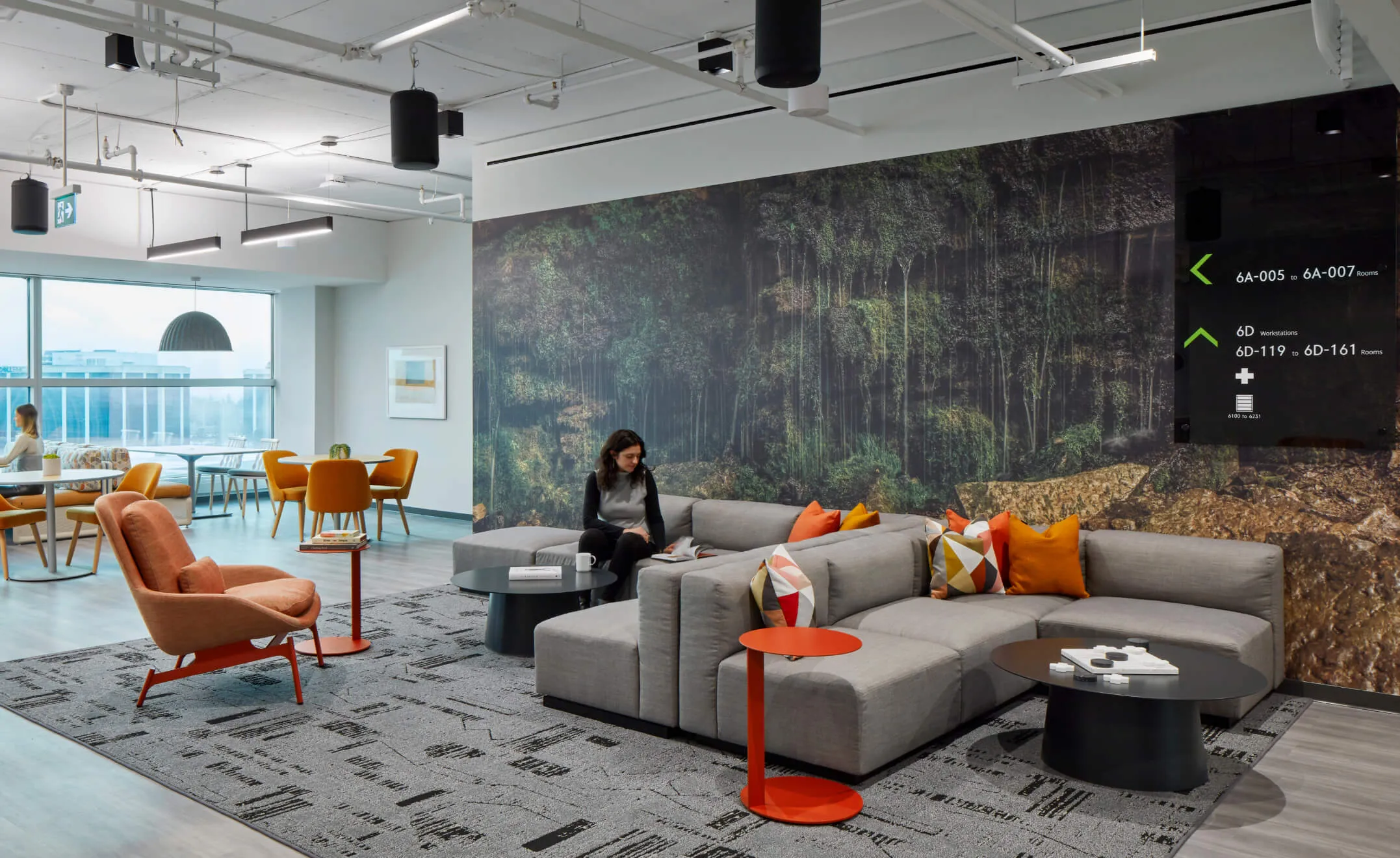
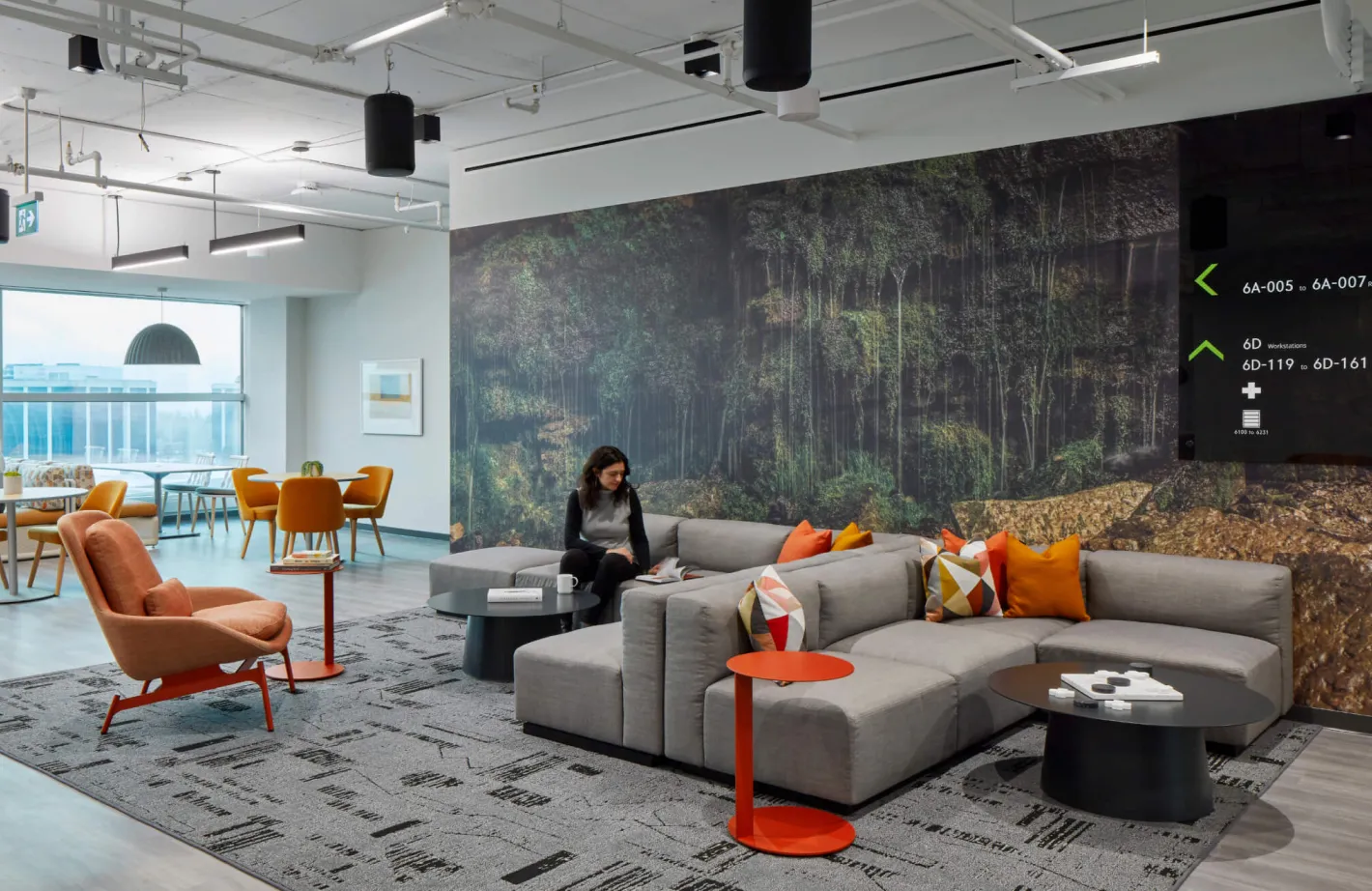
Modern office lounge with a large forest mural, sectional sofa, and orange accent chairs.
A mindful place

Bringing the magic of the outside, in

AFK Studio’s open, airy and modern interior design allowed Forge to create placemaking landmarks that helped anchor and define spaces for work and collaboration. The environmental graphic experience involved showcasing the region’s story through photography and graphics. These became the foundation for creating connections with the other branded signage and wayfinding elements.

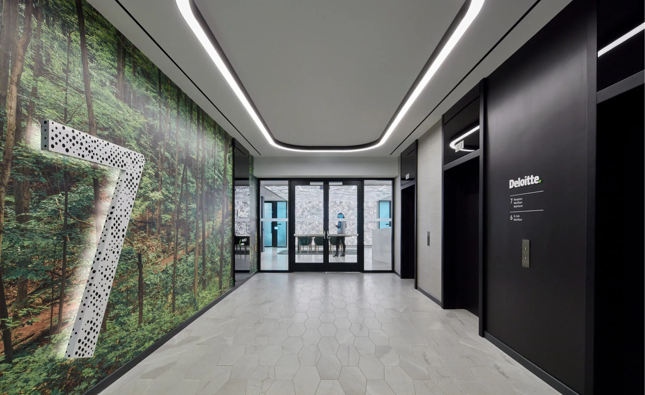
Modern office hallway with forest mural, Deloitte signage, and hexagonal floor tiles.
A green arrival
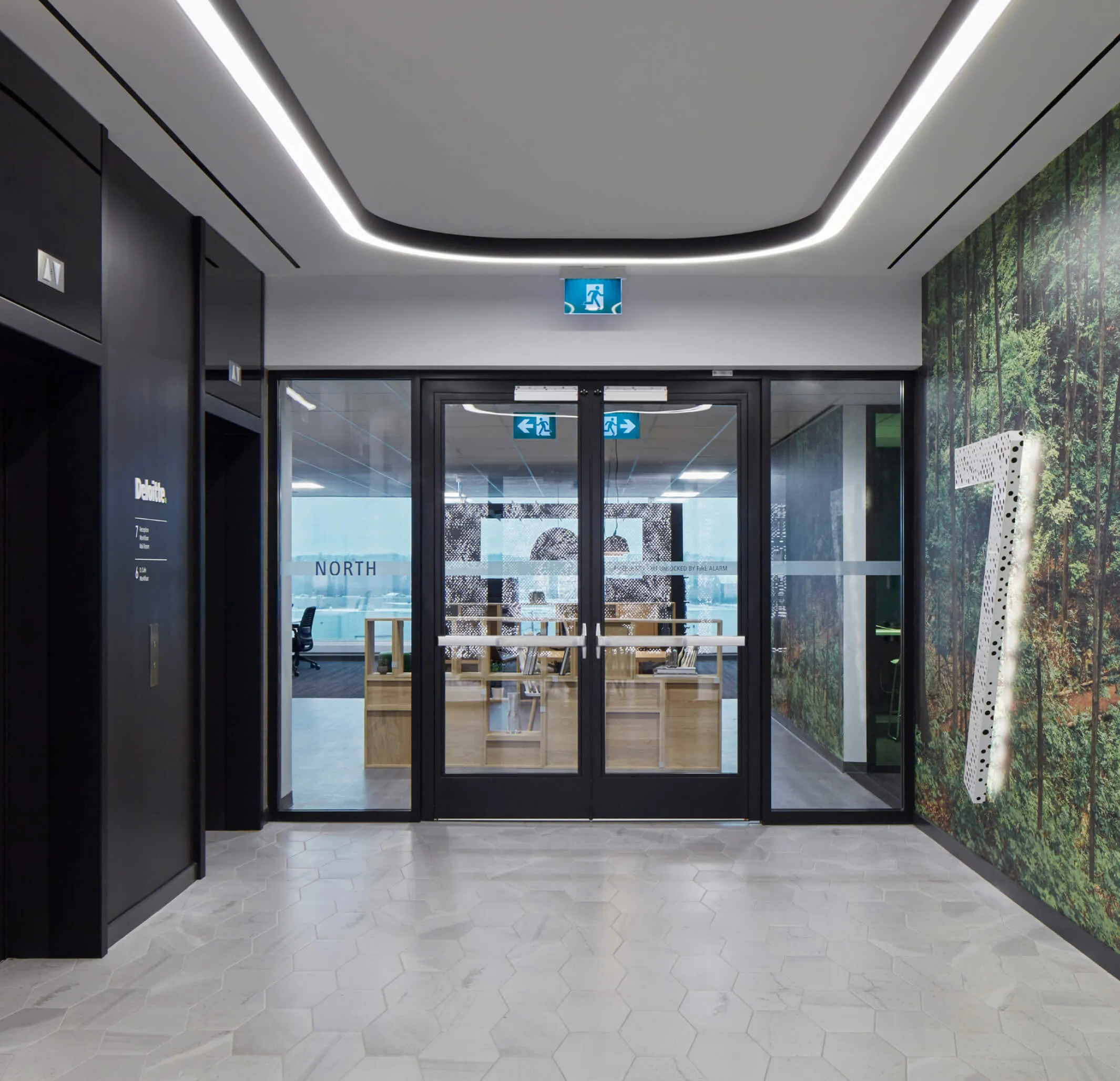
Modern office hallway with glass doors, forest mural, and large number 7.
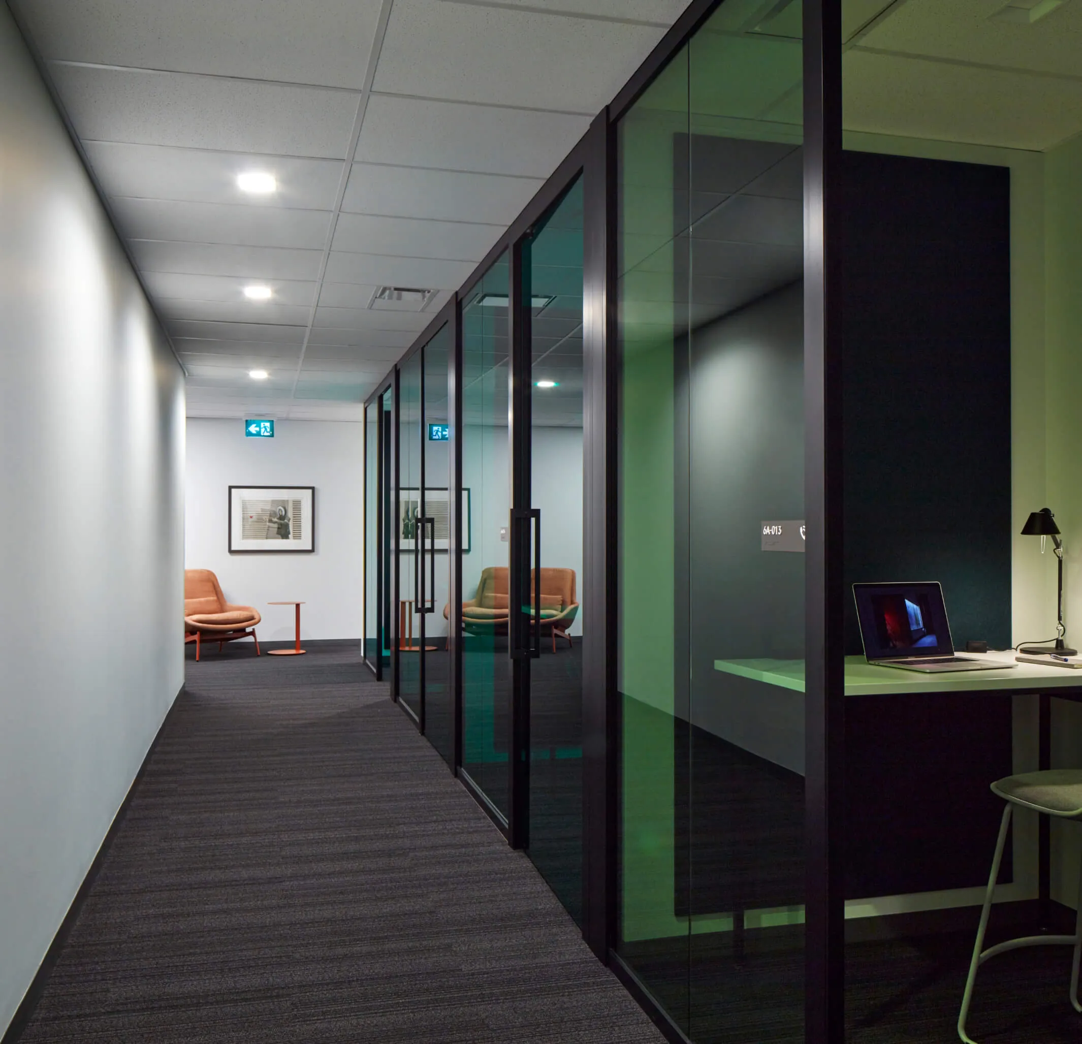
Modern office hallway with glass-walled meeting rooms and a workstation.

Natural collaboration of form and function

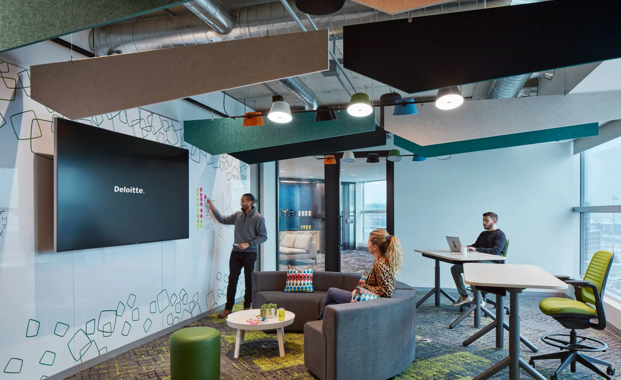
Workspaces benefited from the integration of themed graphic motifs. Integrating these graphics into writable wall surfaces created highly functional rooms. This also helped strengthen the connection to place by creating seamless interaction with the work environment. While establishing a clear visual hierarchy in brand and communication, the program successfully helps both clients and staff understand and navigate their environment while creating pride in their space and its identity.

A man presents at a Deloitte meeting in a modern office with a large screen and seating area.
Flexible and themed collaboration surfaces
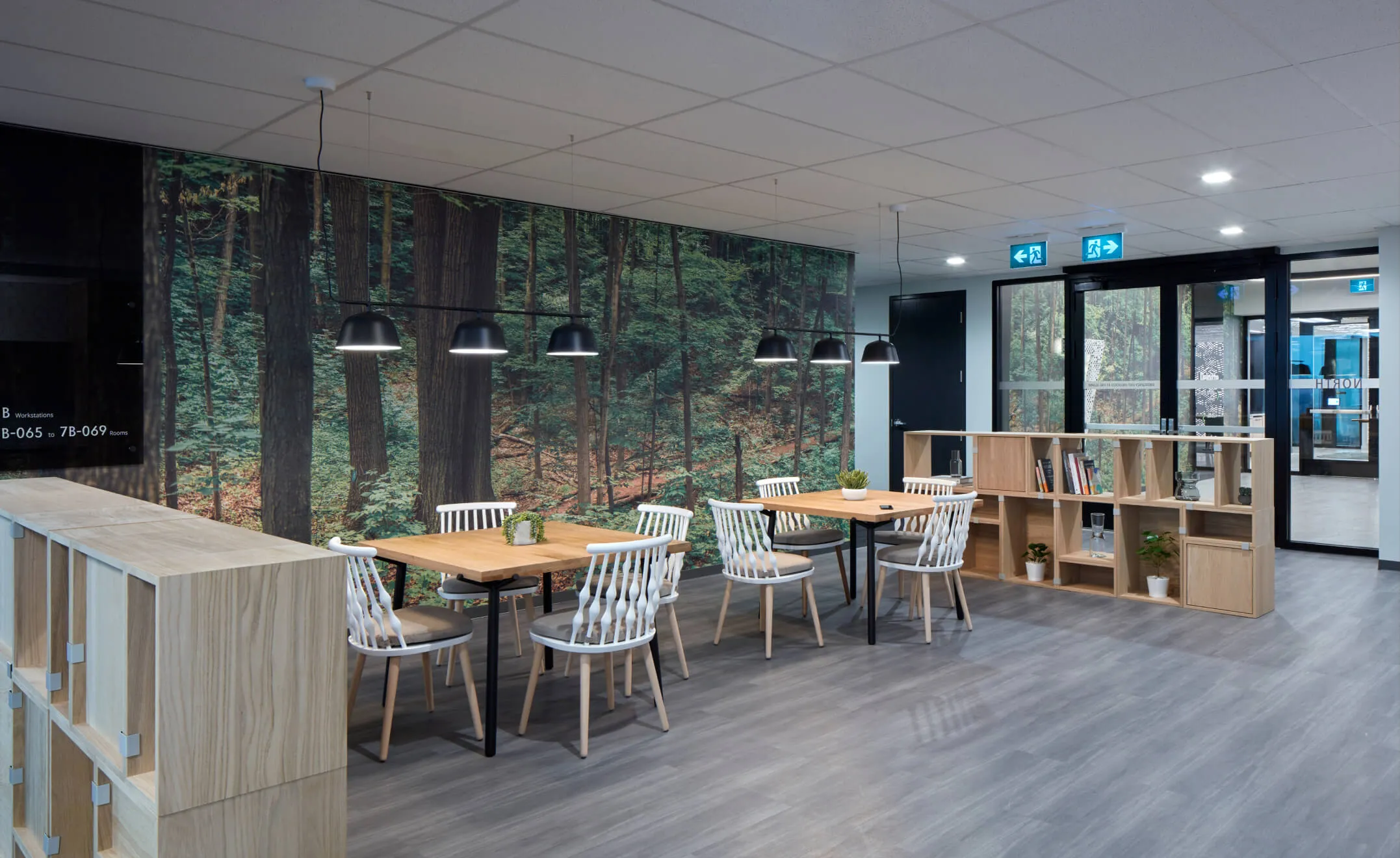
Modern office breakroom with forest mural, tables, chairs, and shelving.
Connecting experience from lobby to Coffee Bar seating
  • 35.5K sq. ft. office space
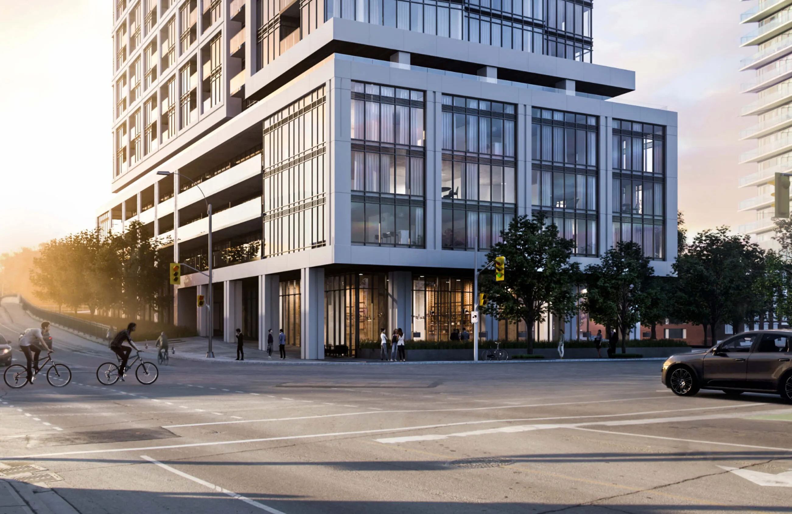
Modern apartment building with people and cars on a sunny street. Modern apartment building with cars and trees on a street.

Liberty House

Services Deliverables
  • Logo
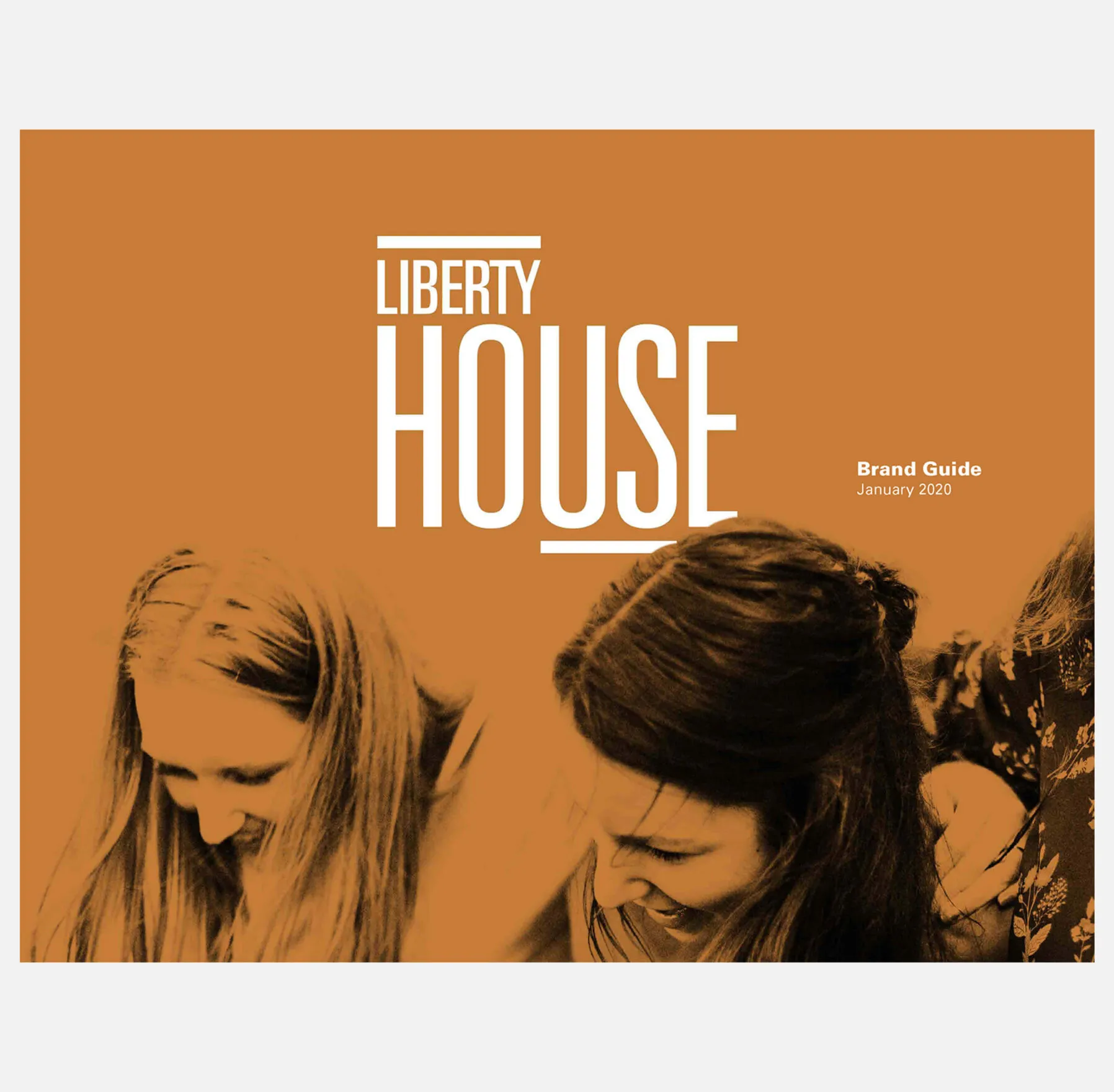
  • Brand Guide
  • Marketing Materials
  • Stationery
  • Signage
  • Wayfinding
  • Uniforms
  • Placemaking
  • Masterplan

Fostering a culture of community within a community

Equipped with luxury amenities and stylish spaces, Liberty House is an elevated rental development that strives to provide a community-focused lifestyle for all residents. To fill a gap in the purpose-built rental space, Fitzrovia aimed to build high-quality rental units with desirable amenity packages marketed to the millennial renter. Forge worked with Fitzrovia Real Estate to define a name and develop a brand for this new property.

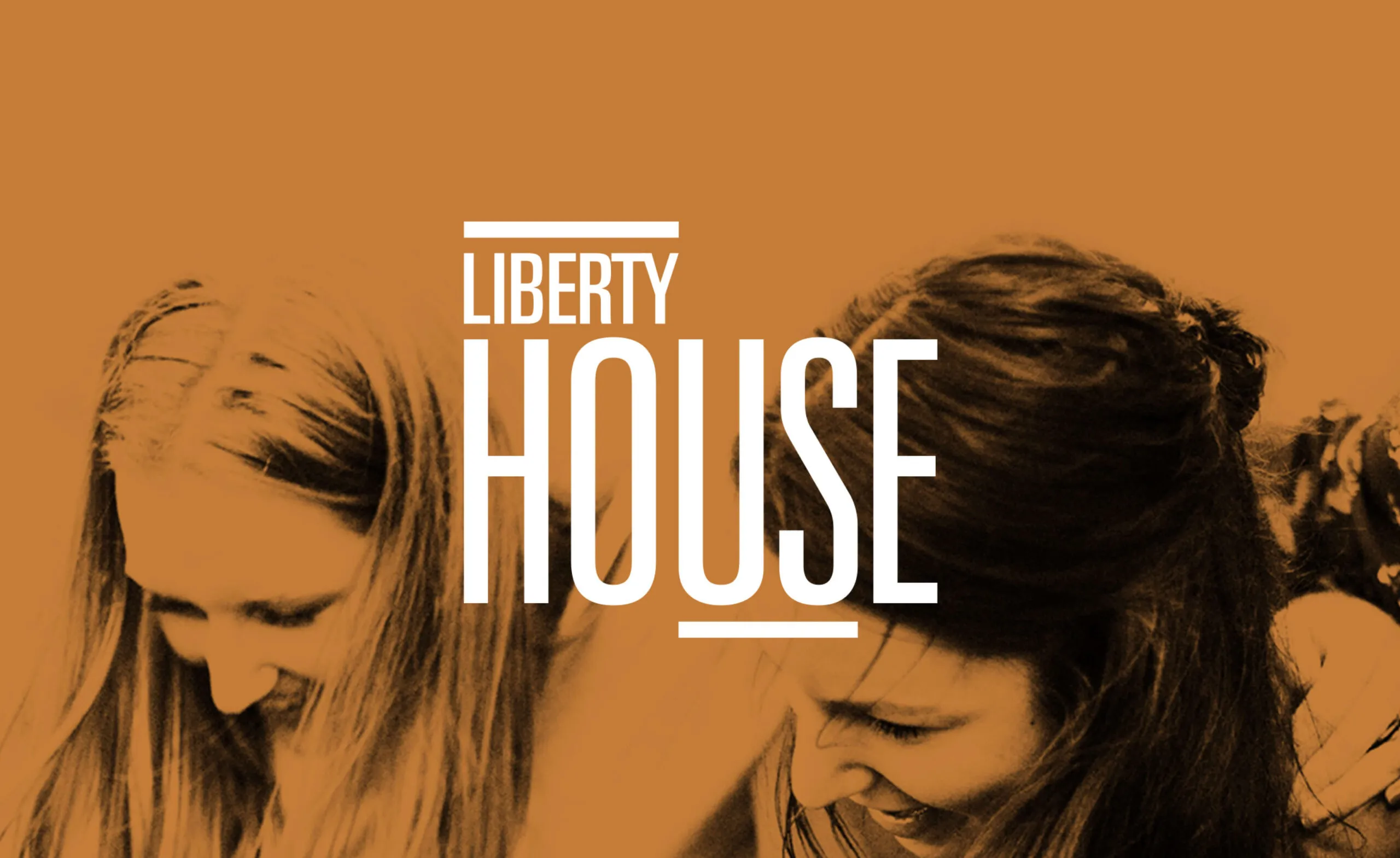
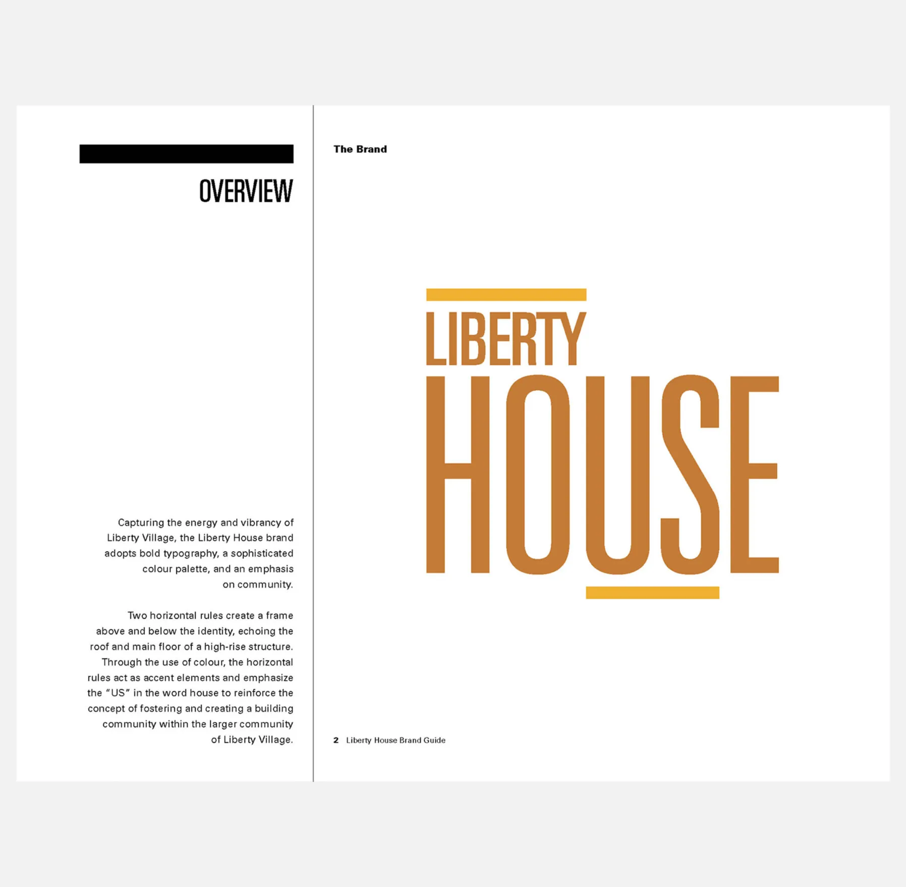
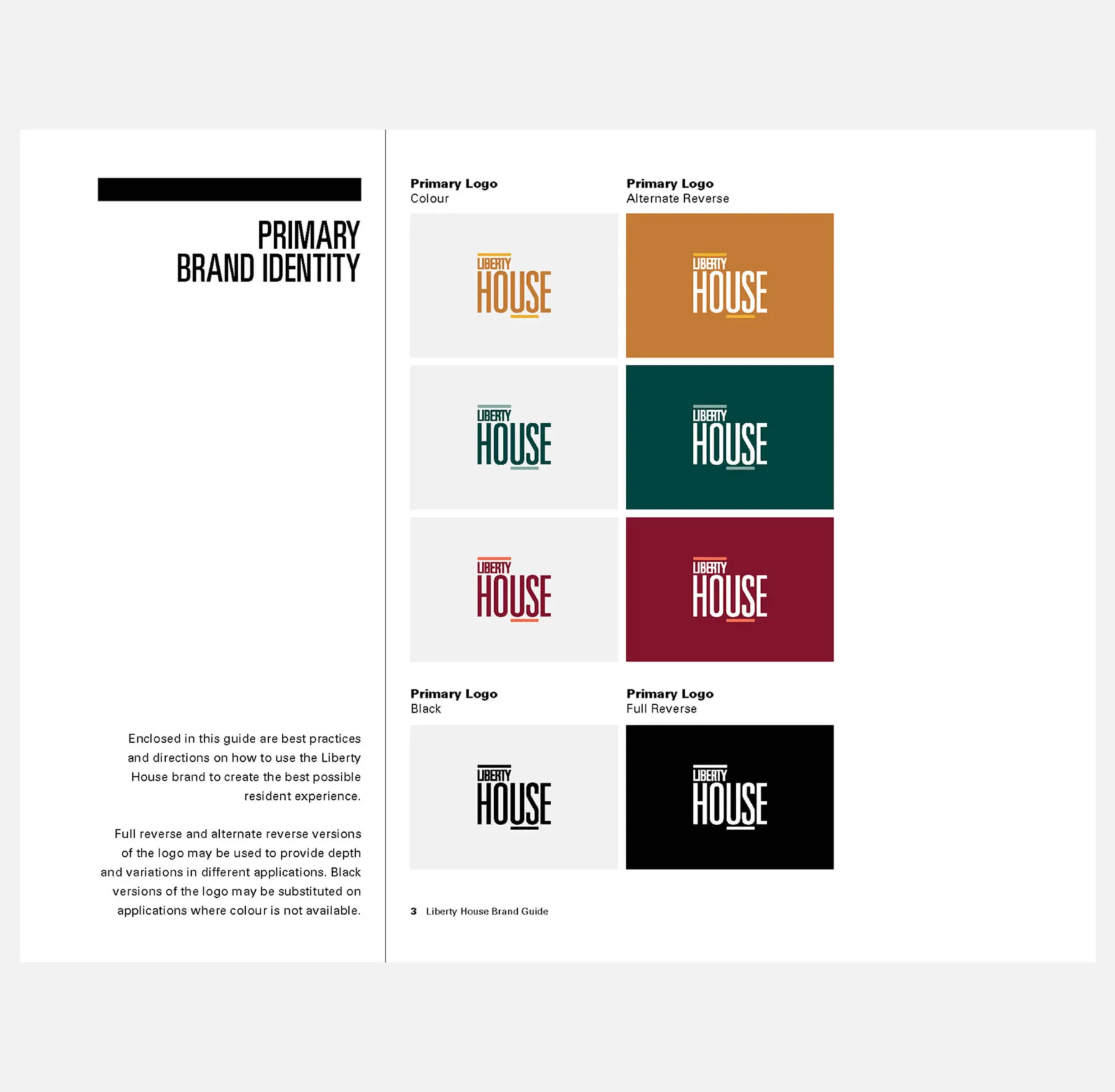
Liberty House logo with two women's faces in silhouette.
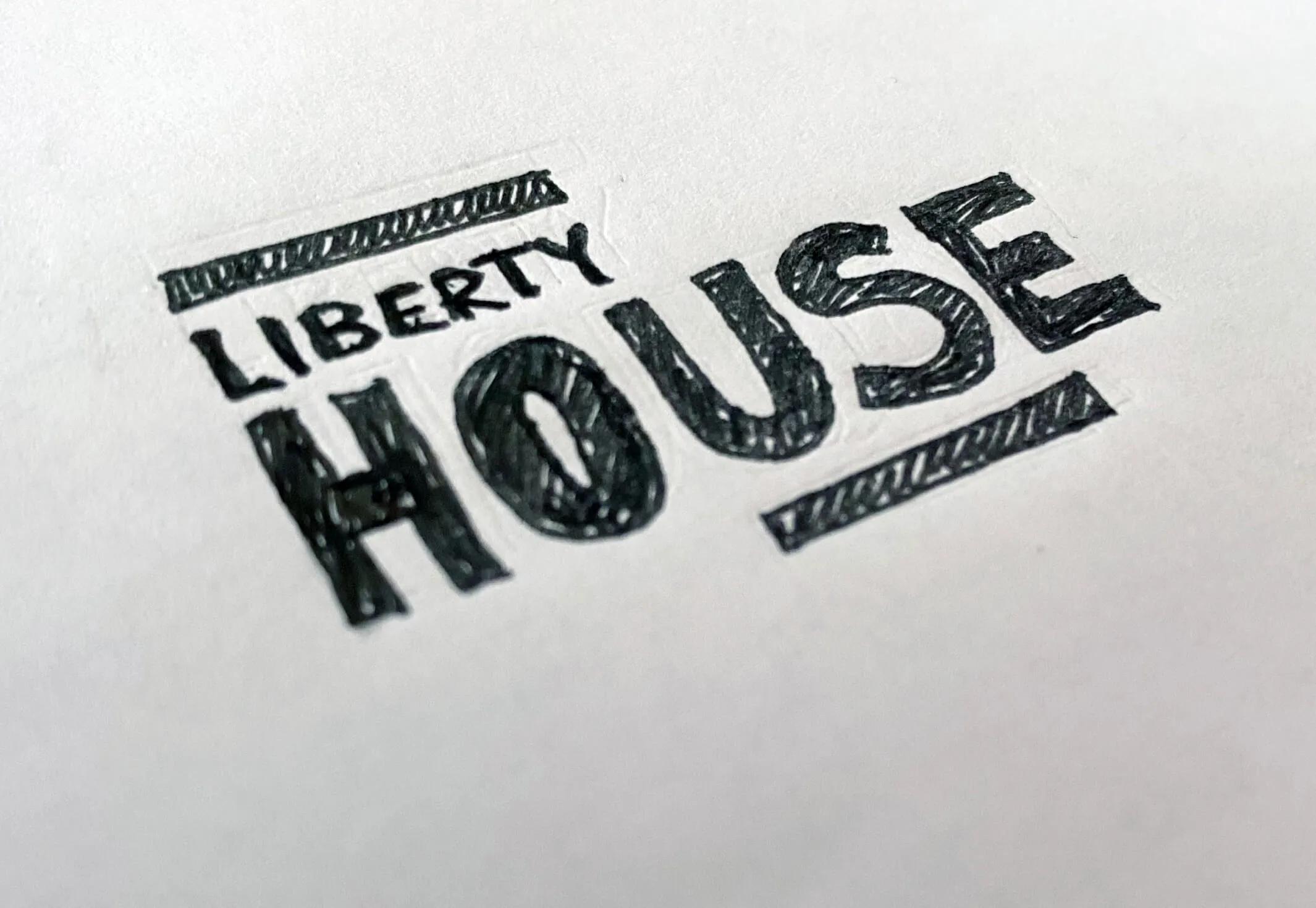
A preliminary sketch for the Liberty House logo
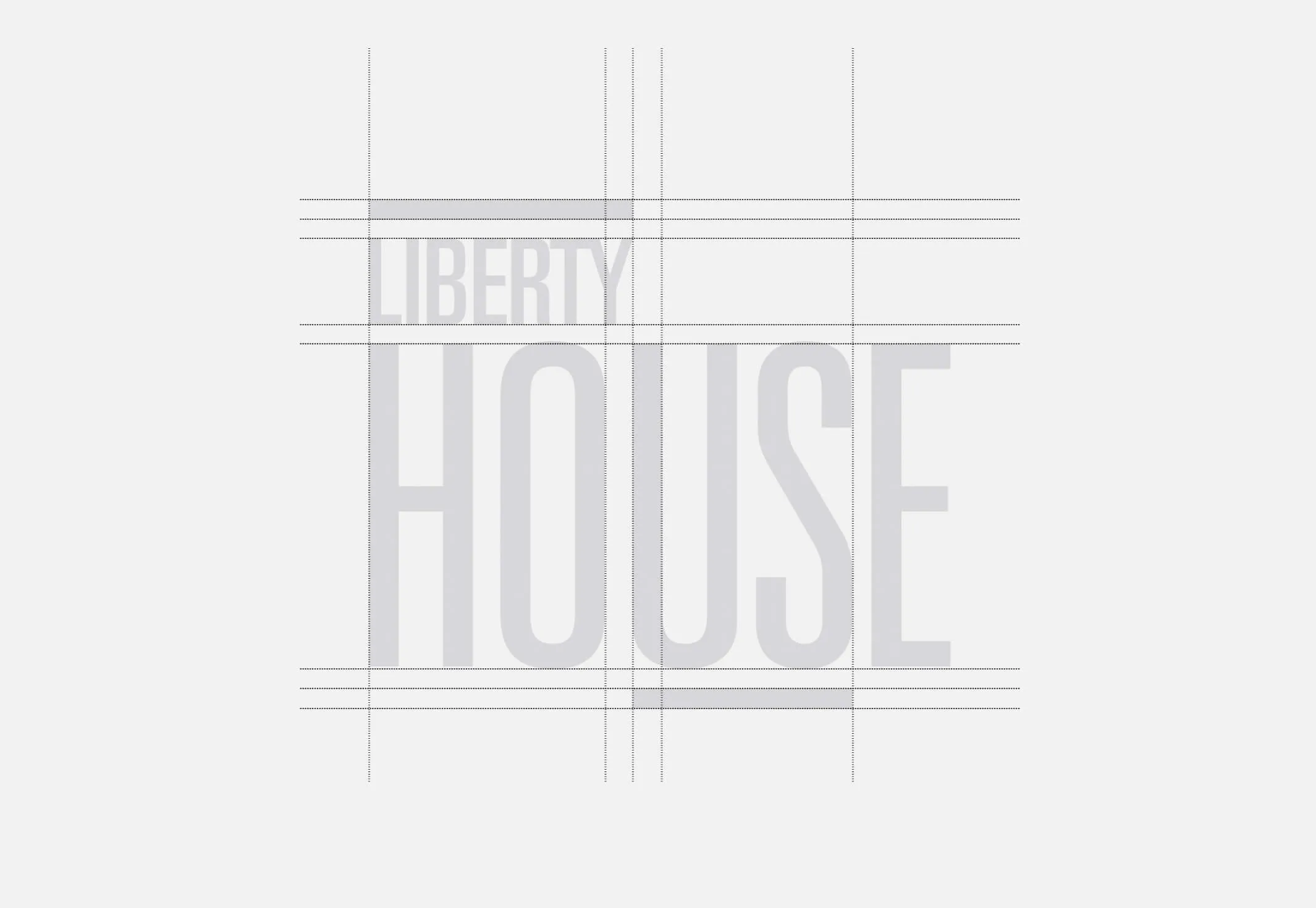
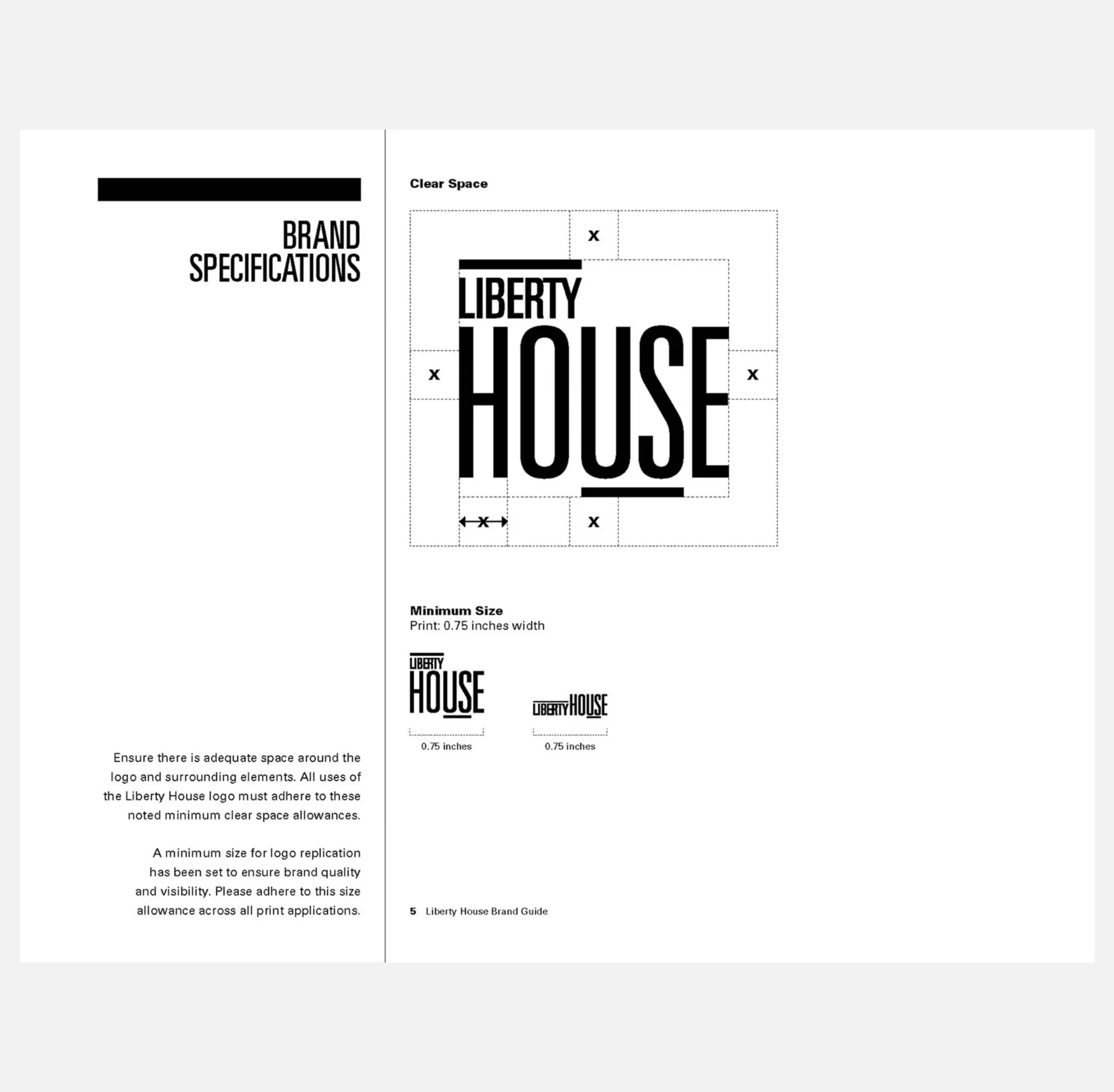
The Liberty House logo seen aligned to a grid
Preliminary sketch and a well structured logo for a fun brand
Abstract background with horizontal stripes in warm, earthy tones.
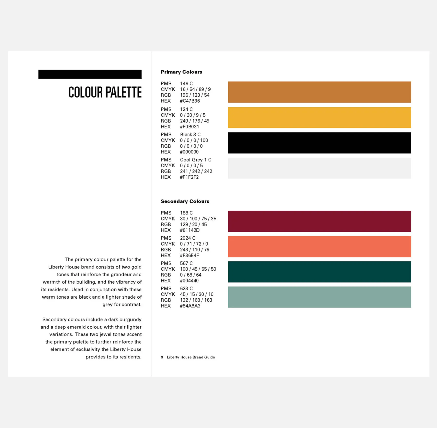
A sophisticated colour palette
A letterform of the letter A for the font Univers Ultra Condensed.
A letterform of the letter A for the font Univers.
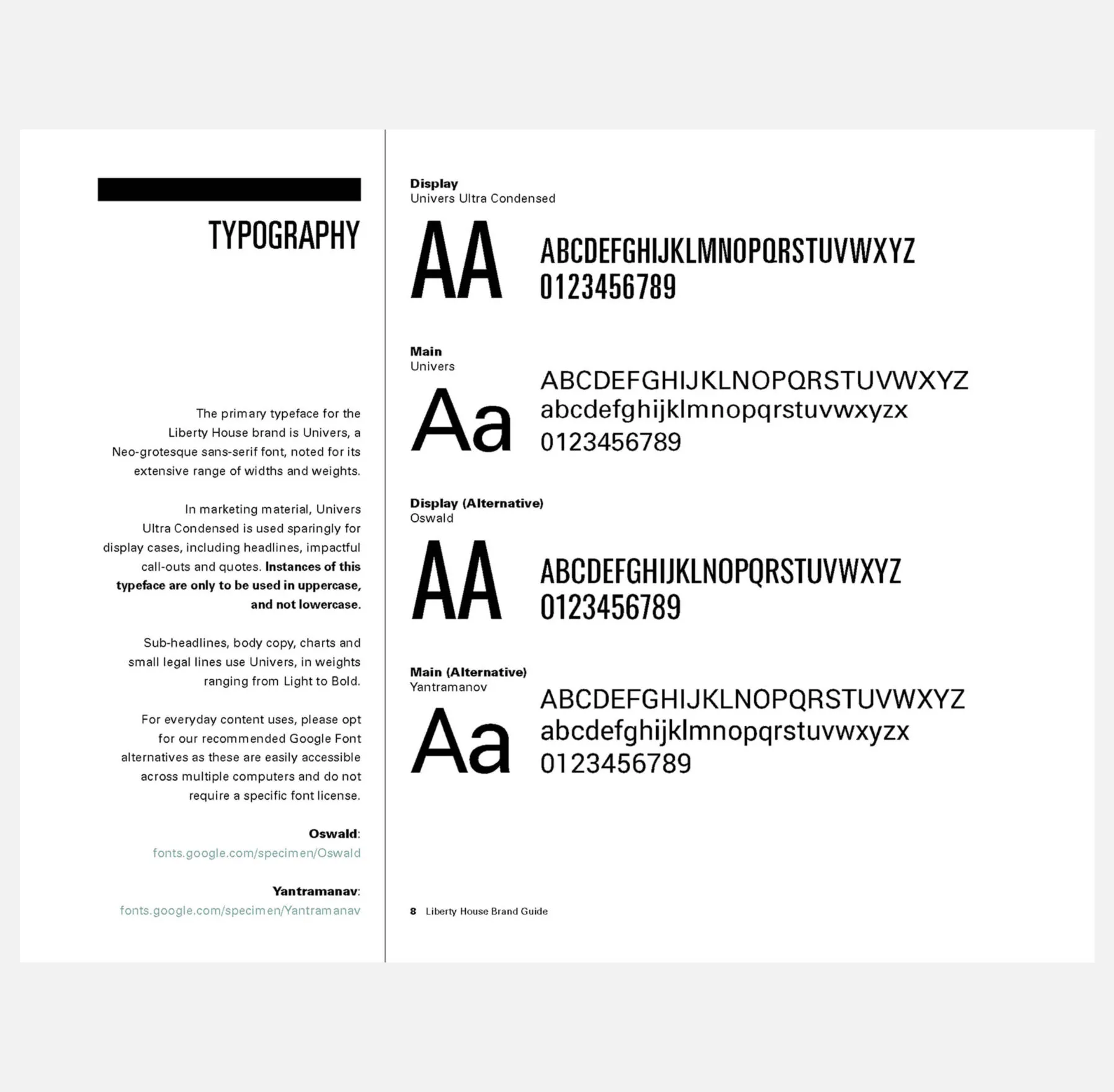
Stylistic typography to communicate to the millennial audience

Resonating with the millennial renter

Seeking to evoke the community aspect of the property, the name Liberty House reflects the idea of one’s family all under one roof. The name also echoes the sense of pride and unity created by the development’s unique spaces, program offerings and amenities. Liberty House offers luxury living within reach to its residents.

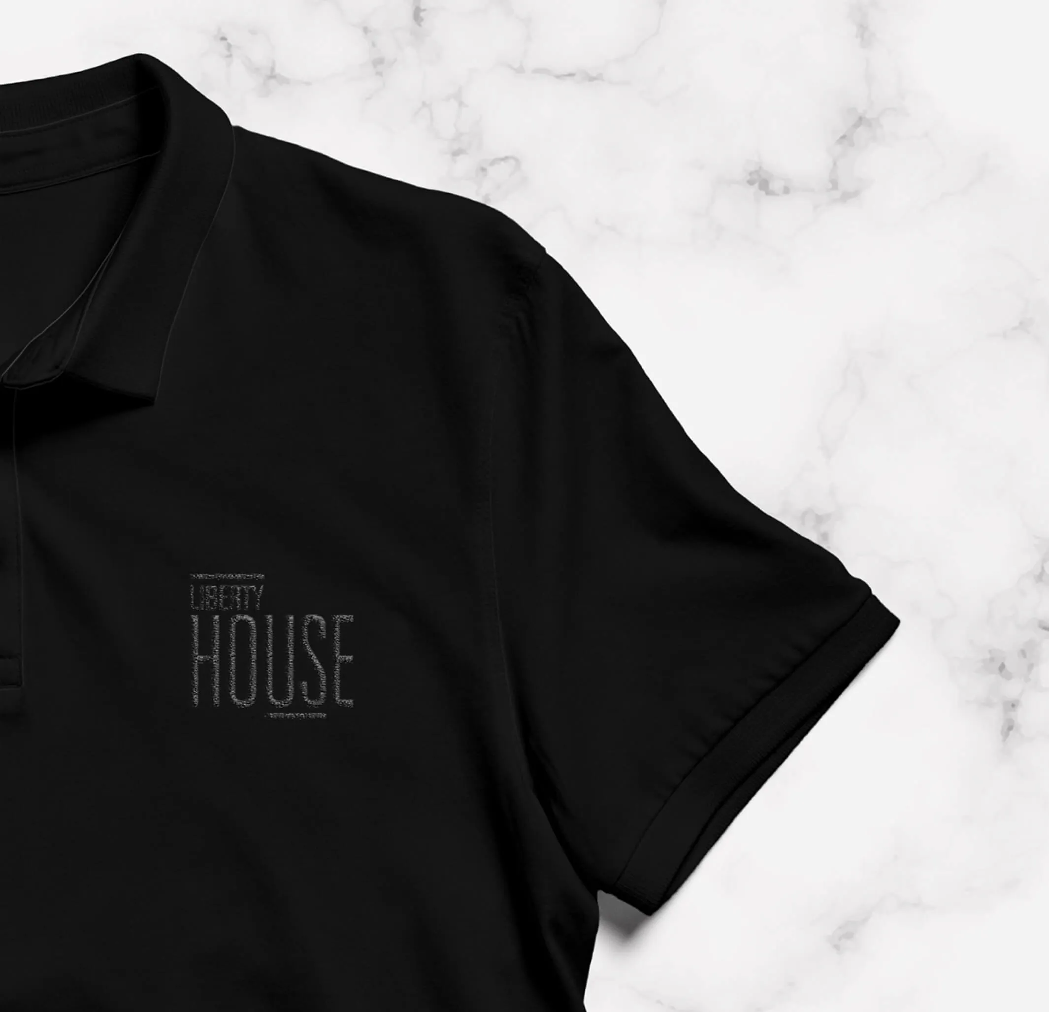
Black polo shirt with
Liberty House logo
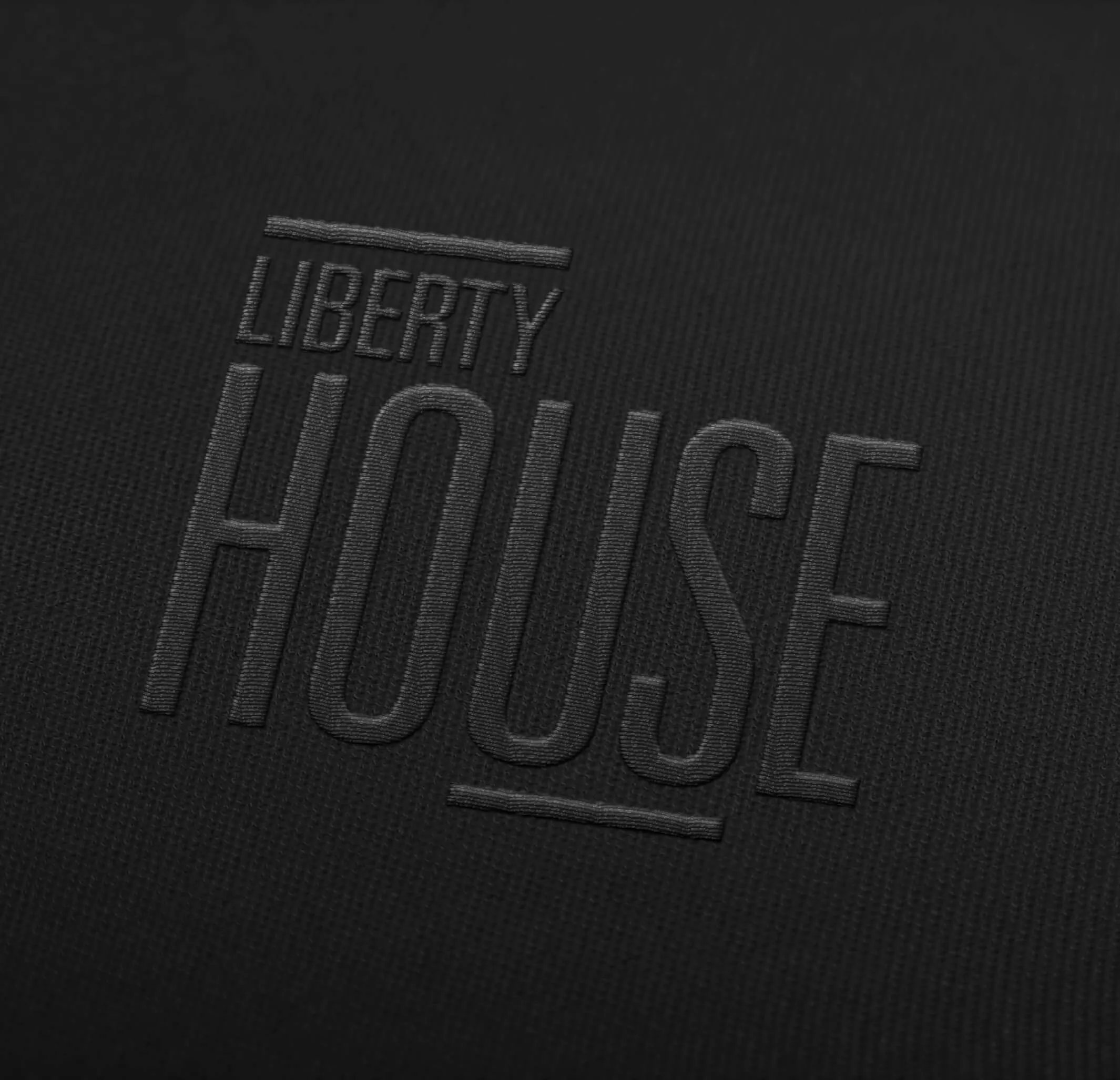
Uniforms
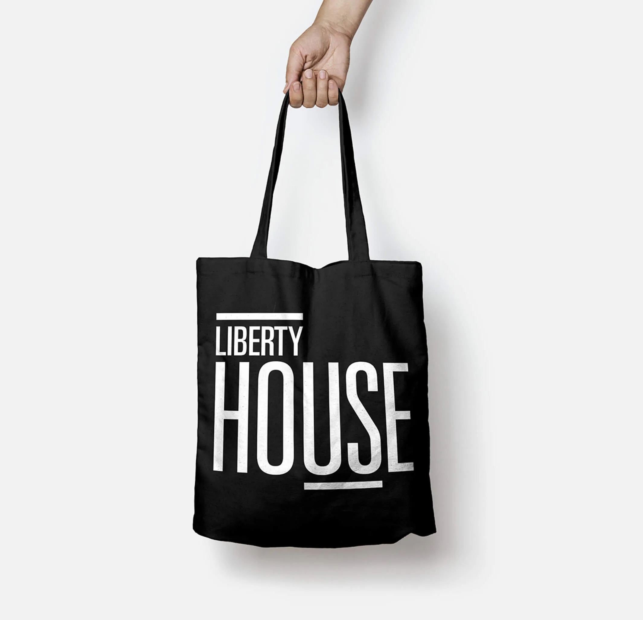
Black tote bag with
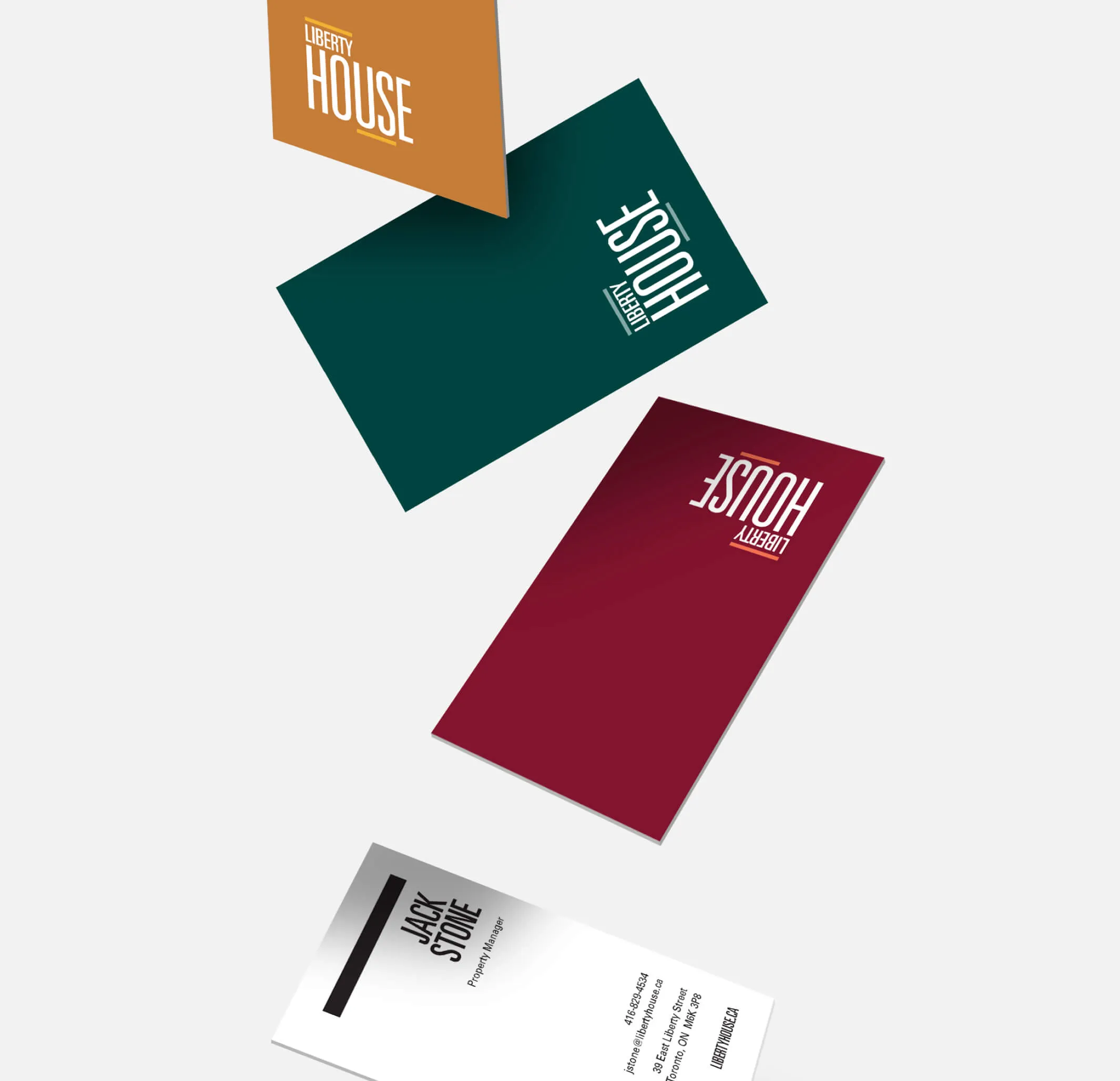
Business cards for Liberty House, featuring the company name and contact information.
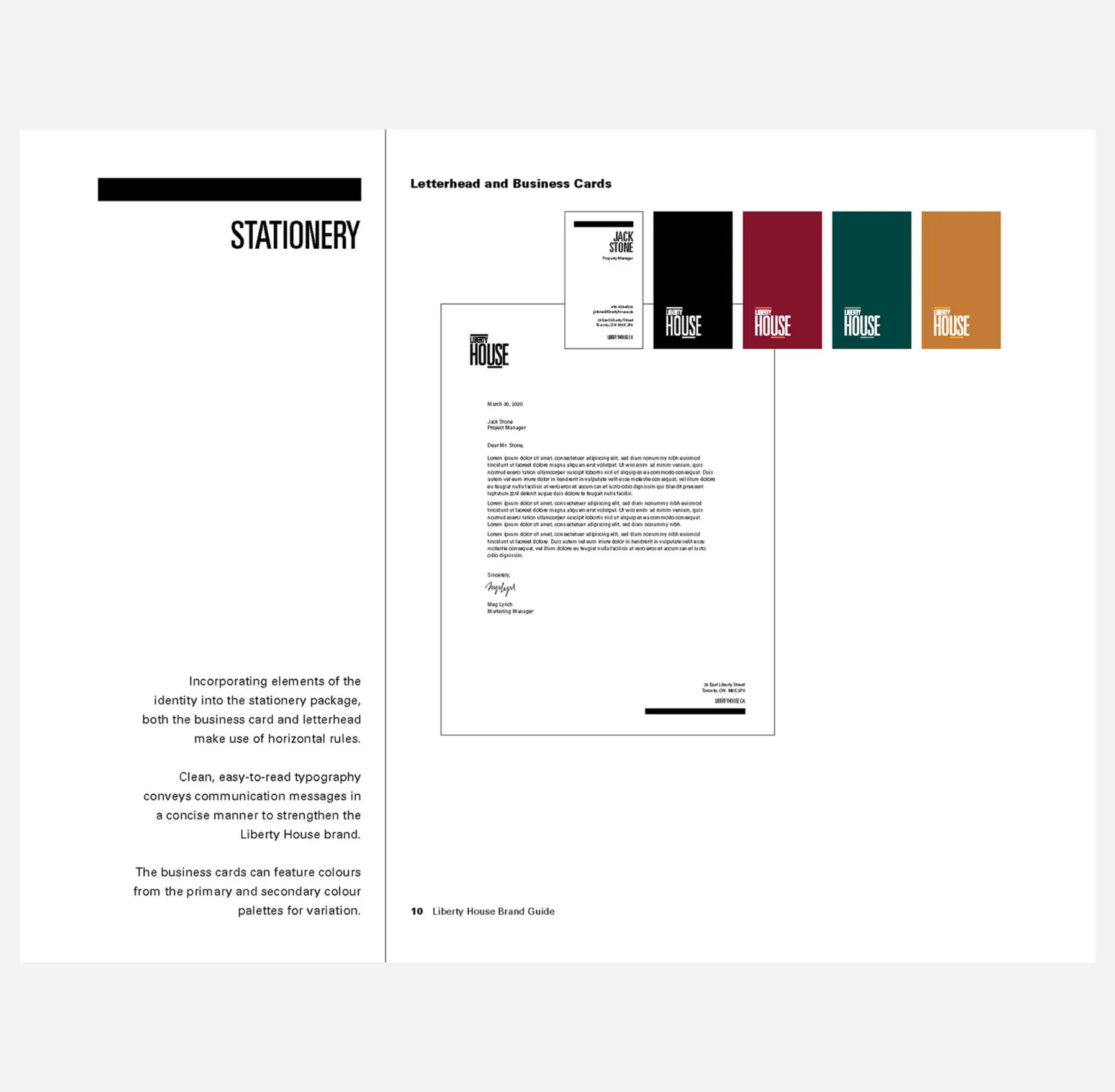
Promotional materials and stationery

Luxury within reach

The property speaks to those looking for an aspirational lifestyle while remaining accessible to the young millennial renter. Curated elements of luxury are present in the buildings offerings and mirrored through the use of carefully chosen materials and custom flourishes throughout the signage program.

Restroom icons for men, women, and disabled individuals.
Abstract logo of two figures in an elevator with up and down arrows
Minimalist golden bicycle logo on a white background.
Custom pictograms to add flair to the signage program
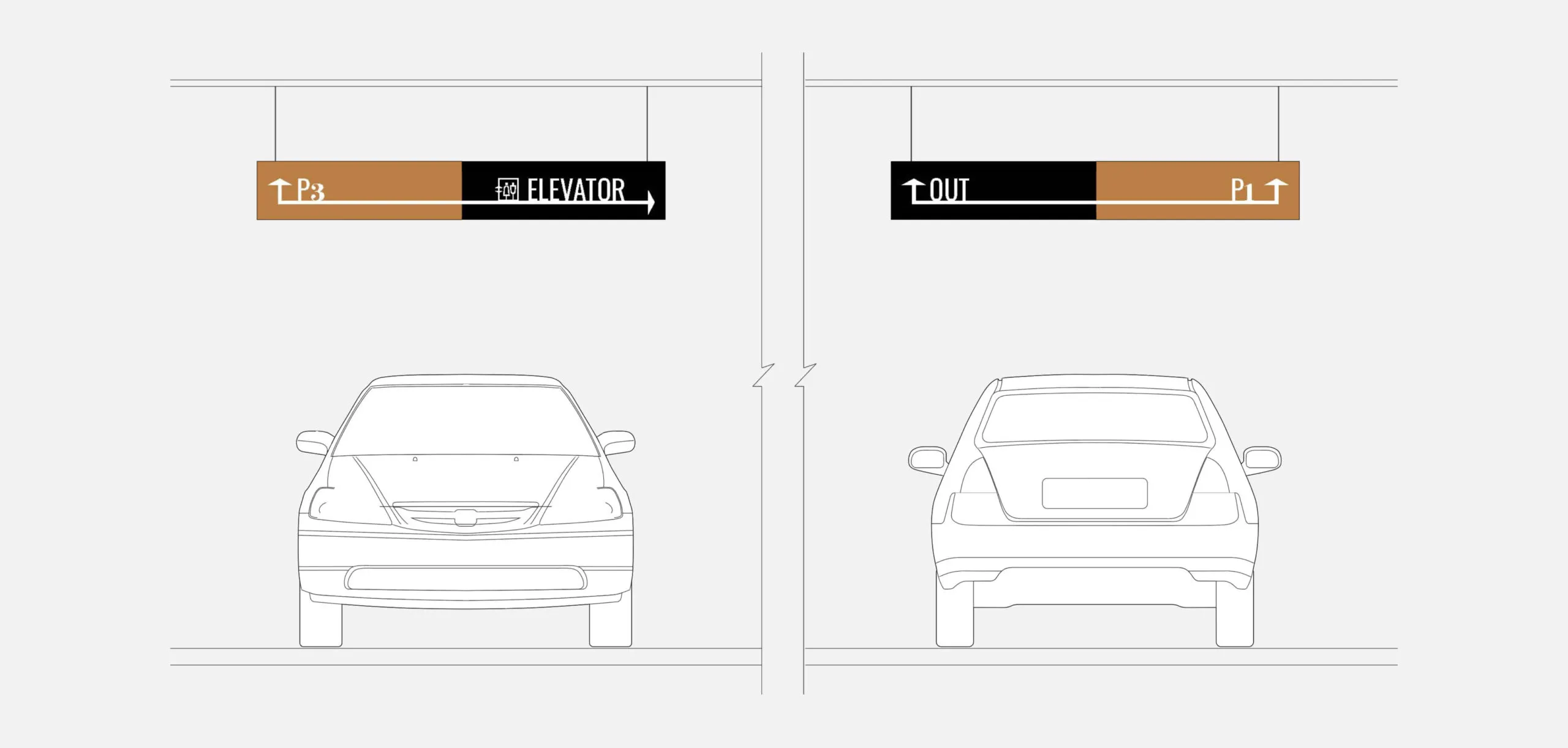
Parking garage signs for P3, Elevator, OUT, and P1 with cars.
Parking signage
Vertical gold frame with white numbers 1542 inside.
Two golden signs with numbers and arrows on a dark green background.
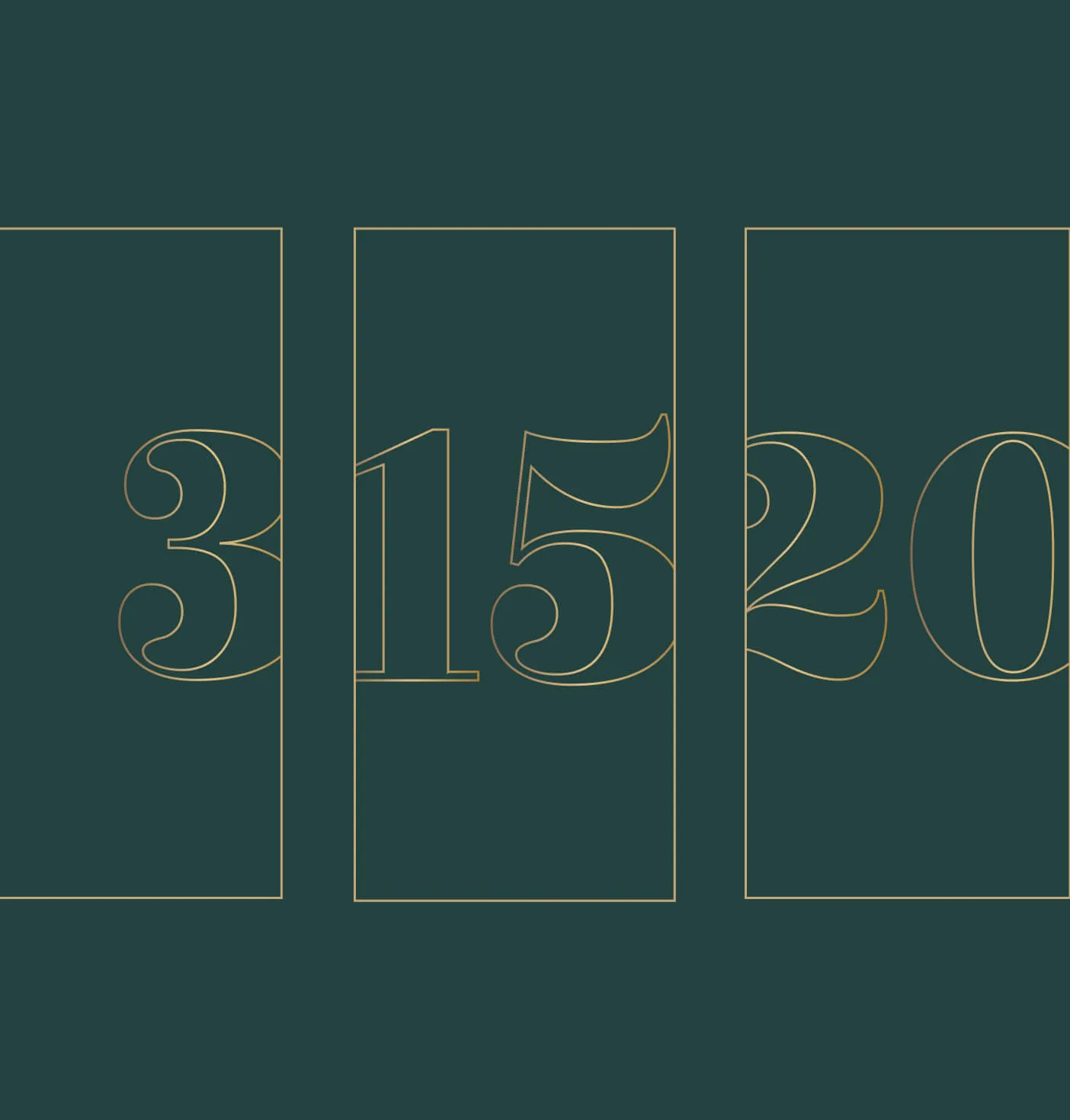
Art deco numbers 3, 15, and 20 in gold outline on a dark teal background.
Room signage, directional signage and floor ID’s
  • 290K sq. ft. of premium rental living space
  • 440 high-end rental units
  • 25 stories tall tower
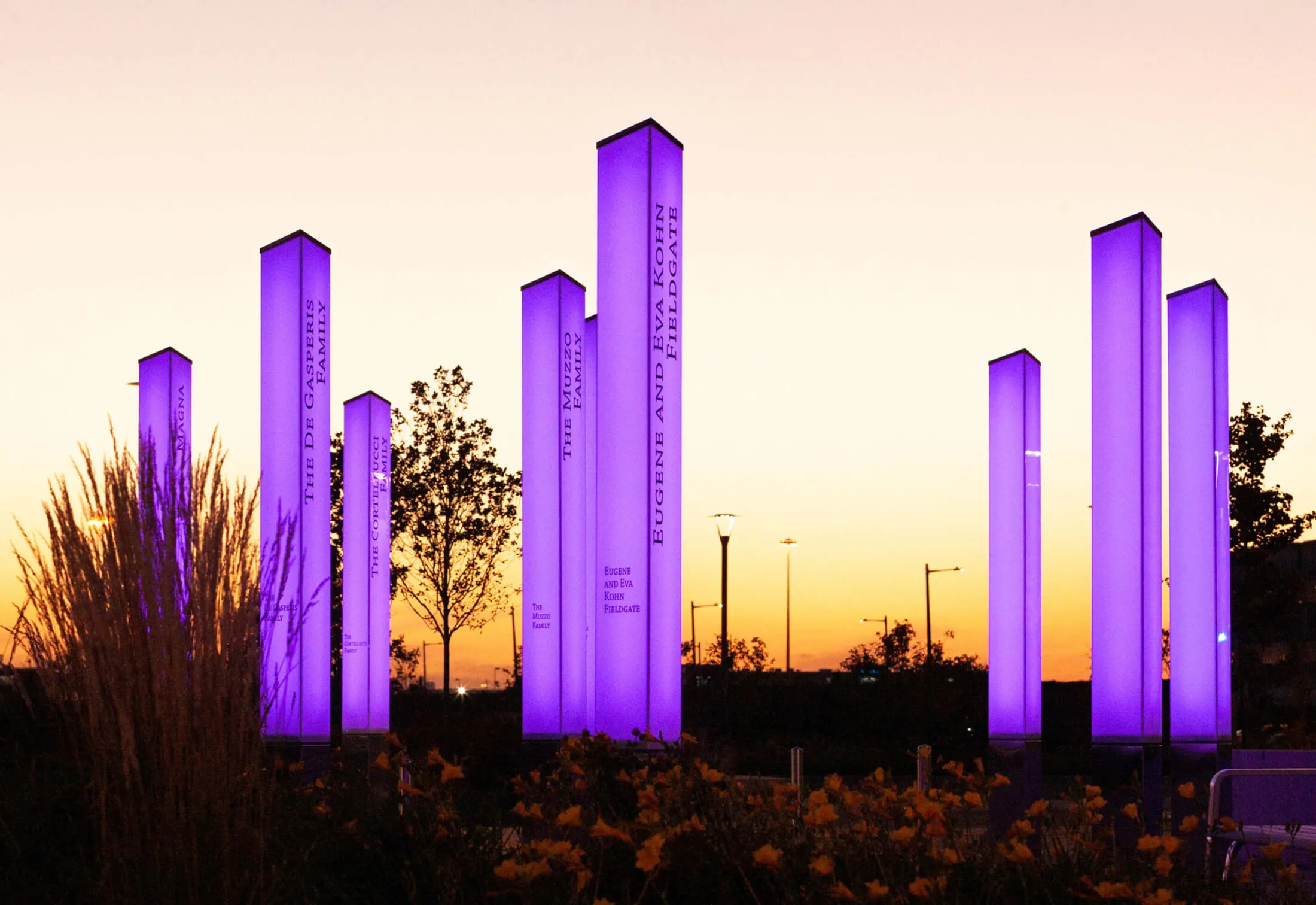
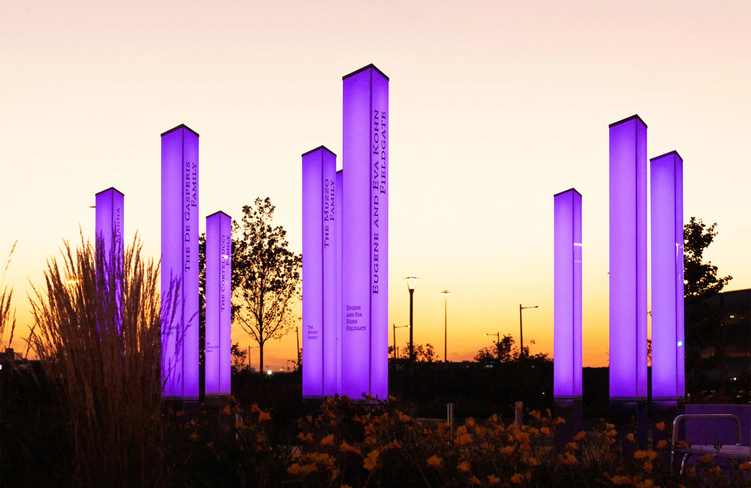
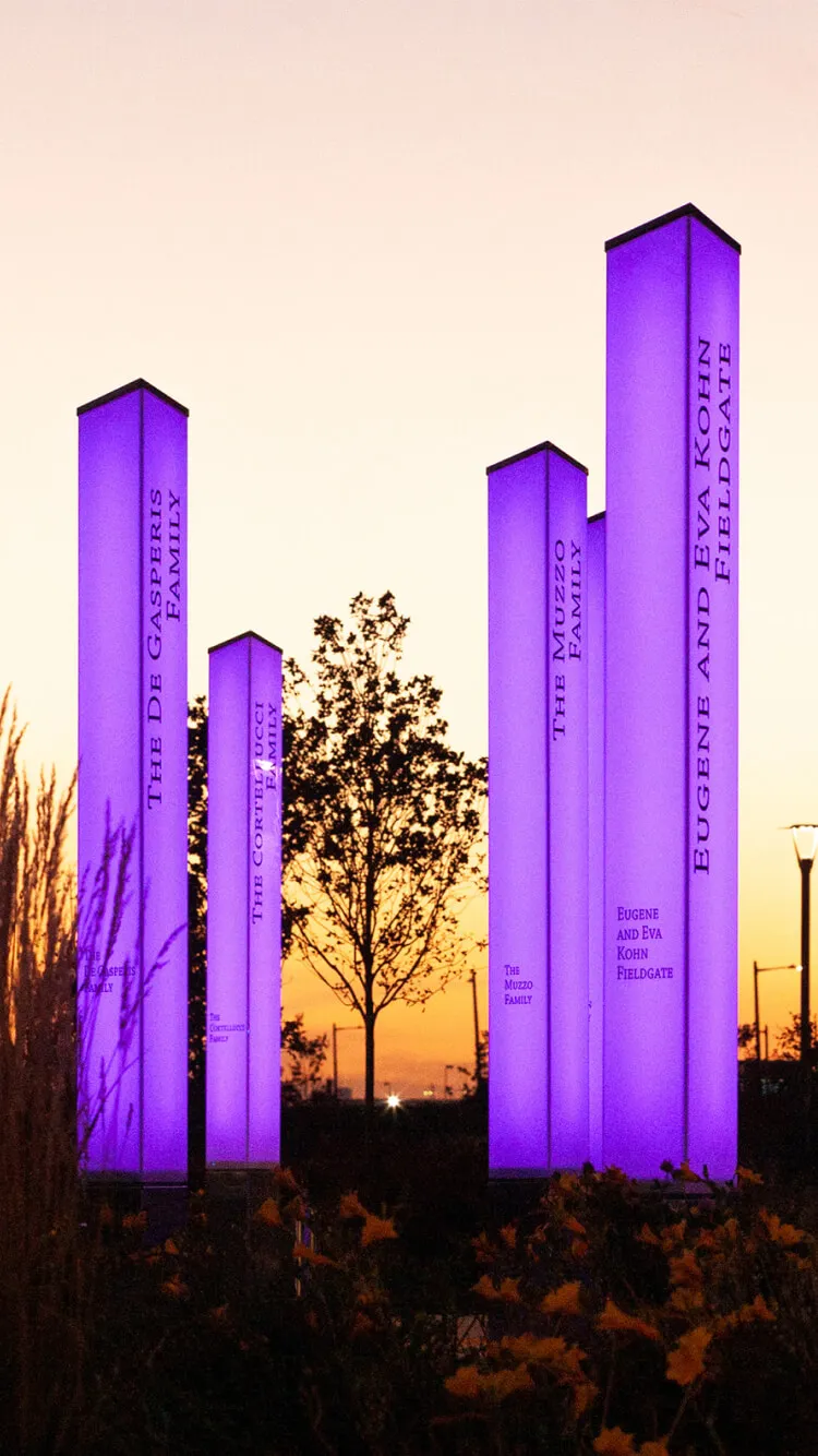
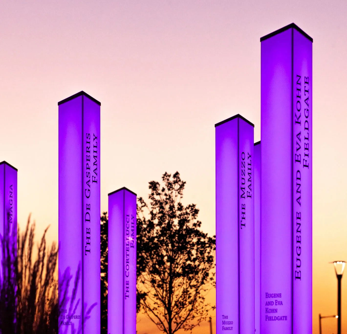
Purple illuminated pillars with family names at sunset with flowers in the foreground. Purple illuminated pillars with family names at sunset.

Cortellucci Vaughan Hospital

Vaughan, ON
Services Deliverables
  • Signage
  • Wayfinding
  • Masterplan
  • Donor Recognition
  • Kiosk
  • Art Installation
  • Placemaking

Celebrating generosity in a tech-forward healthcare facility

Cortellucci Vaughan Hospital (CVH) is Canada’s first smart hospital, featuring innovative technology and medical devices that provide state-of-the-art healthcare to the surrounding communities of Vaughan, Ontario. The Mackenzie Health redevelopment team worked closely with Forge to bring the vision of a fully integrated donor recognition program for the hospital and exterior campus to celebrate those who made the impressive facility possible.

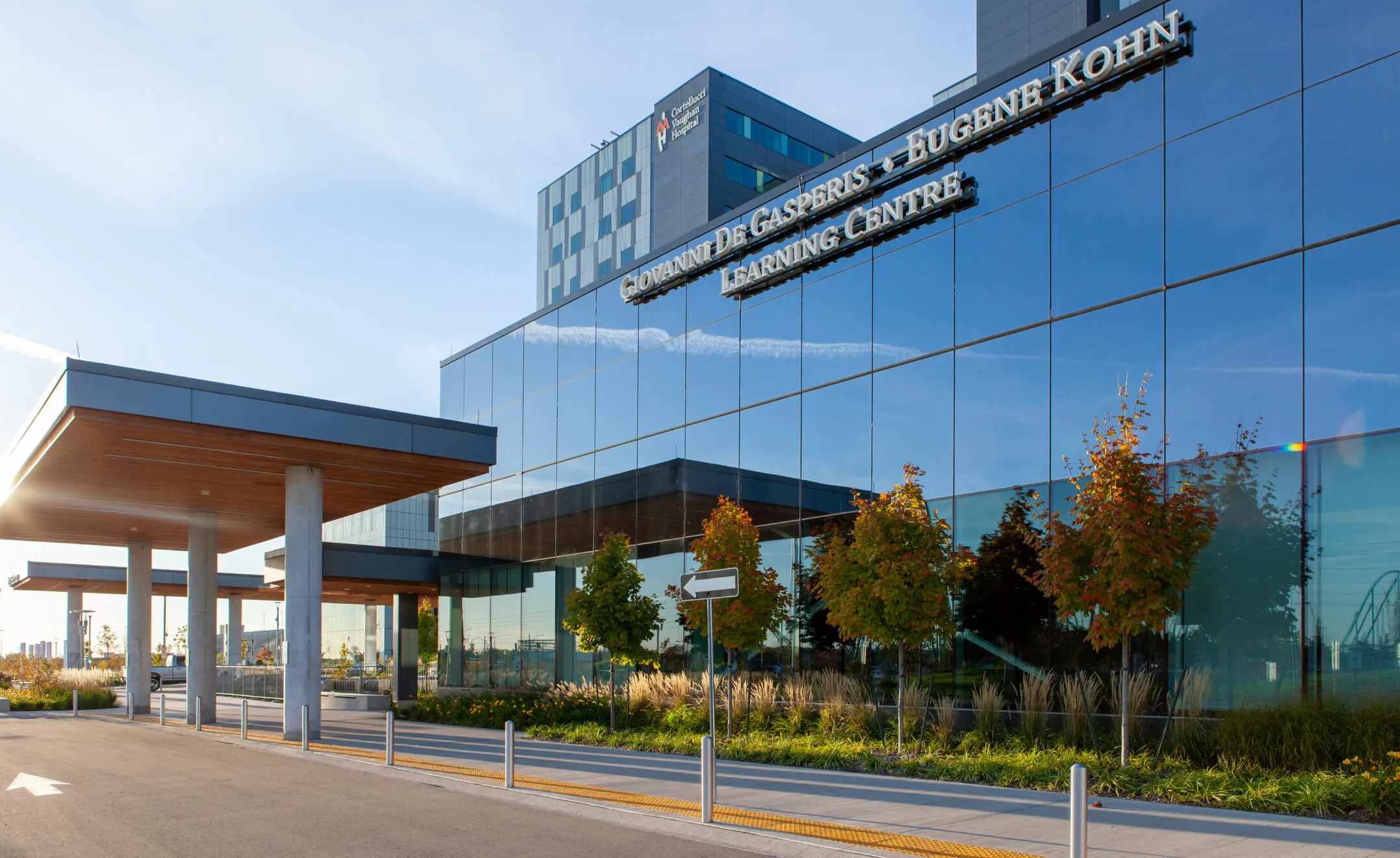
Exterior of the Cortellucci Vaughan Hospital's Giovanni De Gasperis Eugene Kohn Learning Centre.
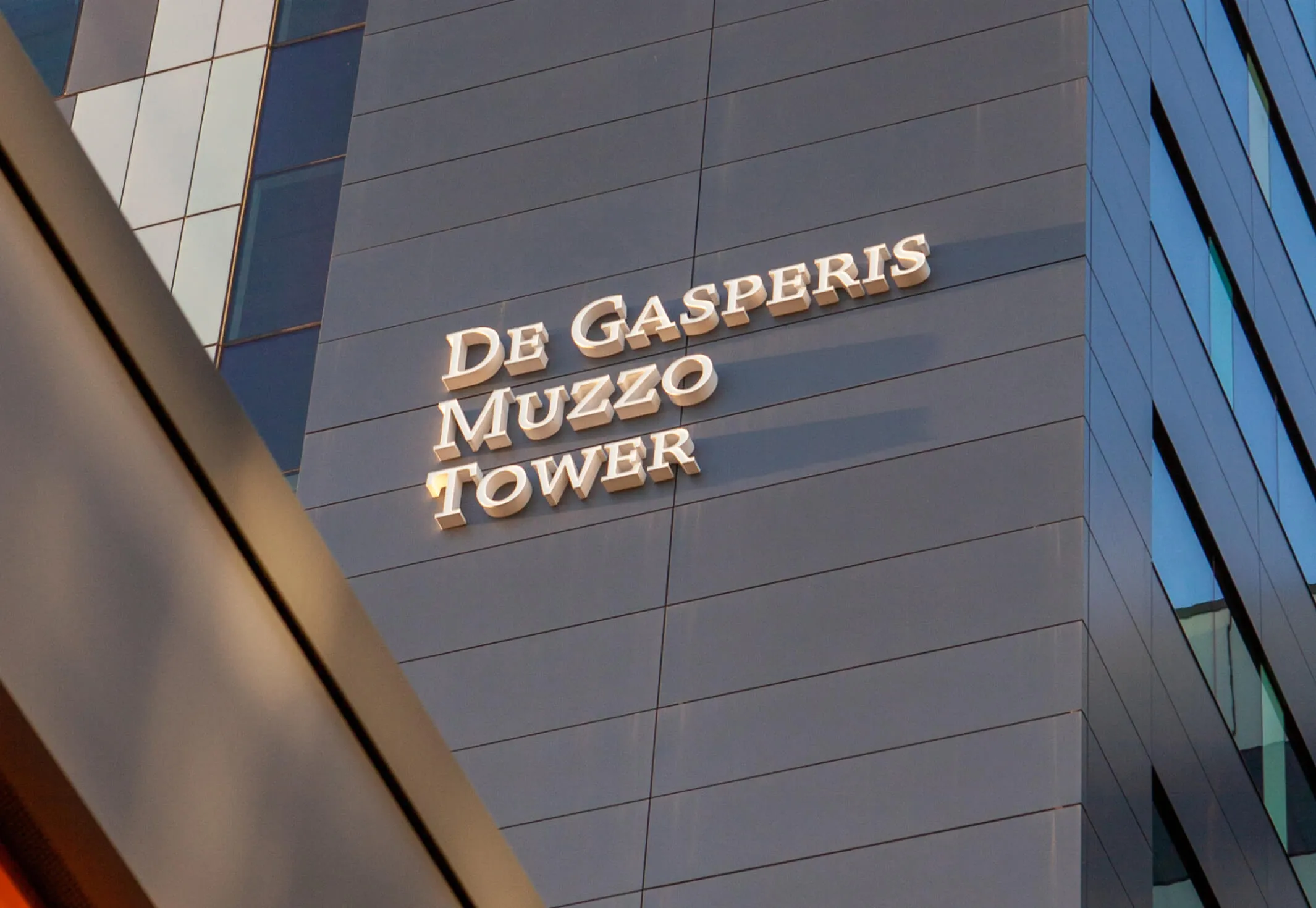
Building recognition
De Gasperis Muzzo Tower sign on a modern building facade.
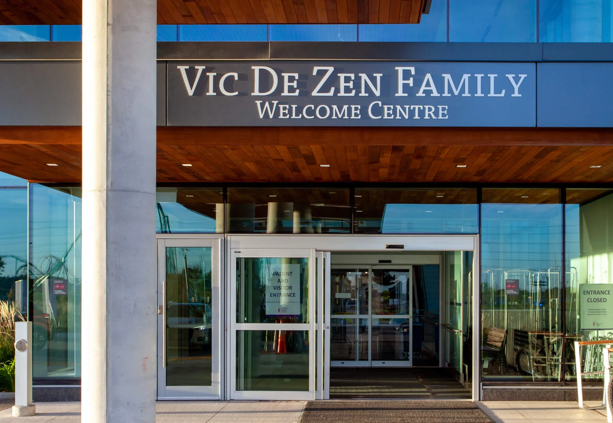
Vic De Zen Family Welcome Centre entrance with glass doors and signage.
Welcoming arrival
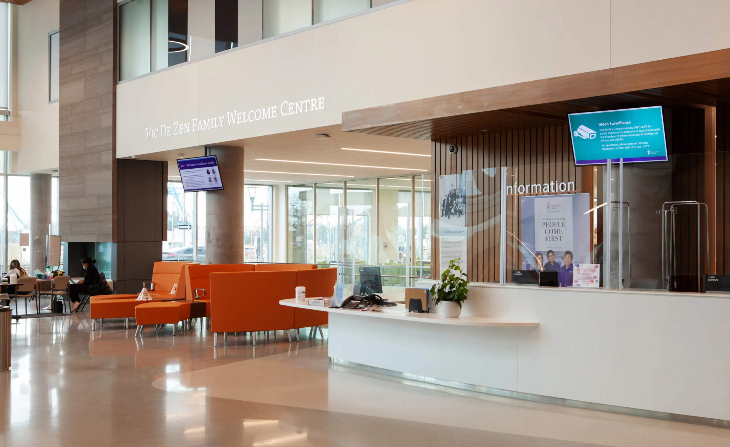
Interior of a modern hospital welcome centre with orange seating and an information desk.
Recognizing a family’s welcome

A multifaceted expression of gratitude

The goal of the donor recognition program was to ensure that every aspect worked seamlessly with the architecture and wayfinding program while providing donors with a sense of appreciation for their incredible generosity. The donor recognition walls collectively celebrate the impact of donors’ crucial contributions and inspire future givings, inform patients, visitors, and staff alike.

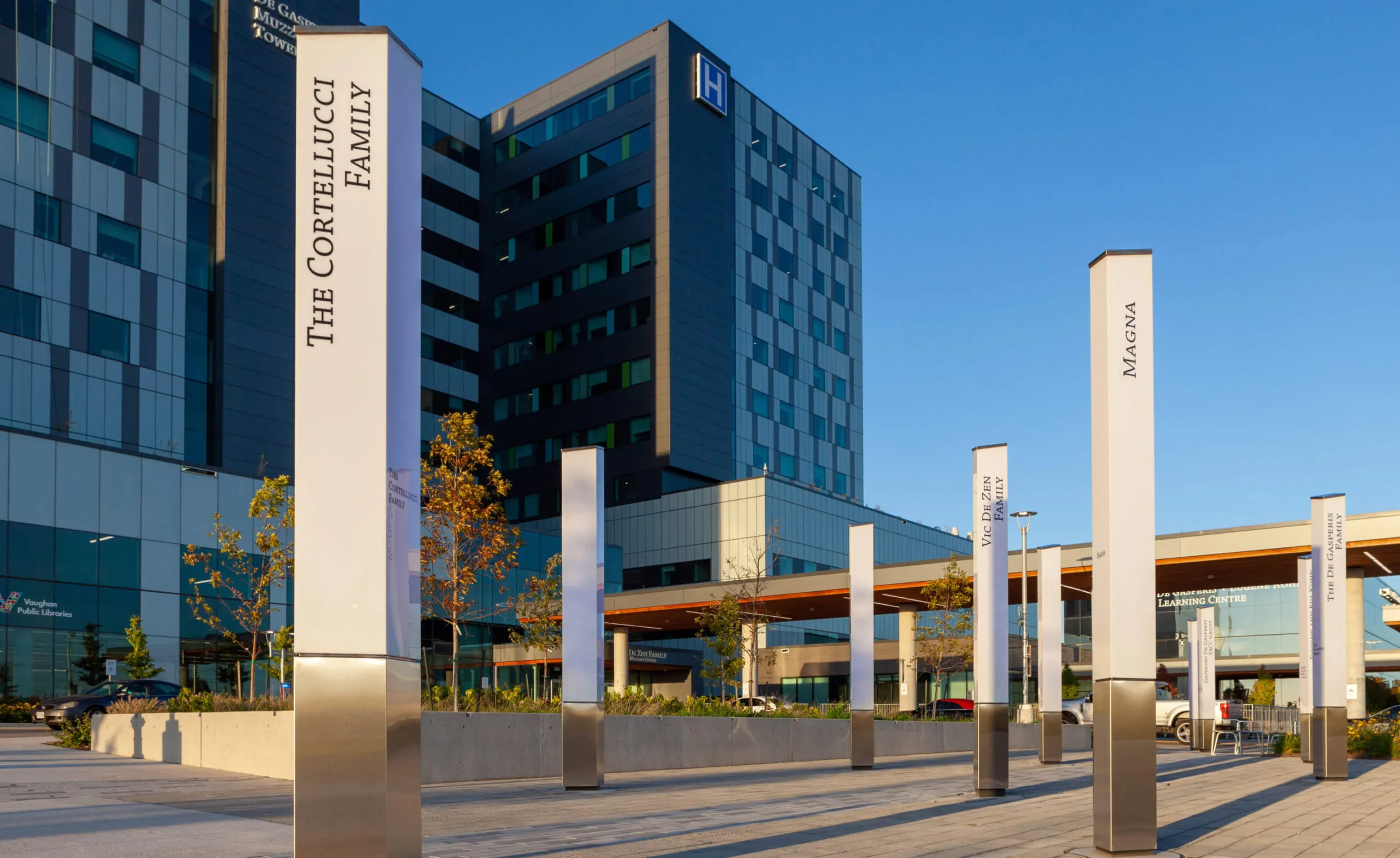
Modern hospital building with signage for The Cortellucci Family and other donors.
A garden of gratitude
Purple illuminated pillars with company name at sunset
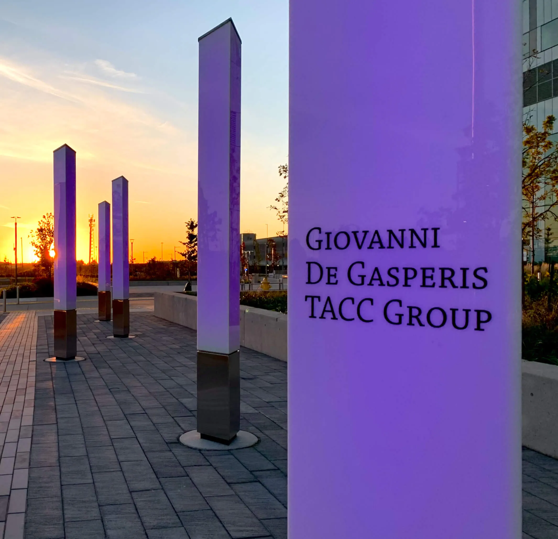
Purple illuminated pillars with family names at sunset.
Glowing recognition

An inspired donor-focused experience

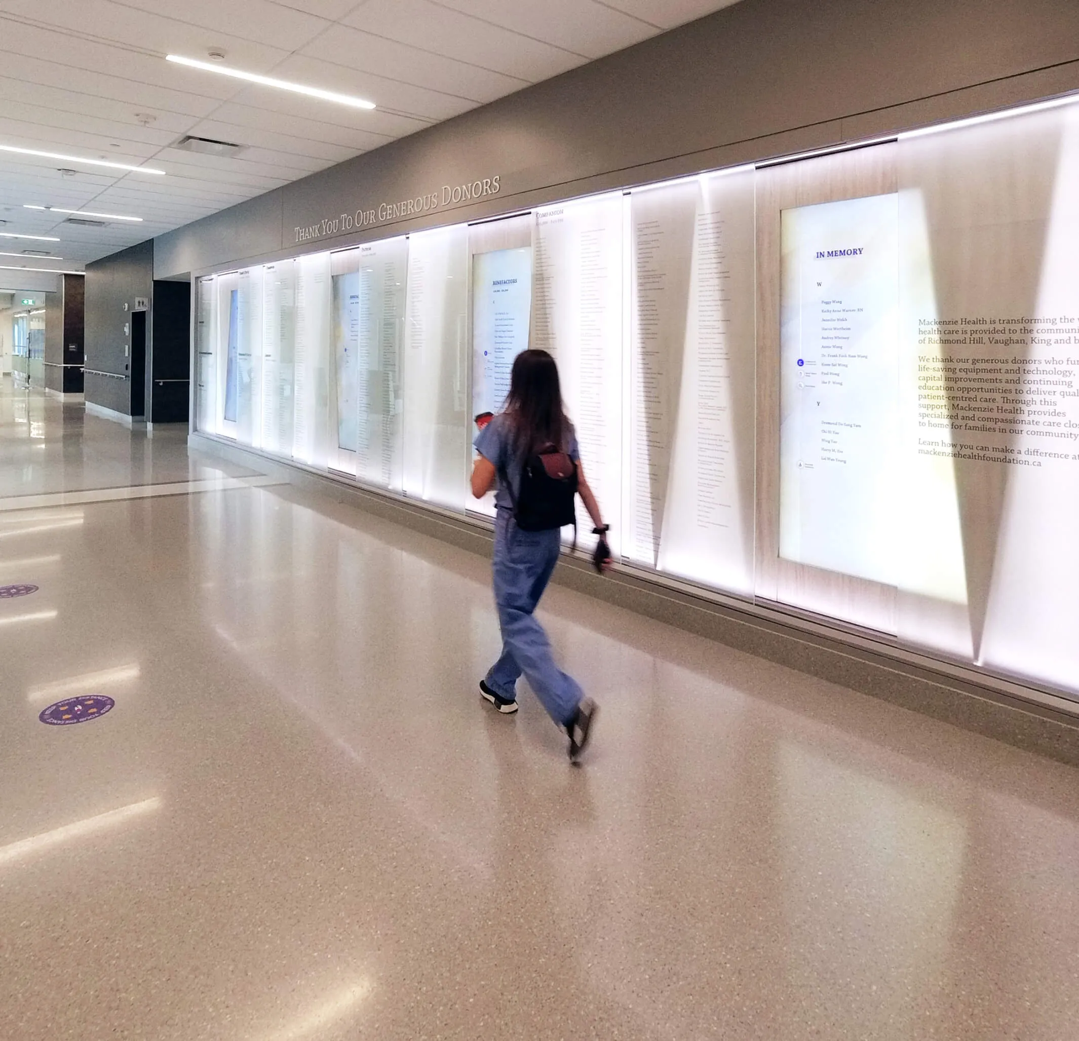
CVH’s commitment to providing innovative healthcare became a central theme that inspired the development of this large-scale donor program. From the integrated programmable LED plinths on the exterior to three unique digital donor walls on the interior and donor signage throughout the campus, this suite of applications creates a beautifully varied, yet cohesive expression of appreciation.

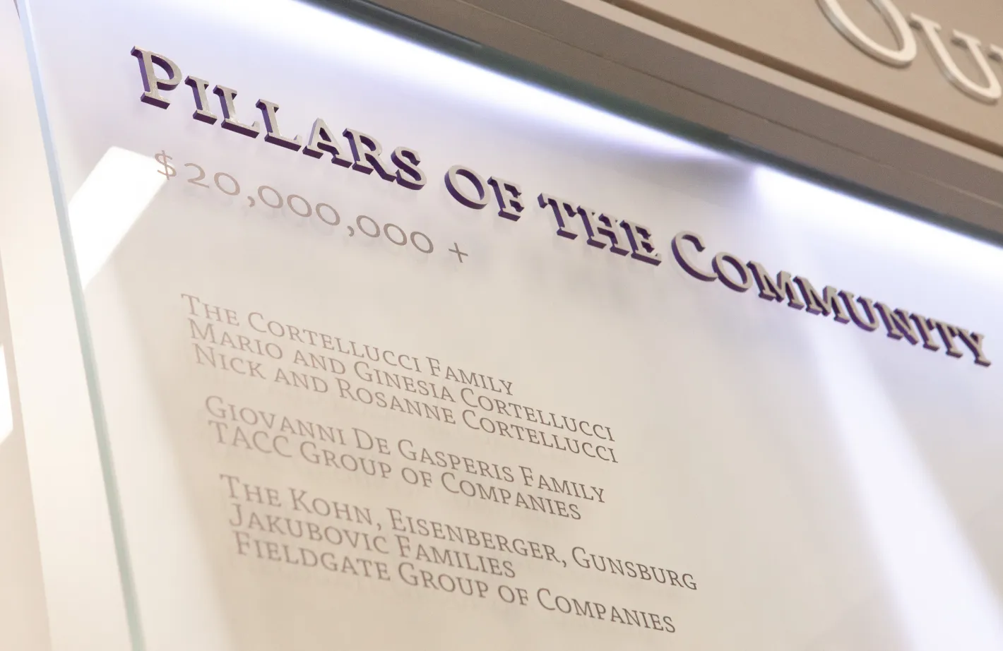
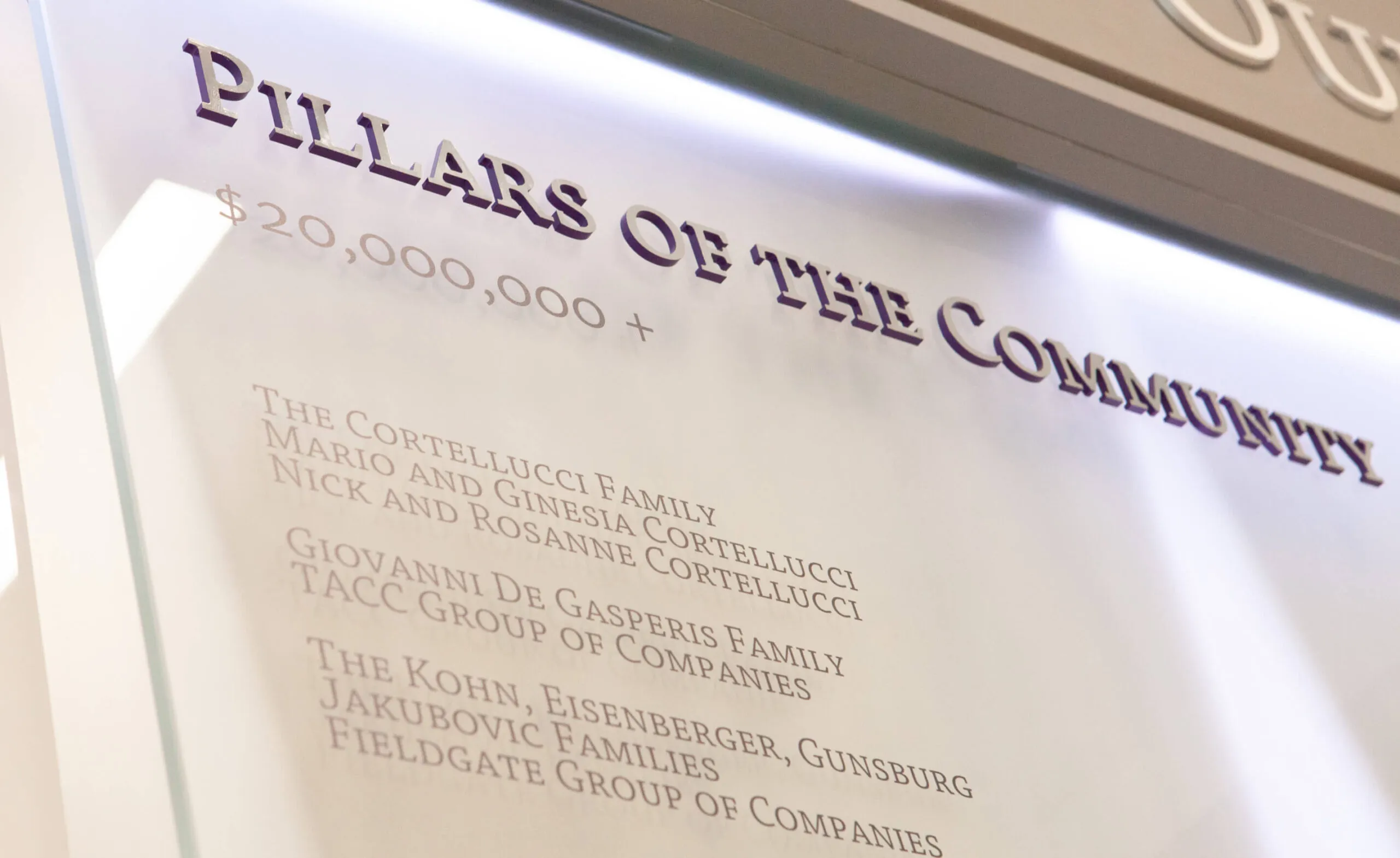
Pillars of the Community donation list with names and amounts.
Detailed view of donor recognition wall
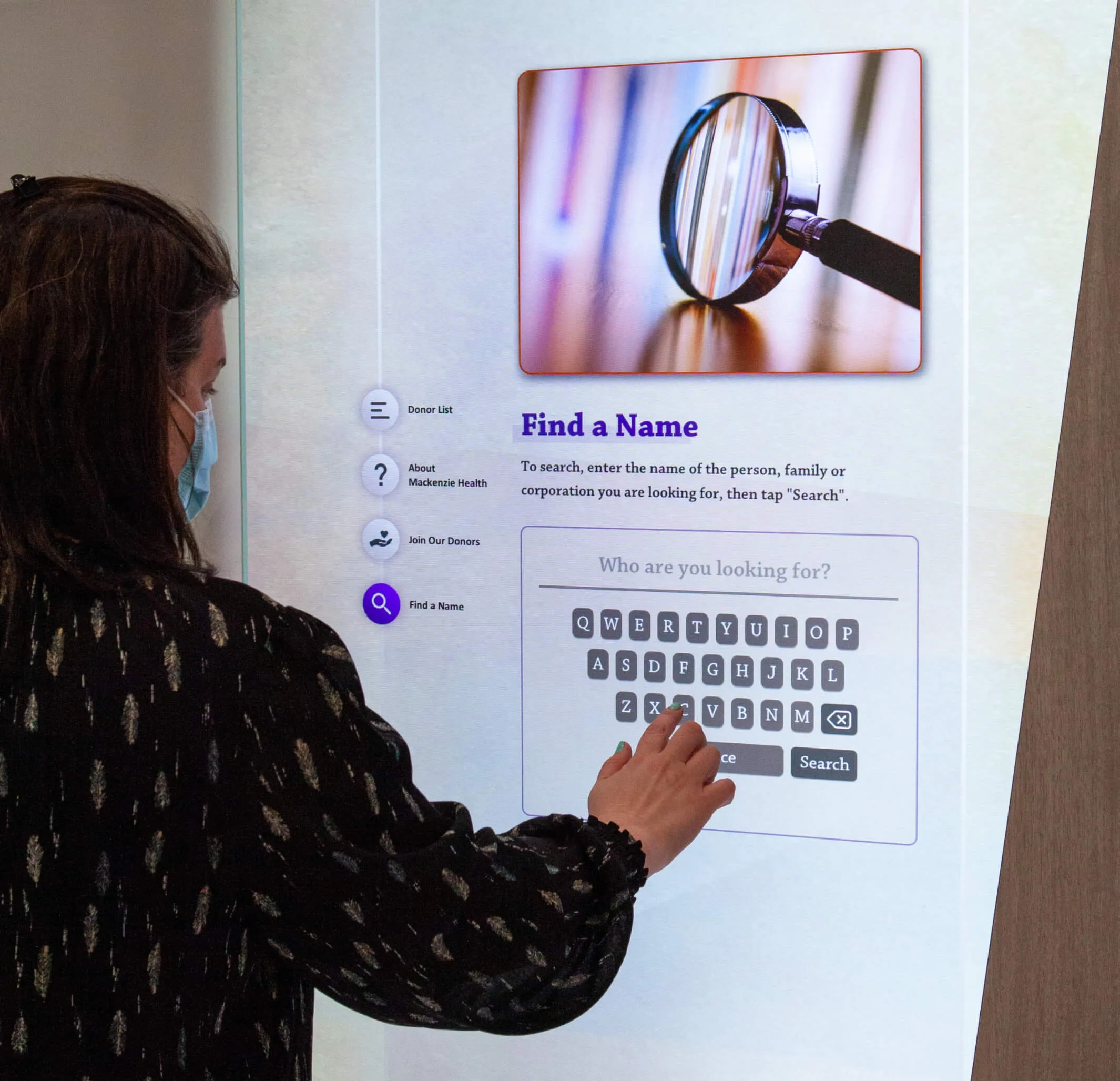
Woman using a touchscreen to search for a name on a digital display.
A person in scrubs walks past a wall of donor names in a hospital hallway.
Interactive donor recognition wall

Celebrating the wonder and joy of new beginnings

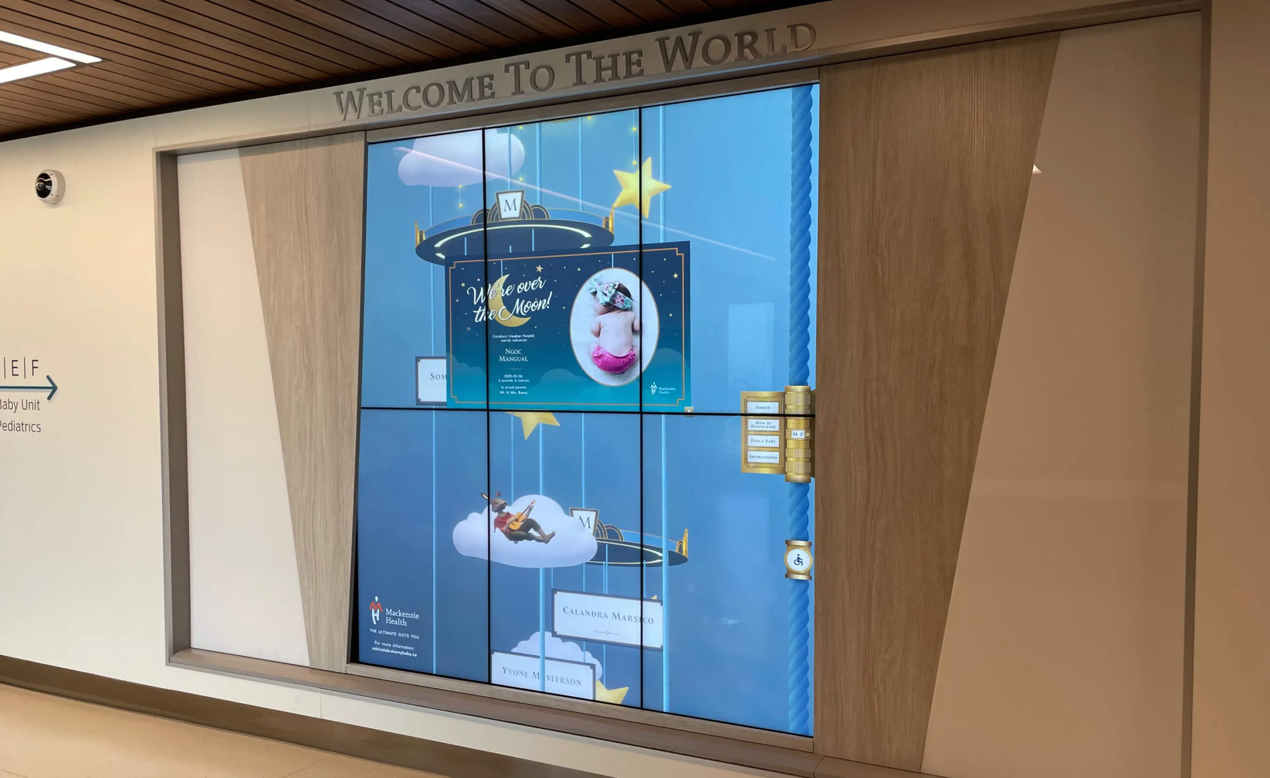
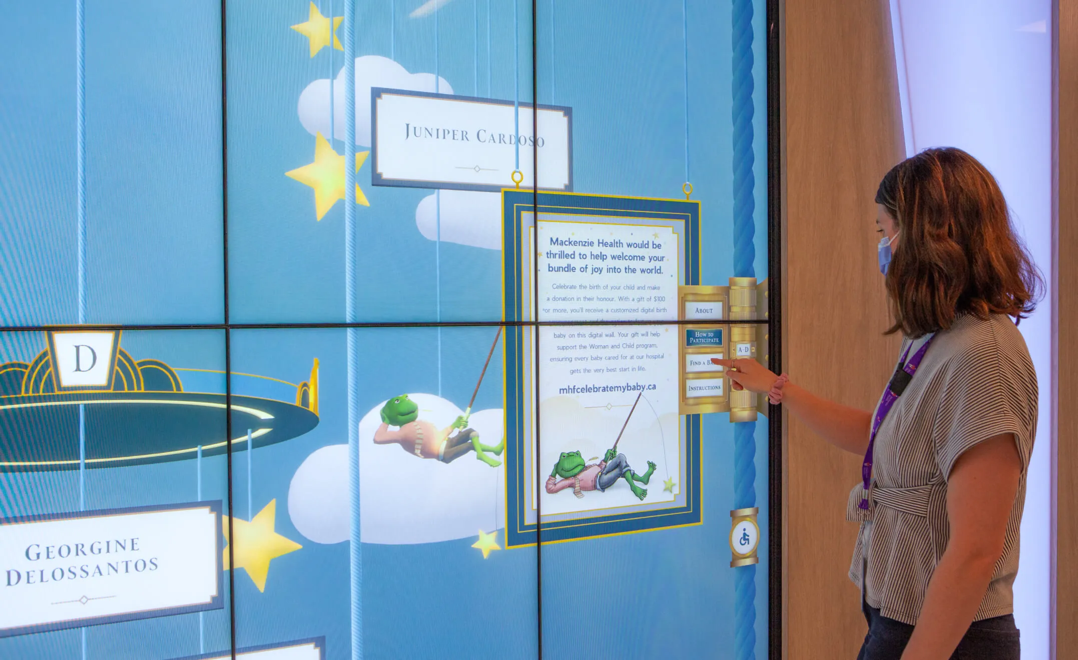
At the entrance to the maternity ward, families can commemorate and celebrate the arrival of their newborns. This large-scale display presents an interactive sky-themed mobile with baby name plaques hanging from its alphabetically categorized plates. Families can make a small contribution to showcase a personalized baby announcement, including the name, date, weight and photo of the child, triggered by tapping on the name plaques or using the user interface’s search function.

Digital display in a hospital lobby with
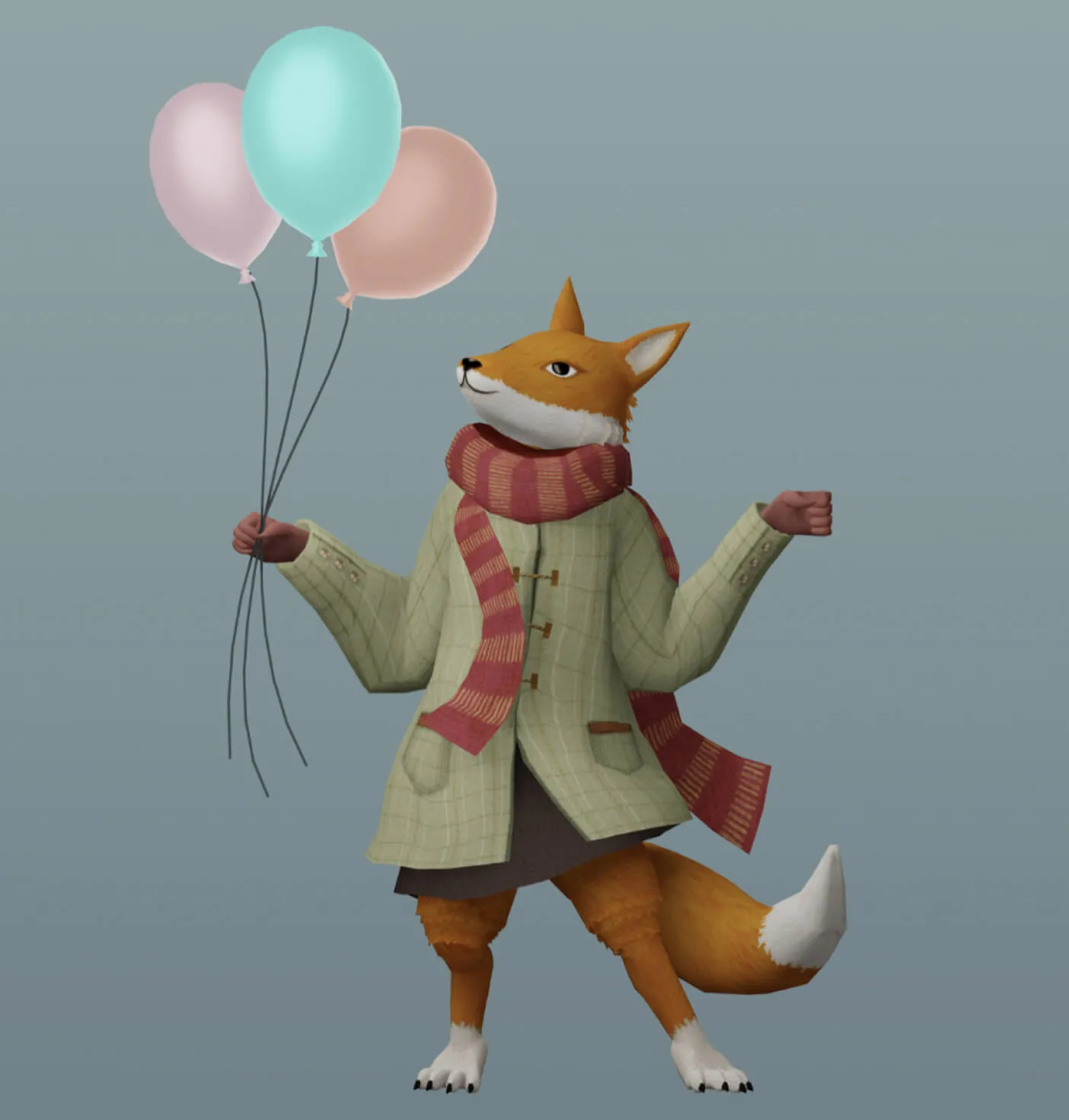
Anthropomorphic fox in a coat and scarf holding balloons.
A cartoon fox in a coat and scarf holds three balloons.
Character sketch and rendering design development
Woman interacting with a digital wall displaying baby names and donation information.
Large-scale display with baby announcements
  • 350 beds
  • 500 bed capacity
  • 1.2M sq. ft. hospital campus
  • 11 storeys
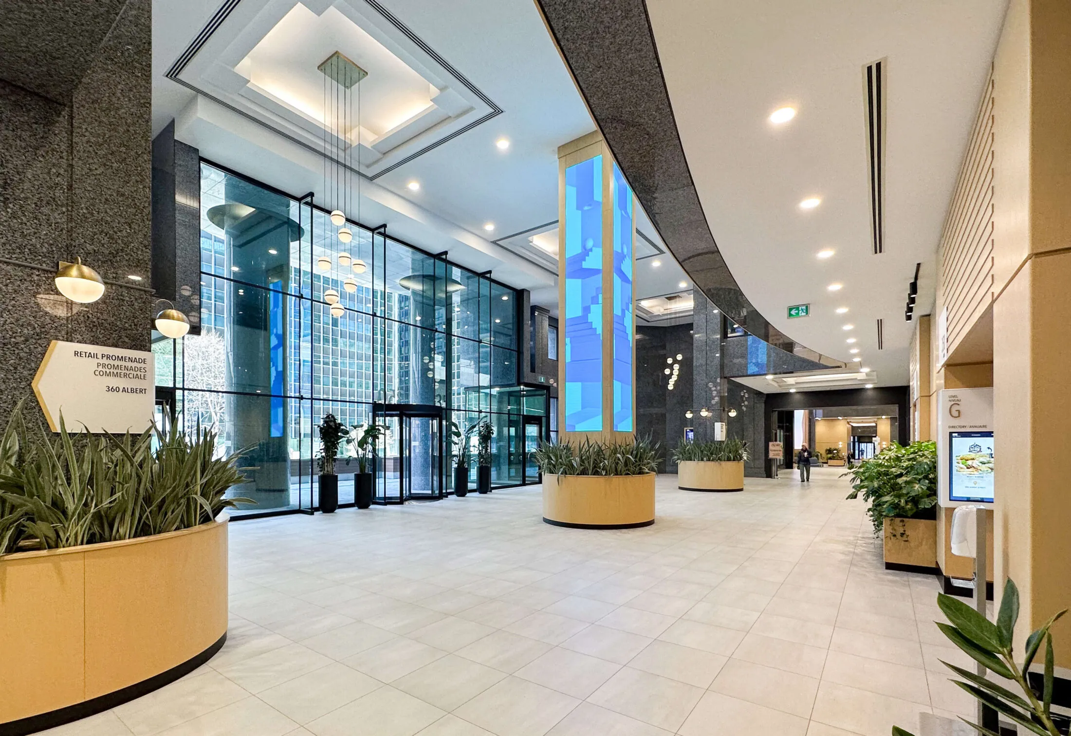
Modern office building lobby with large glass windows, plants, and a digital directory.

Constitution Square

Services Deliverables
  • Logo
  • Brand Guide
  • Illustration
  • Hoarding
  • Brochure
  • Motion Graphics
  • Social Media
  • Kiosk
  • Signage
  • Wayfinding
  • Art Installation
  • Marketing Materials
  • Placemaking
  • Masterplan
  • Video Production
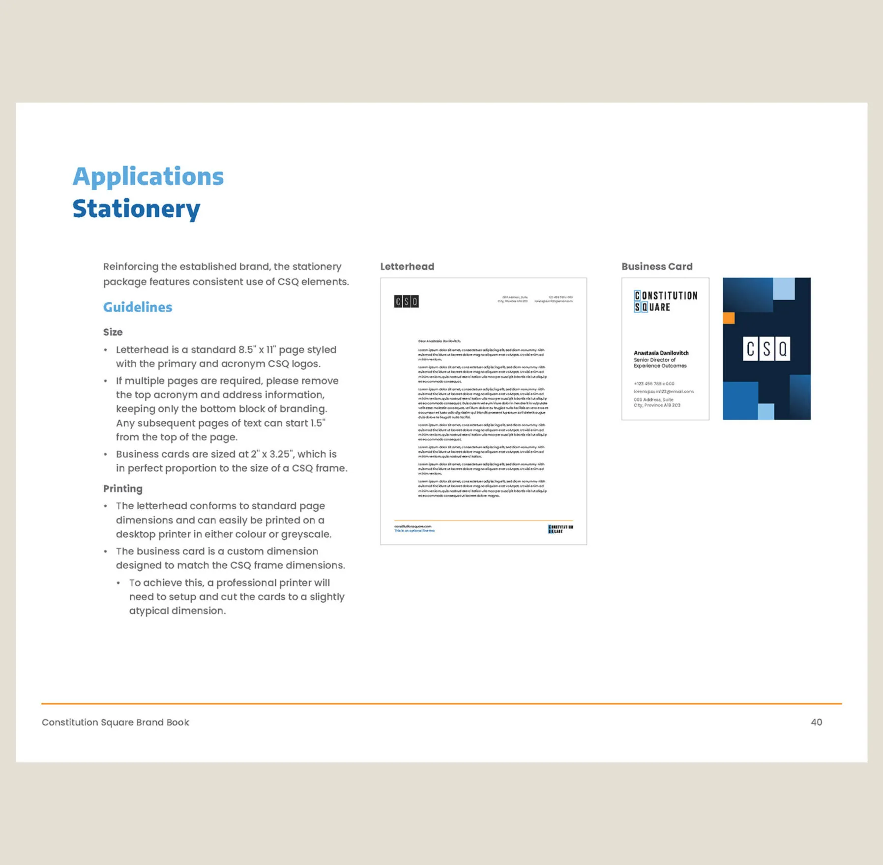
  • Stationery
  • Website

Reimagining a workplace experience for a new era

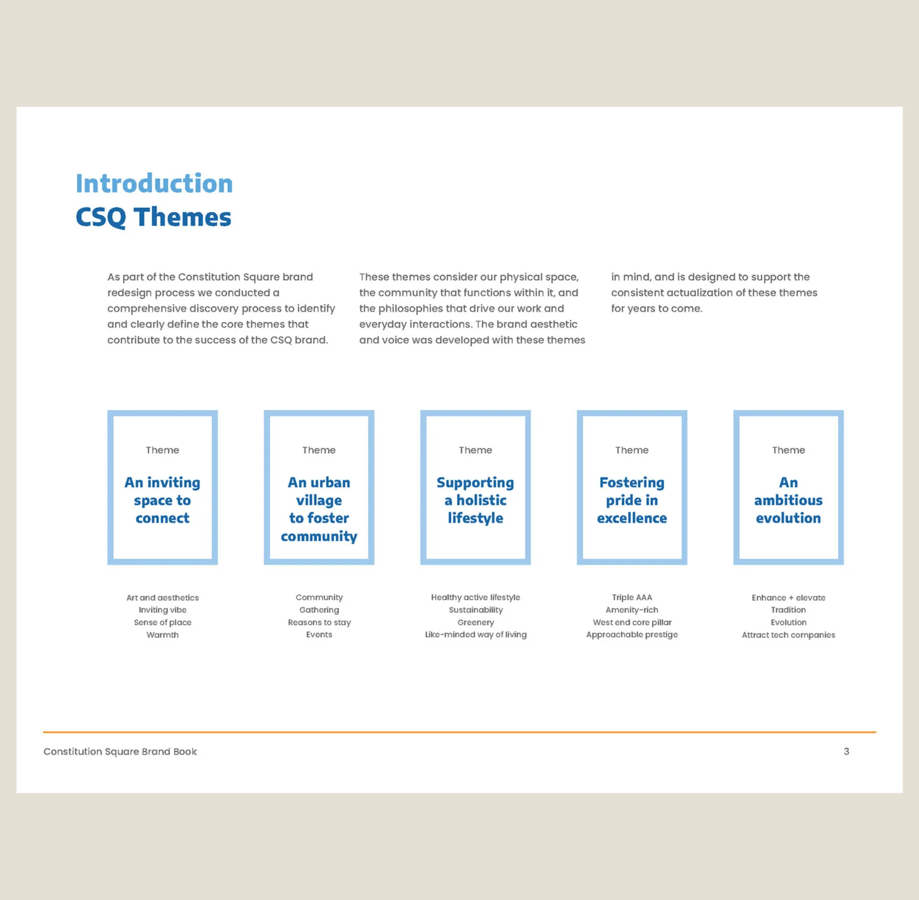
Constitution Square is an upscale office complex in the west end of downtown Ottawa, Ontario. It is an amenity-rich space that promotes connectivity and fosters community while conveying a sense of pride in supporting the ever-changing workplace experience. The Canderel team looked to Forge to bring this vision of a holistic workplace to life through brand, physical and digital signage, interactive displays, and digital public art.

A playful logo for a serious office building
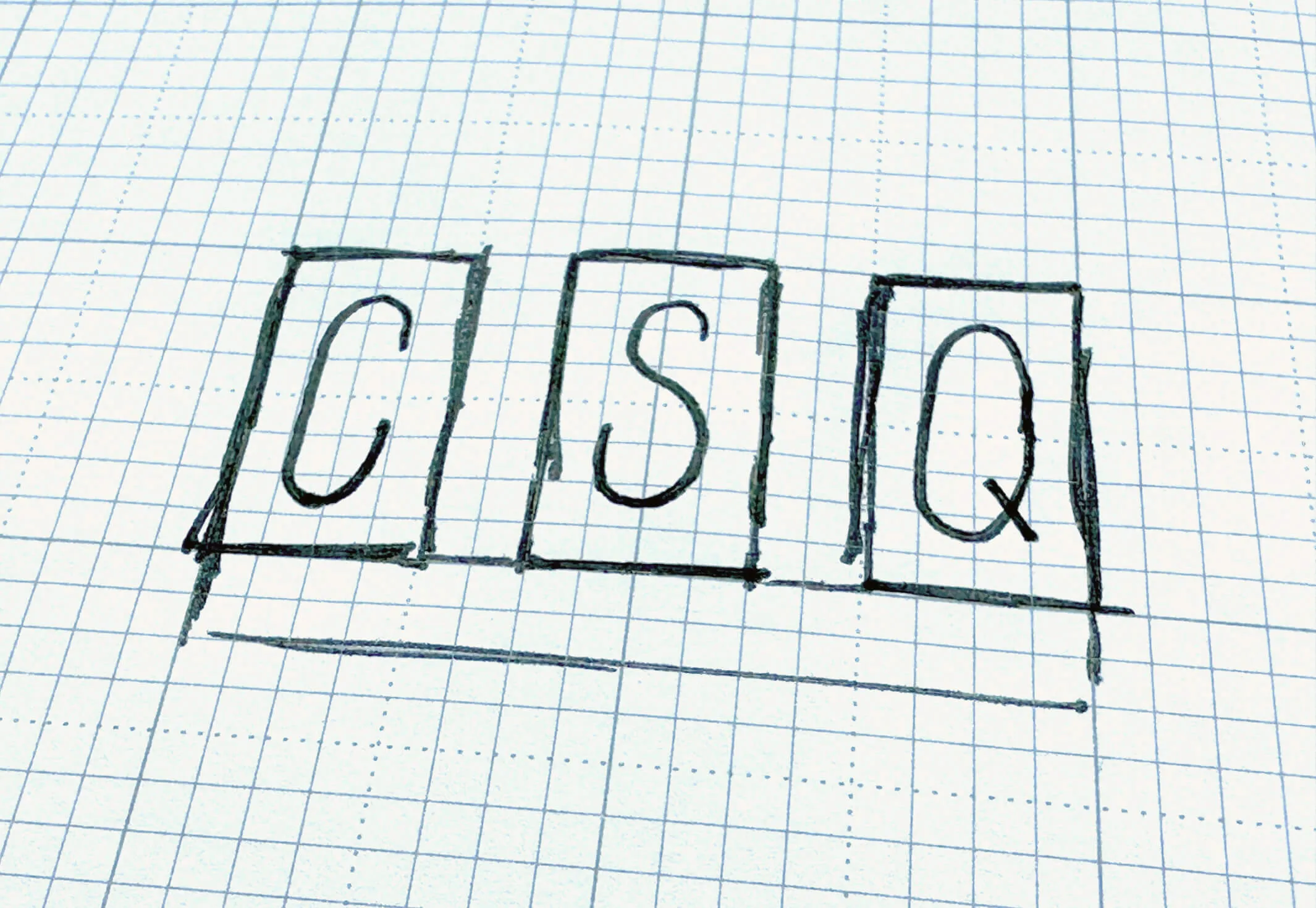
A preliminary sketch for the CSQ logo
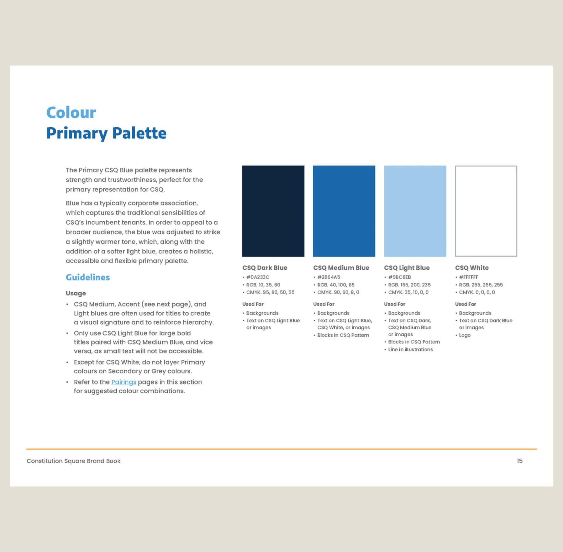
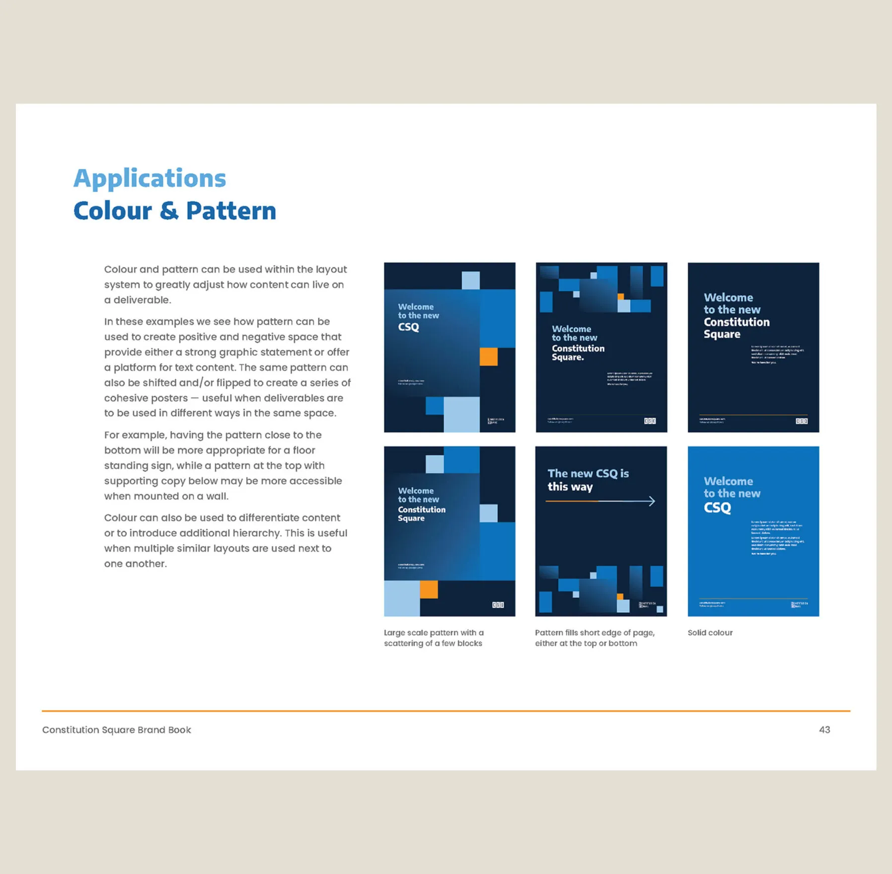
Colour palette with dark blue, medium blue, light blue, sky blue, orange and beige stripes.
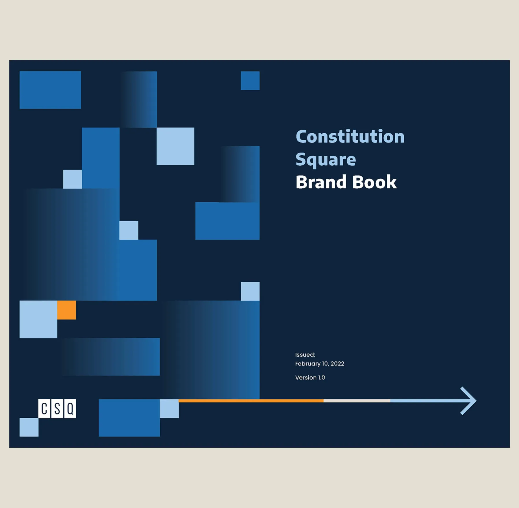
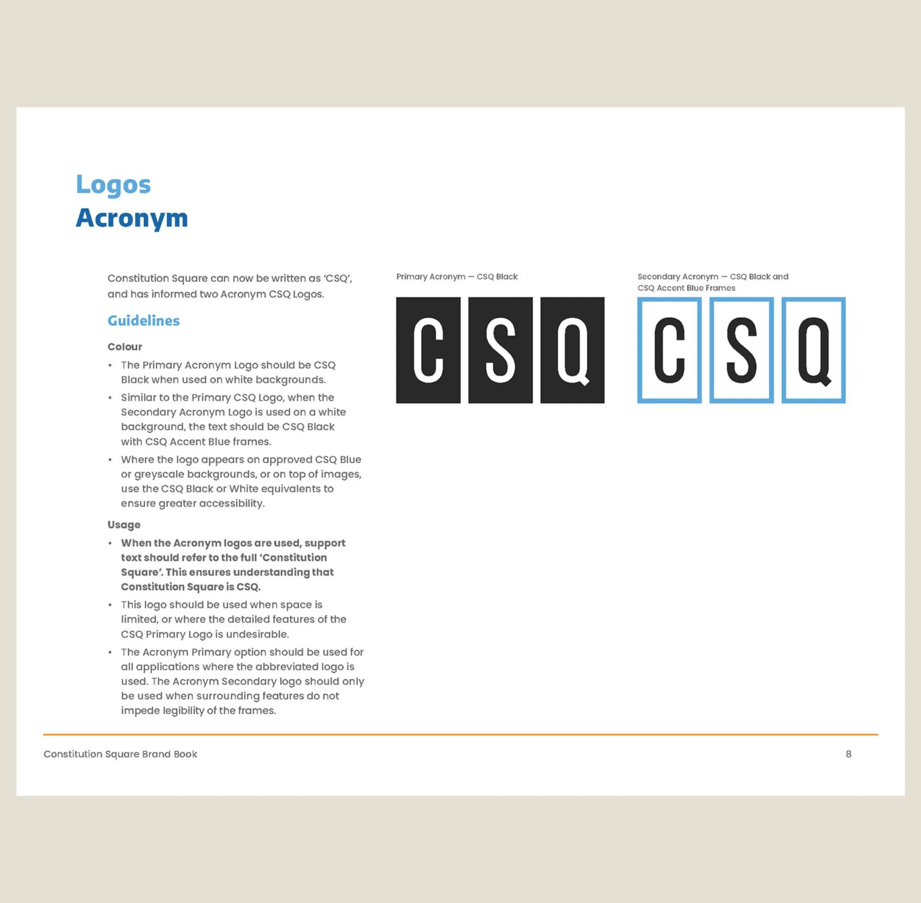
Logo inspired by the three towers of the building and a simple colour palette to support the brand
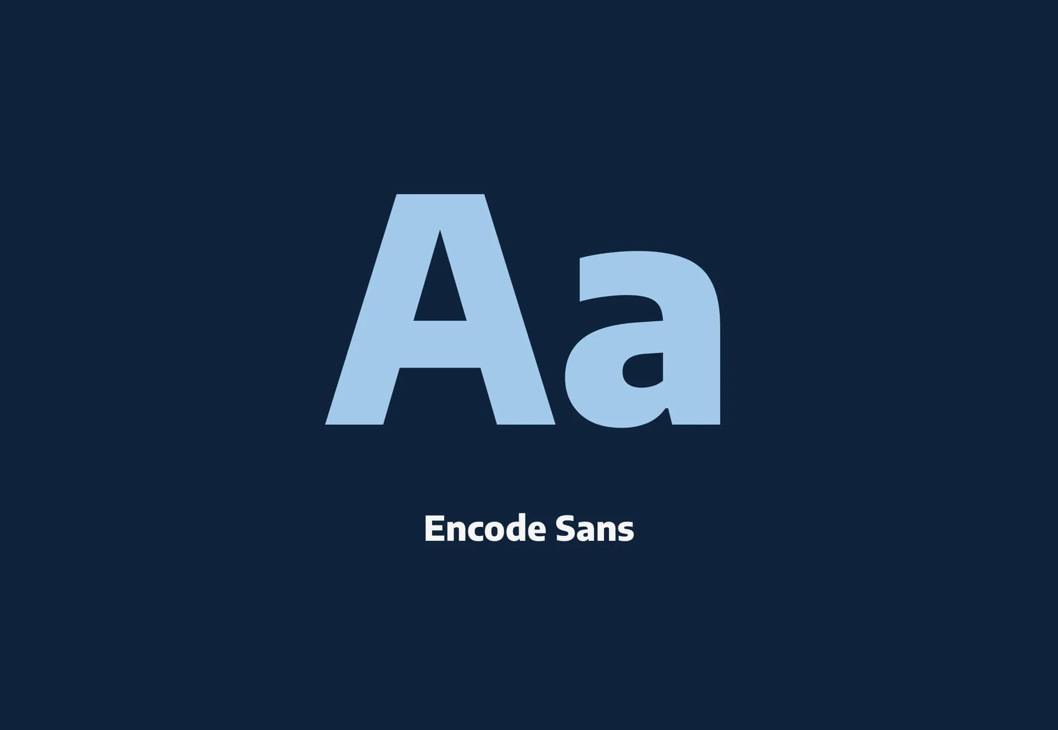
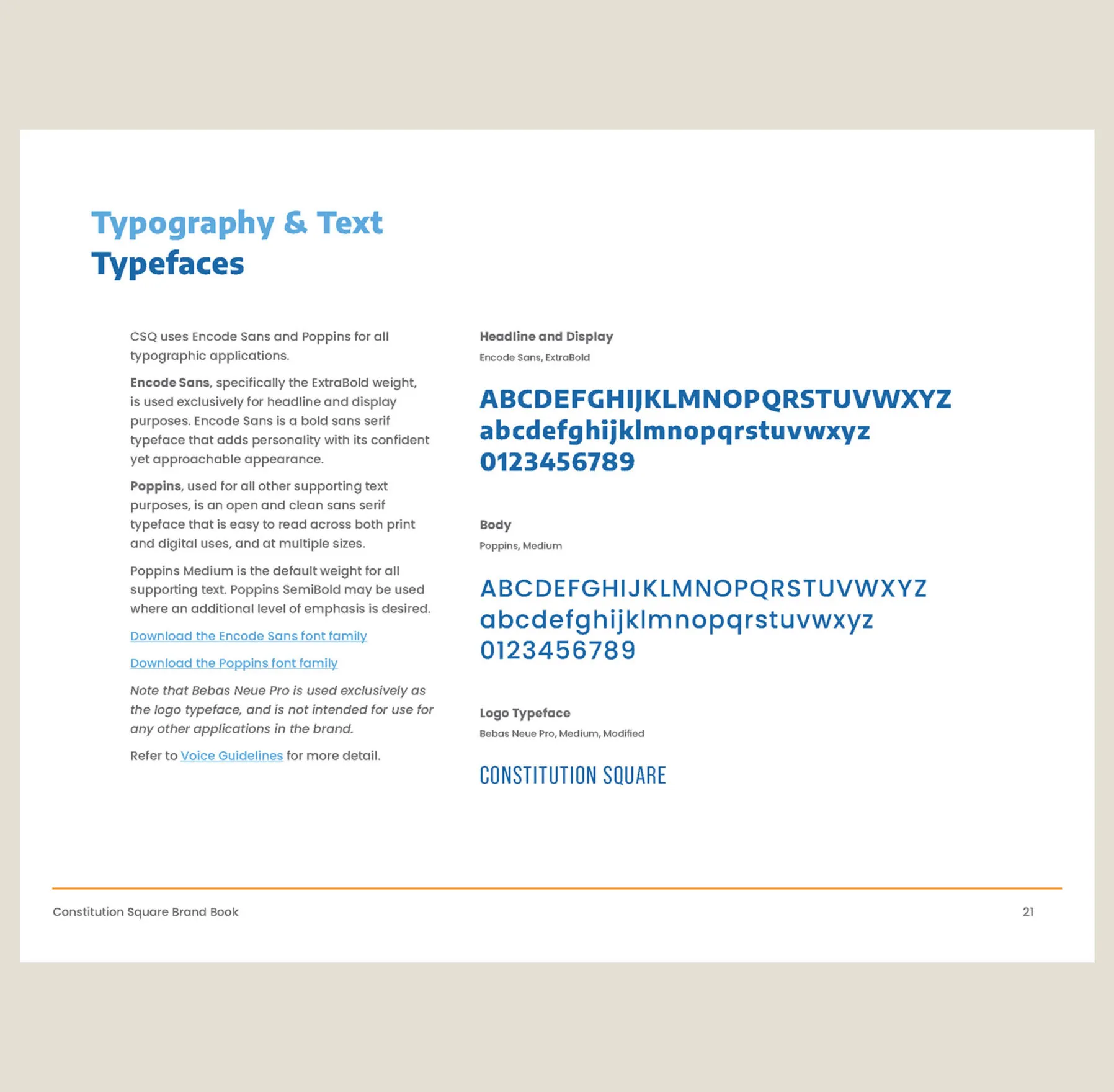
The Encode Sans font family, shown with large
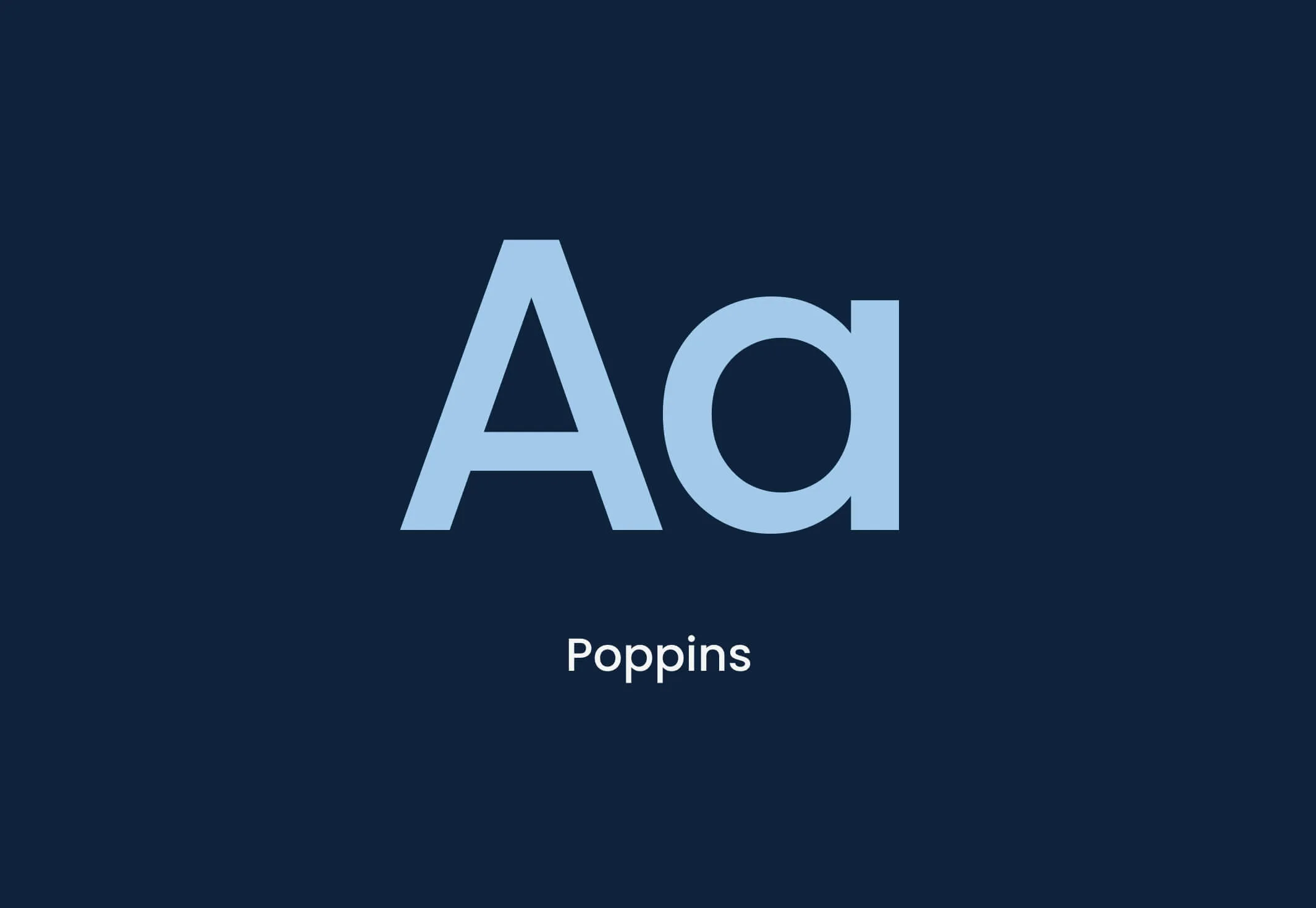
The Poppins font displayed with the letters Aa and the word Poppins.
Ownable typography to define all communications

Communicating an evolution to a modern audience

The newly established brand adds a sense of liveliness and forward-thinking reflected in the building’s vision—adopting a more casual tone of voice and a visual identity that is modern, friendly and relatable.
Minimalist illustration of a bicycle with orange frame and blue wheels on a dark blue background.
Abstract illustration of two overlapping chairs in orange and blue outlines on a dark blue background.
Custom illustrations to communicate all things about the brand
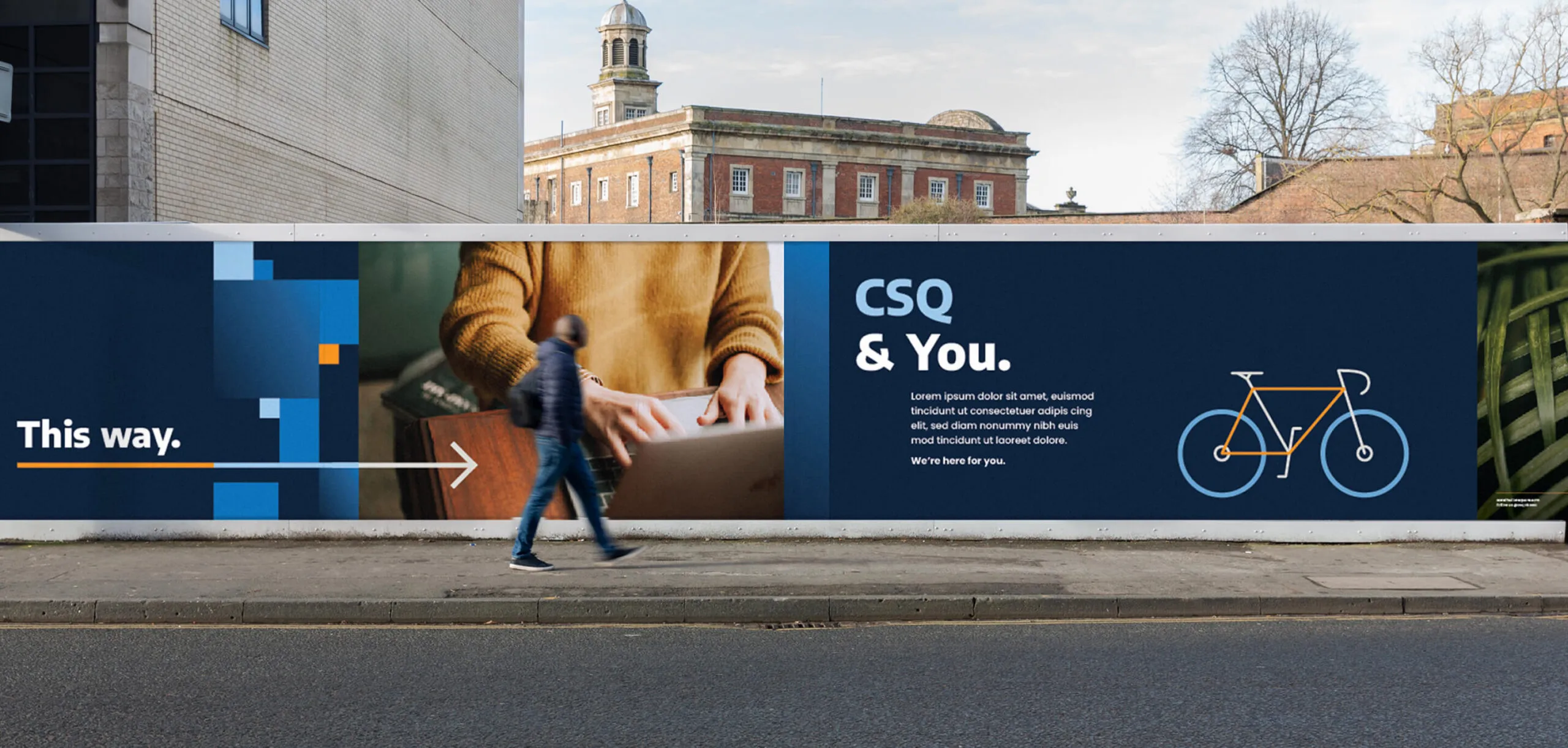
A banner with
Bold hoarding to build suspense during construction
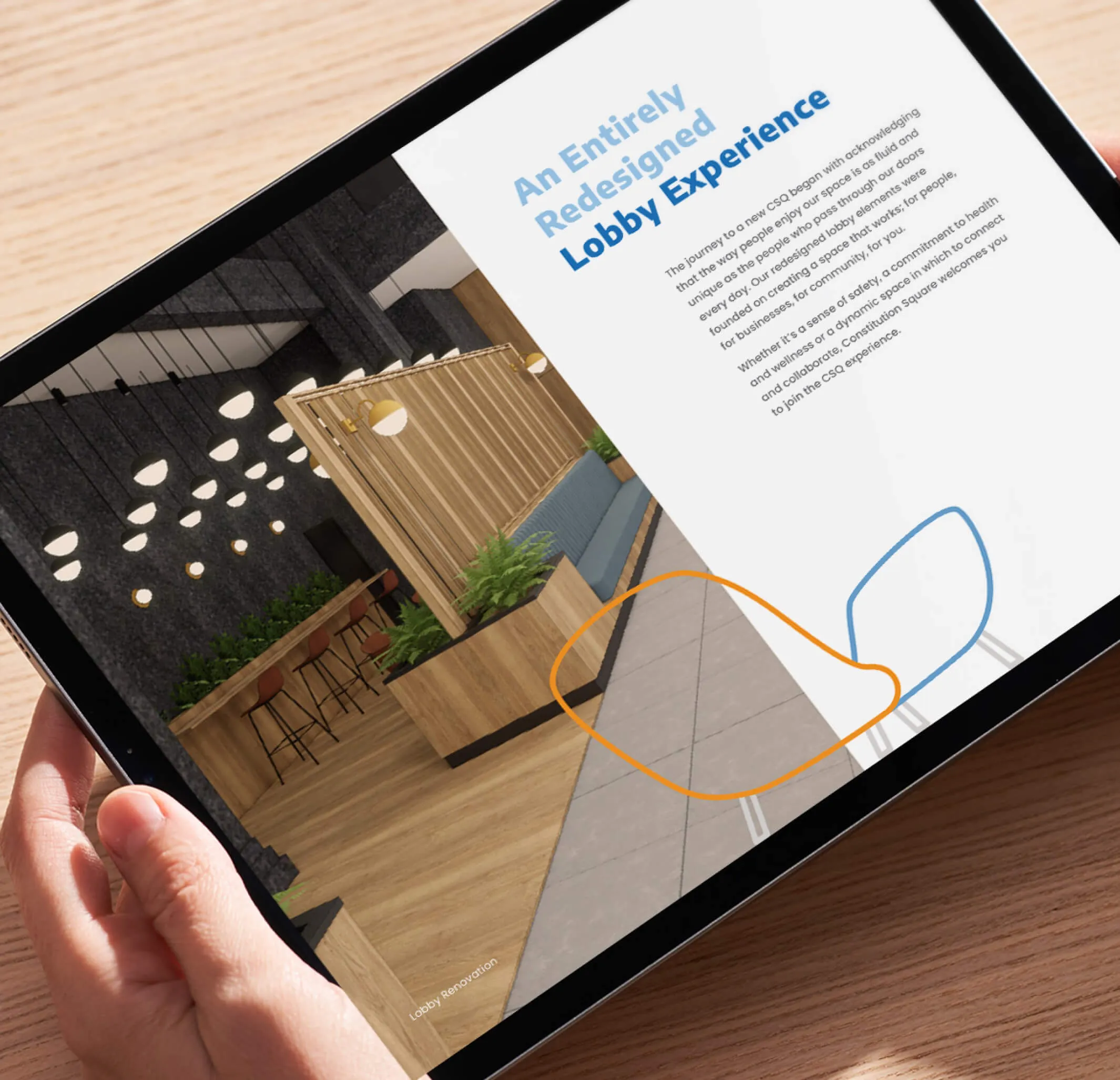
Tablet displaying a modern lobby renovation with text
Digital brochure for sales team
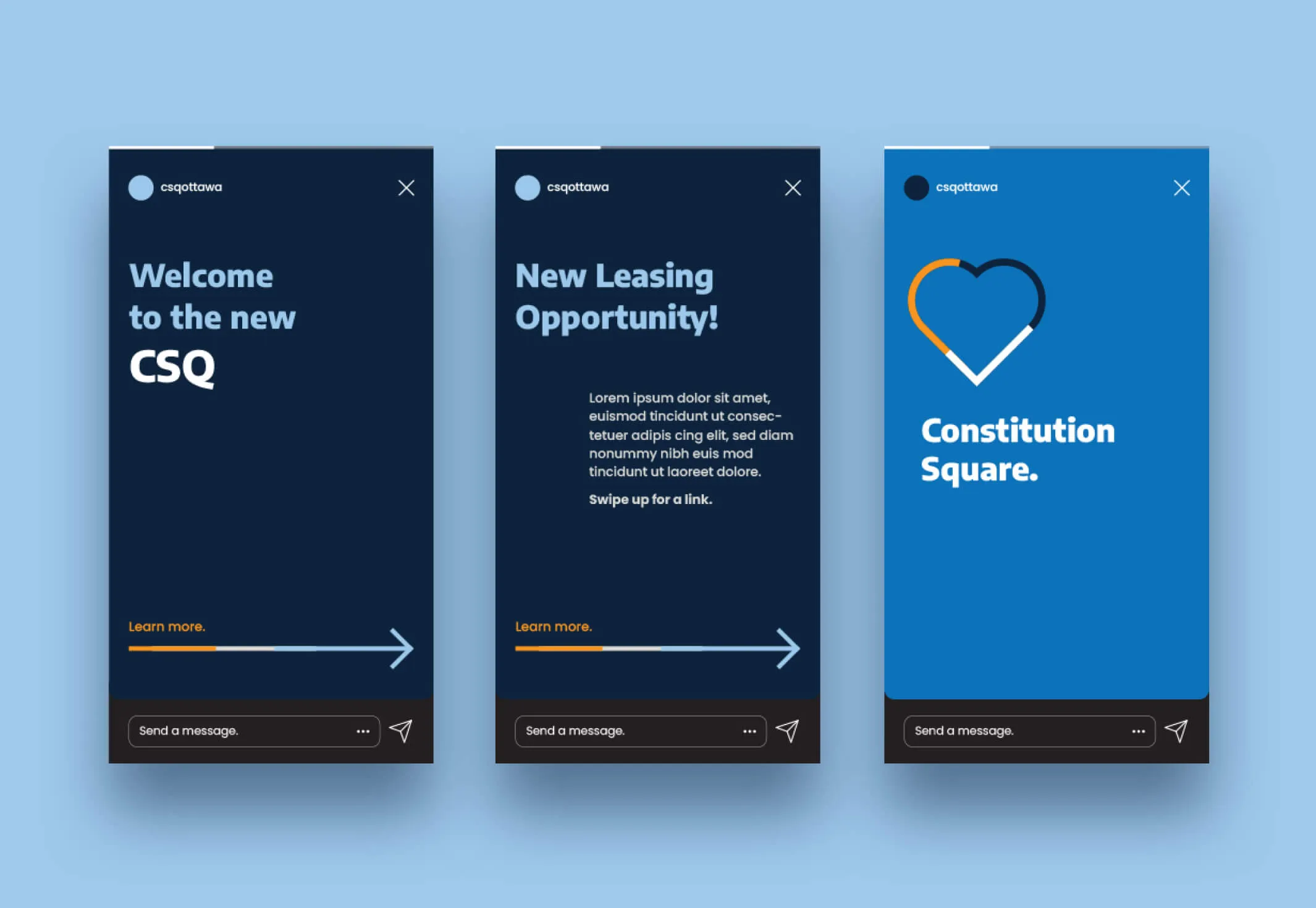
CSQ Ottawa social media story ads promoting the new Constitution Square
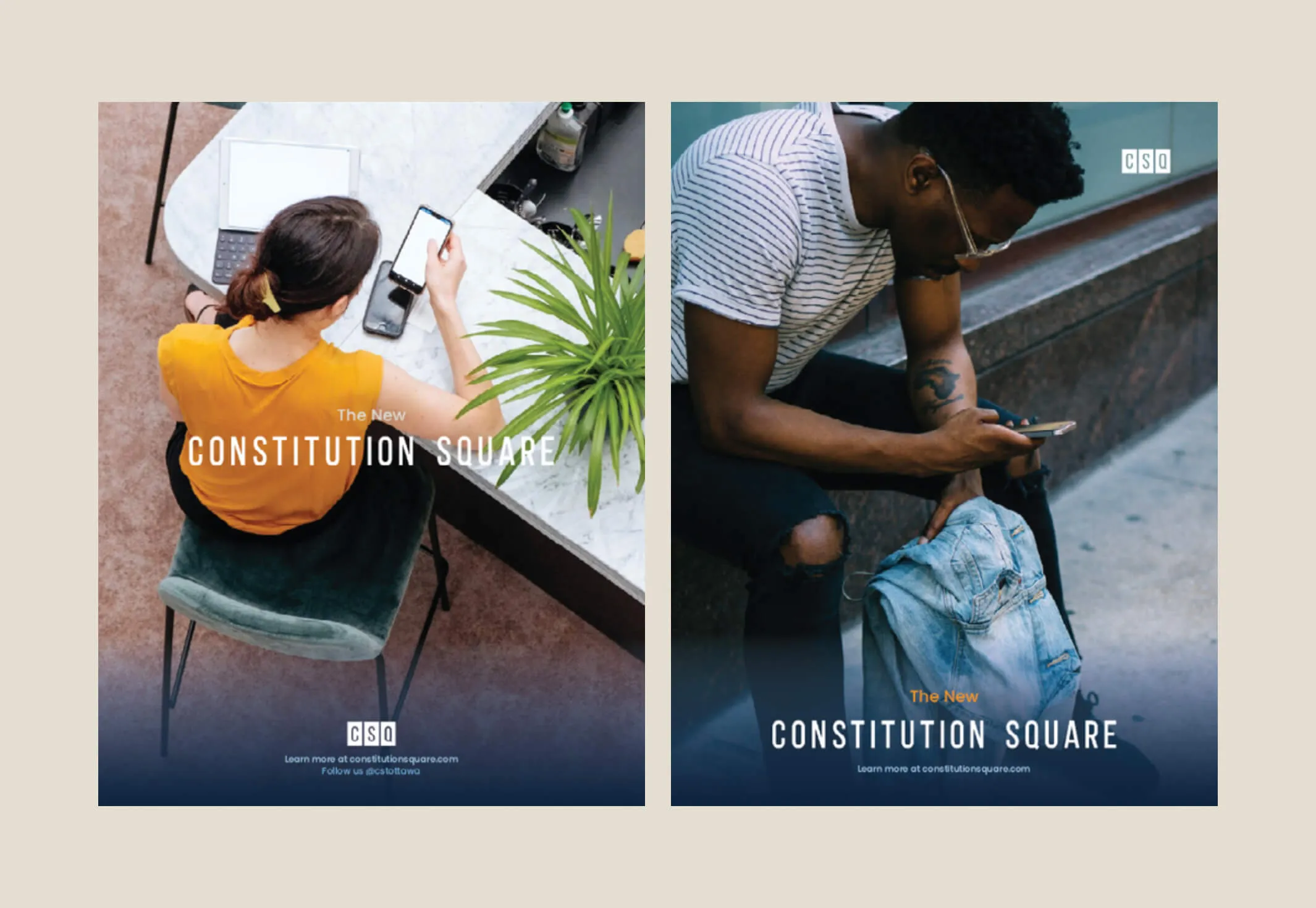
Two split images advertising Constitution Square, one with a woman at a table and the other with a man holding a jacket.
Social media and poster campaign to promote the changes

Establishing a strong sense of community and space

Our team developed design solutions that ensured an intuitive understanding of the connectivity of the three towers throughout the newly renovated concourse. The foremost opportunity was to create a strong sense of place and clear awareness of which of the three towers you were in, regardless of which entrance was used.

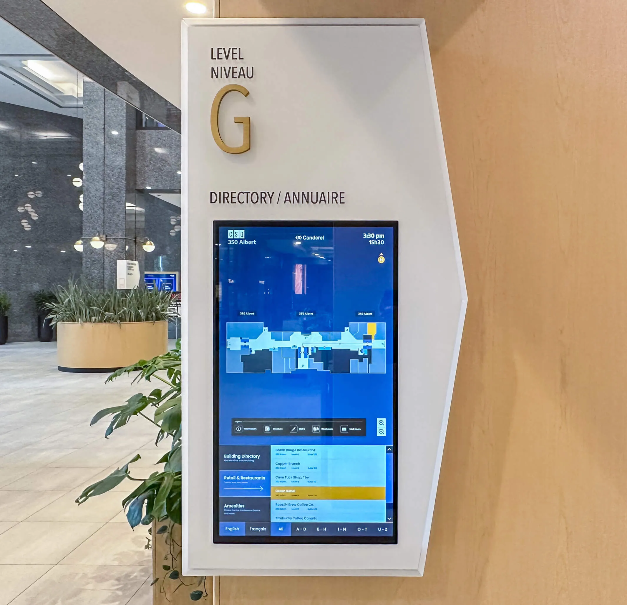
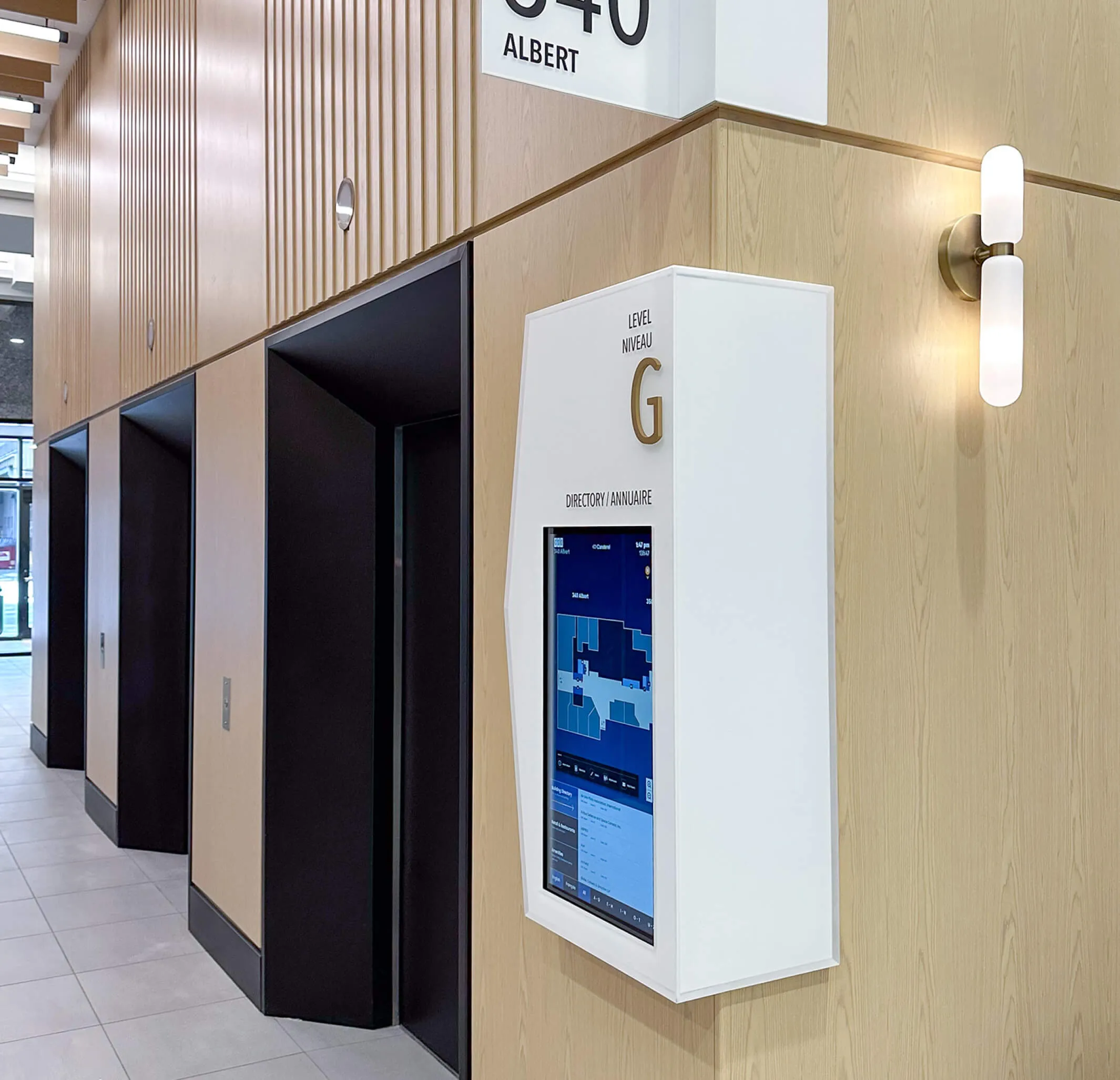
Digital directory sign for Level G at 350 Albert, showing a floor plan and business listings.
Modern building directory and elevators with wood paneling and contemporary lighting.
Interactive building directory integrated into signage program
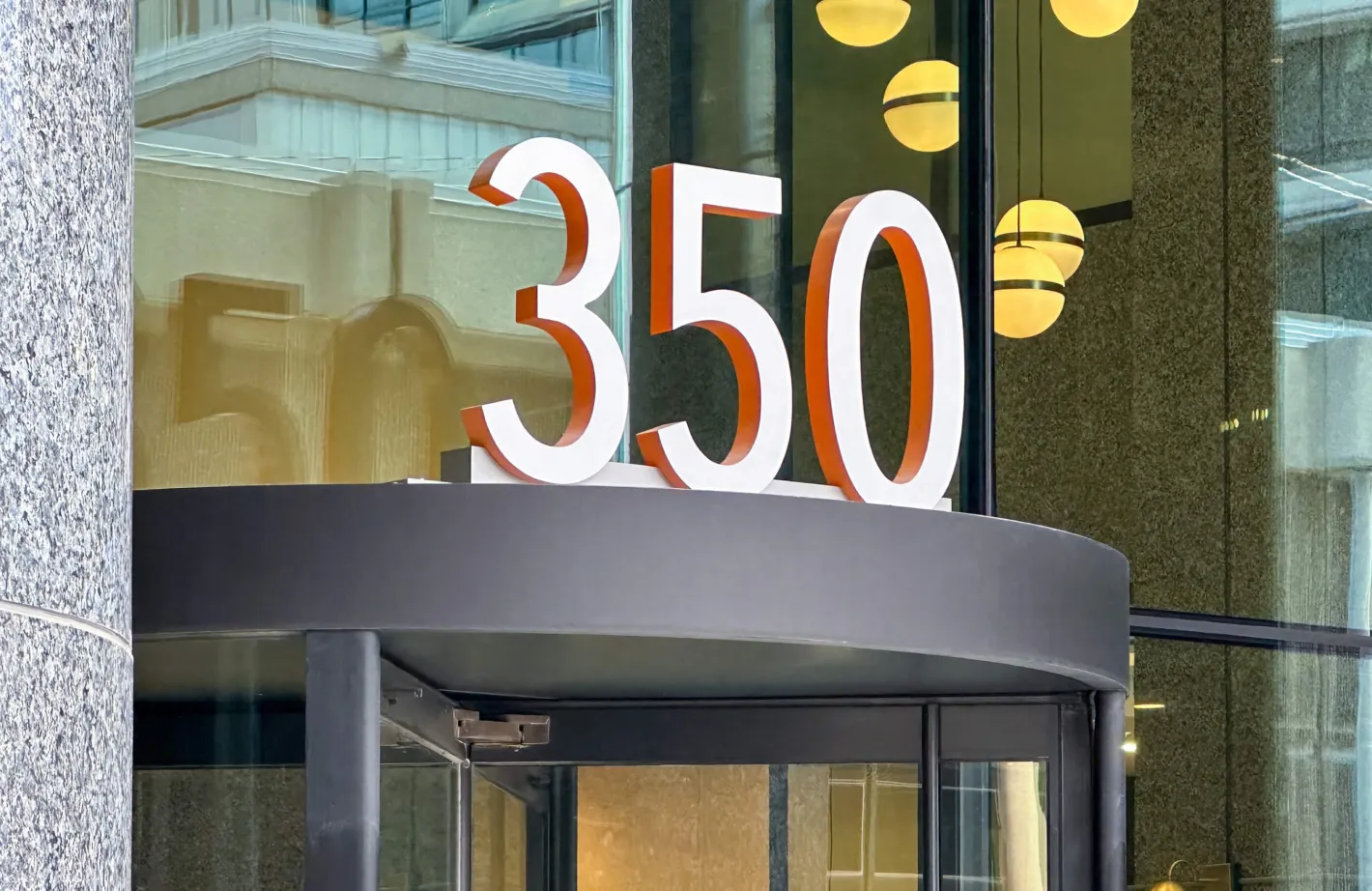
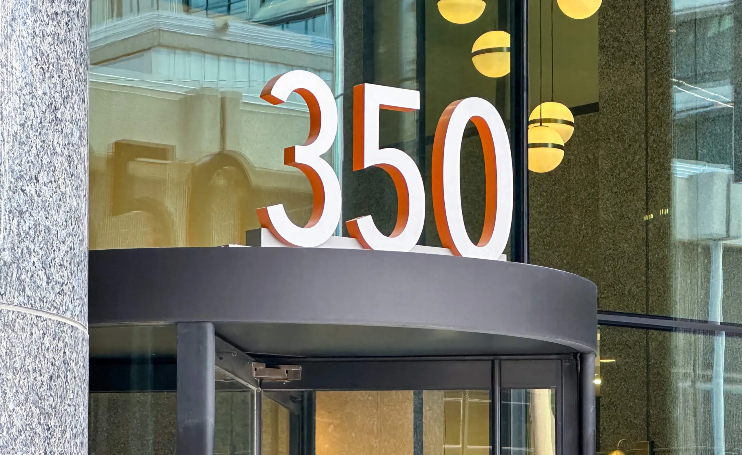
Building entrance sign with large white numbers
Bold signage to identify each of the three towers
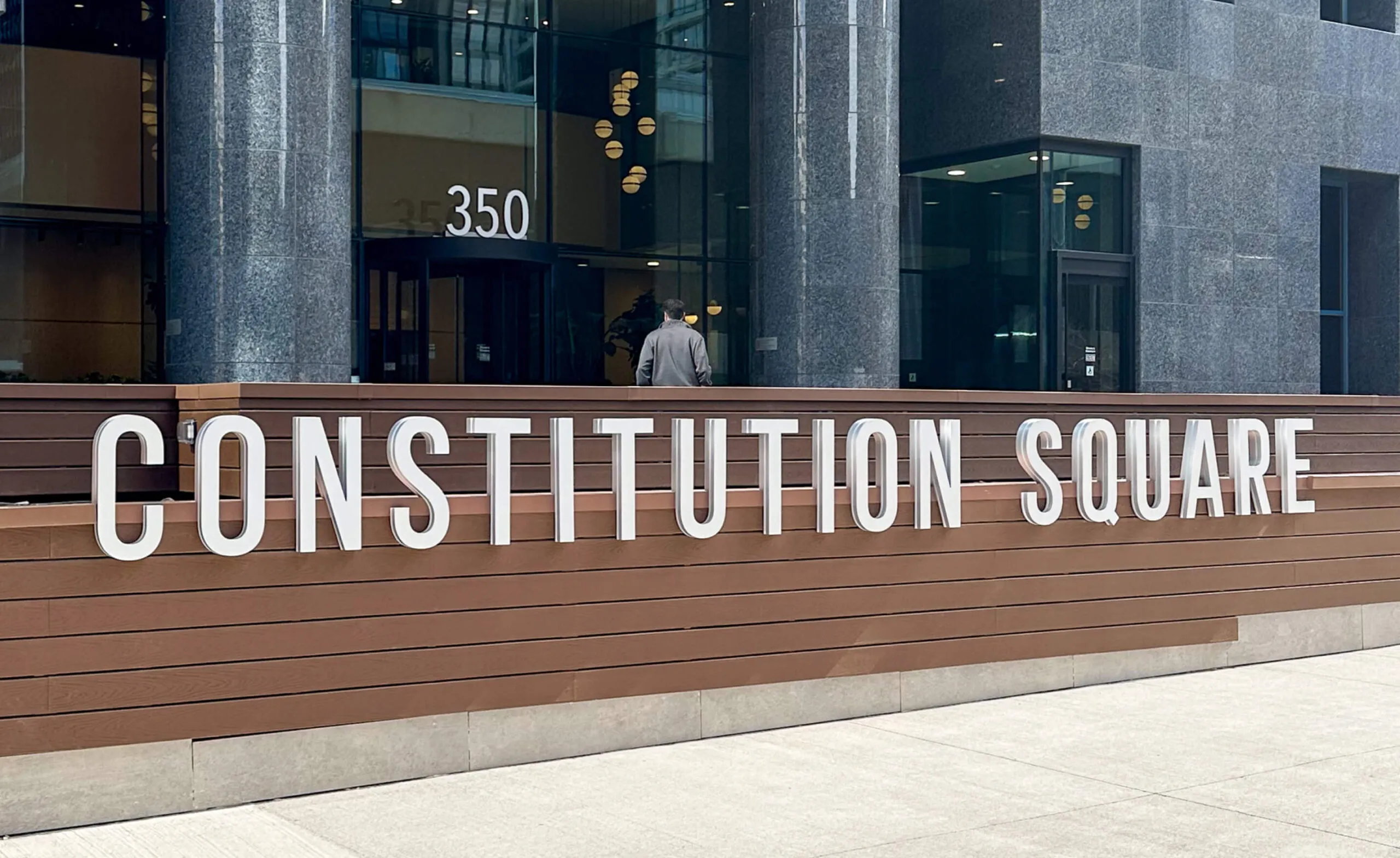
Constitution Square building sign with 350 address and revolving door entrance.
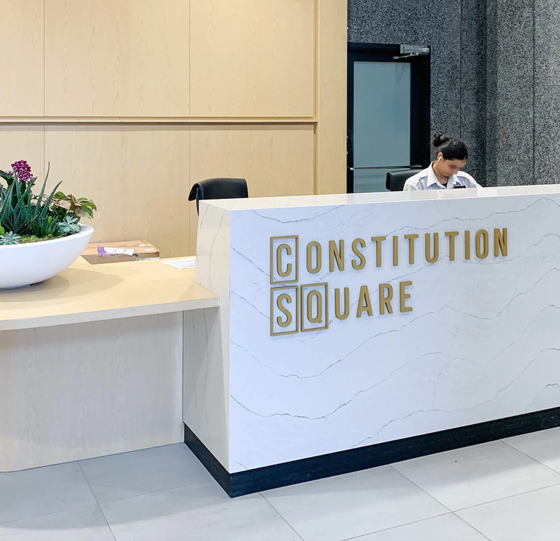
Reception desk with
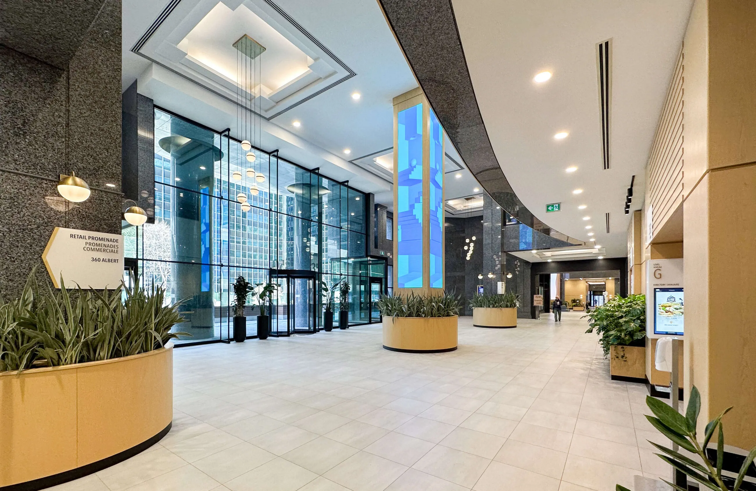
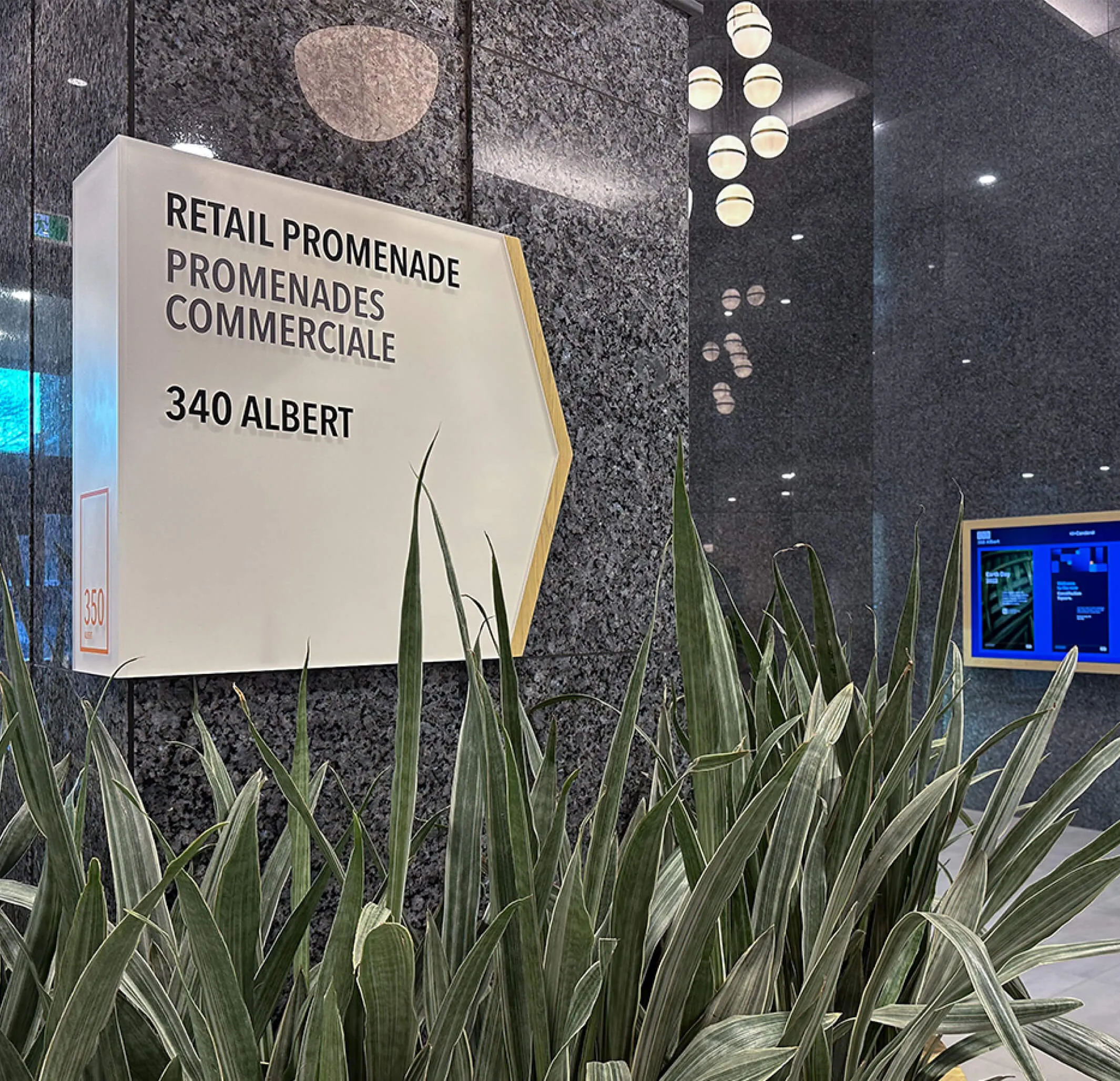
Sign for Retail Promenades Commerciales at 340 Albert, with plants in foreground.
Consistent signage application throughout the entire building complex

Art as a reflection of brand values

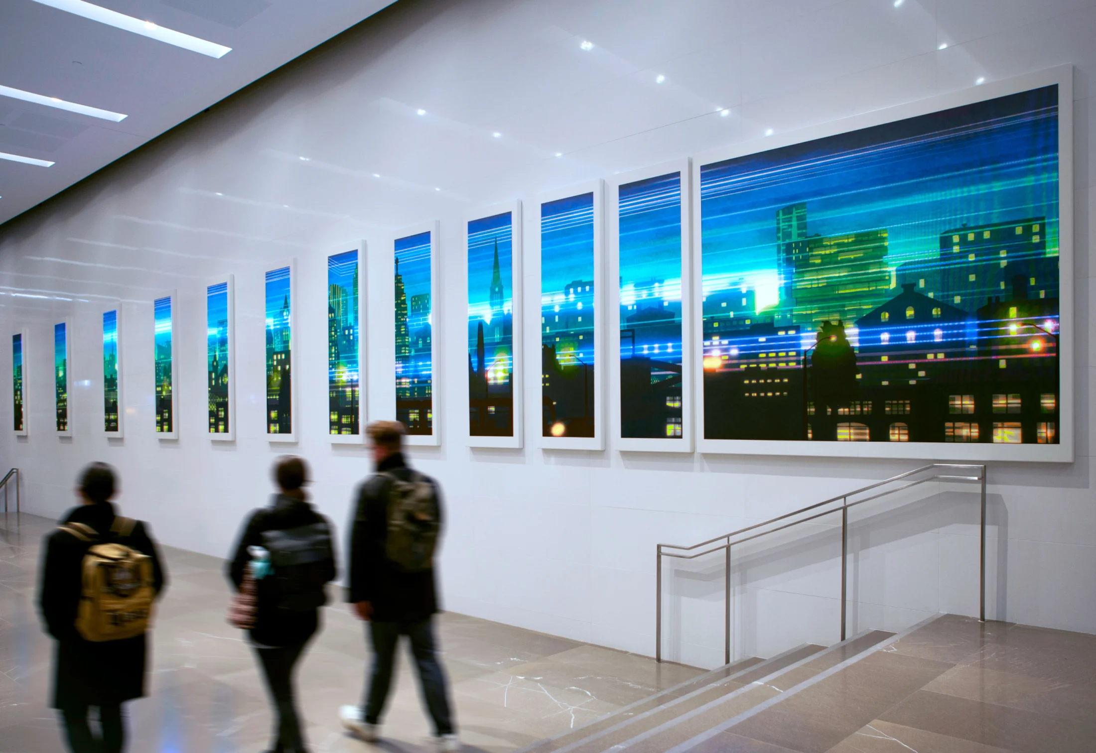
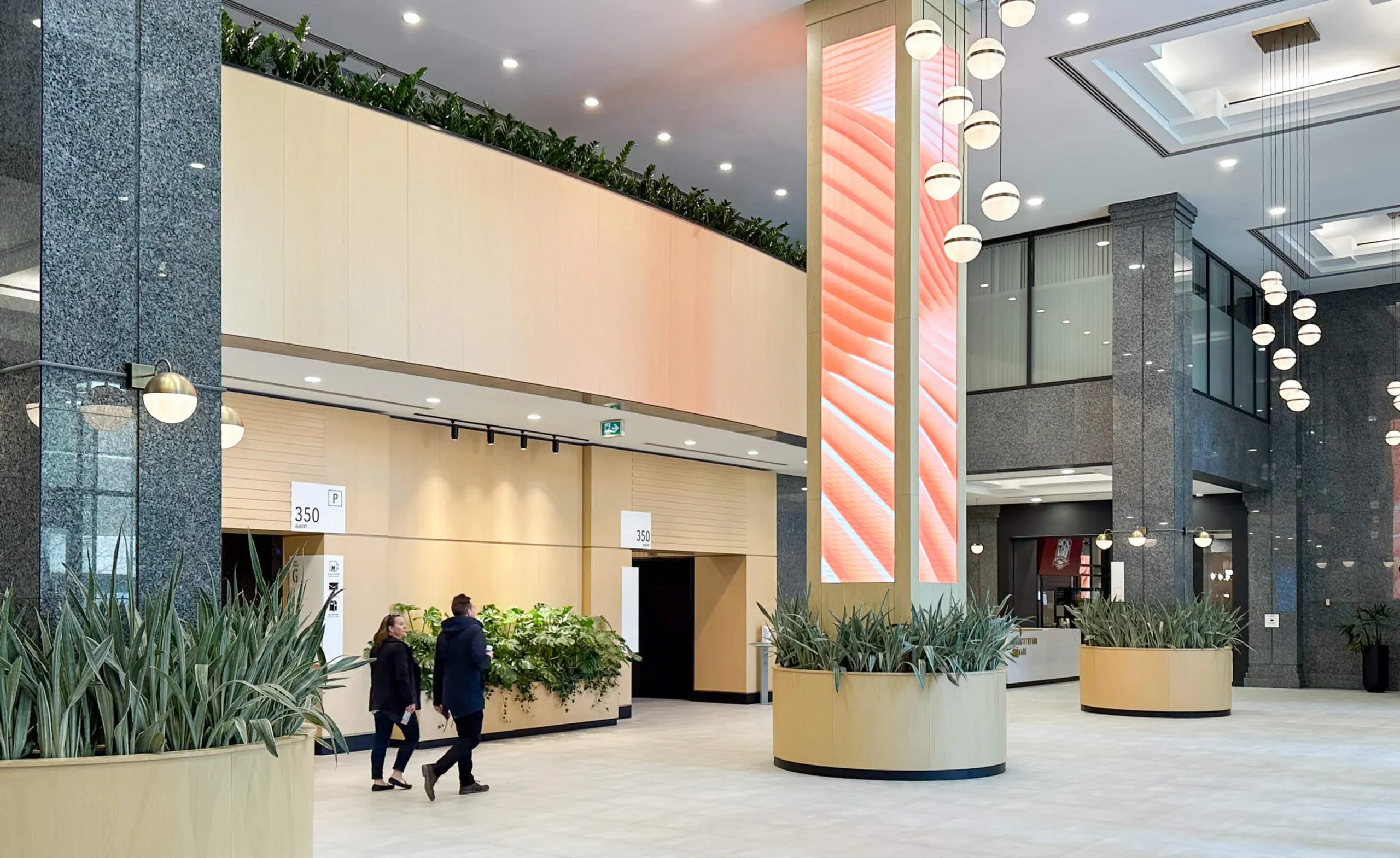
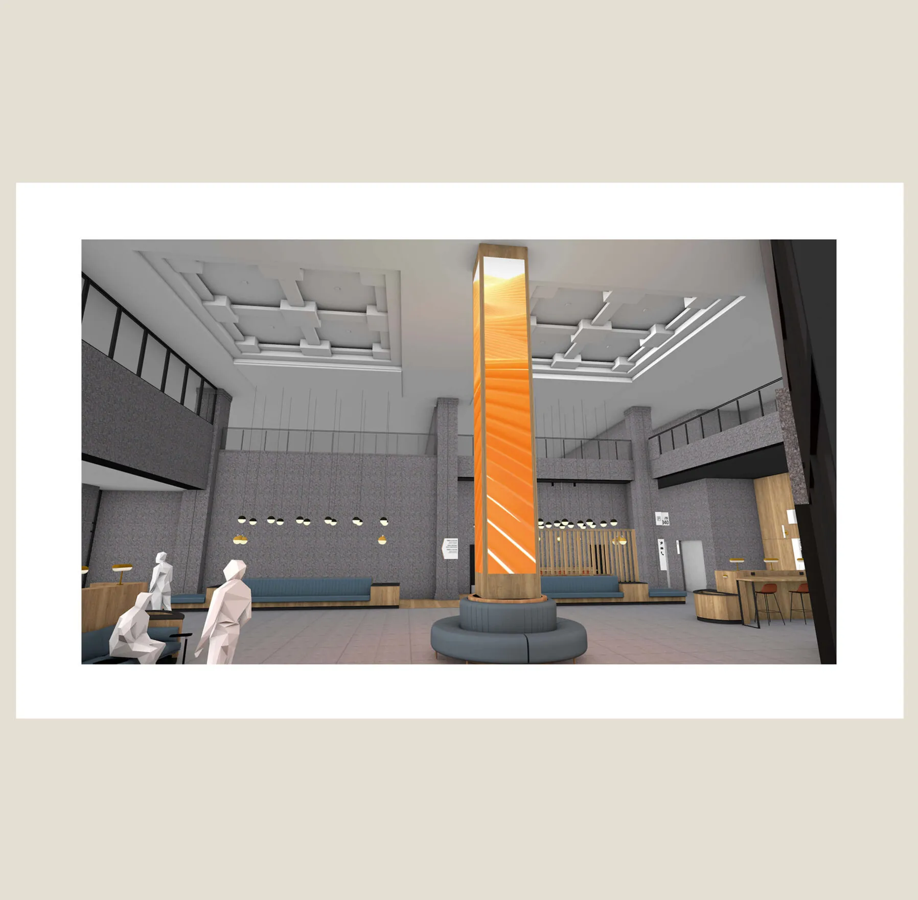
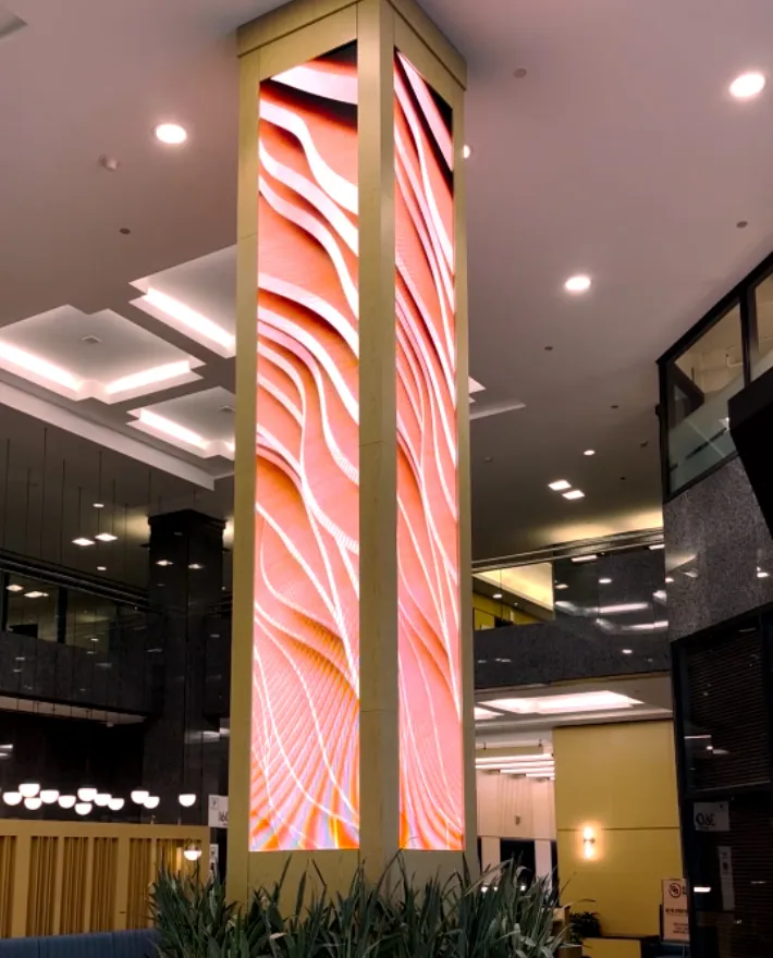
At the heart of each building’s lobby is a 4-sided LED column featuring a series of custom-crafted artwork that ties directly into the brand’s themes of Gather, Grow, Connect, Evolve. The three pillars create a symmetry between the buildings as you walk the concourse, and their impressive presence infuses the space with a sense of palpable energy and vivid life. They further underpin Canderel’s desire to make these public common areas a pleasant place to work and dwell.

Modern office lobby with plants, digital display, and globe lights.
Enhancing the lobby experience through a digital art installation on three centre columns
A tall pillar with a digital display showing abstract orange and white wavy patterns.
Digital art installation in action
  • 1986 year of completion of first tower
  • 1M+ sq. ft. office complex
  • 21 floors of highest tower
  • 3 towers that make up CSQ
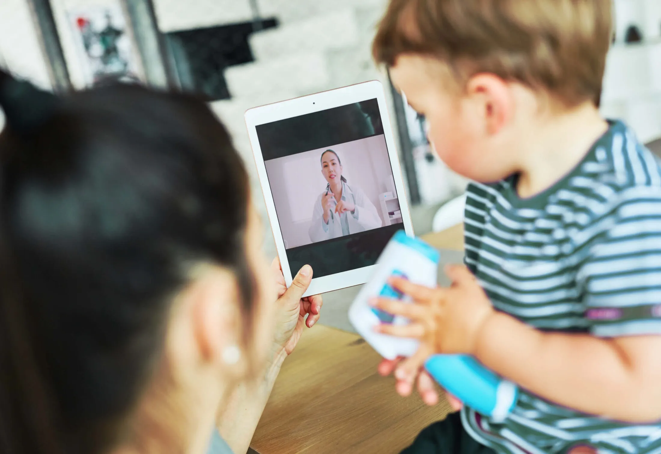
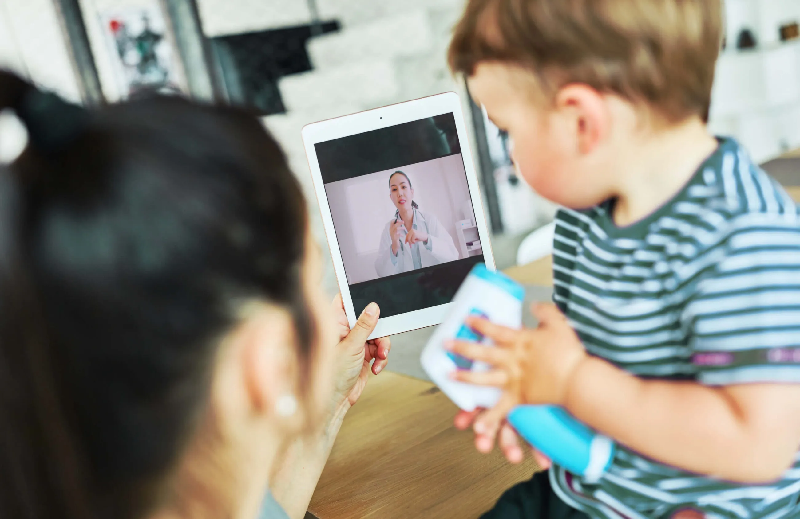
A child and adult have a telehealth appointment with a doctor on a tablet.

Winterberry Family Medicine

winterberrymedical.ca
Services Deliverables
  • Logo
  • Brand Guide
  • Illustration
  • Social Media
  • Signage
  • Stationery
  • Website
  • Marketing Materials
  • Motion Graphics
  • Placemaking

A fresh take on personal, caring family medicine

Winterberry is a dynamic, family-oriented medical clinic offering a wide variety of services through trusted in-person and virtual consultations. The Winterberry team approached Forge to revitalize and reposition their brand and website. The existing brand did not accurately represent the personalized care provided by the vibrant family practice team.

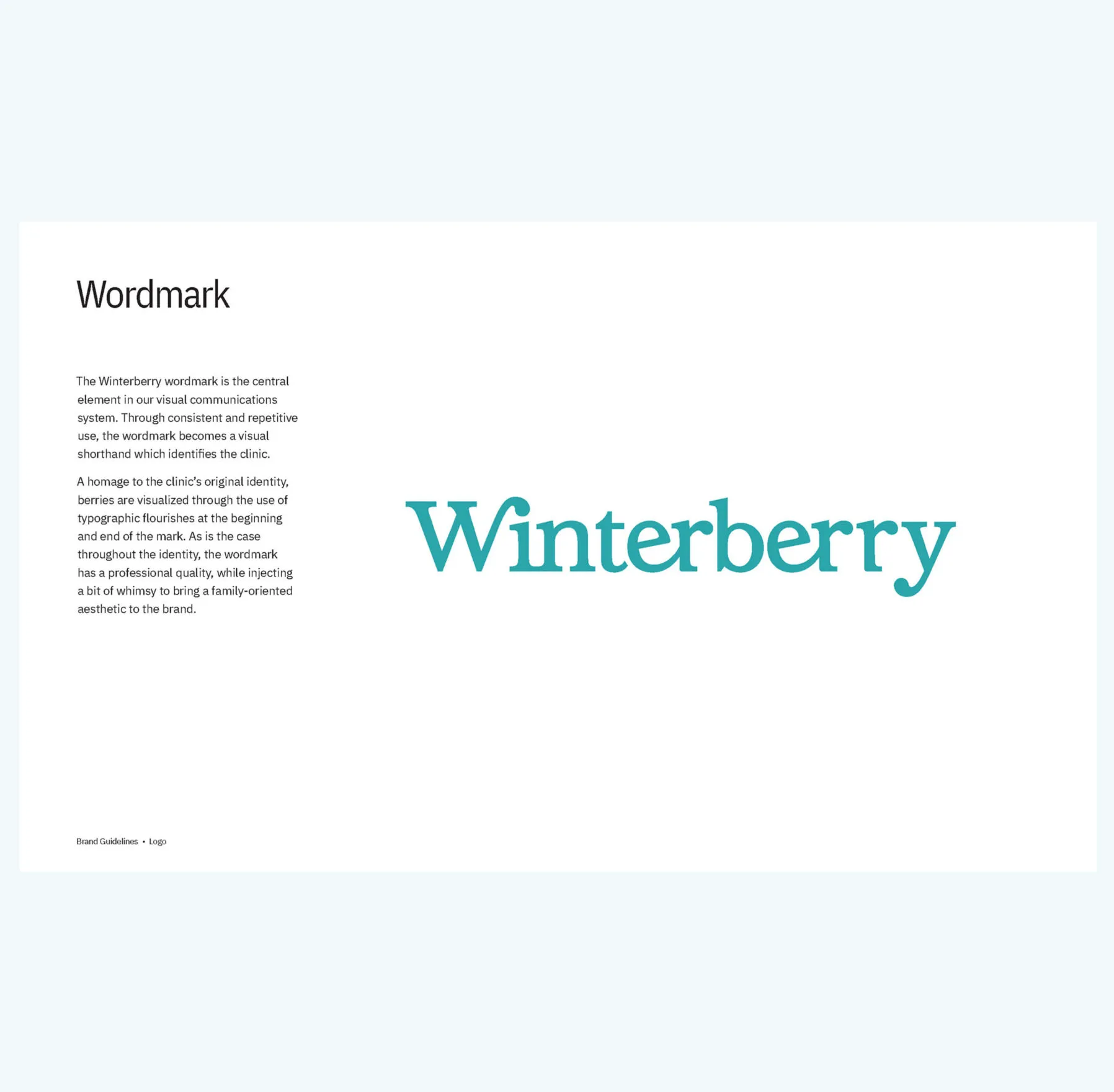
Logo design inspired by “berries”
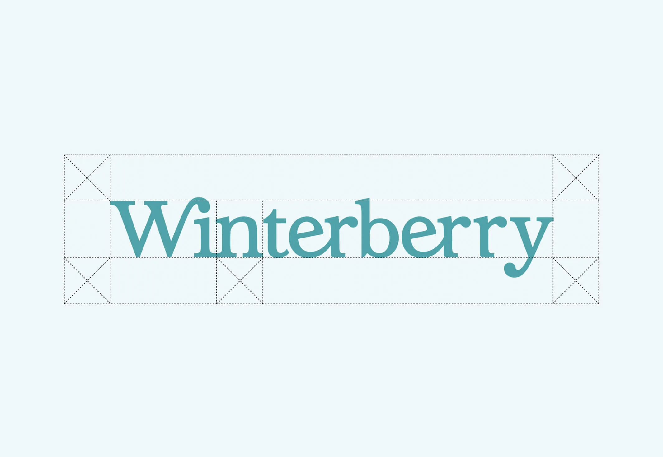
An image showing the safe space around the Winterberry logo
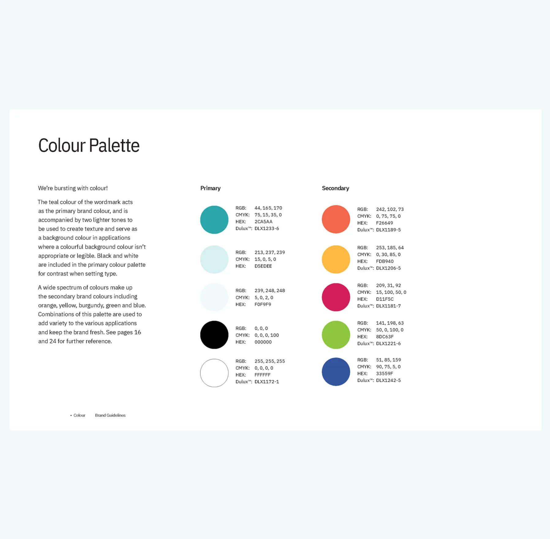
Colour palette for Winterberry brand: Teal, light teal, orange, yellow, cherry, lime, blue.
Our brand standards defined everything including the use of clear space and a bright colour palette to support the family-style medical practice
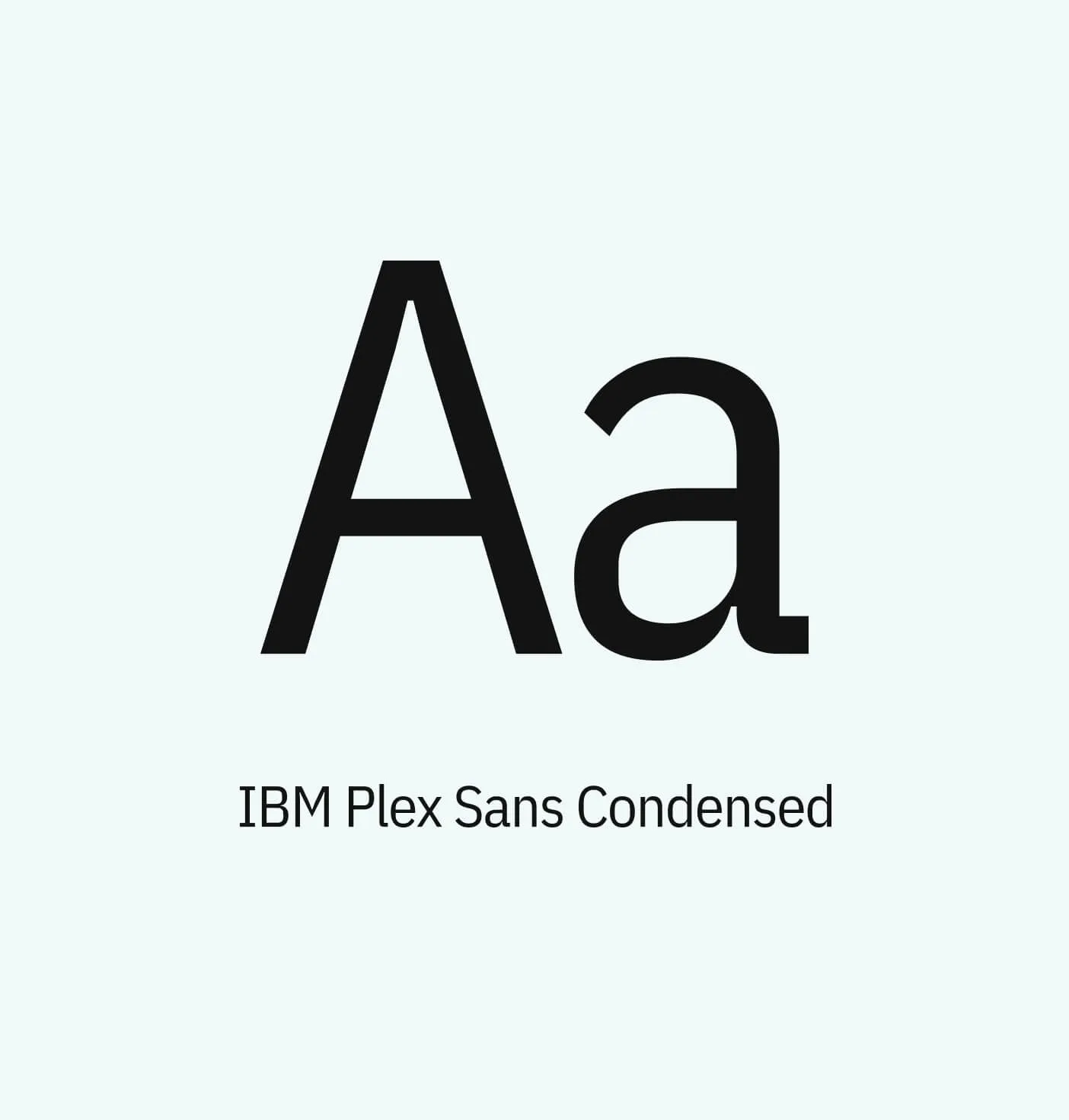
A letterform of the letter A for the font IBM Plex Sans Condensed.
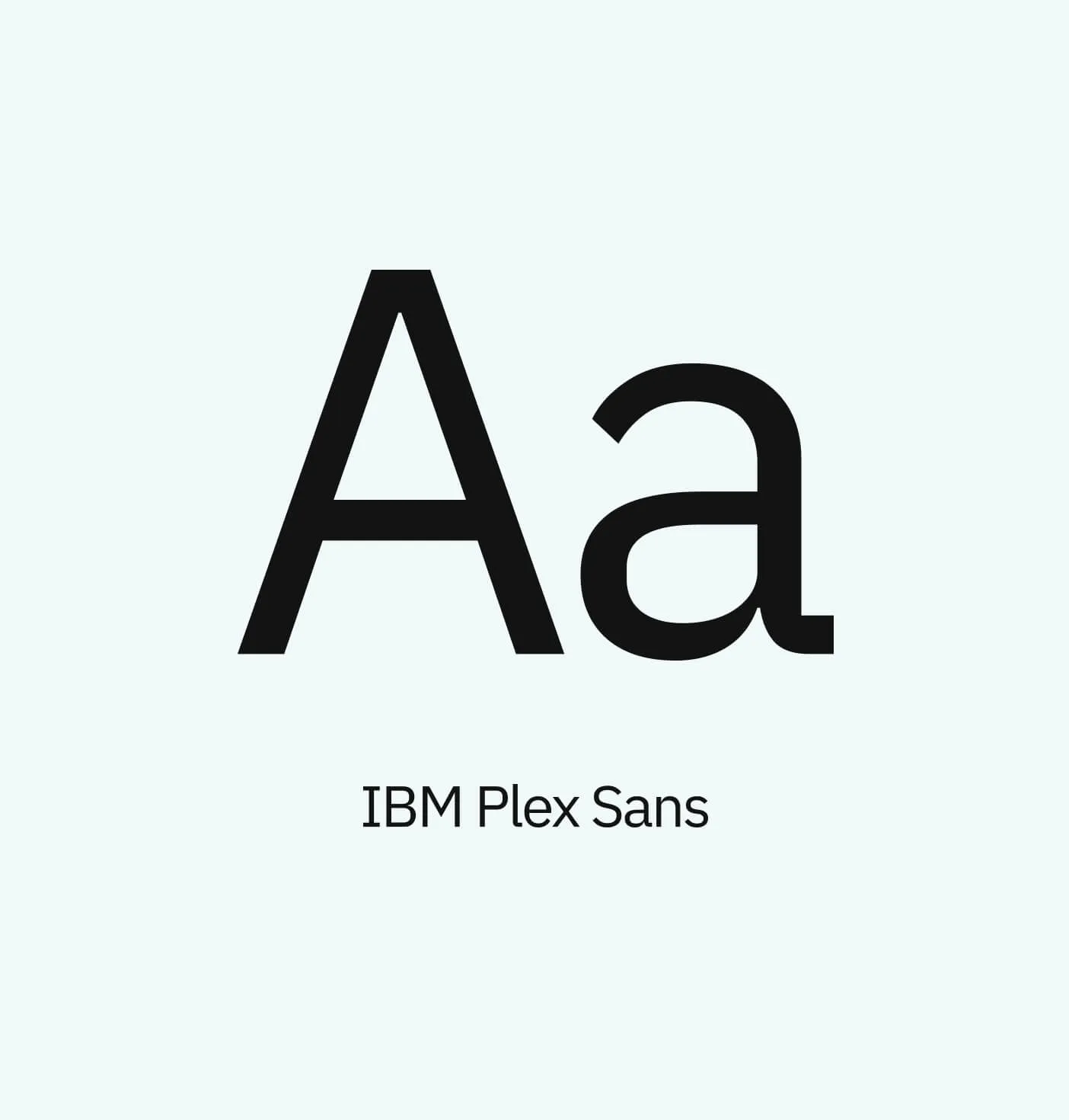
A letterform of the letter A for the font IBM Plex Sans.
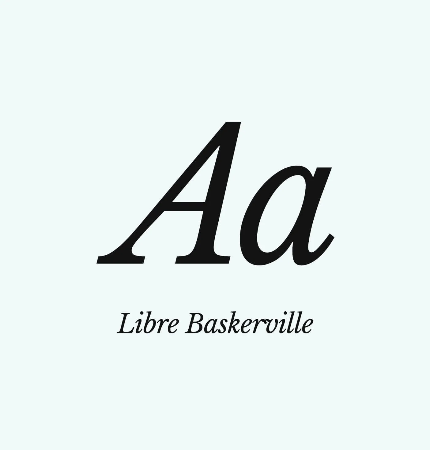
A letterform of the letter A for the font Libre Baskerville in italics.
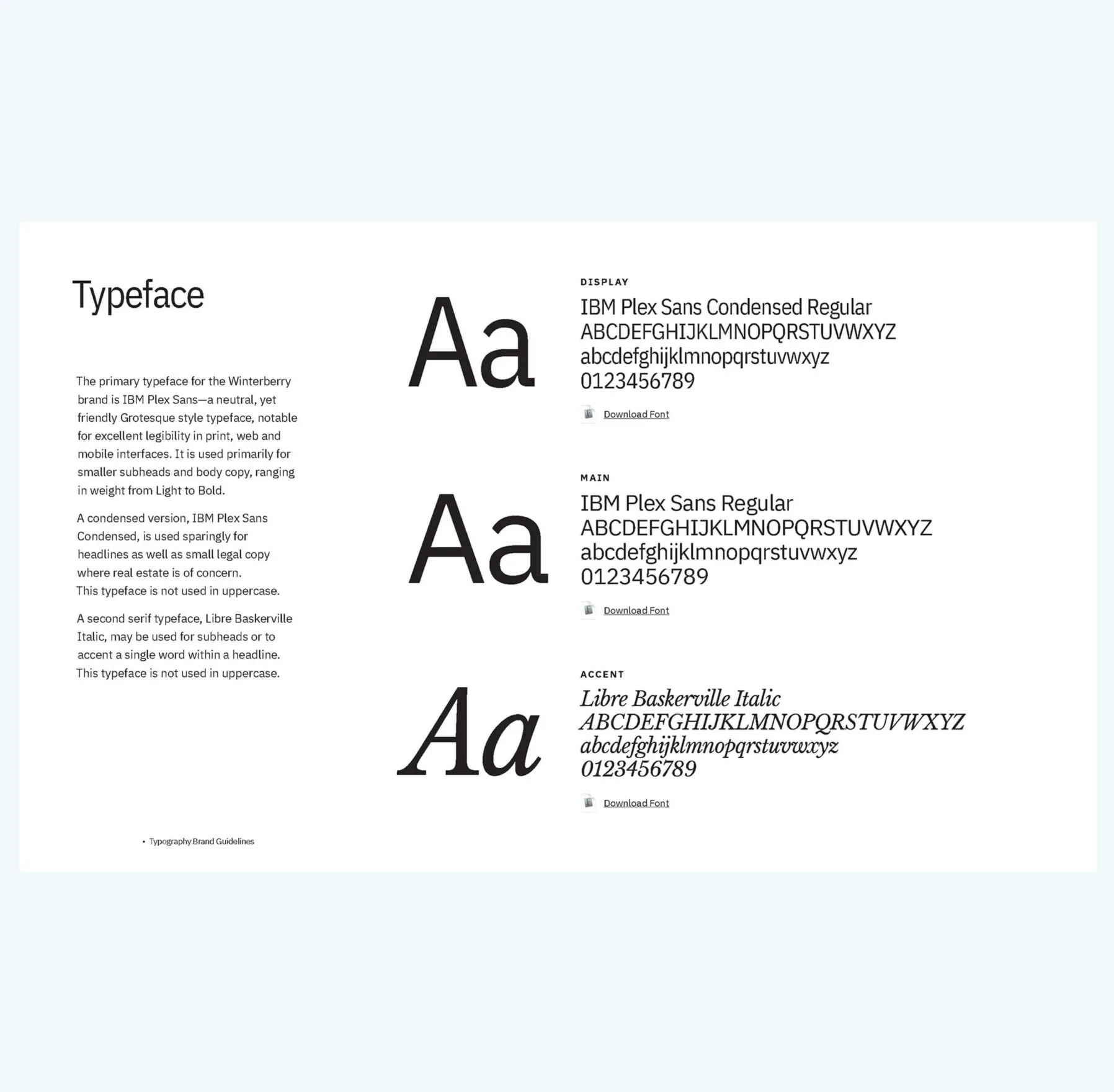
Clean and modern typography to communicate clearly with all audiences

Redefining the healthcare experience

Forge met with Winterberry stakeholders to determine the existing brand’s pain points and developed a strategy to make the most of the reimagined brand. Playful illustration expresses the brand’s personality and allows the clinic to stand out from their competitors.

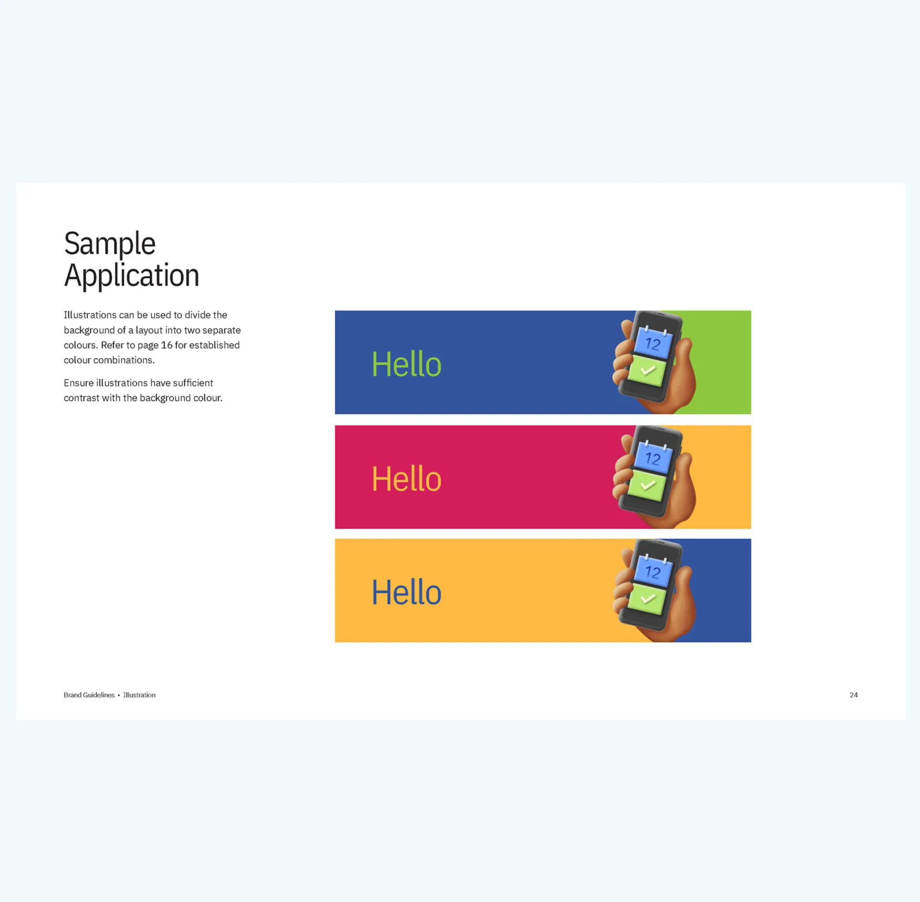
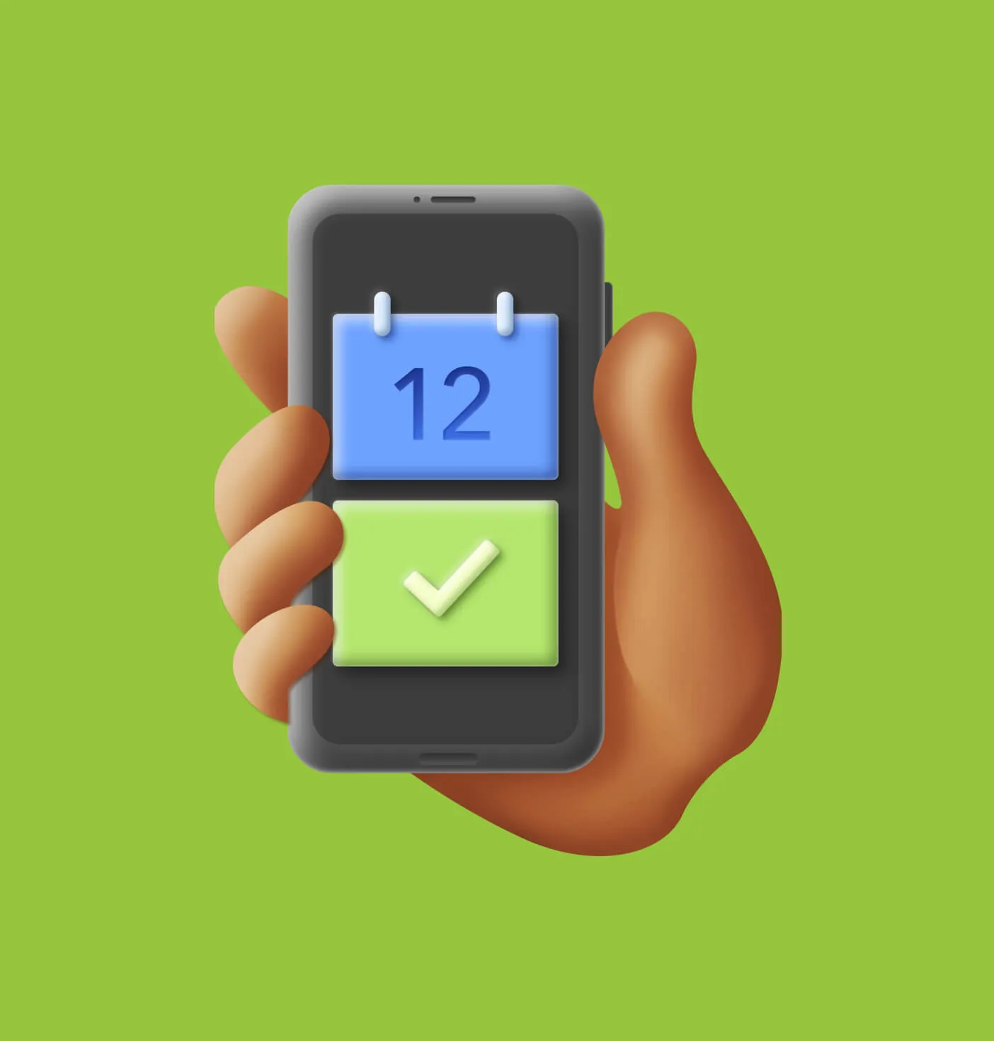
3D illustration of a hand holding a smartphone with a calendar icon and a checkmark.
Tablet displaying a list of doctors with stethoscopes.
3D icon of a document with a magnifying glass over it.
Custom illustrations were created to liven up the brand
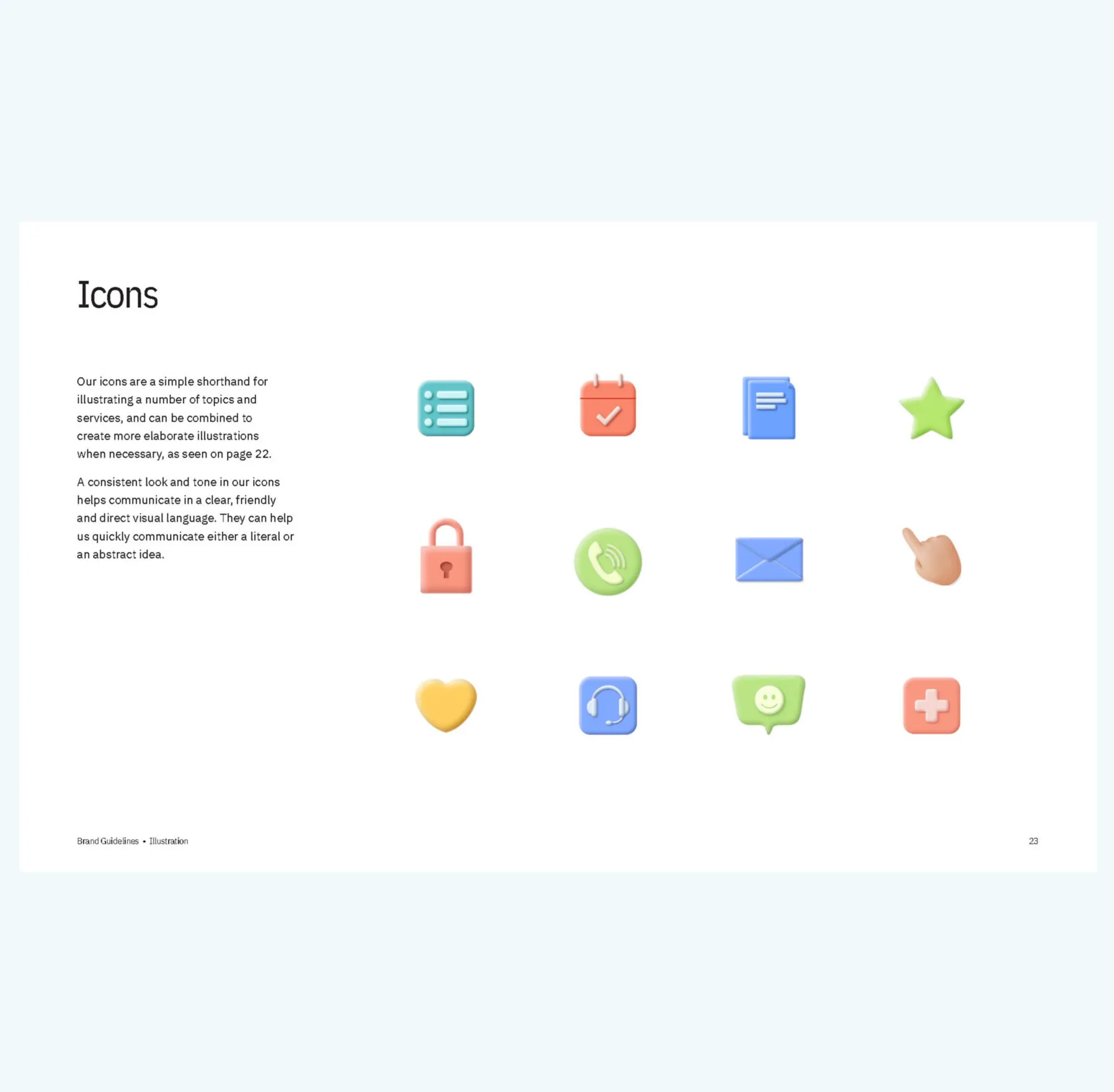
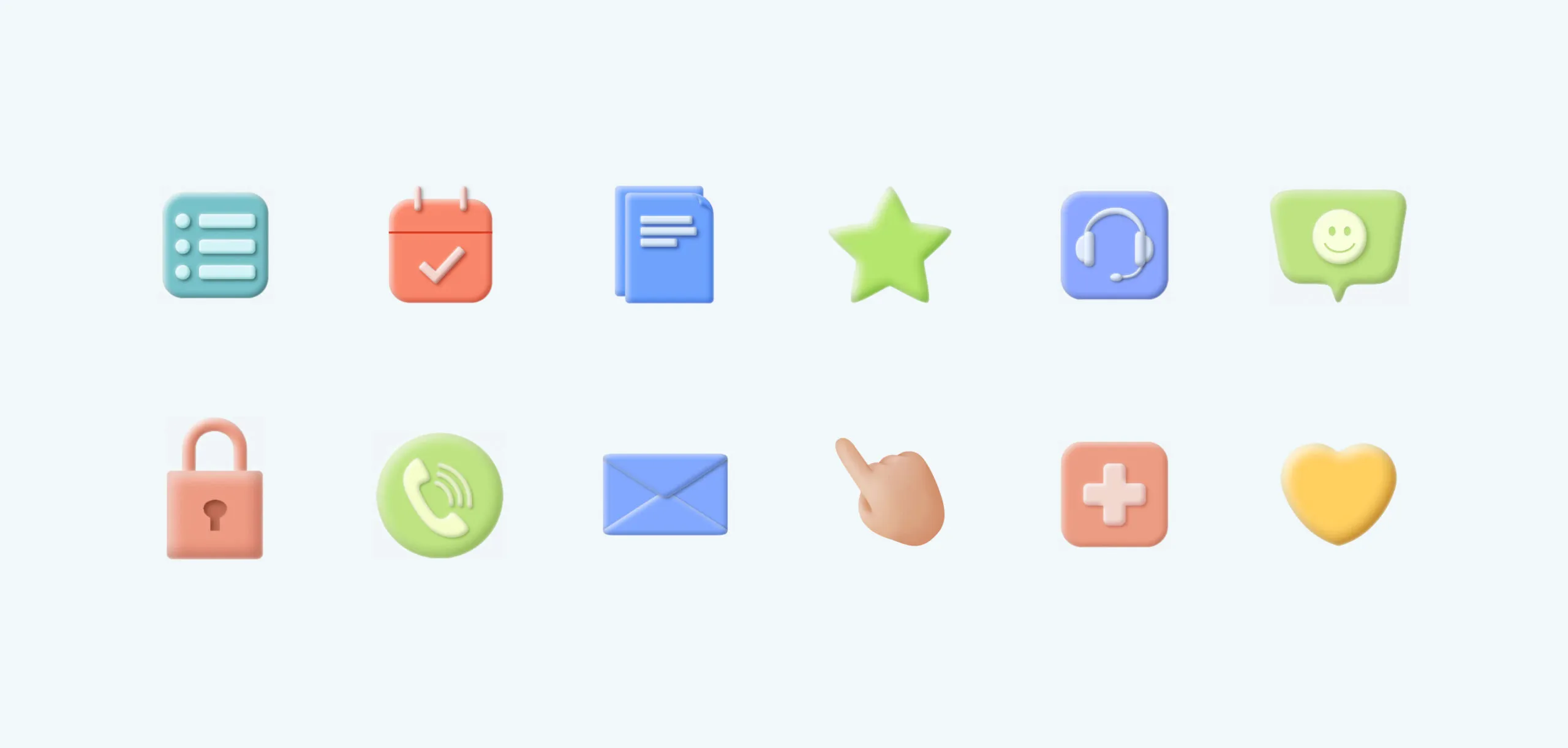
Collection of colourful 3D icons including calendar, chat, phone and heart
A matching icon set supports all brand visuals

Timely information for a thriving social network

Communicating with existing patients through social media allows the Winterberry team to share frequent updates on current and immediate information regarding statistics, scheduling, healthcare tips, and more. A comprehensive social media production guide was created for the internal marketing team to easily create content in a consistent tone and voice.

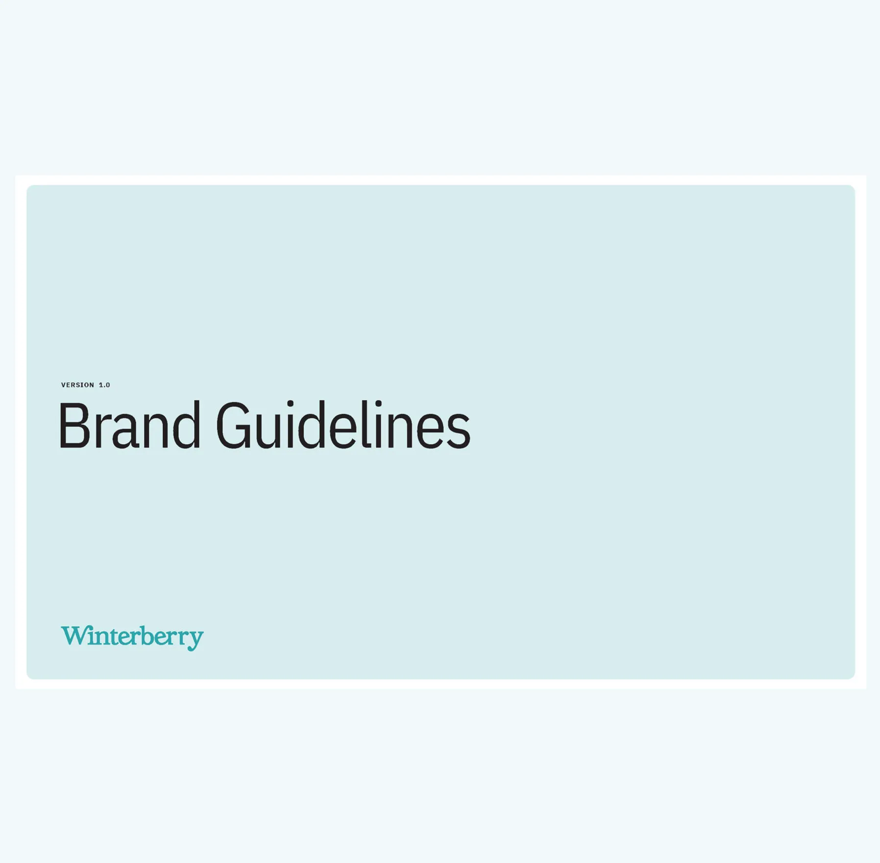
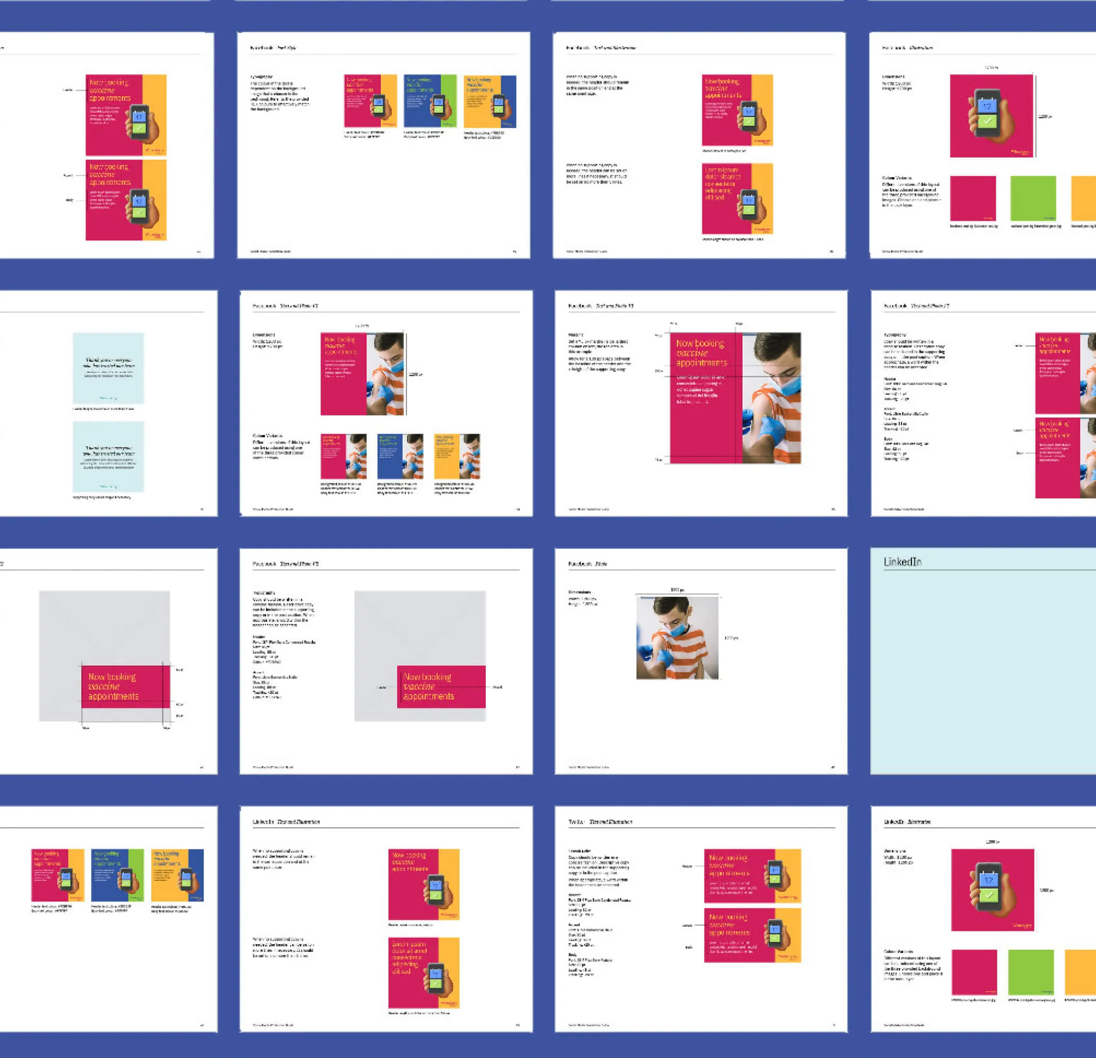
Social Media Production Guide by Winterberry with a smiley face icon.
A hand holds a phone with a green checkmark on screen, with text about booking vaccine appointments.
Social media production guide for use by in-house team
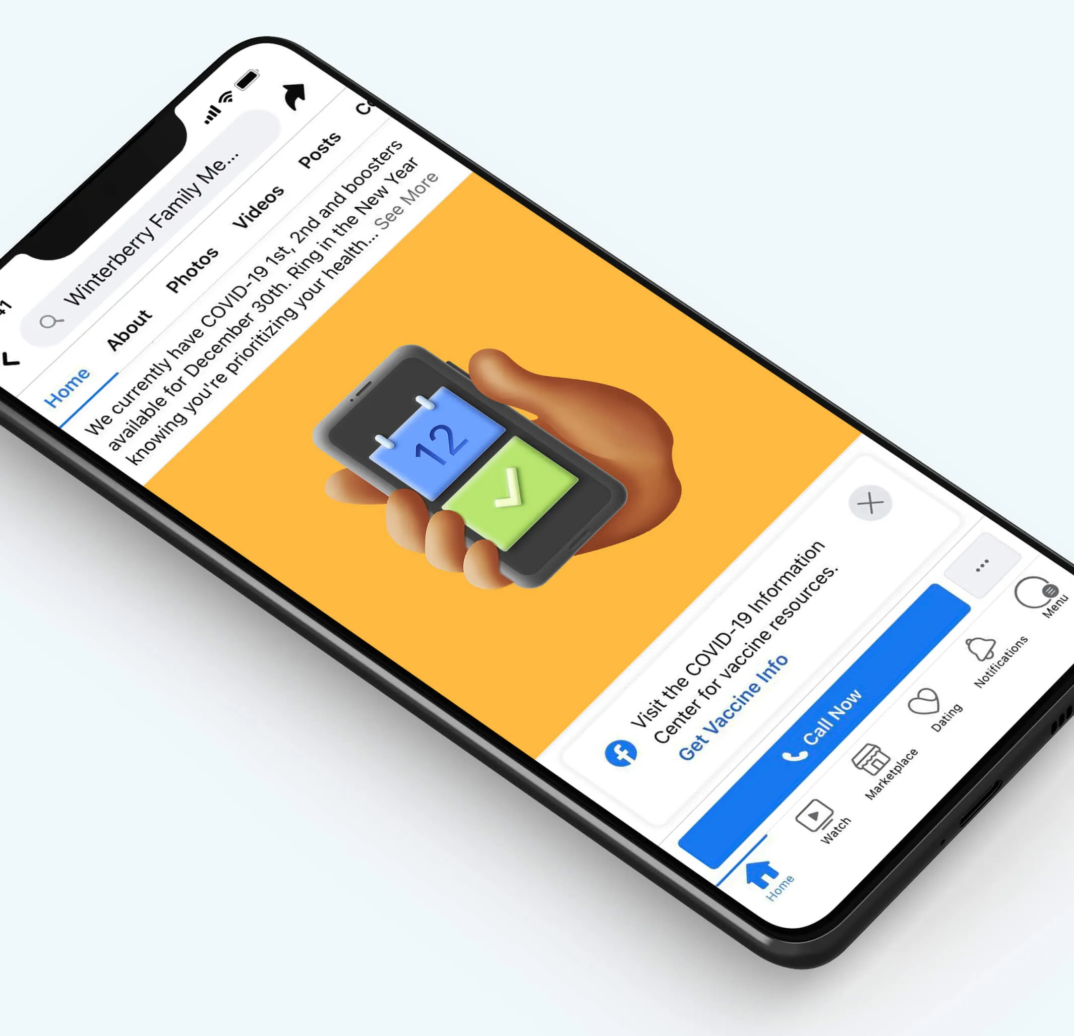
Facebook page for Winterberry Family Medicine showing COVID-19 vaccine information.
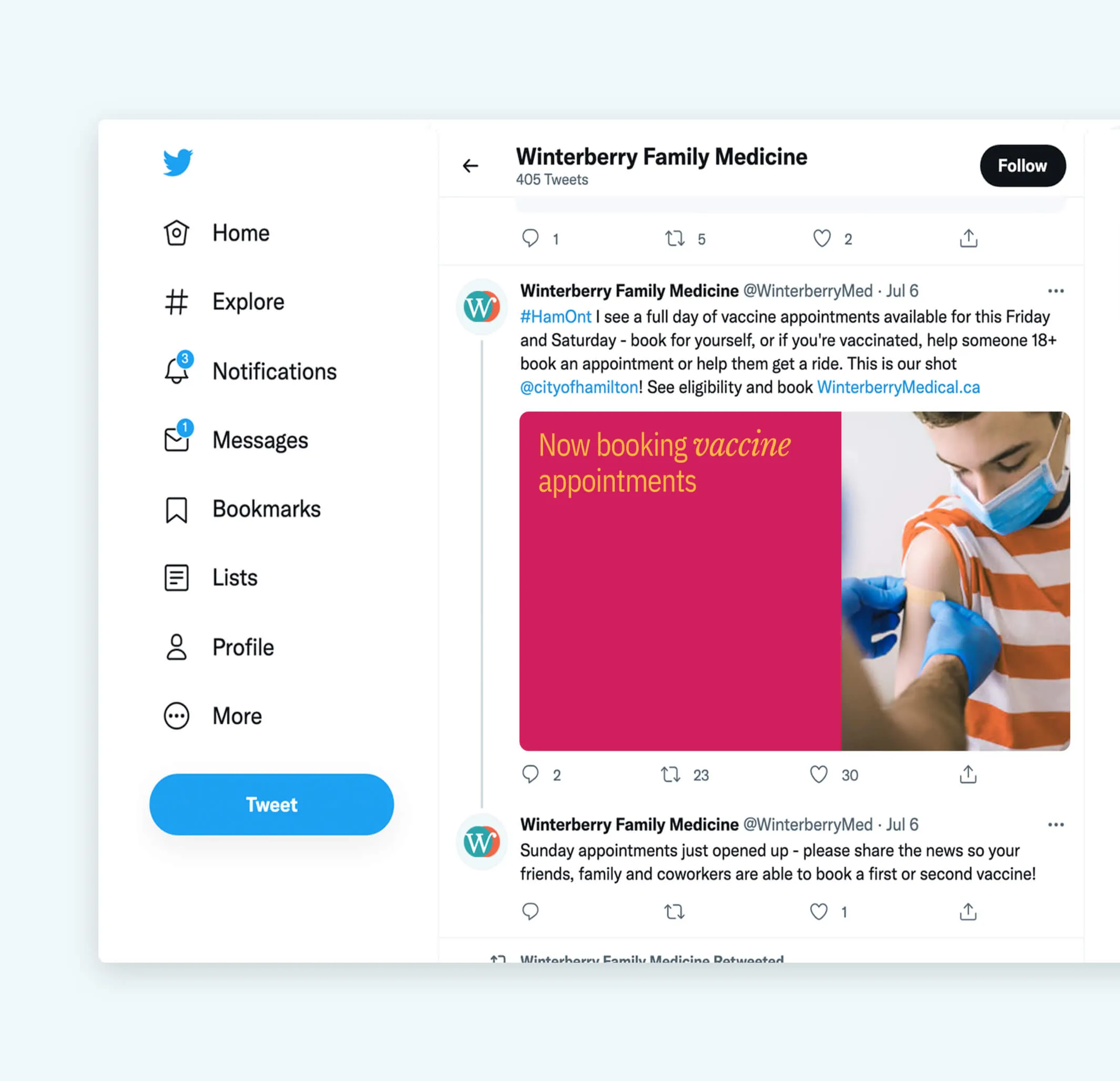
Twitter interface showing Winterberry Family Medicine's profile with tweets about vaccine appointments.
Social media graphics samples

A sense of trust and approachability

Ensuring the brand could be applied to various touchpoints and deliverables was crucial, as well as creating a welcoming environment that evokes the feeling of dependability and trust in all patients.

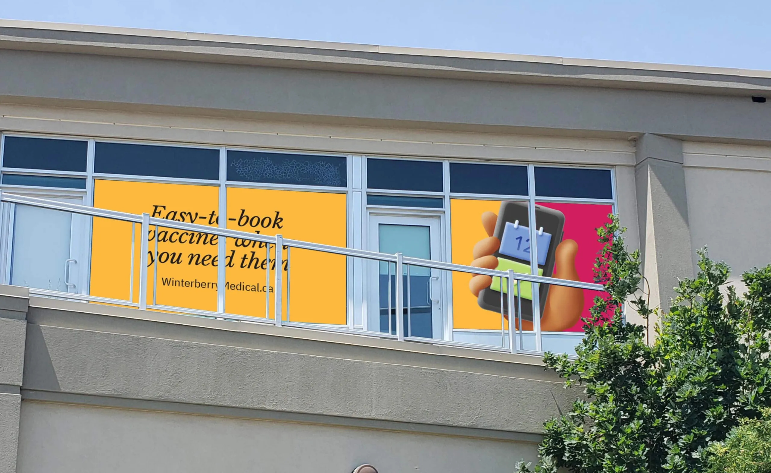
Window decal for Winterberry Medical showing
Window clings announced the new brand to the neighbourhood
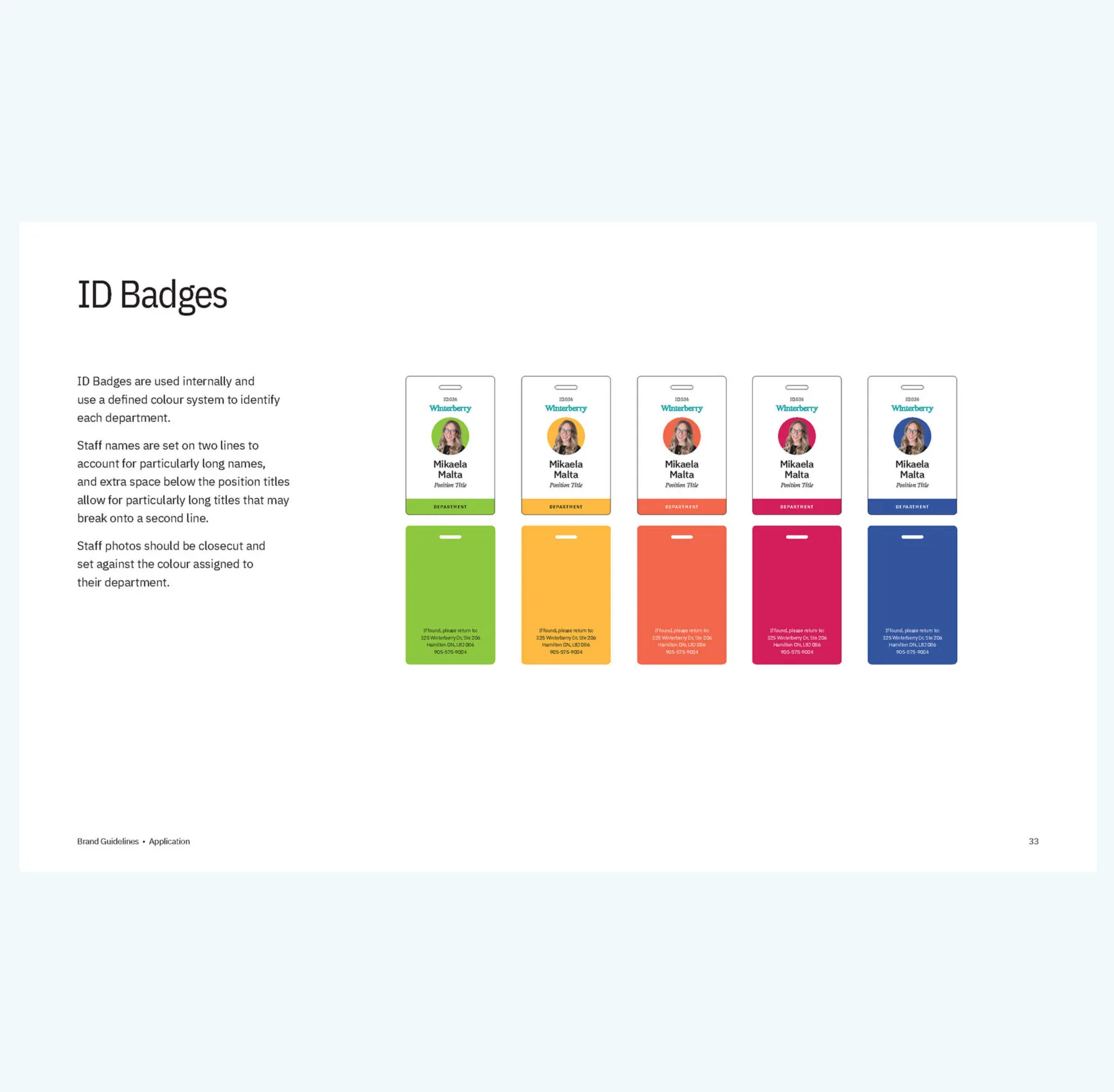
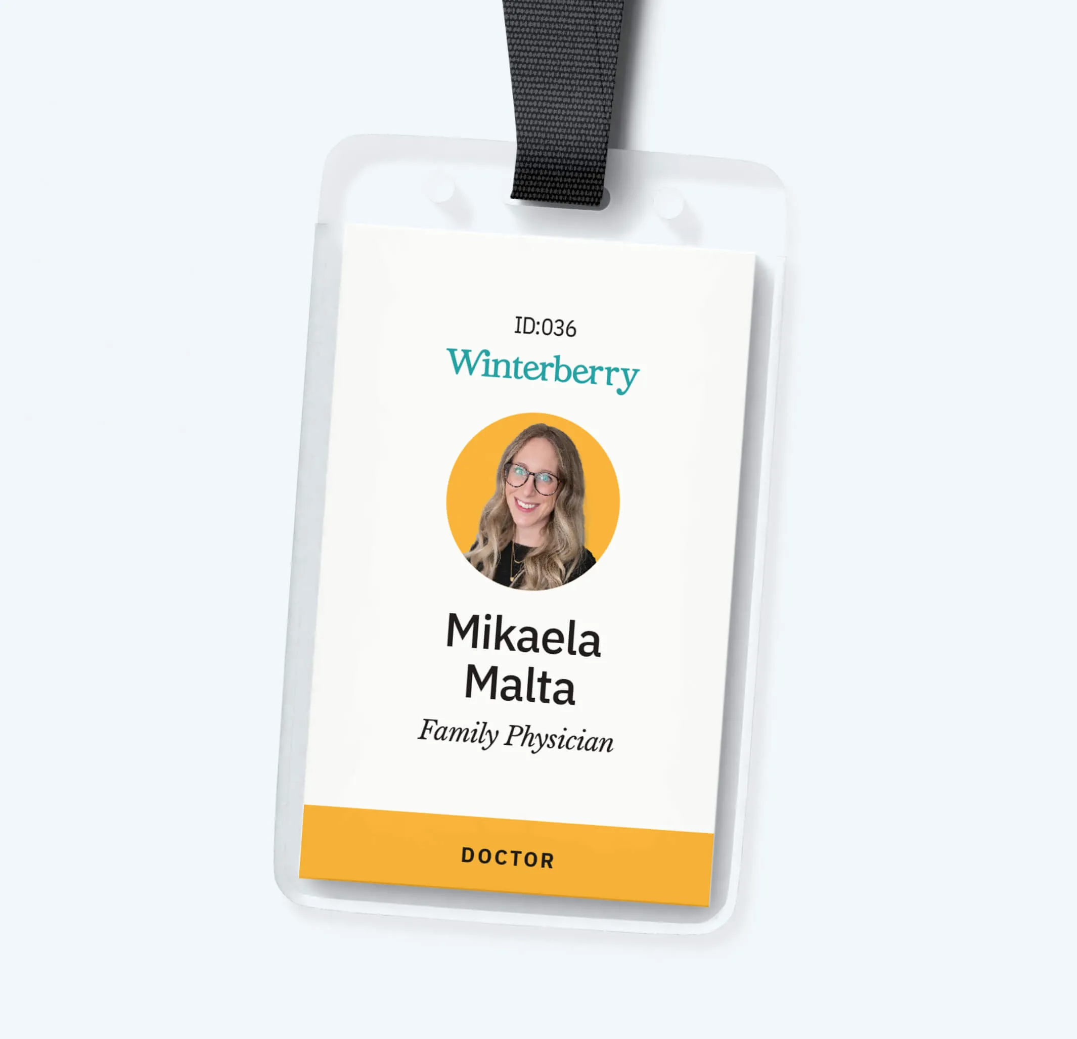
Mikaela Malta, Family Physician ID badge from Winterberry
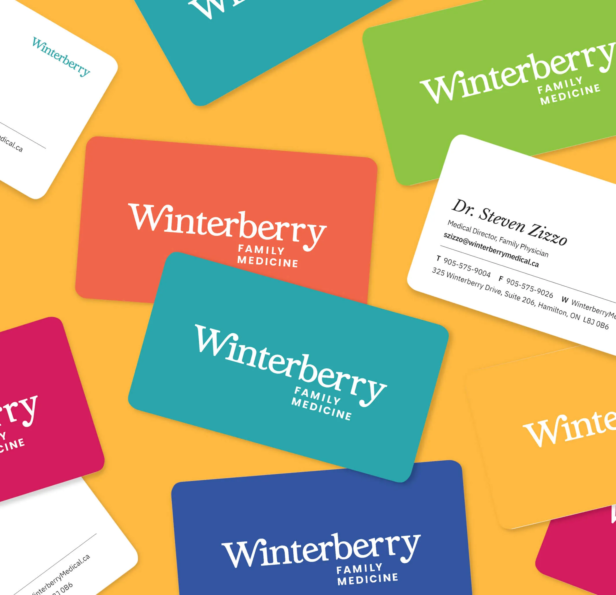
Business cards for Winterberry Family Medicine in various colours.
ID Badges for their team and stationery including colourful business cards

Shaping the online experience

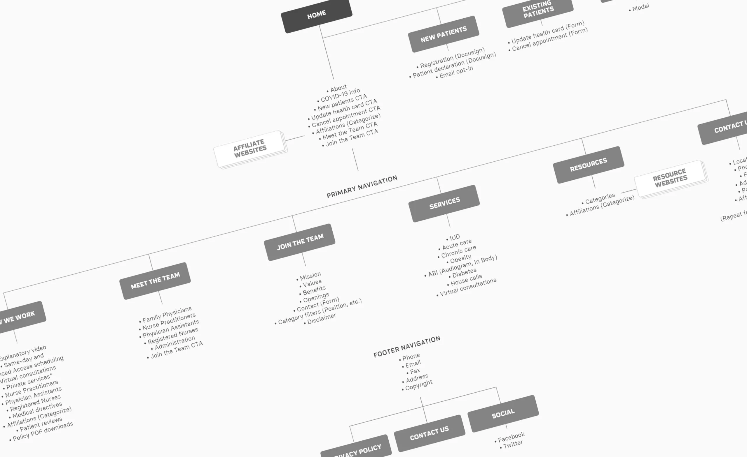
Content strategy sessions were held with the goal of optimizing information and ensuring users are presented with the most appropriate content with minimal effort. Before establishing a visual language, website architecture was established in order to improve communications and create a frictionless browsing experience.

Website sitemap showing navigation and content structure.
Sitemap for the new website
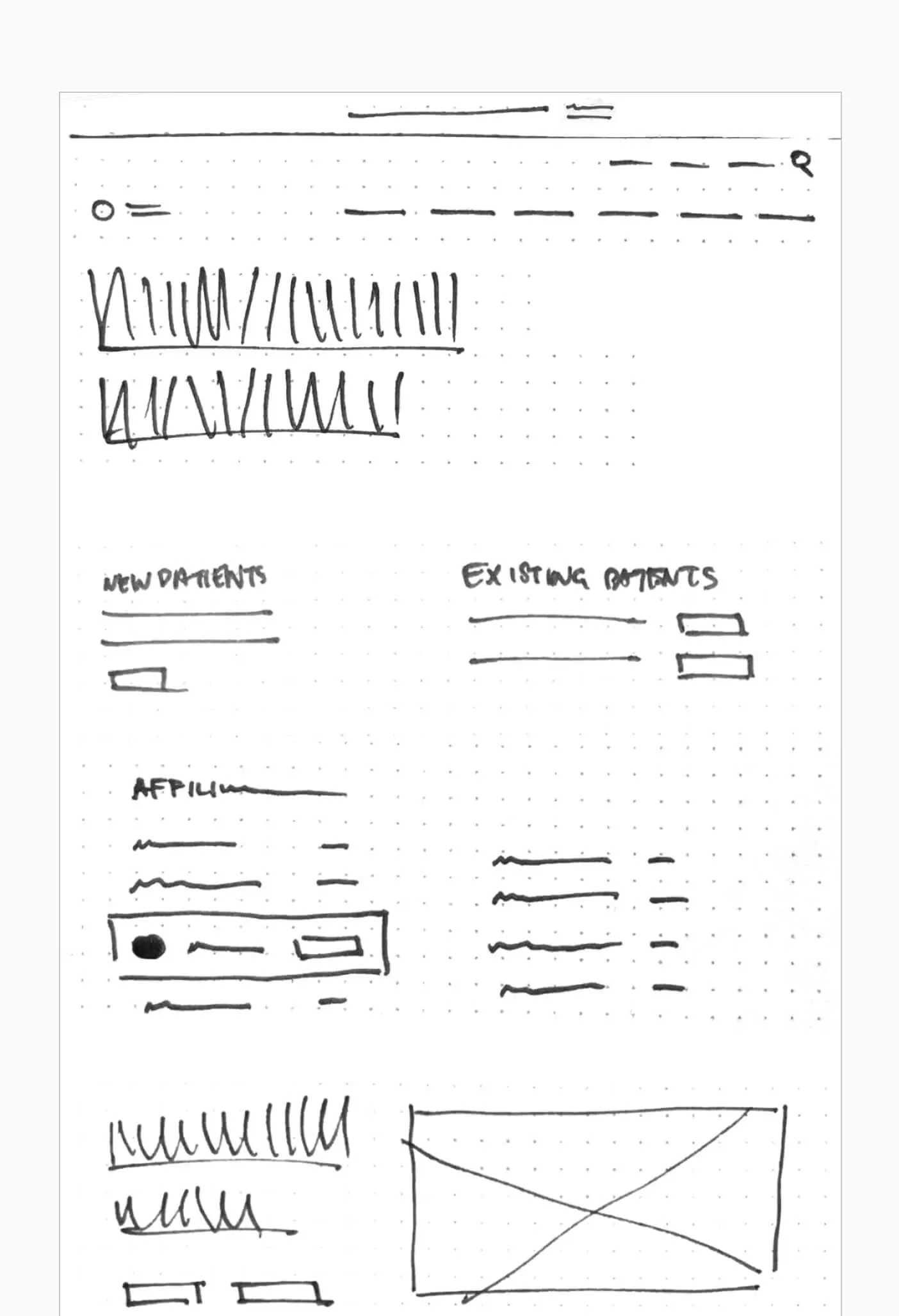
Wireframe sketch of a website with sections for new and existing patients, and a placeholder for an image.
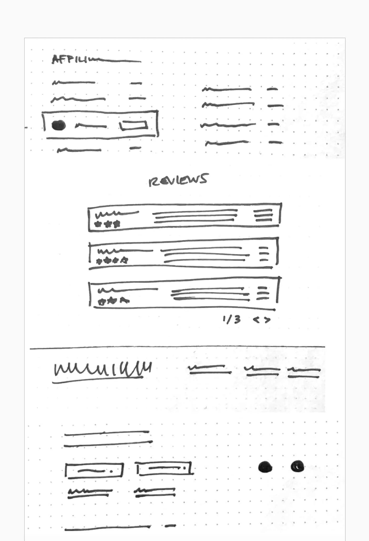
Wireframe sketch of a website with sections for affiliate links, reviews, and a footer.
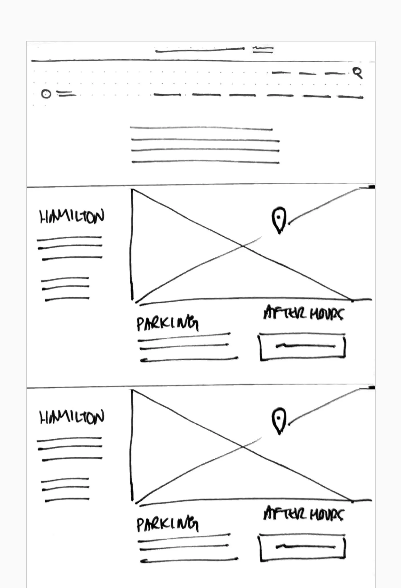
Wireframe sketch of a website layout with sections for
Hand sketched wireframes

Modern, progressive patient care
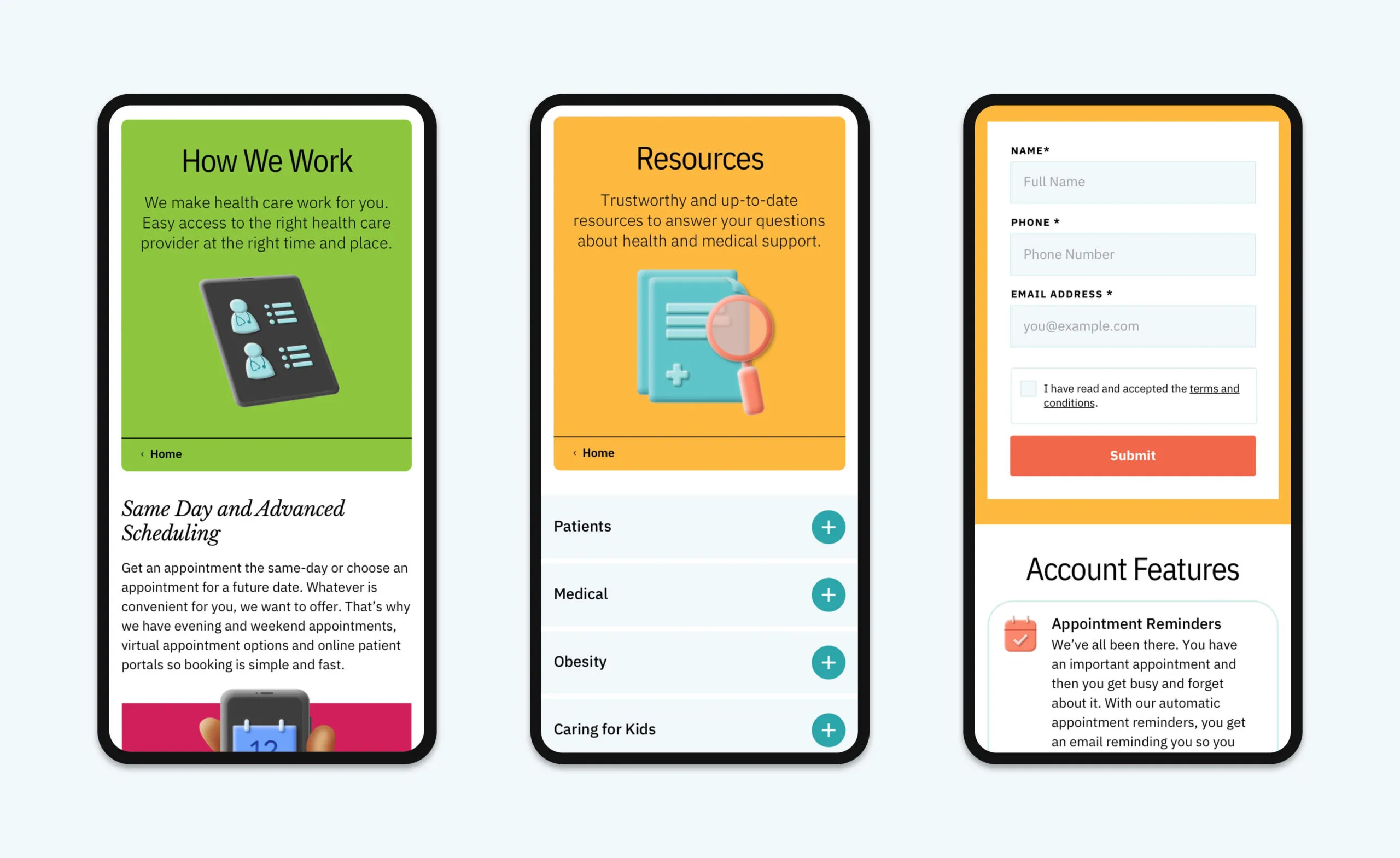
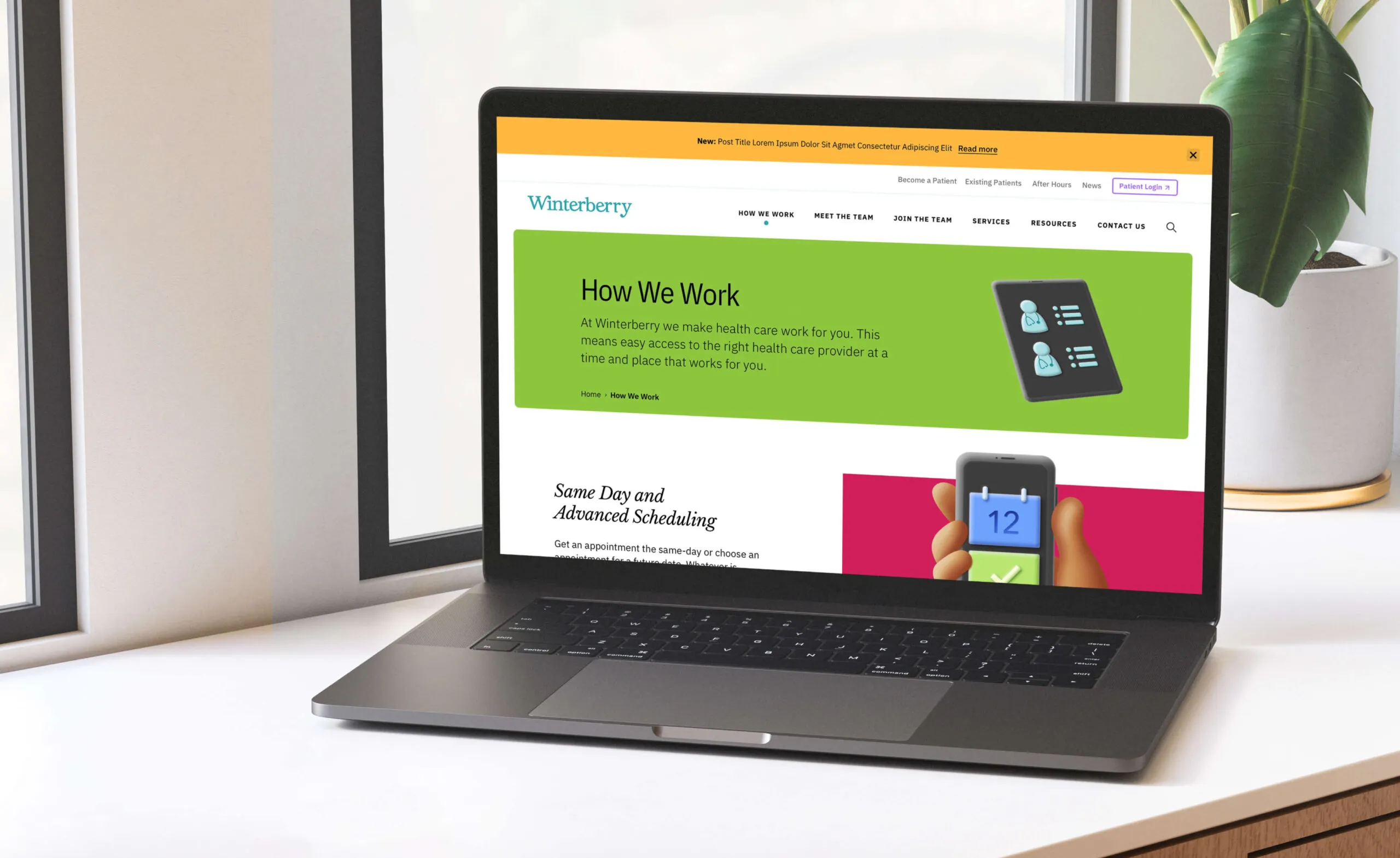
An overhauled website was created that is fully responsive, and ensures accessibility compliance for all user types. The brand’s vibrance is showcased throughout the website experience, representing the best of modern and progressive patient care.
Features

WordPress CMS

User account portal

Online appointment booking

Monthly newsletter

Google analytics

Custom icons

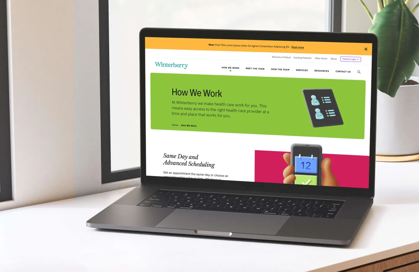
Device agnostic website design and development
Screenshots of a mobile app showing
Laptop displaying the Winterberry website with
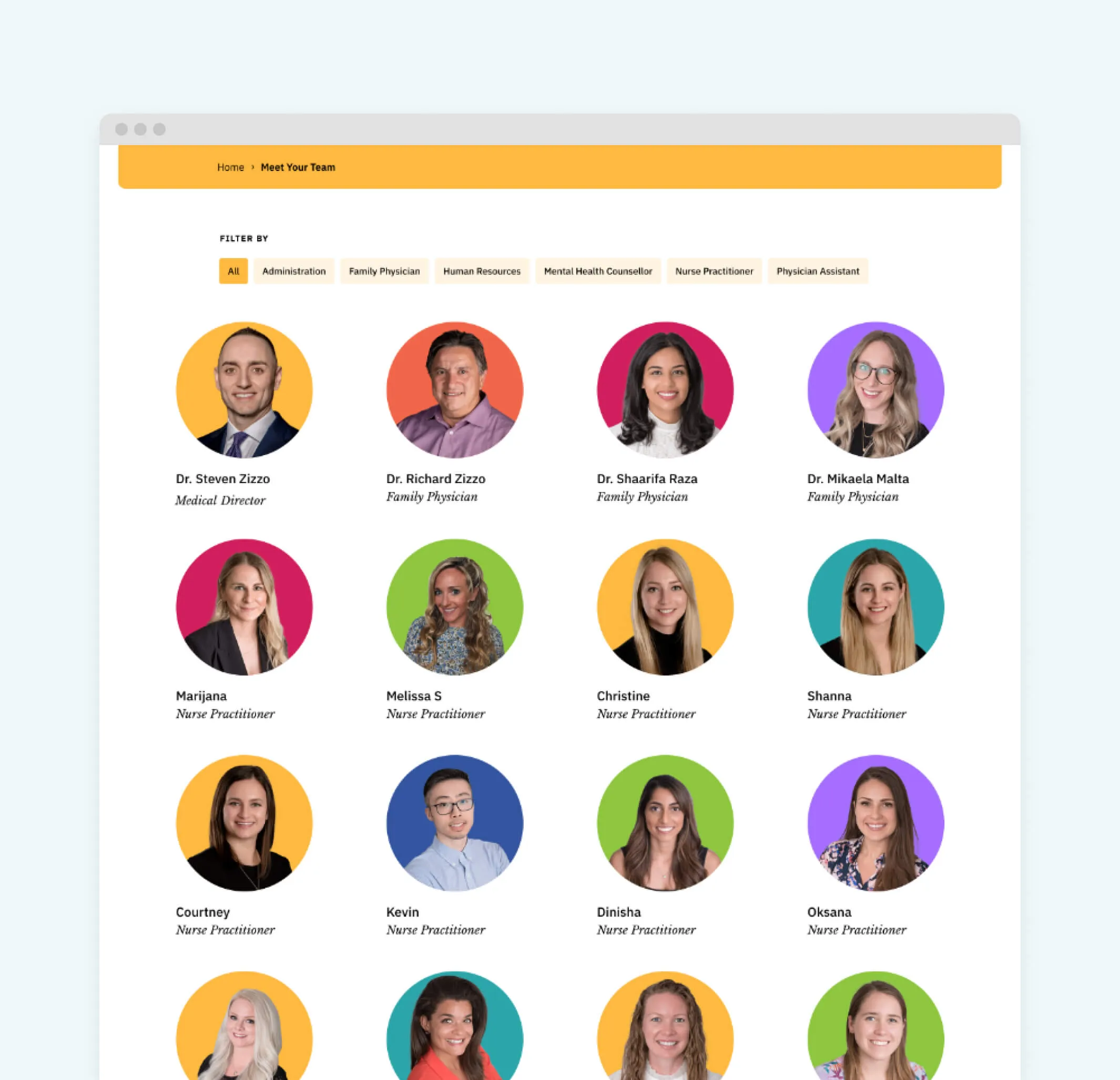
Team members of a medical practice, including doctors and nurse practitioners.
A woman with dark, wavy hair and a white lace top smiles.
  • 400% anticipated growth in patients over next 5 years
  • 10K+ current number of patients
Working with the Forge team quickly became one of the best parts of my week. The entire team made the process incredibly easy, stress-free and to be honest, fun. Their creativity and innovative ideas brought our vision to life in ways I couldn’t have imagined.
Sharon Ricci, Communications Director