This website uses cookies.

A stronger foundation for the nation’s trusted legal career platform

The Precedent A-List is a Canada-wide job board and career platform for lawyers. Forge partnered with Precedent Magazine to breathe new life into an outdated website that was becoming increasingly fragile after years without sufficient maintenance. Building a more modern and user-friendly experience began with identifying pain points, project goals and opportunities for improvement. Insights gained during early phases informed our strategy on how to improve UX, SEO, analytics, security, performance, scalability, accessibility, technical structure and competitive positioning to elevate brand application. A highly customized content management system streamlined processes for daily management tasks such as job postings, user segmentation and advertisement management.

Features

WordPress CMS

Custom theme

Credit system integration

Stripe payment processing

Automated email notifications

Ad management

Google Analytics

Sync and migration

Ongoing site maintenance and updates

Modernized website experience and brand application

Intuitive wireframes for mapping user journeys

A structured sitemap established clear information architecture and intuitive navigation, while wireframes provided an early foundation for defining layouts, user flow and content hierarchy. Based 
on traffic and SEO analysis, key user journeys were prioritized and new pathways were introduced to improve discovery across previously siloed content. Stakeholder feedback throughout each iteration helped refine the experience and ensure alignment, resulting in a shared sense of ownership in the final product.

Wireframes for new and existing pages establish content layout and user flow
Sitemap defines navigation for content managers, visitors and registered users

Building flexibility into the design system

Following an extensive audit of existing brand touchpoints, subtle visual refinements and an articulate design system were established without losing sight of their core audience of legal professionals accustomed to traditional website conventions. Leveraging the existing WordPress installation and database, functionality was preserved while improving performance and addressing key gaps in productivity, efficiency and transparency. Existing and new plugins were integrated as needed, and page creation was streamlined through the use of a custom, modular block system.

Design systems enforce brand consistency and ensure smooth handoff for development
Thoughtful use of serif and sans-serif typography creates visual contrast
Custom iconography and modular webpage components
Before and After
Demonstration of homepage evolution from existing to refined brand application

Blending content-first design with integrated system logic

The frontend design employs a content-first, editorial layout approach that emphasizes readability, hierarchy and a traditional publishing sensibility, while the backend provides clear visibility of all important content and features such as posting history, transactions and user credit balances. A credit system was fully integrated into user accounts with secure Stripe-based credit handling and automated email notifications for purchased job listings and advertising.

Editorial-style page design suited for profile features and news articles
Content clearly defines user registration processes and offers timely information for legal professionals
Responsive website build optimized for all devices and viewports
Credit system enables law firms and recruiters to create job listings while providing content managers with a clear overview of user account data

Supporting long-term growth and optimization

We delivered a high-performance, future-ready website with advanced search filtering, fast load times and a fully responsive experience across desktop and mobile. Built with semantic HTML and WCAG 2.1 AA accessibility standards, the site is optimized for SEO, discoverability and long-term scalability. Comprehensive testing, analytics integration, team training and ongoing maintenance ensure the platform remains easy to manage, adaptable to future needs and supported well beyond launch.

Search functionality allows for global and filtered searches to quickly collect relevant content
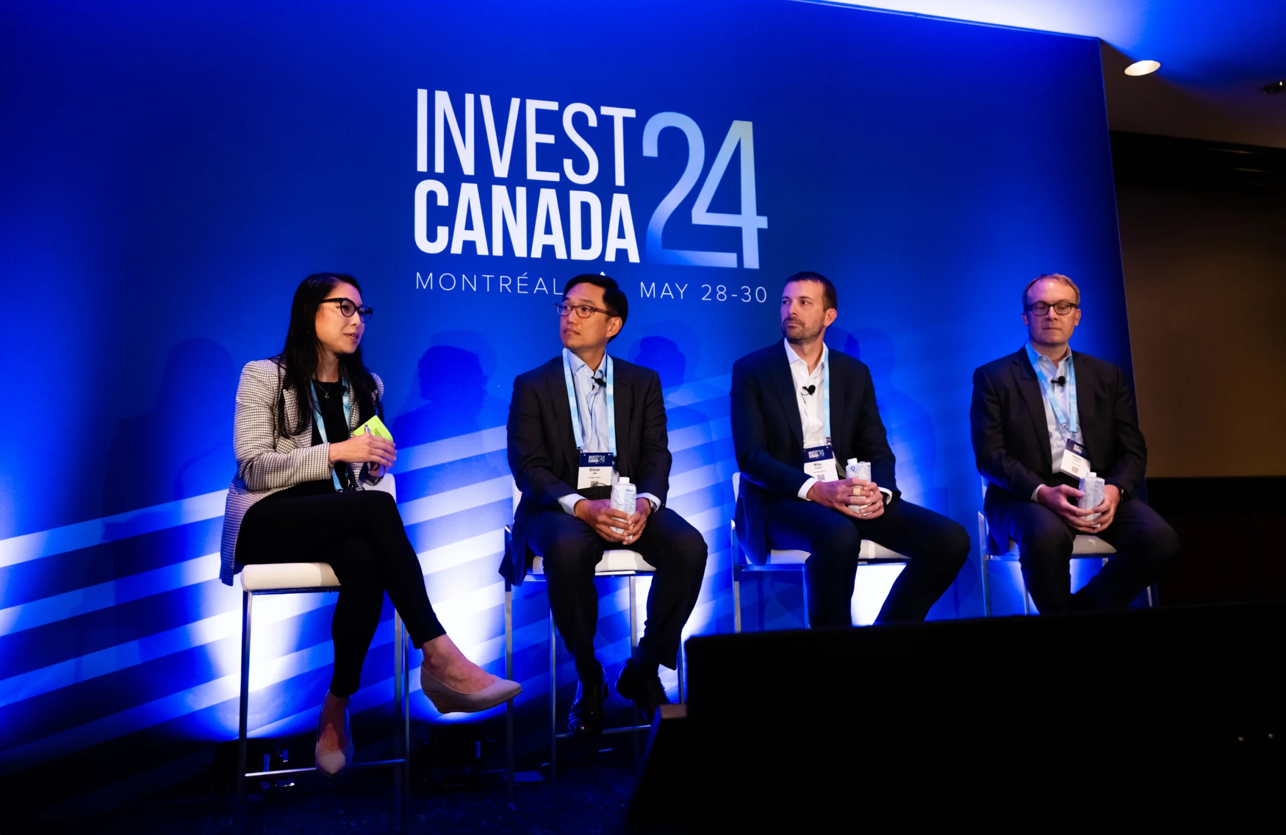
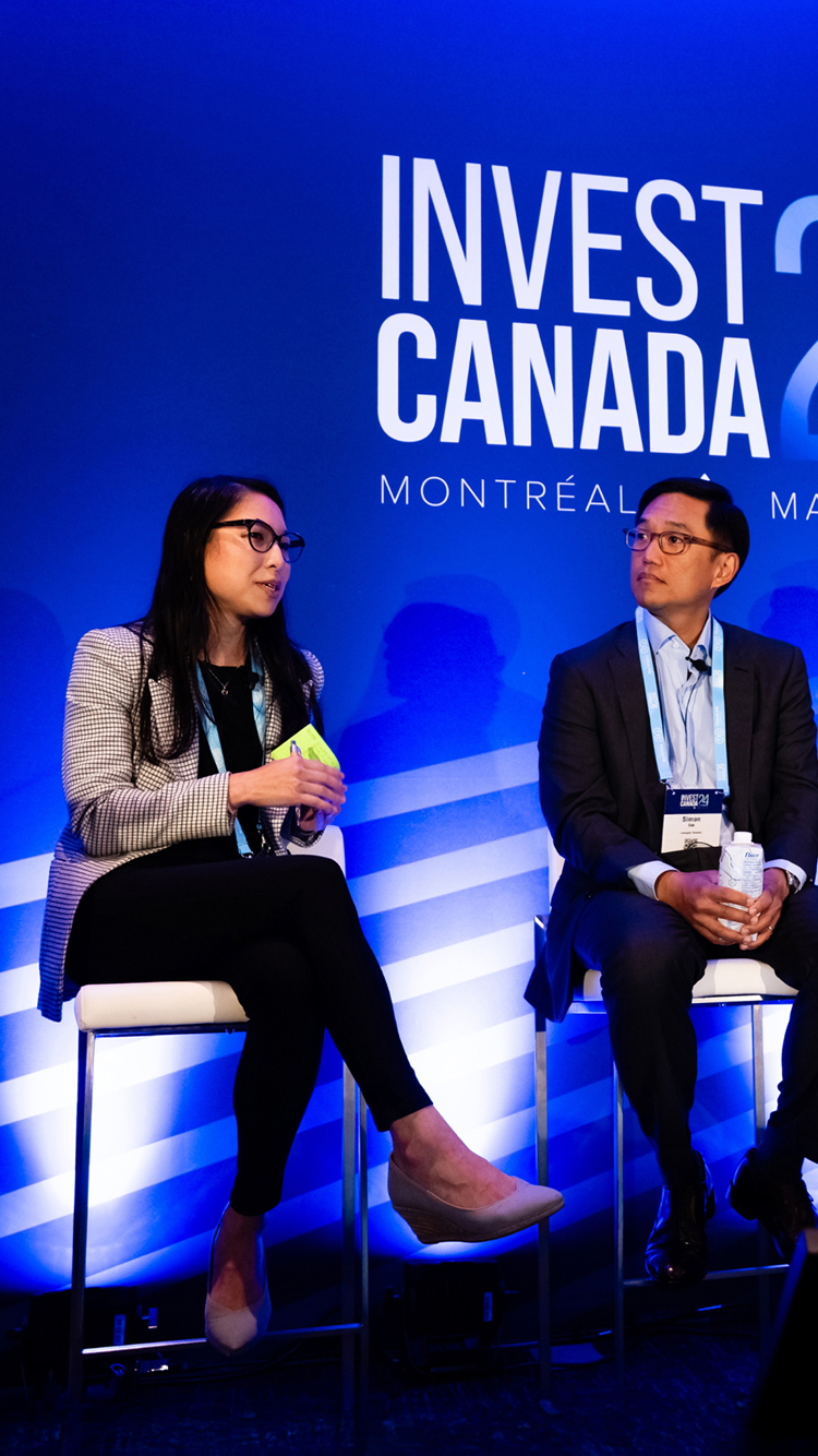
Panelists at Invest Canada 2024 event on blue background Two speakers on a stage at Invest Canada 2024.

Canadian Venture Capital & Private Equity Association

cvca.ca
Services Deliverables
  • Website
  • Logo
  • Illustration

Modernizing the hub for Canada’s private capital community

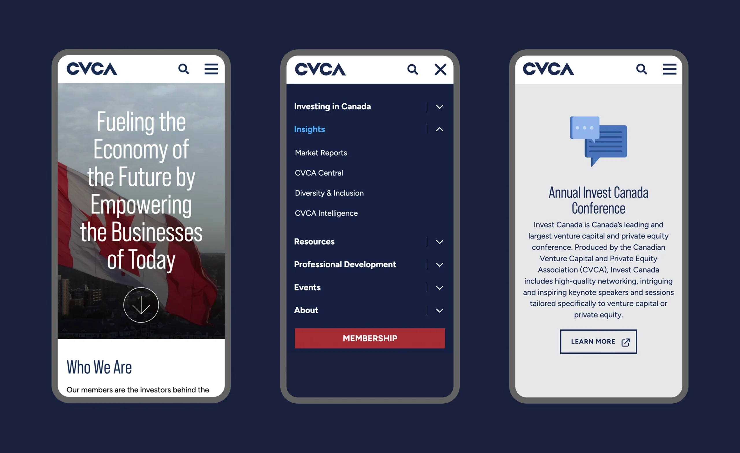
CVCA is the voice of Canada’s private capital industry, offering members access to research, data, events and member resources. To elevate and improve the user experience amongst various online resources and standalone properties, Forge reimagined and continues to maintain their main platform, along with annual conference sites and CVCA Central—a hub for industry news and events.

Features

WordPress CMS

Custom theme

Google Analytics

Sync and migration

Events Calendar

Downloads manager

Document tracking

Member directory

CRM-enabled forms

Custom animations

Interactive data visualization

Refreshed website for scalability

Laying the groundwork for a cohesive online presence

Systems for the brand application were carefully examined and established to ensure a strong sense of unity across all digital applications, including typography with a stronger focus on legibility and economy, a stylistically cohesive family of iconography and a foundational colour palette.
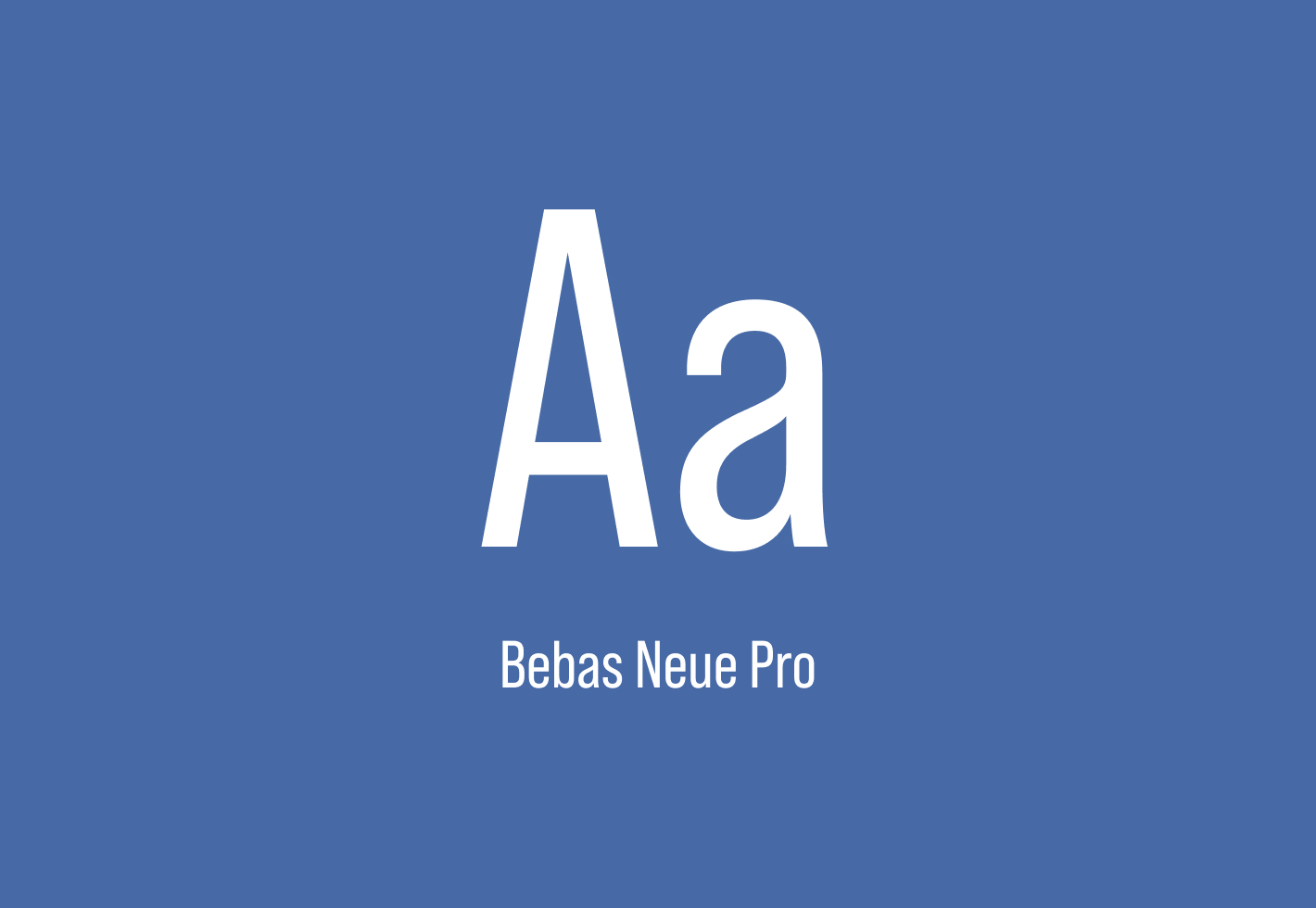
The letters Aa in Bebas Neue Pro font on a blue background.
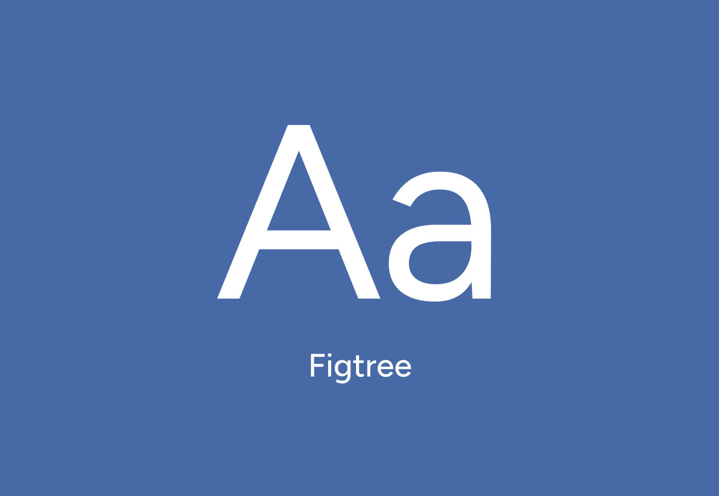
Figtree logo with Aa text
Modern typographic styles to increase legibility on digital applications
Business icons: person, chart, plant, folder, binoculars, presentation, graph, megaphone, chat, calendar, rocket, trophy
Visually cohesive icon set supporting various messaging
CVCA 50 years logo
CVCA 50 years logo
Anniversary logo design used in all communications during the association’s 50th year

An ecosystem of future-facing websites

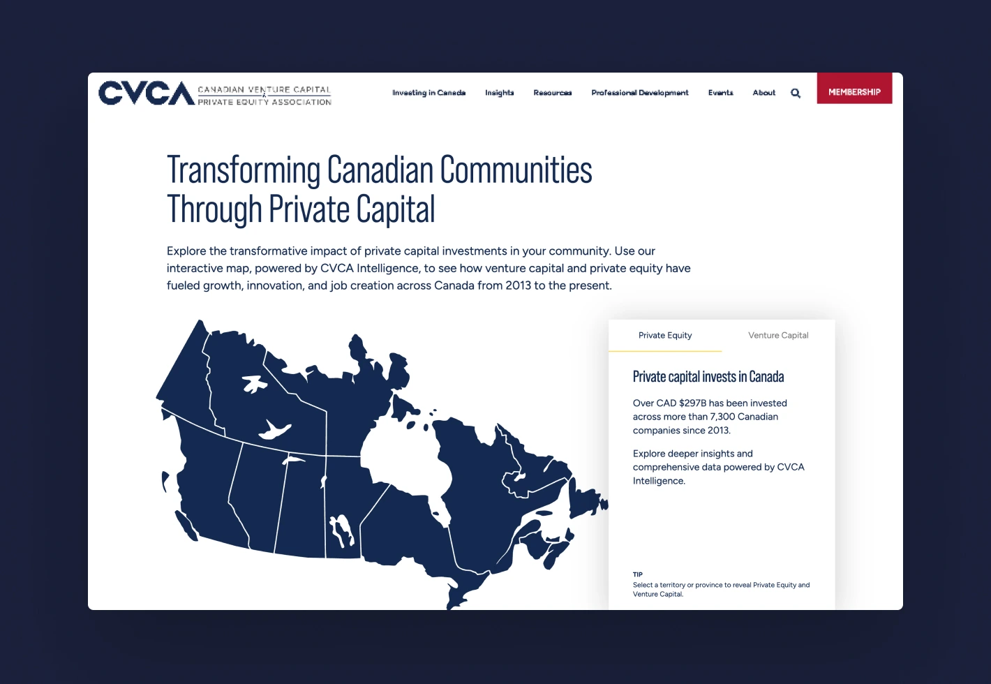
The CVCA website offers users a clean and intuitive interface, with key features including a powerful member directory, events calendar, integrated content management and dynamic news and insights sections—all built with a focus on usability and performance. By leveraging custom theming, brand consistency is ensured through every page and component, while still allowing flexibility to adapt to evolving content needs. Behind the scenes, several premium plugins were tailored to meet CVCA’s custom workflows, allowing for a smooth experience for both administrators and frontend users.
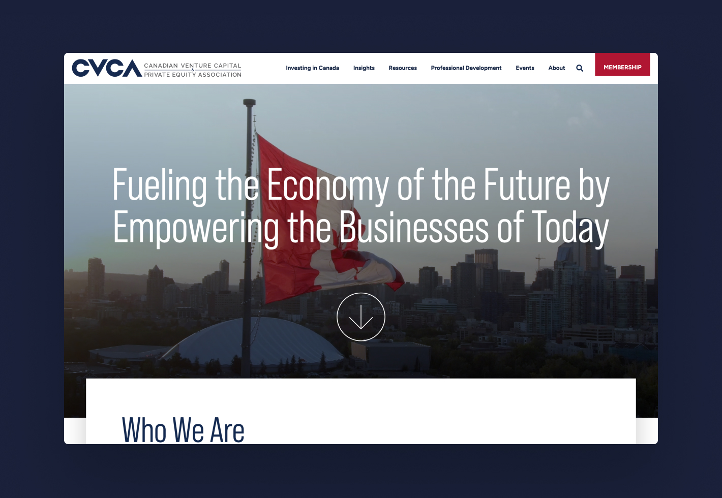
CVCA logo over city skyline with Canadian flag
CVCA logo and map of Canada showing private capital investments.
Responsive website design built on WordPress with custom theming
CVCA website with navigation menu and conference information.

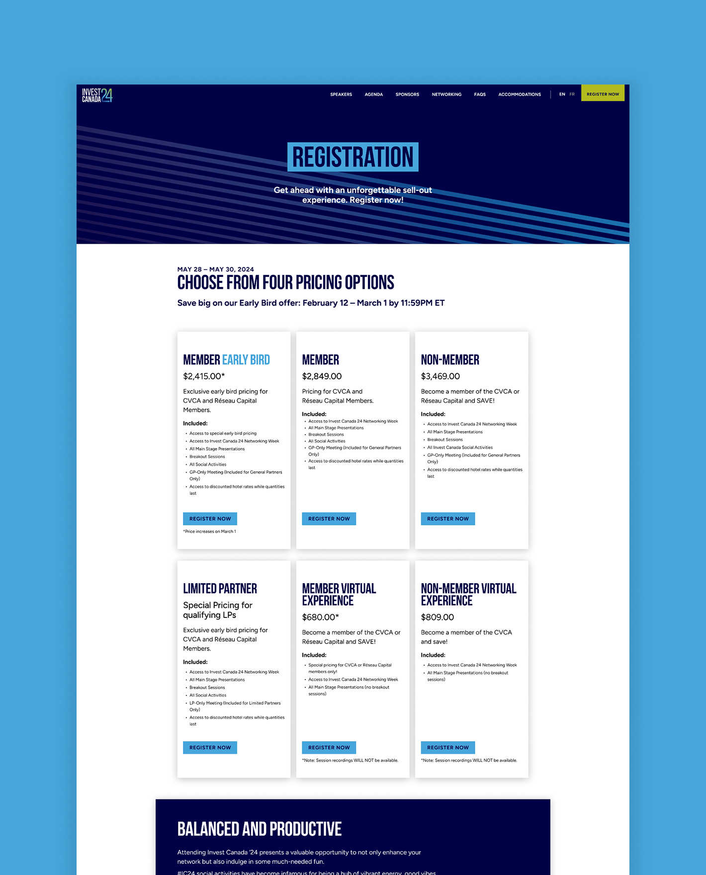
Leading-edge conference site built for conversions

The Invest Canada conference is an annual event, hosting key decision-makers in venture capital 
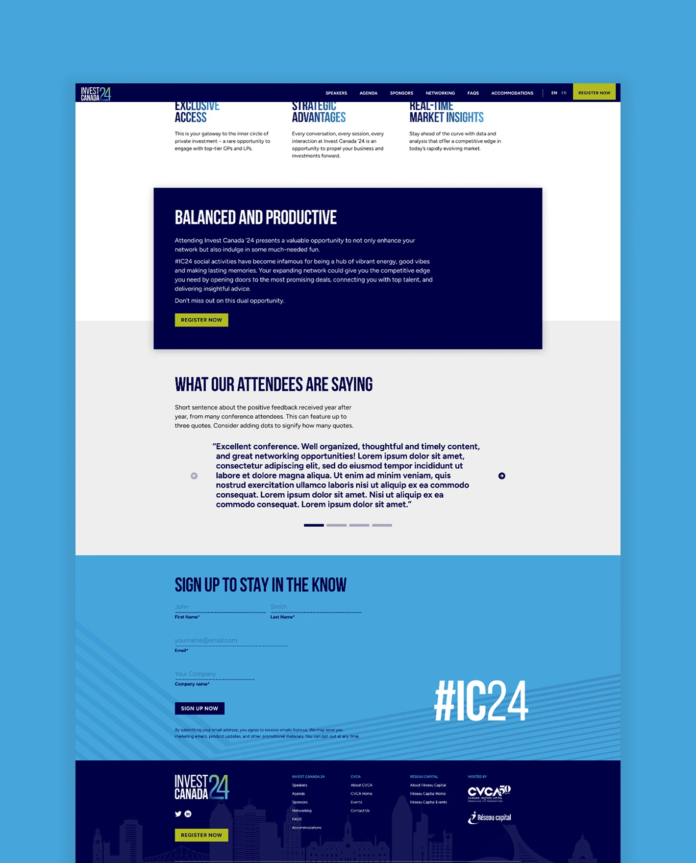
and private equity. The conference website is updated each year with unique visual themes, features an agenda with event registration leading to third party payment processing and is tied to a CRM to gather leads.
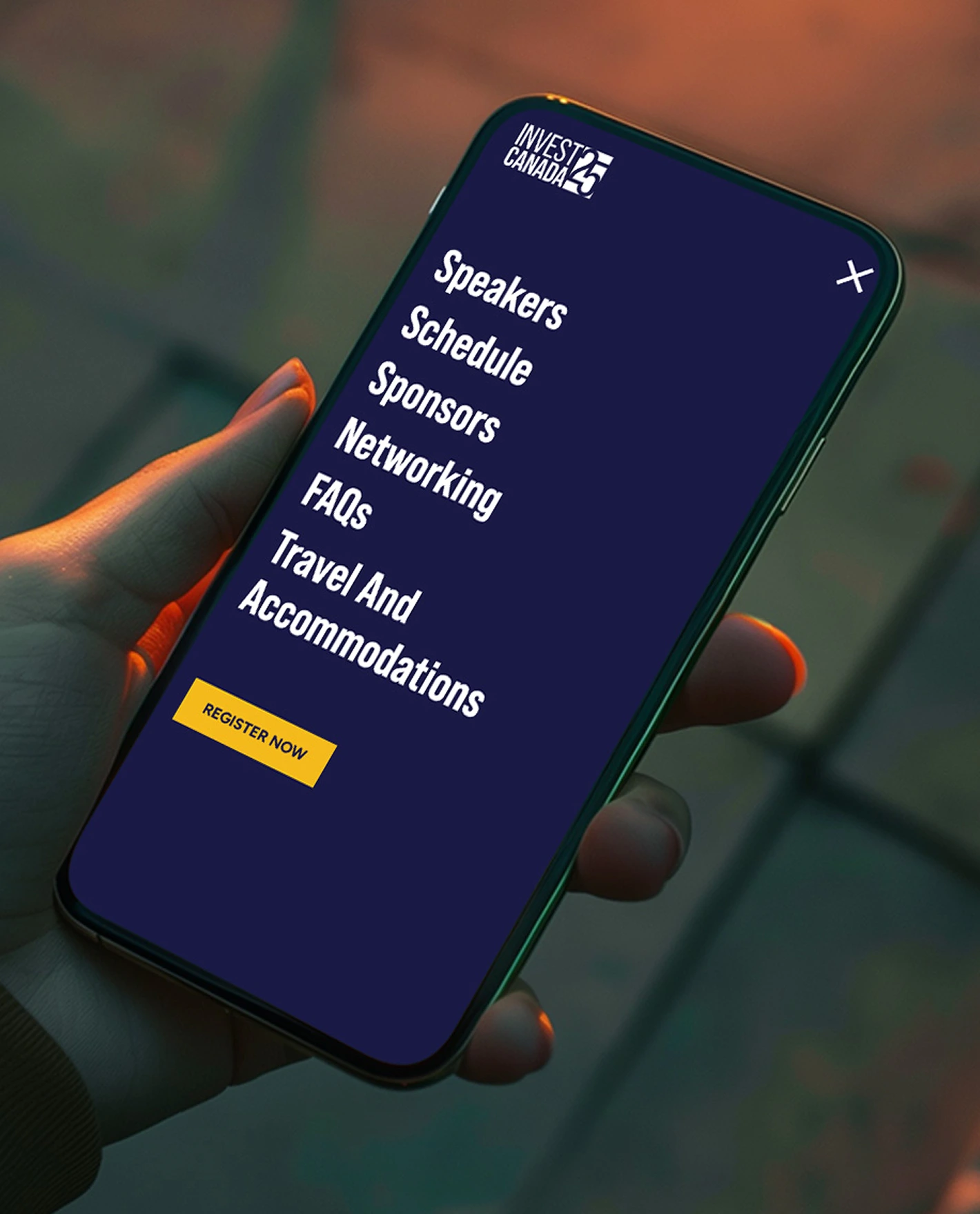
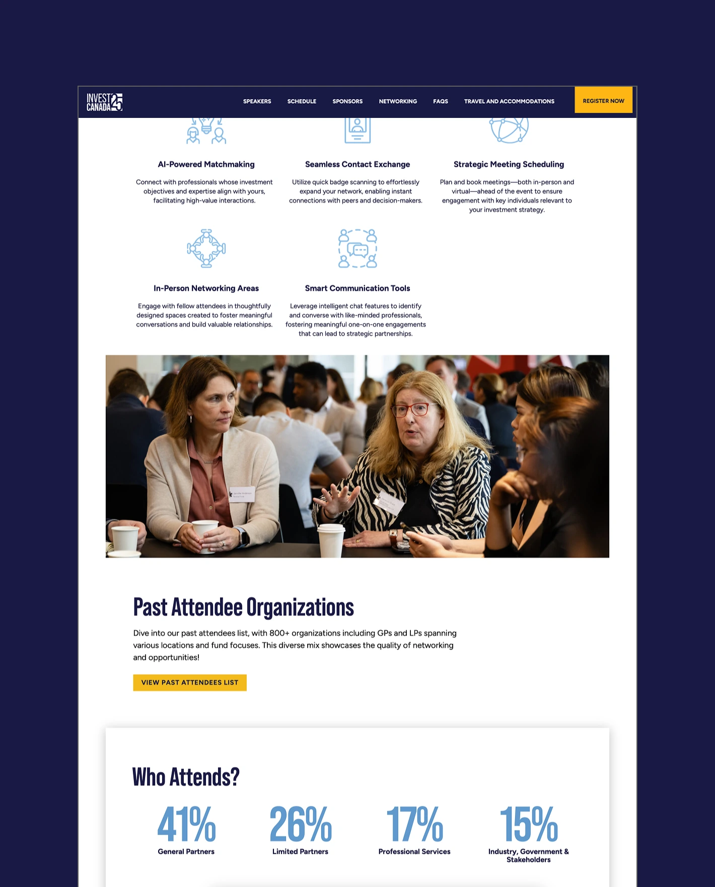
Annual, bilingual conference websites offer focused messaging and interface design that ties conference branding to the association’s core brand
Invest Canada 2026 conference statistics and networking event photo.
Invest Canada 2025 pricing options and conference floor articles.
Invest Canada 25 app menu with speakers, schedule, sponsors, networking, FAQs, travel and a register now button.
Invest 24 Canada accommodations page with conference building image.

Revitalizing an authoritative center for thought leadership

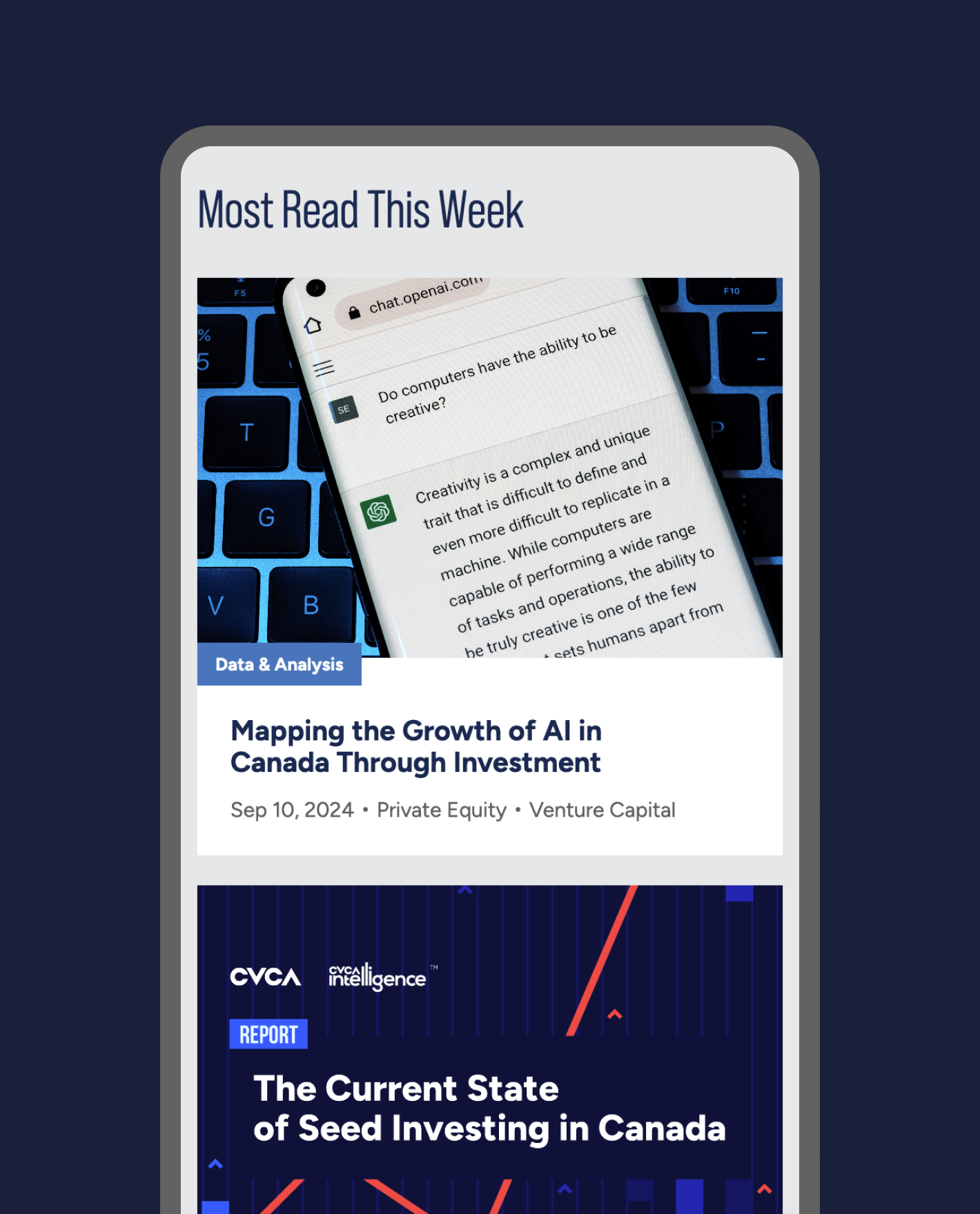
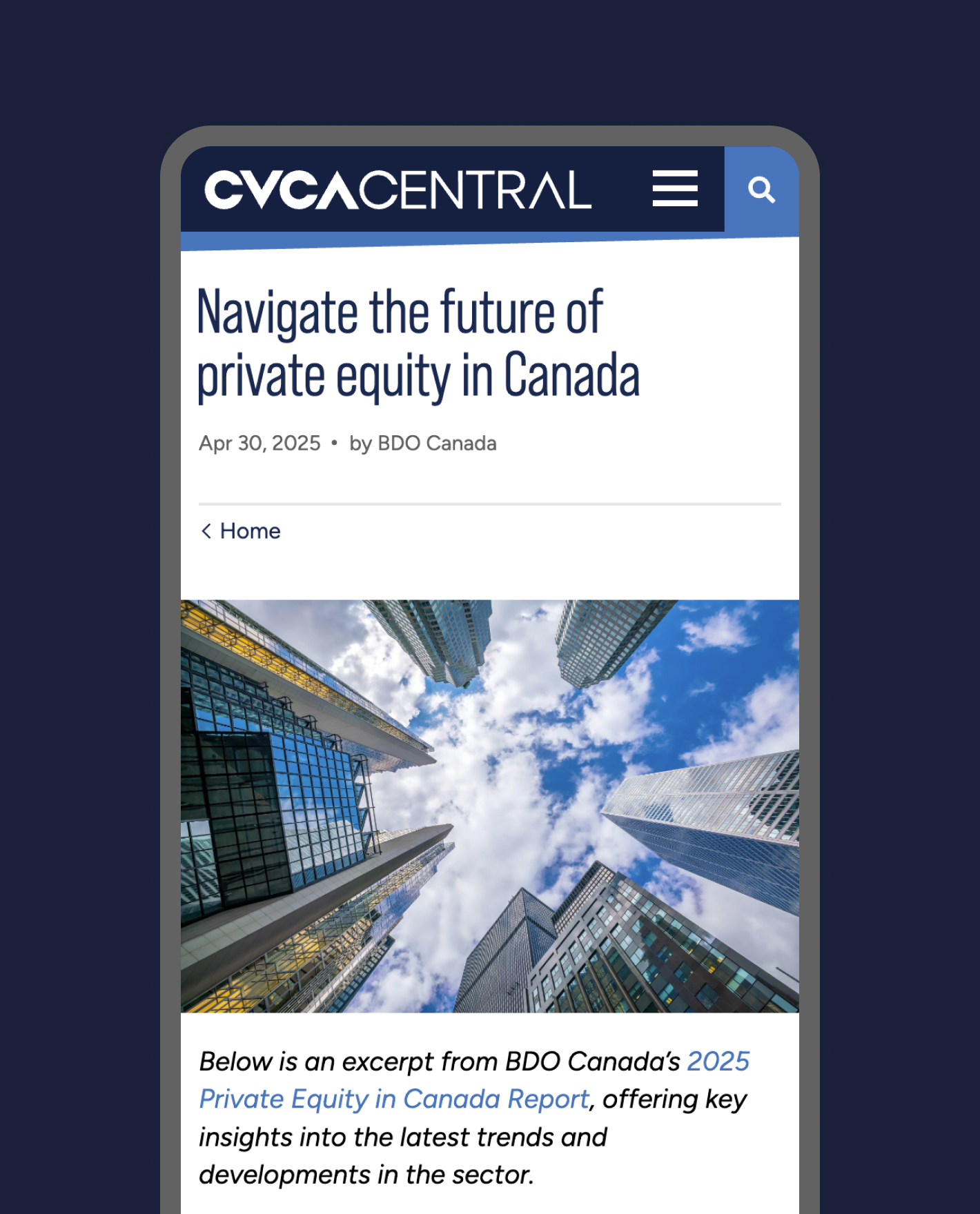
CVCA Central is the official publication of the association, offering timely information on industry news and events. The website’s design was updated to bring CVCA Central under the visual umbrella of the main website, while the CMS was migrated from Craft to WordPress in order to maintain consistency, ease of use and seamless data sharing between the two products.
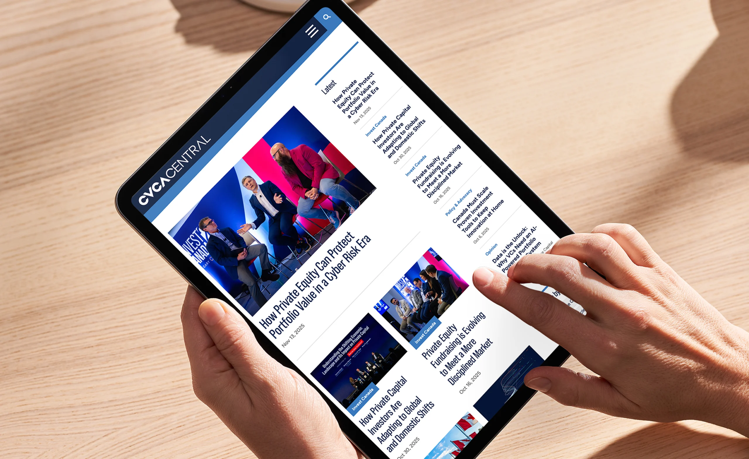
Hands holding a tablet displaying the CVCA Central website with articles on private equity.
Refreshed website built with custom blocks in WordPress provides a modular and adaptable framework
Modern skyscrapers viewed from below against a cloudy sky.
Most Read This Week: Mapping the Growth of AI in Canada Through Investment
  • 3 Websites migrated 
to WordPress
  • 3 Annual conference websites developed
  • 150K Users across three websites

Aerial view of The Well development, featuring modern high-rise buildings and surrounding urban landscape. Aerial view of modern high-rise buildings with balconies and rooftop gardens.

The Well

Services Deliverables
  • Brochure
  • Website
  • Brand Guide Extension
  • Photography Art Direction
  • Video Production

A spirited environment to live, work, shop, and play

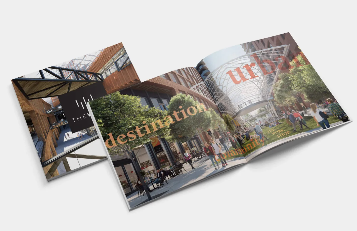
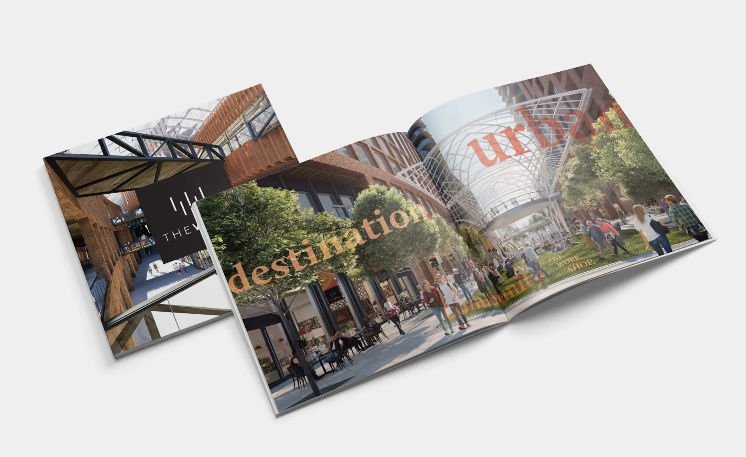
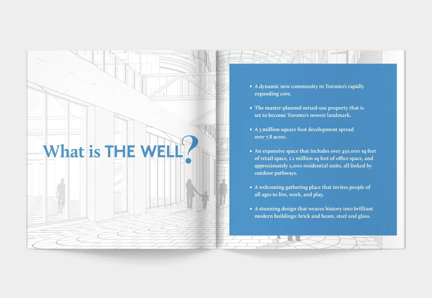
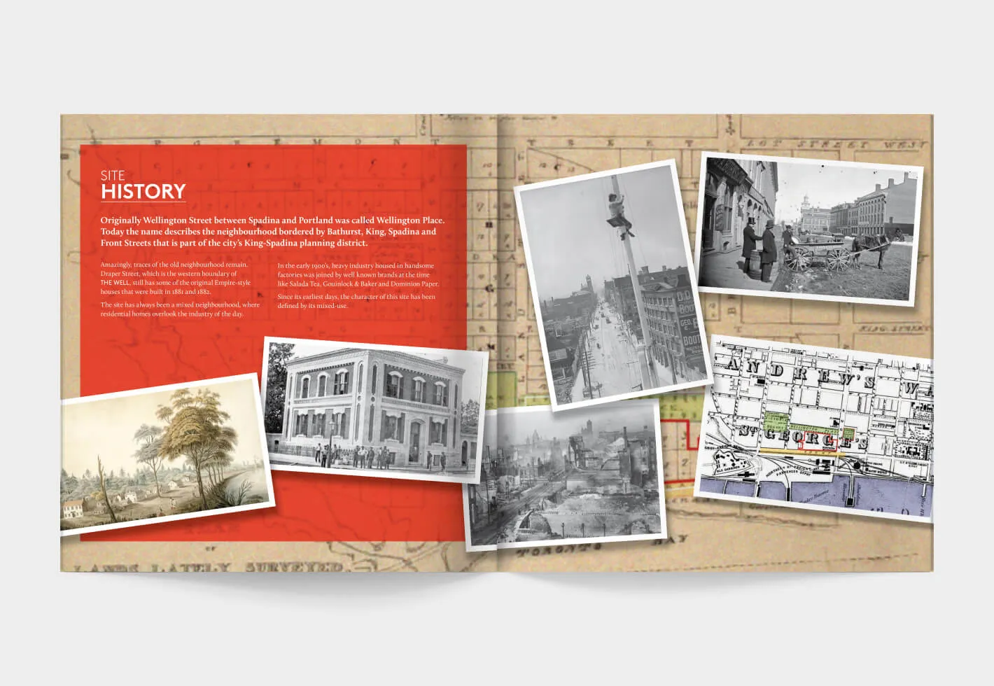
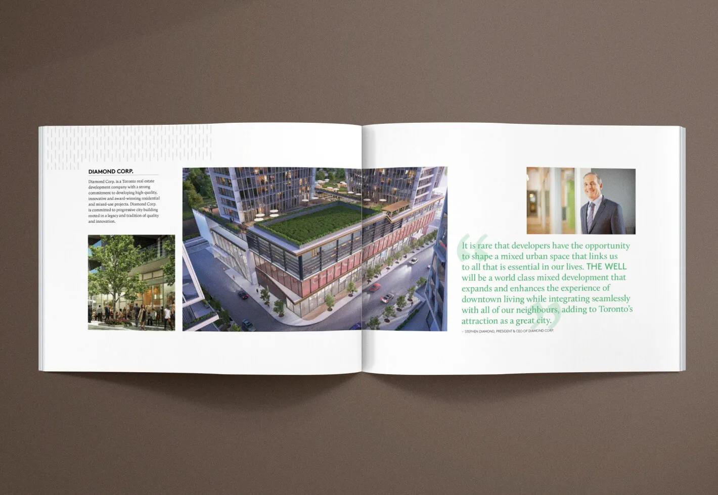
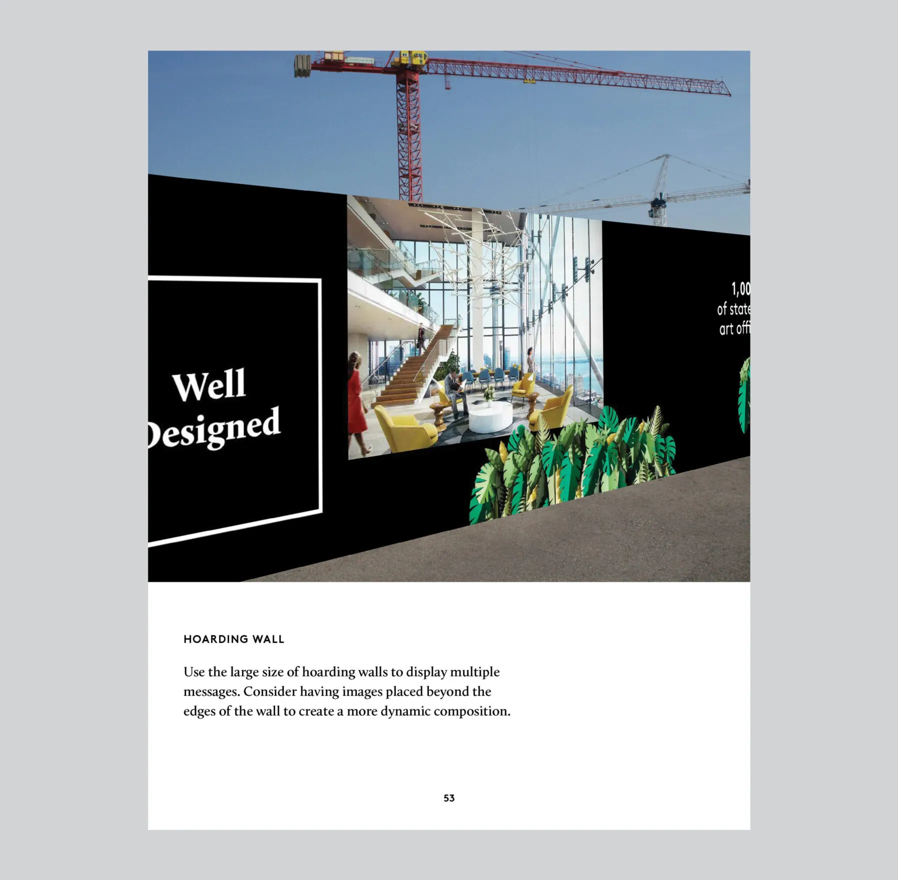
The Well is an innovative mixed-use property development in Toronto’s vibrant King West area where visitors and residents can eat, shop, work, live, and play. To introduce this multimillion-dollar endeavour to the public and generate buzz during a major media push, Forge created various marketing materials and brand assets including brochures with custom photography and vibrant layouts showcasing the properties features and the site’s exciting history.

Brochure spread showing urban development with text
Print collateral to promote offerings and communicate brand values
Illustration of
Site history of Wellington Place, Toronto, with historical images and maps.
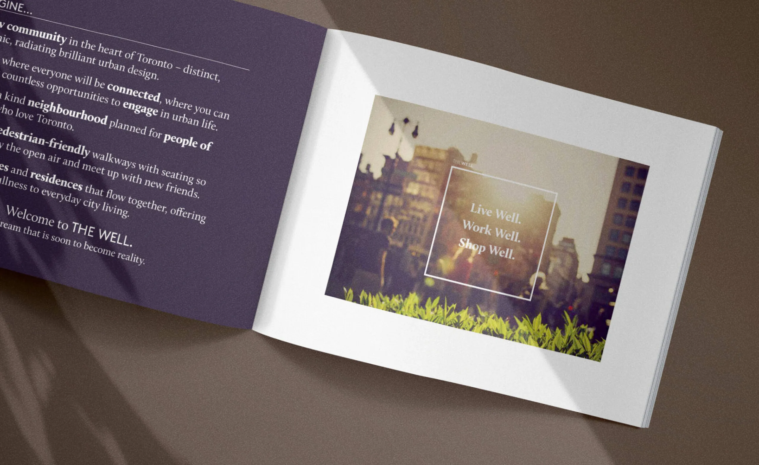
The Well: Live Well. Work Well. Shop Well.
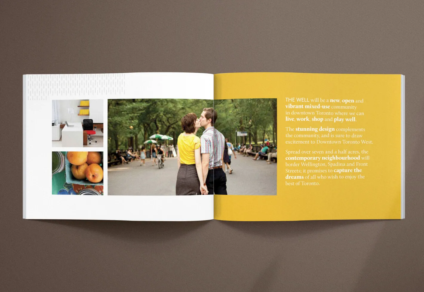
A couple kisses in a park with text about a new community development.
Diamond Corp. brochure featuring a rendering of The Well development and a quote from Stephen Diamond.

Moving the brand forward

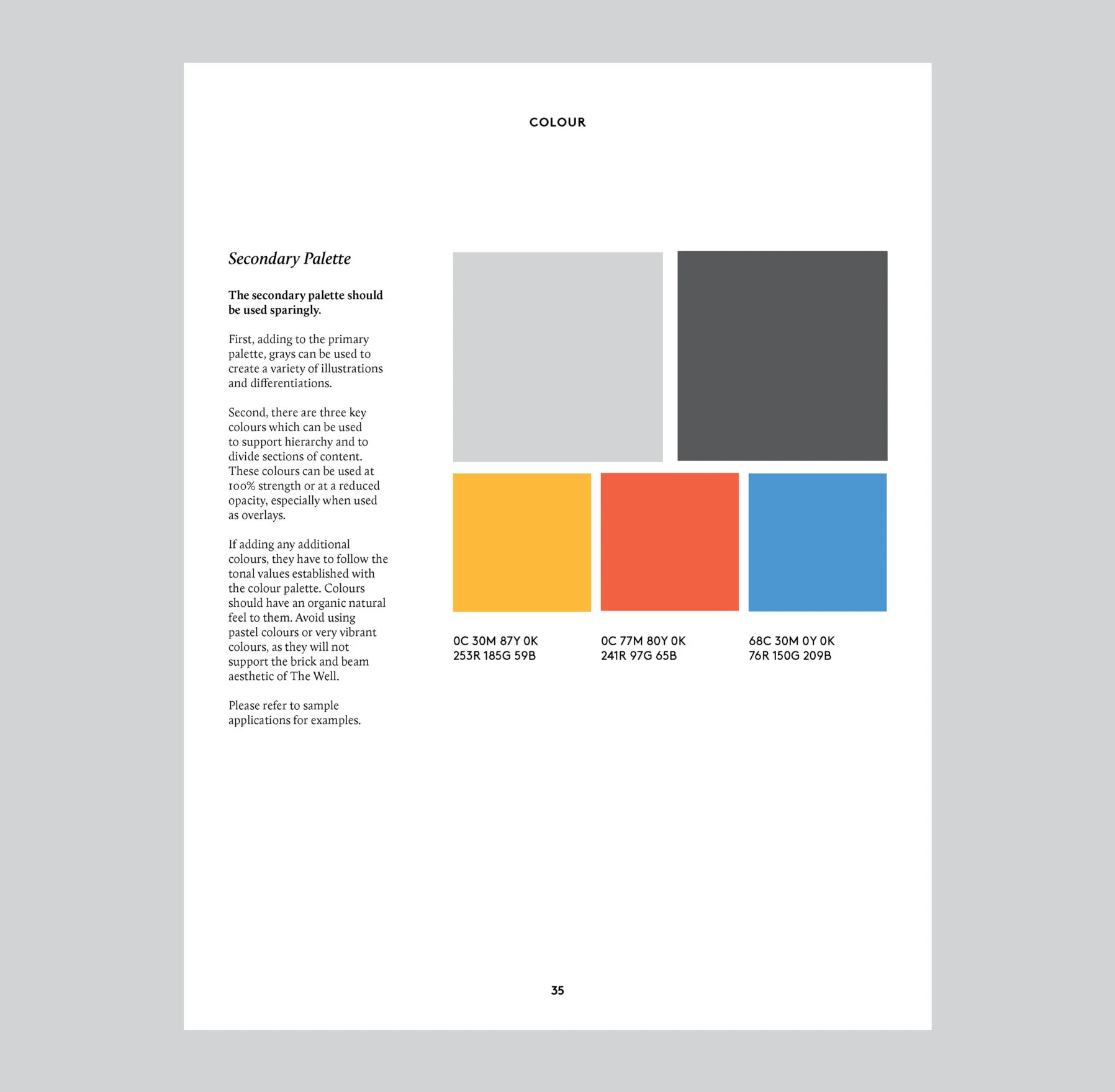
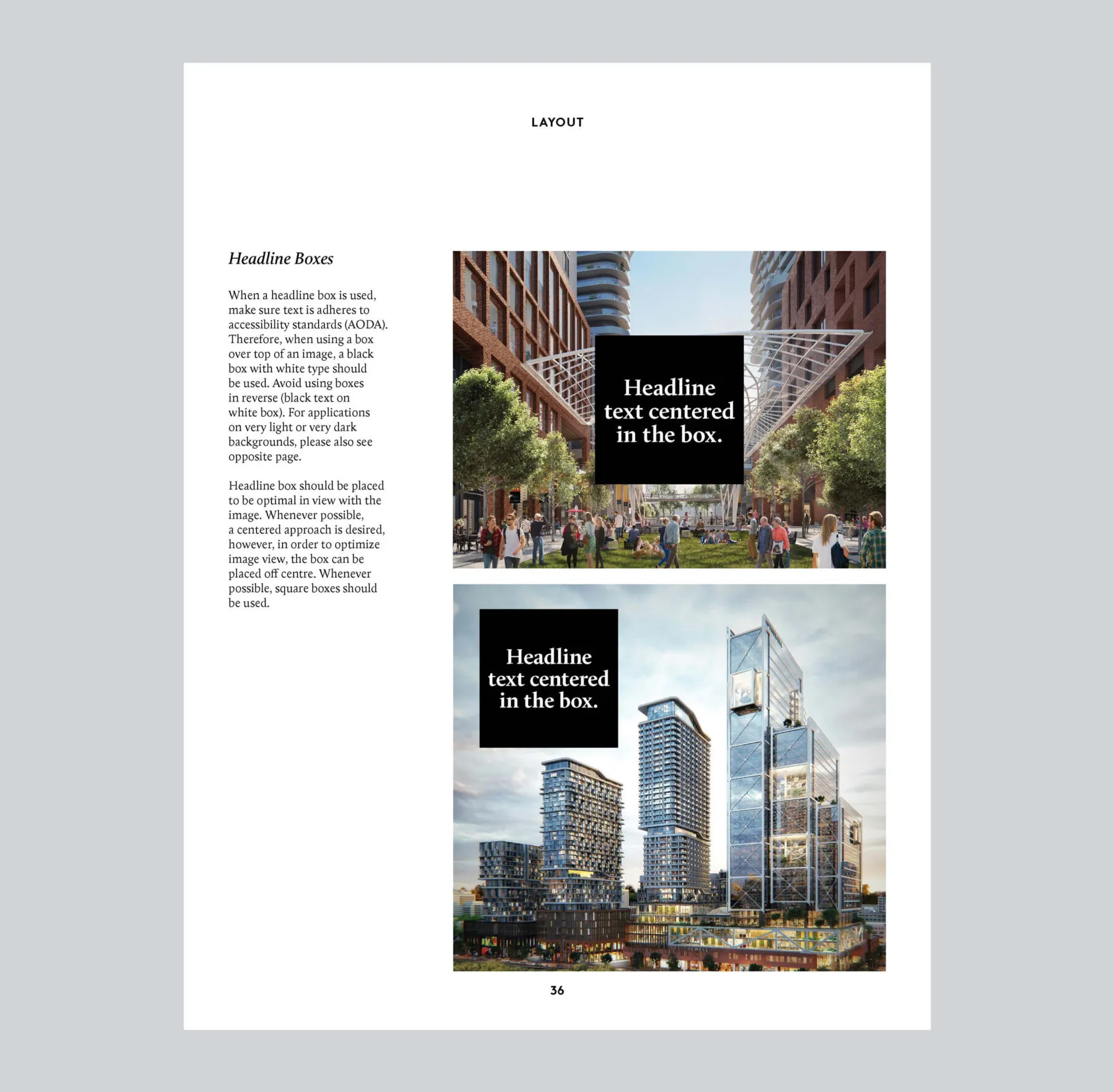
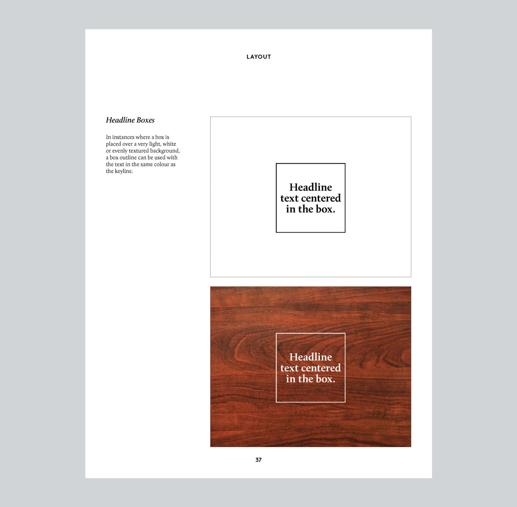
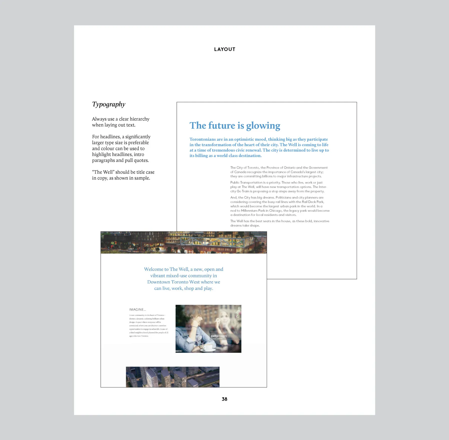
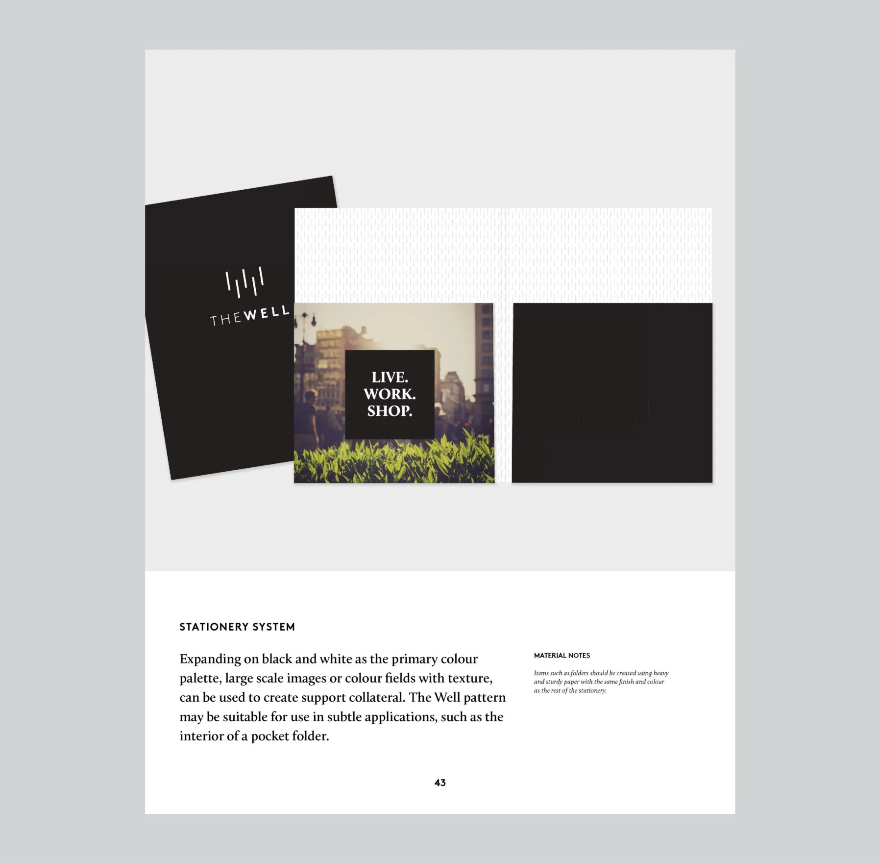
Expanding upon The Well’s existing brand guidelines created by Bruce Mau Design, additional standards were added by Forge, deepening the brand focus and addressing a broader range of brand application scenarios.

Engaging communities from near and far

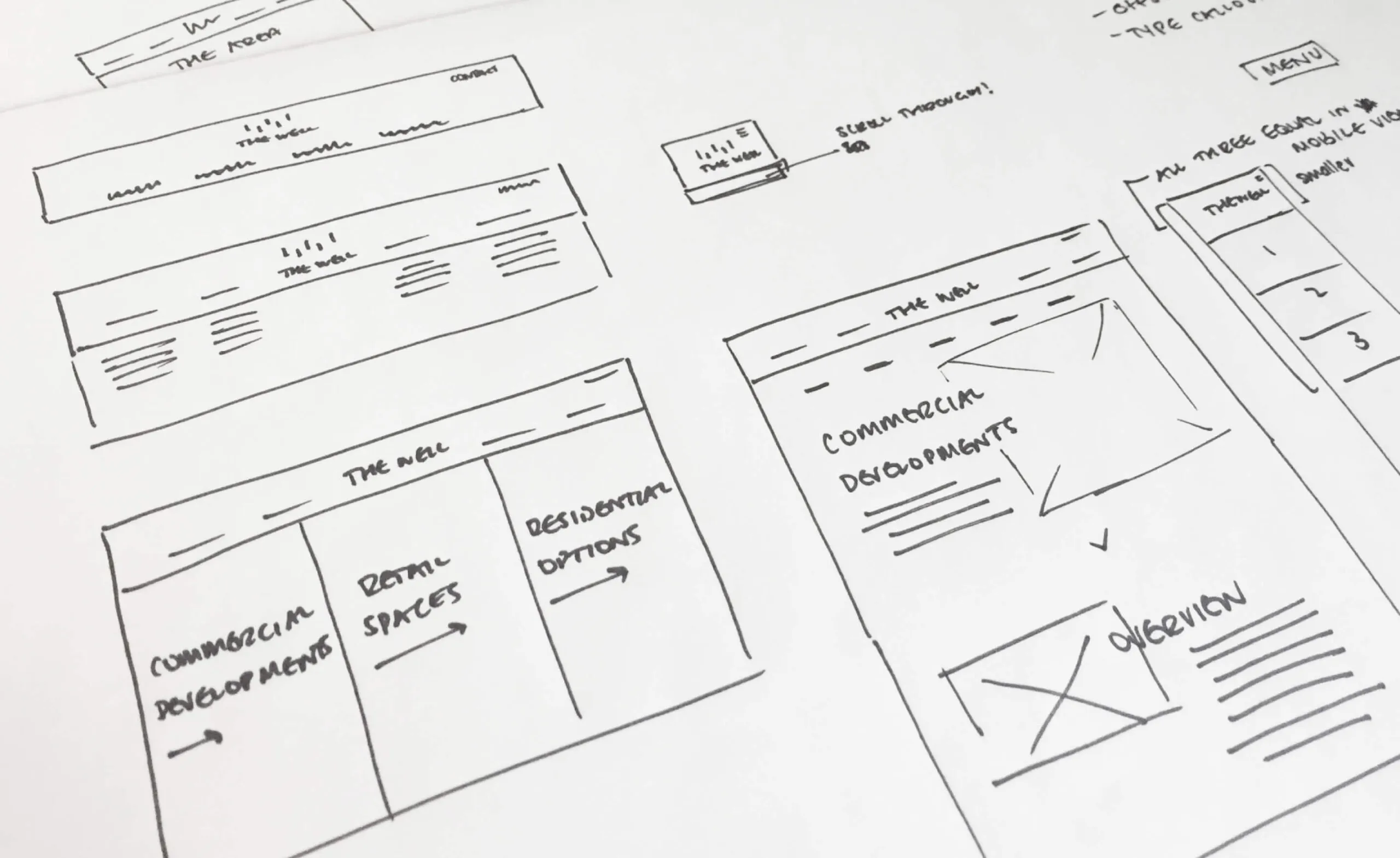
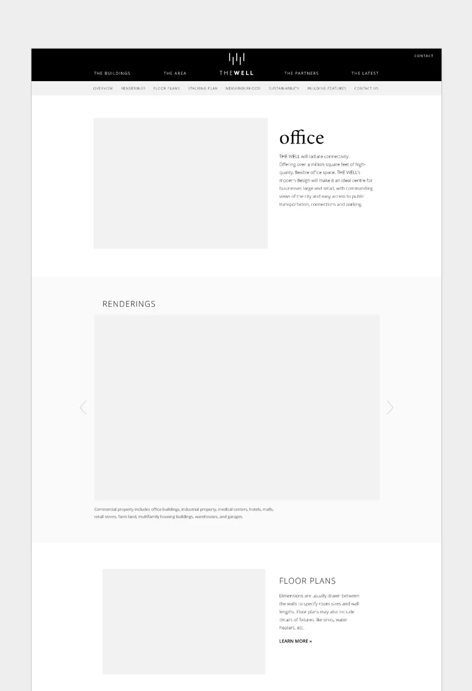
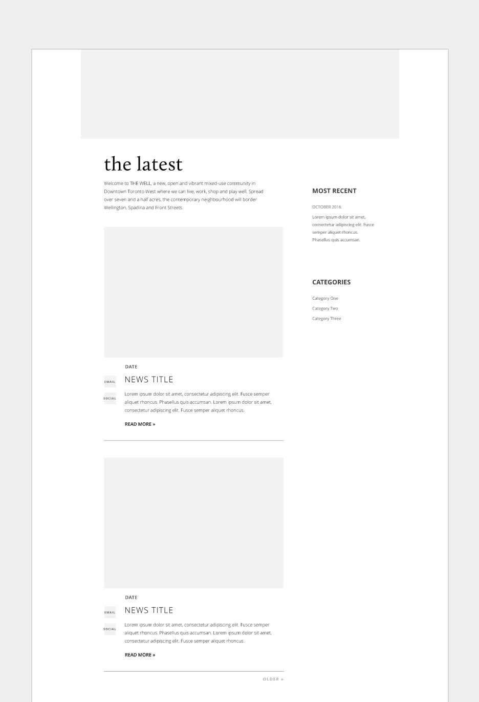
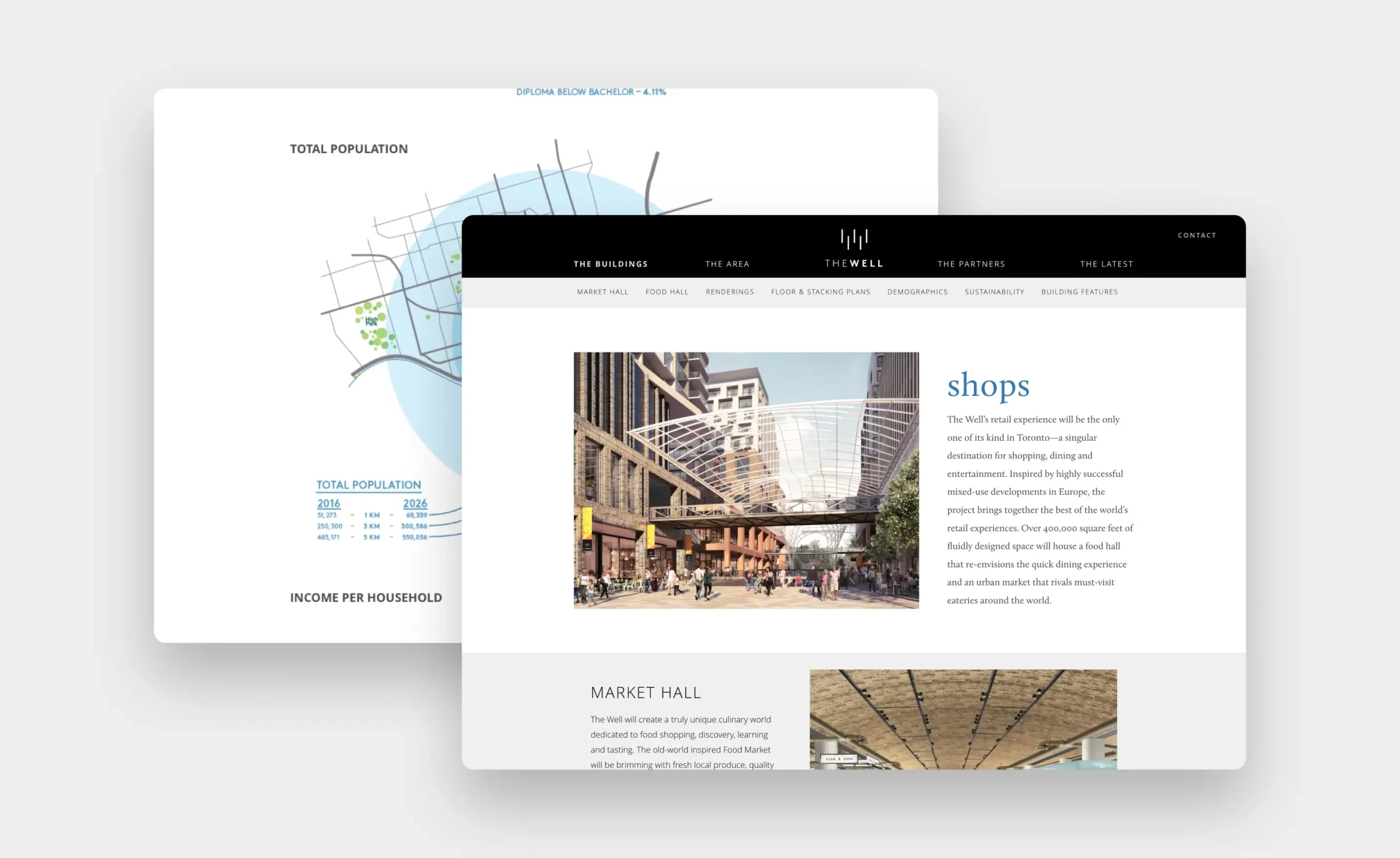
A website was created to showcase The Well’s various offerings, and provide an in-depth look at their residences, lifestyle amenities, flexible office spaces, retail locations, and the surrounding neighbourhood. Following an initial discovery phase, wireframes were created to determine an optimal strategy in presenting content and to create a dynamic and user-friendly experience.

Wireframe sketches for The Well website layouts
Low fidelity wireframing
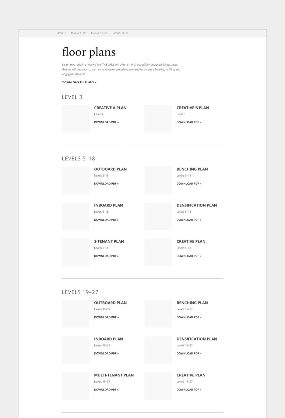
The WELL office building renderings and floor plans
The latest news from The Well community in Downtown Toronto.
Floor plans for The Well building, categorized by level.
High fidelity wireframing

Creating a foundation for memorable experiences

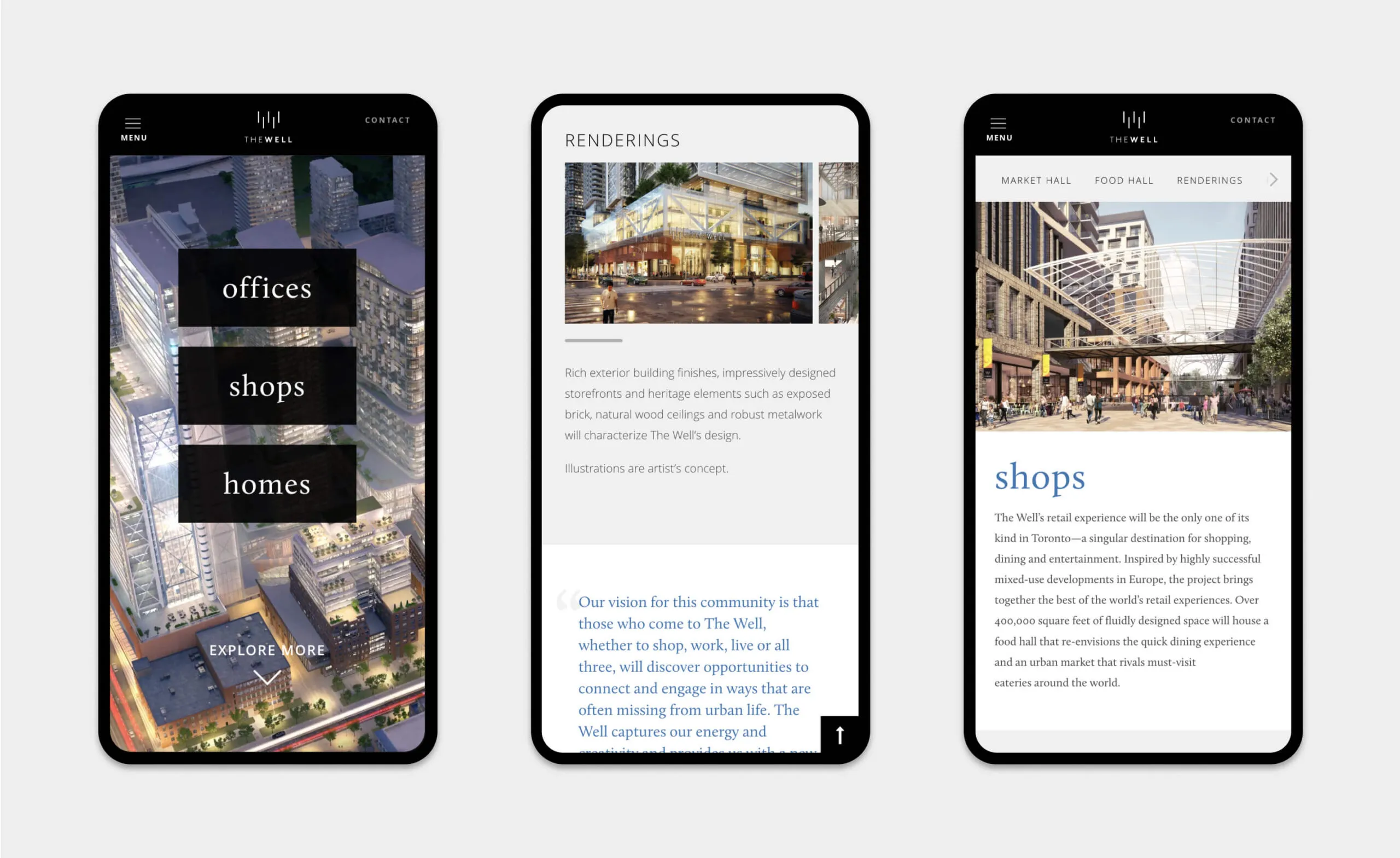
With a focus on lifestyle photography, architectural renderings, and data visualization, the website welcomes users with a warm, lively, and inspiring look into The Well’s community-focused philosophy. Optimized for various devices, the website is both accessible and intuitive for a modern audience.

Features

Google Analytics integration

WordPress CMS

Custom theme

CRM integrated forms

Video animation

Custom photography

Amenities maps

Data visualization

Website flexible for regular content updates
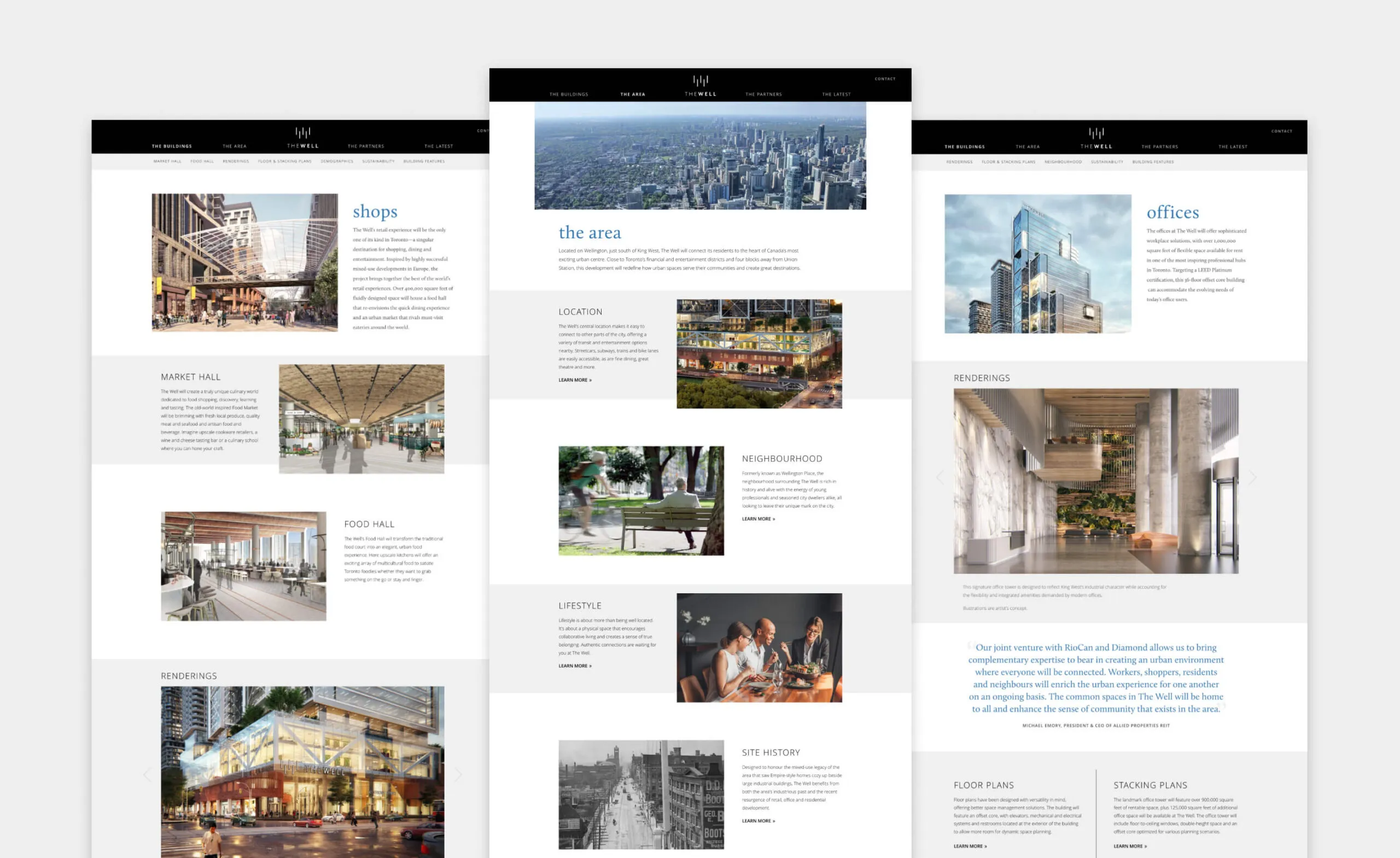
The Well development in Toronto, featuring shops, market hall, food hall, offices and renderings.
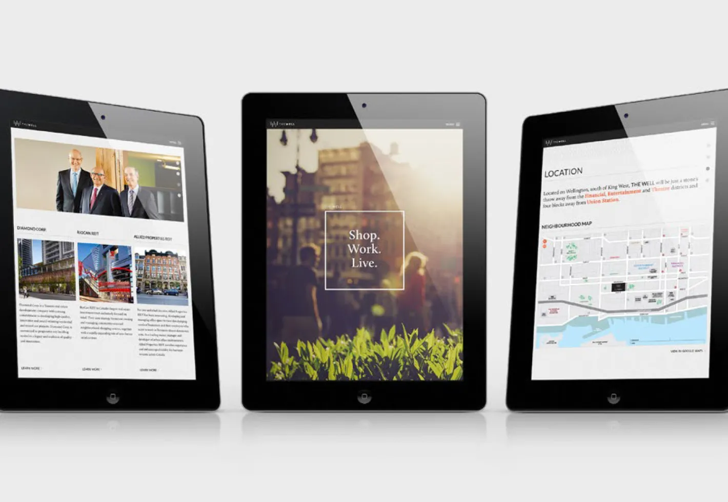
Three tablets displaying website content about The Well development.
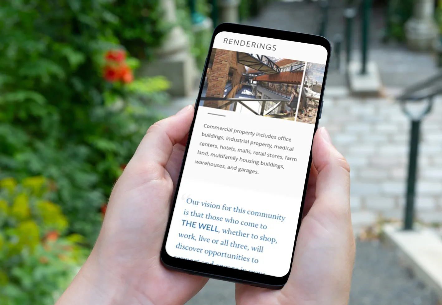
Phone displaying renderings and text about commercial property and community vision.
The Well retail experience in Toronto, featuring shops, market hall and renderings.
The Well development: renderings of shops, offices, and homes.
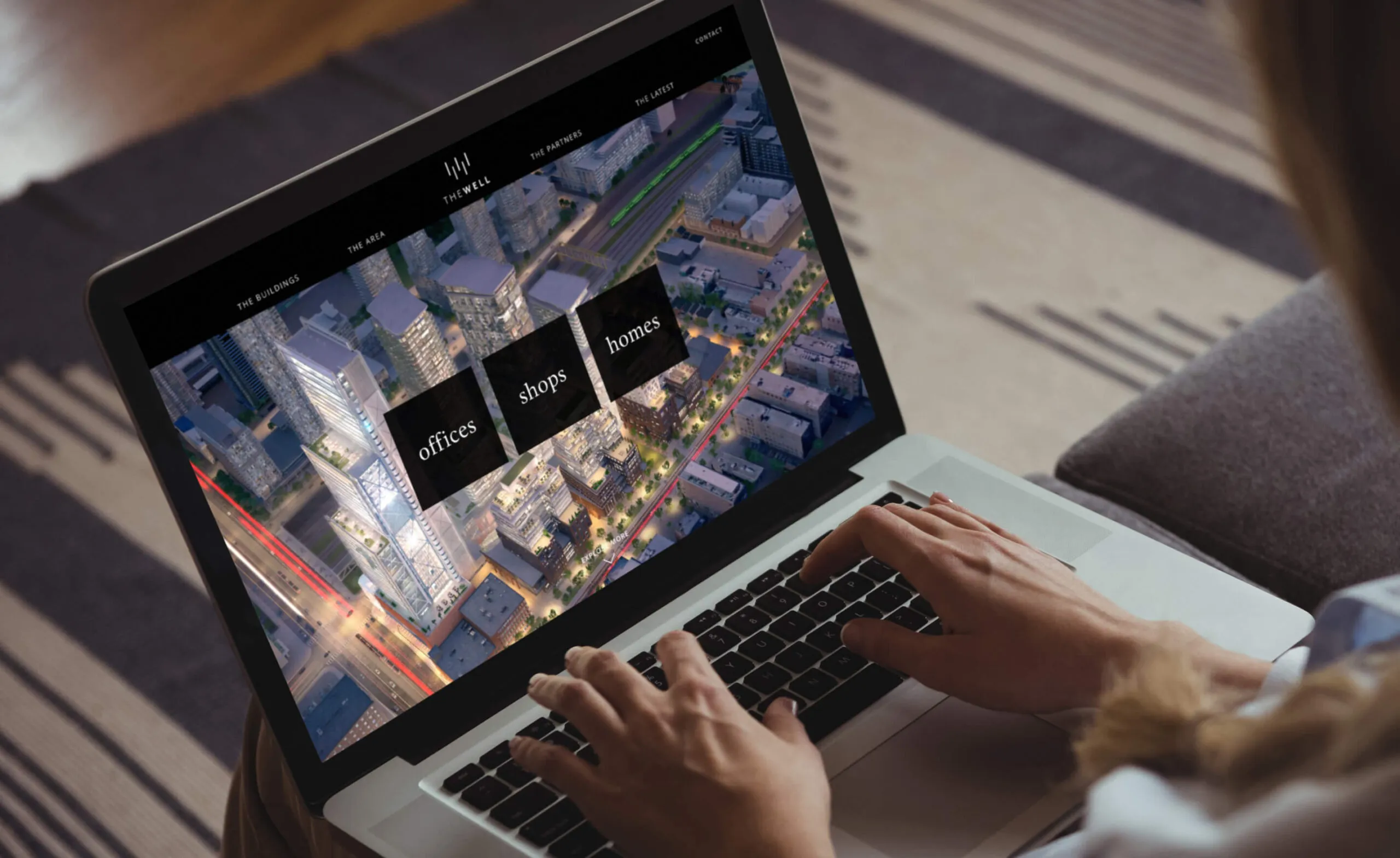
The Well website showing a city aerial view with navigation links for buildings, area, offices, shops, and homes.

Employing motion to amplify the message

To elevate the brand experience at events, our team produced a seamlessly-looping video to be leveraged in various presentation and promotional scenarios, providing The Well with a versatile and powerful marketing tool.

  • 22K daily guests
  • 1.7K premium residential units
  • 320K square feet of retail and food service
  • 1.2M square feet of office space
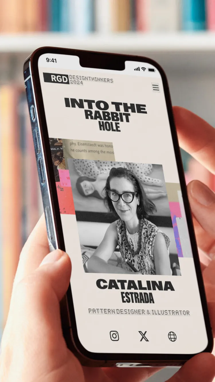
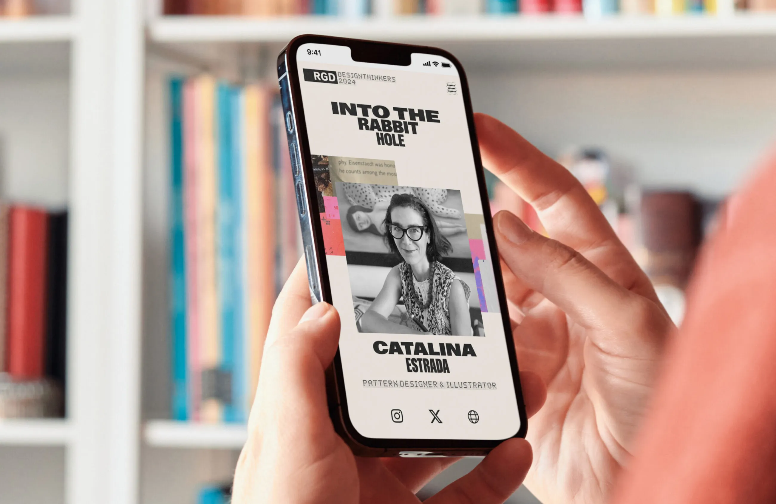
Catalina Estrada's portfolio website on a phone, with Catalina Estrada's Designthinkers 2024 profile on a mobile phone.

Bringing together a community of creatives

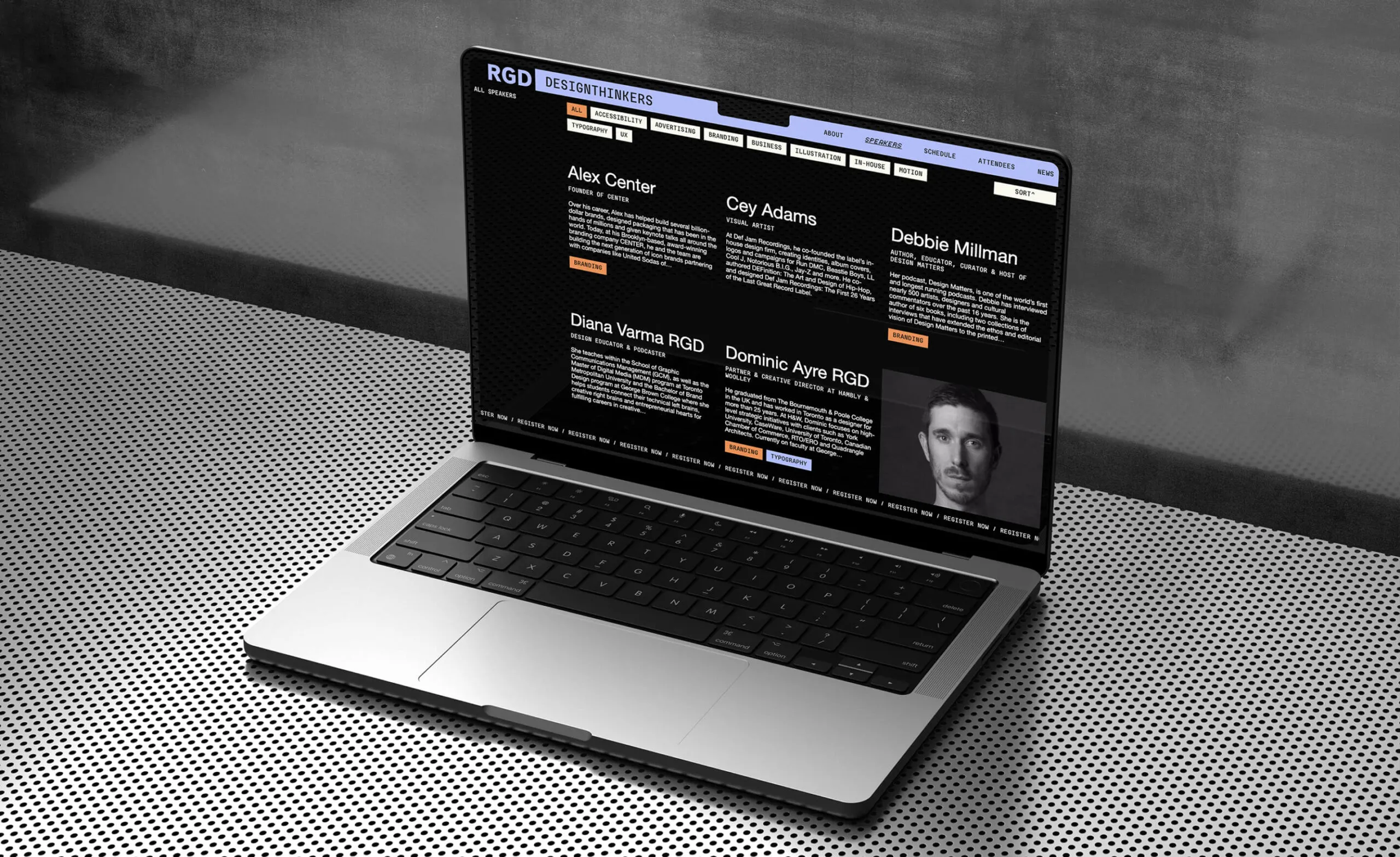
DesignThinkers is Canada’s largest design conference, organized by the Association of Registered Graphic Designers (RGD). Offering in-person and virtual experiences, DesignThinkers hosts annual conferences in Toronto and Vancouver, bringing together creatives and designers nationwide.

Features

WordPress CMS

Custom theme

Events calendar integration

Pheedloop registration

Custom animations

Google analytics

Website based on Whitman Emorson’s branding

Adapting a dynamic aesthetic to the digital space

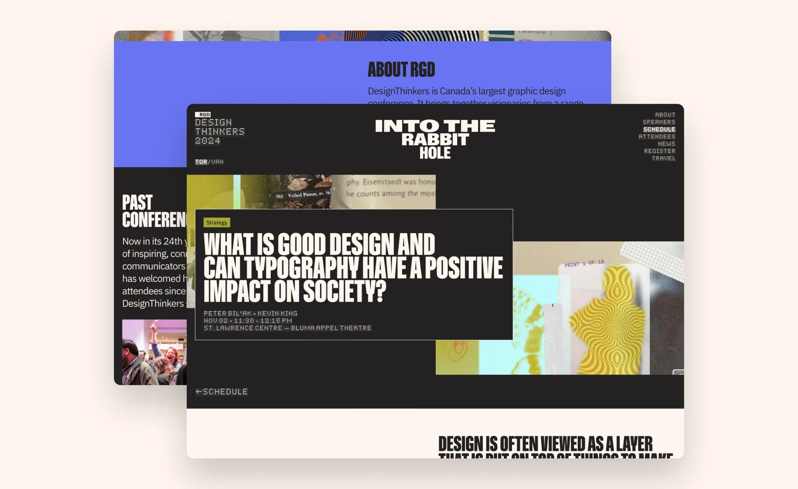
Each year features a theme focusing on industry trends and opportunities, with this year’s titled ‘Into The Rabbit Hole’. Envisioned by Whitman Emorson, our design partner—the concept is supported by various collage and optical illusion graphic elements, reinforcing the idea of a dreamlike, unpredictable, and unexpected world of discovery.

Abstract collage with mushrooms, a slider, and geometric patterns.
Abstract graphic with text
Graphic elements supporting the ‘Into The Rabbit Hole’ theme
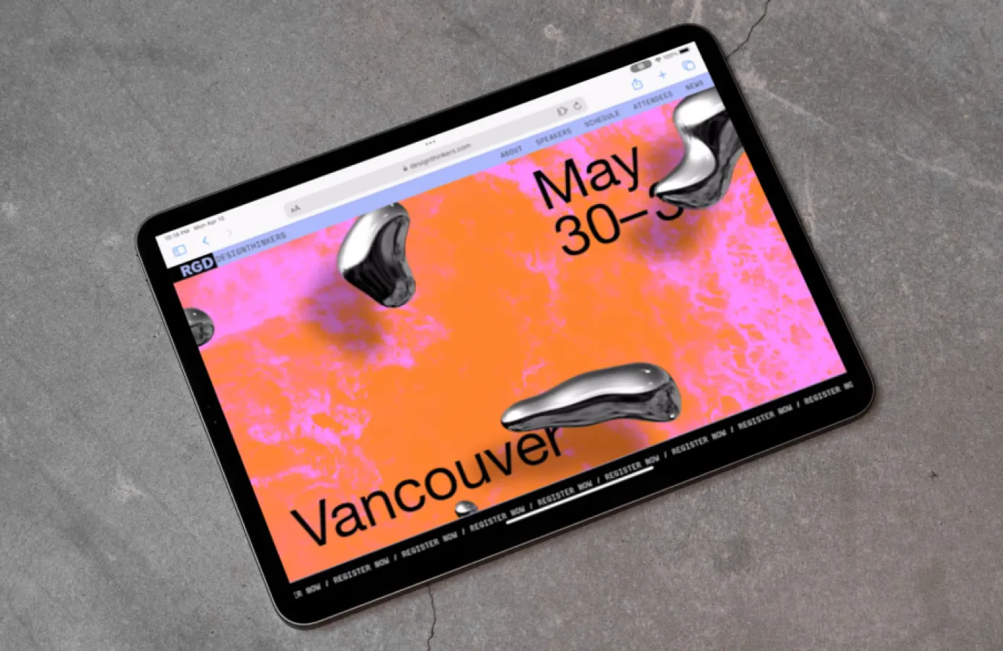
RGD Design Thinkers 2024 website with conference details and abstract art.

Creating a frictionless user experience

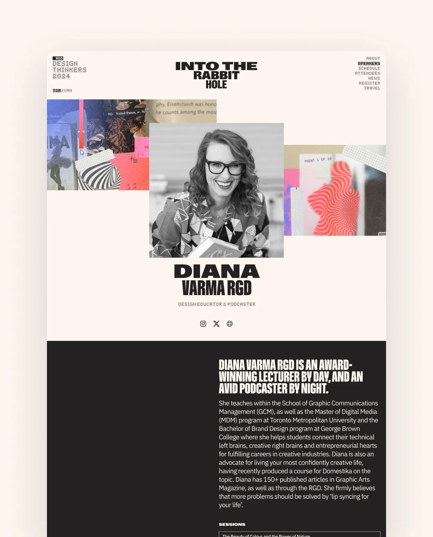
Through user testing and strategic discussion, the overall user experience was enhanced by identifying moments of friction, improving user flow, and increasing registration conversions. By improving the existing UI, optimizing page layout, and creating a stronger focus on speaker content, users can more easily navigate key areas of the website including event schedule, featured speakers, registration, and travel accommodations.

Diana Varma RGD, Design Educator & Podcaster
DesignThinkers 2024 conference poster with event details for Toronto and Vancouver.
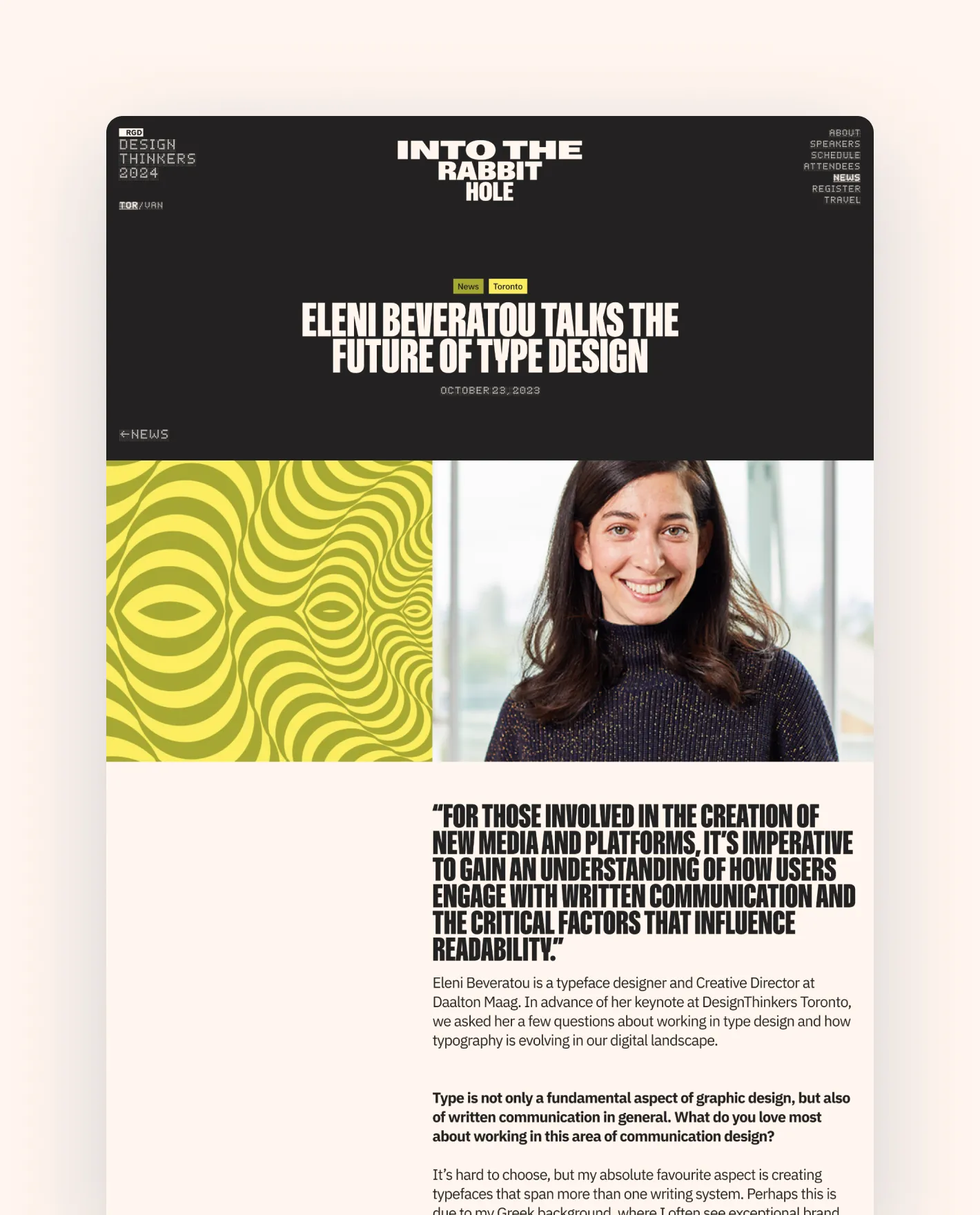
Eleni Beveratou, typeface designer and Creative Director, speaks about the future of type design.
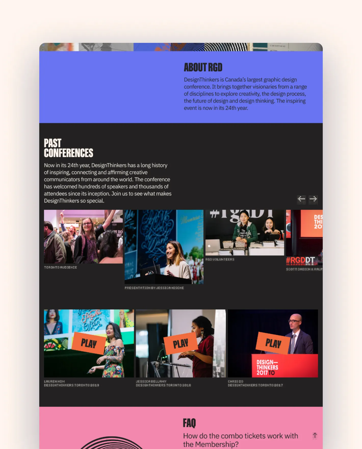
DesignThinkers conference past events and speakers.
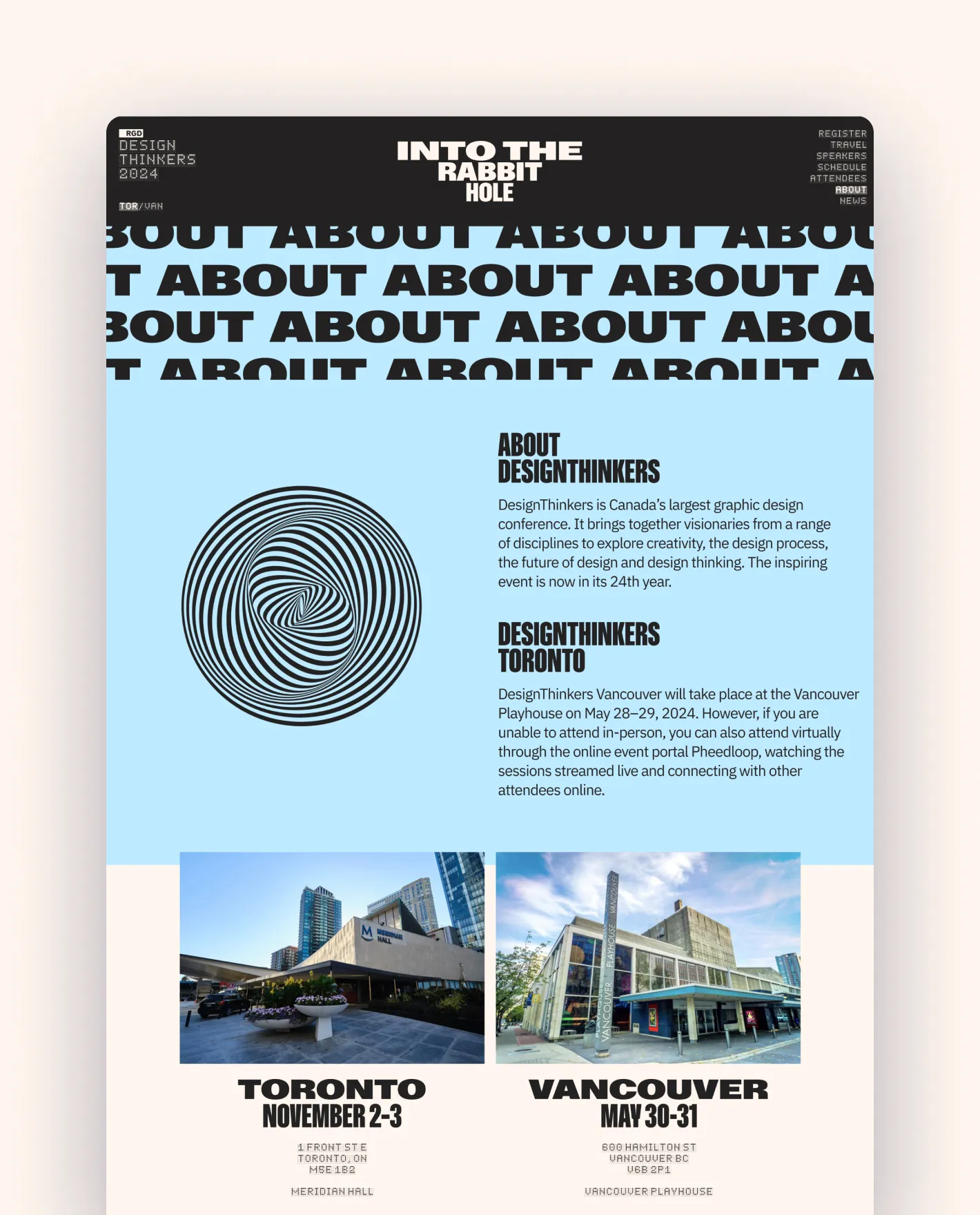
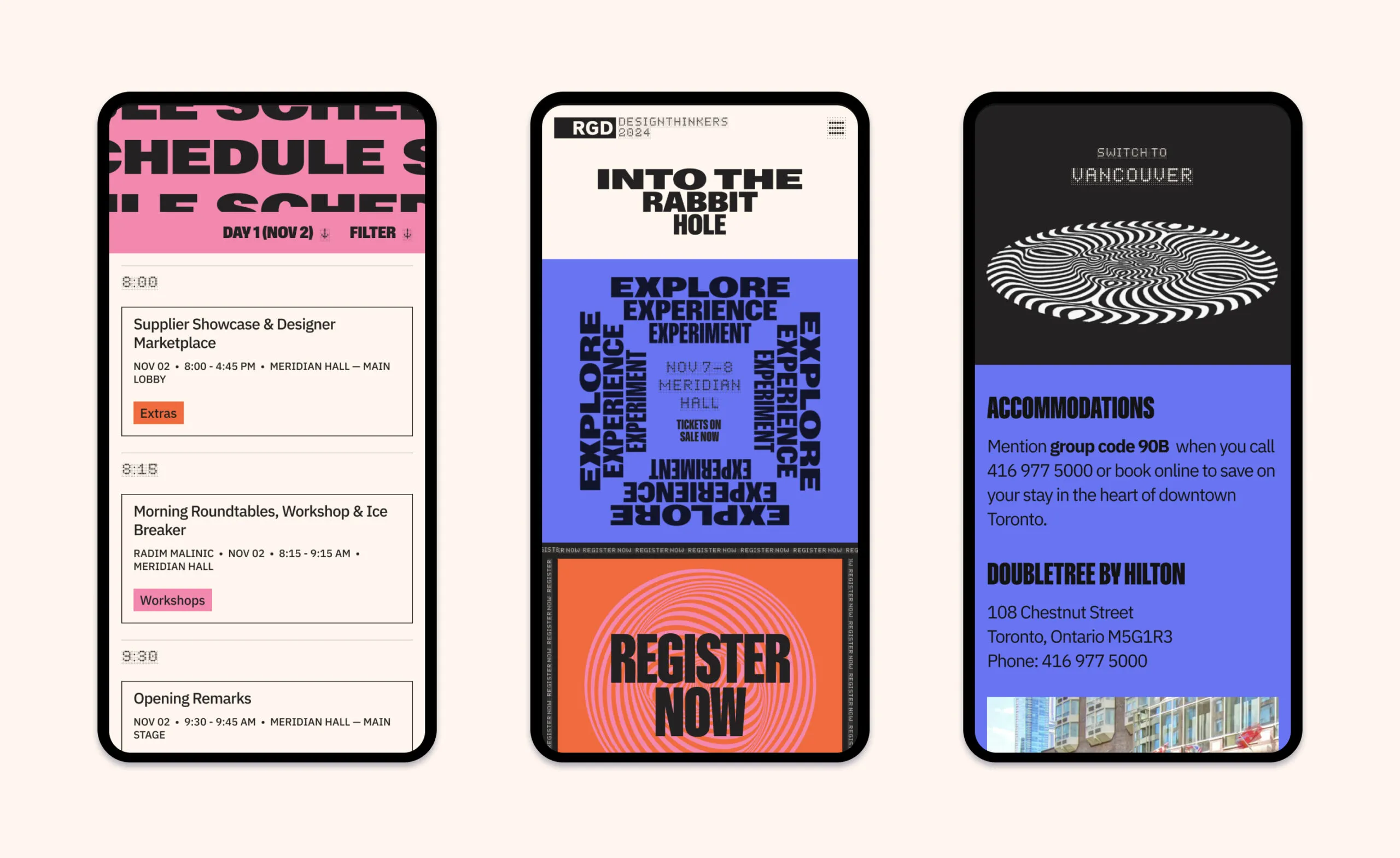
Unique colour palettes are used to differentiate pages for the Vancouver and Toronto events
Three mobile screens showing a schedule, event poster and accommodations for DesignThinkers 2024.
  • 2.3K delegates attended in 2023
  • 30 editions and counting in 25 years
  • no. 1 graphic design event in Canada
  • 2 cities visited per year
Two workers in hard hats review documents in front of stacked shipping containers. Two workers in hard hats review documents in front of stacked shipping containers.

Metro Supply Chain

metroscg.com

Revitalizing an innovative supply chain leader

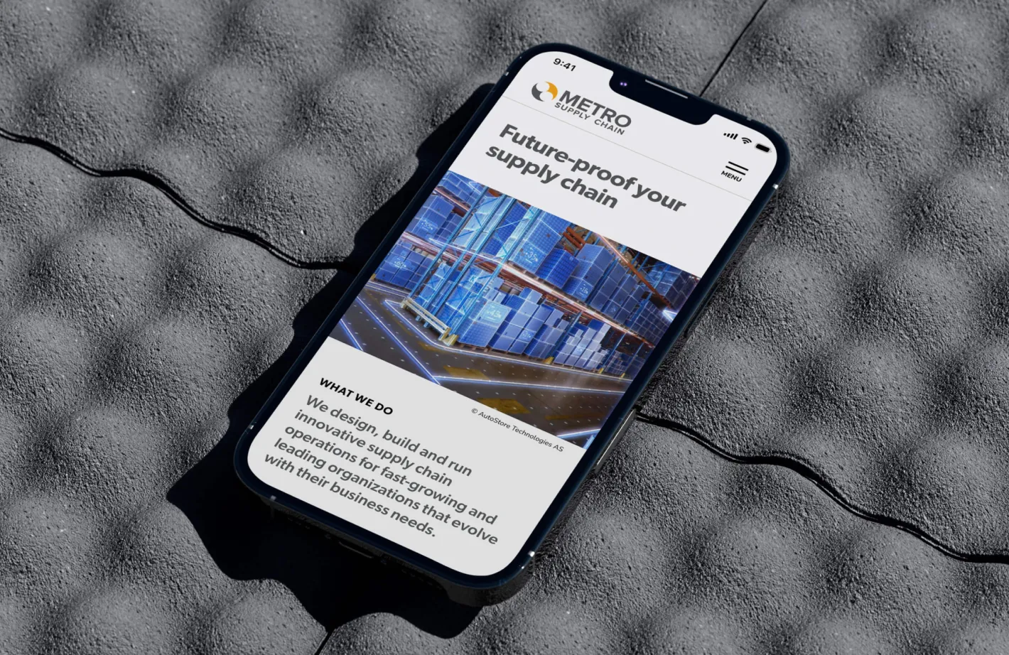
Delivering innovative supply chain solutions and consulting services, Metro Supply Chain has worked with many of the world’s most recognizable brands and organizations. Looking to create a web experience that better aligns with the high-performing solution offerings of both companies, the team worked with Forge to create more robust and engaging websites.

Features

Multilanguage

WordPress

Google Analytics

Custom Form integration

An extensive supply chain expertise

To best understand the family of companies housed under the Metro Supply Chain name, Forge led an extensive discovery research process to define what each entity stands for and aspires to be and how it can best support the customer through revitalized websites. This research resulted in a clear path forward showcasing the company’s deep supply chain expertise, pride in meaningful business relationships and a trusted, people-centric culture.

Metro Supply Chain logo
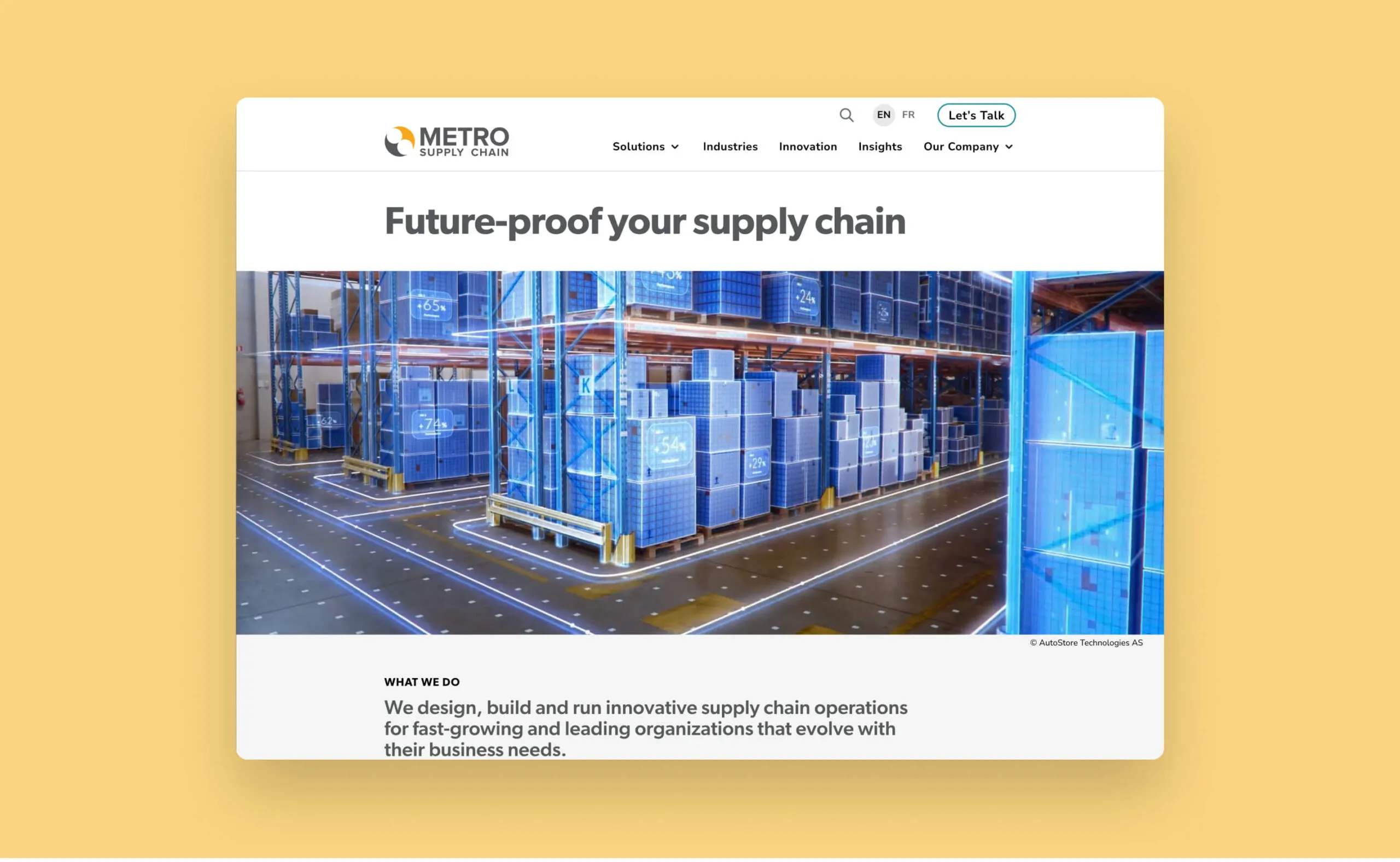
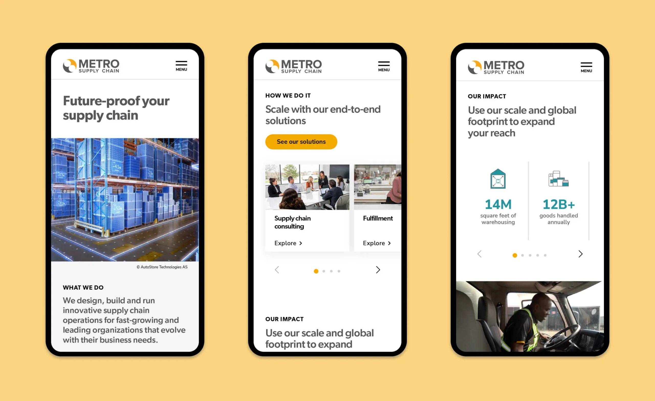
Metro Supply Chain logo and website section on end-to-end solutions with carousel of services.
Warehouse interior with futuristic blue overlays and text
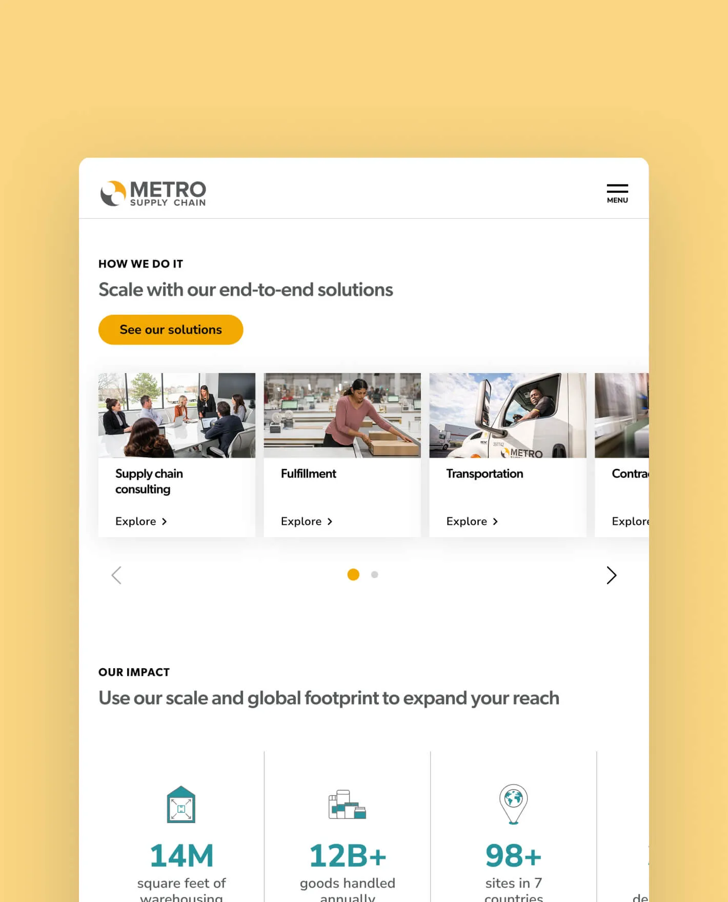
Metro Supply Chain website showing three mobile phone screens with supply chain solutions and impact statistics.

Easily customizable website, with effortless ease of use

The website uses a modular build method with reusable content blocks that can be placed in various layouts when creating new pages. Dynamic videos and subtle page load animations are used throughout the website, creating an inviting space for visitors to learn more about Metro Supply Chain’s story and services. Clean, easy-to-read typefaces ensure content is accessible with proper colour contrast ratios.

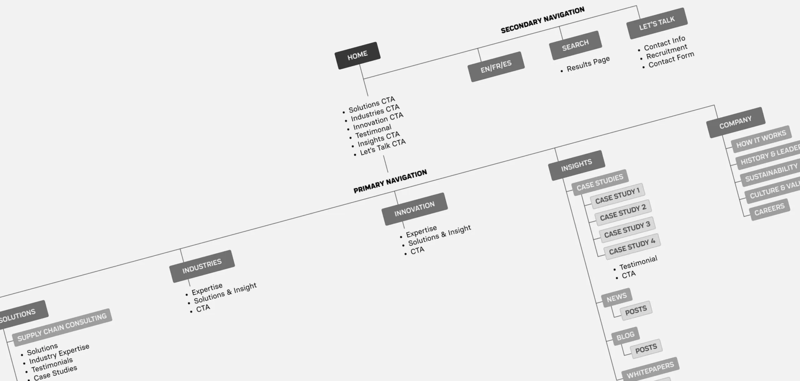
Website sitemap showing navigation structure with sections for Home, Secondary Navigation, Primary Navigation, and Company.
Comprehensive sitemap to clearly organize the vast content from their many divisions
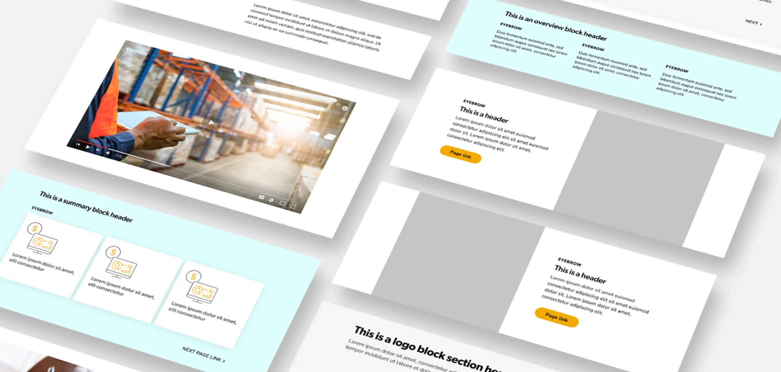
Website mockups with various content blocks including video, text and icons.
Content blocks to allow for a flexible expansion of sections
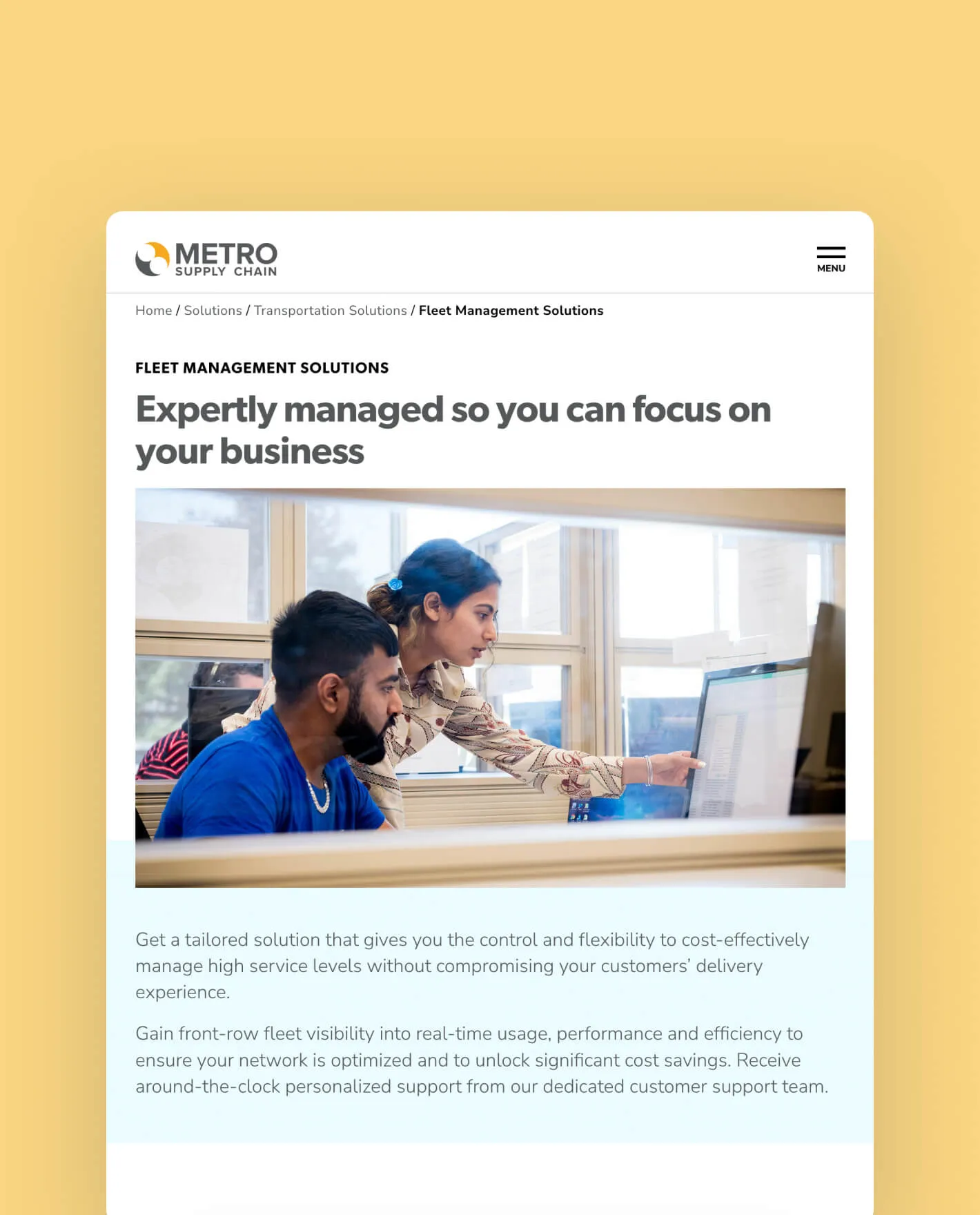
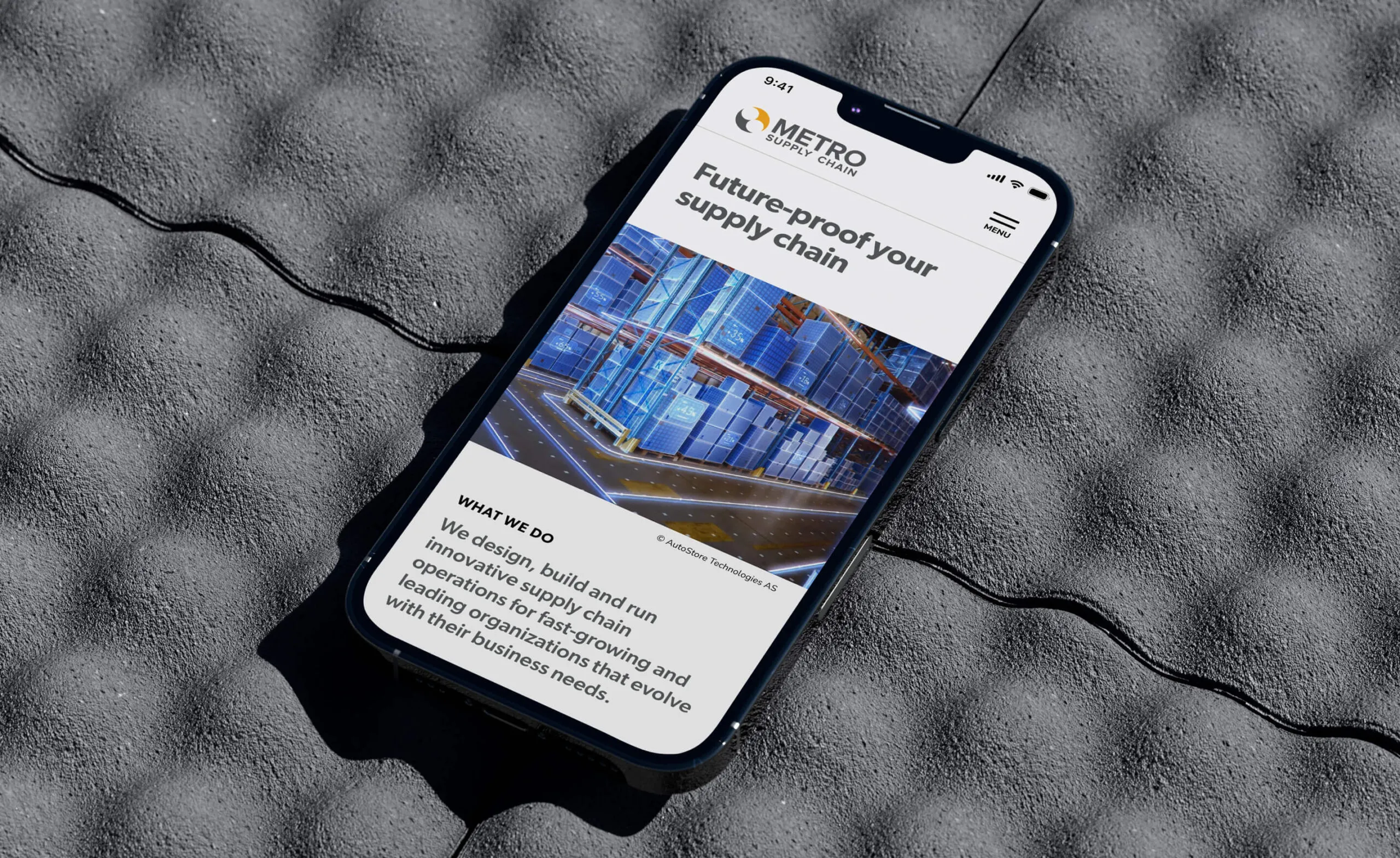
Metro Supply Chain website on a phone, showing
Person using a laptop displaying text about dementia stigma and a

Dementia In New Light

dementiainnewlight.com
Services Deliverables
  • Logo
  • Website
  • Illustration
  • Social Media
  • Lesson Development

Shedding light into the world of dementia

Dementia in New Light is a digital learning experience that builds upon the research-driven production, Cracked: New Light on Dementia. By following individuals with dementia and their families, it aims to challenge the stigma around dementia and its care. Forge collaborated with a diverse team of researchers and artists and applied co-design methodologies to create an accessible educational experience, fostering a reimagining of dementia and improved support for those impacted.

Features

Headless CMS

React framework

WebGL 3D render with custom shaders

User account portal

Analytics

Emotive narratives, challenging stigma

In our initial discovery phase, we met with the project stakeholders, care providers and individuals affected by dementia to understand how to spread awareness and educate people better about dementia and its effects. We listened to each individual’s story about their lived experiences, engaged in co-design discussions to shape our digital learning outcome and fostered an open, inclusive forum for collaboration. This discovery process uncovered invaluable information from diverse perspectives to enrich the outcome of our digital learning experience.

Two people sitting in a boardroom.
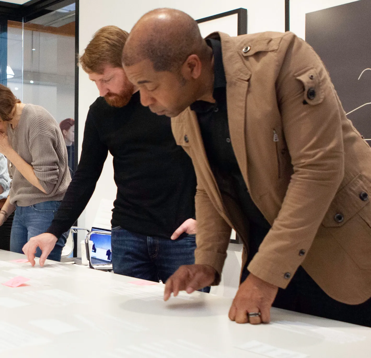
A group of people discussion research, while looking a table.
Snapshots from our discovery and research synthesis process

An engaging and informative experience

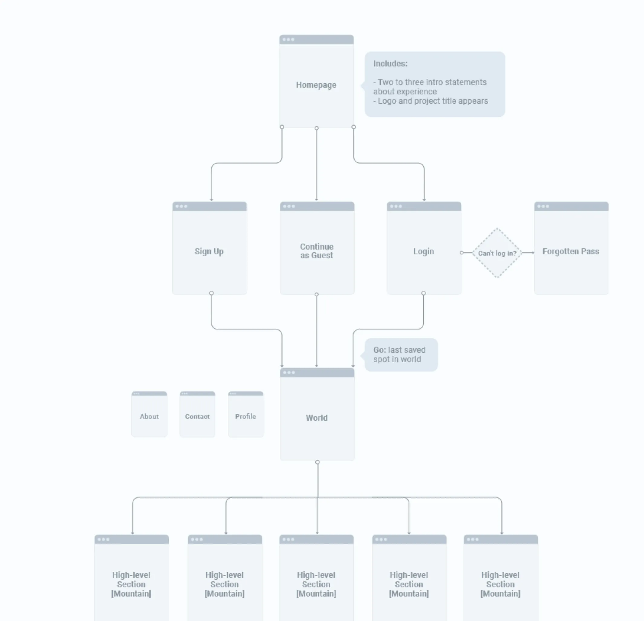
Our core objective was to enable learners to explore a wide range of topics related to dementia care while providing them with insights into the daily lives of persons living with dementia and their families, fostering empathy and understanding throughout their journey. To ensure an intuitive user journey, we developed detailed site architecture and wireframes, meticulously planning how learners would navigate the content.

An image showing the site architecture with information hierarchy
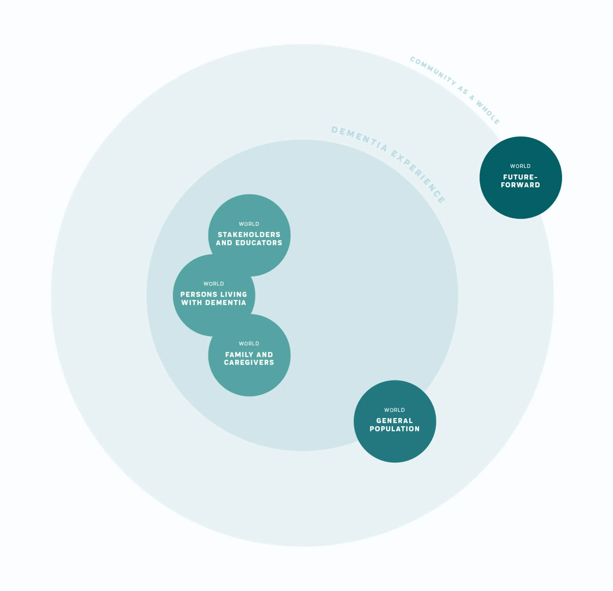
A circle diagram that shows the relationship between various topics
Detailed sitemap for a complex website and a small sample from our extensive discovery
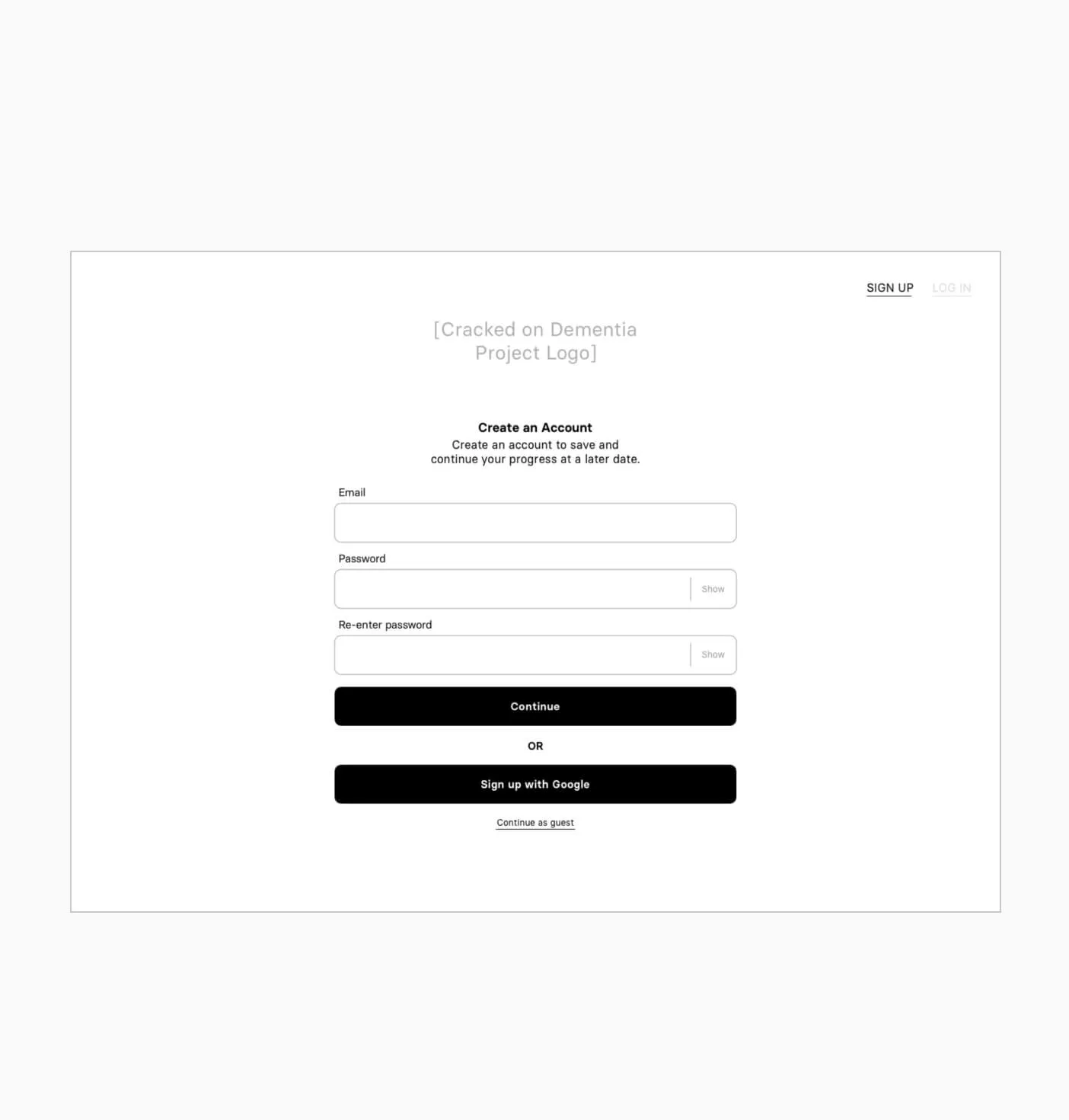
wireframe image of the login screen
a sketch exploring the theme of murmuration, or clusters of meaning
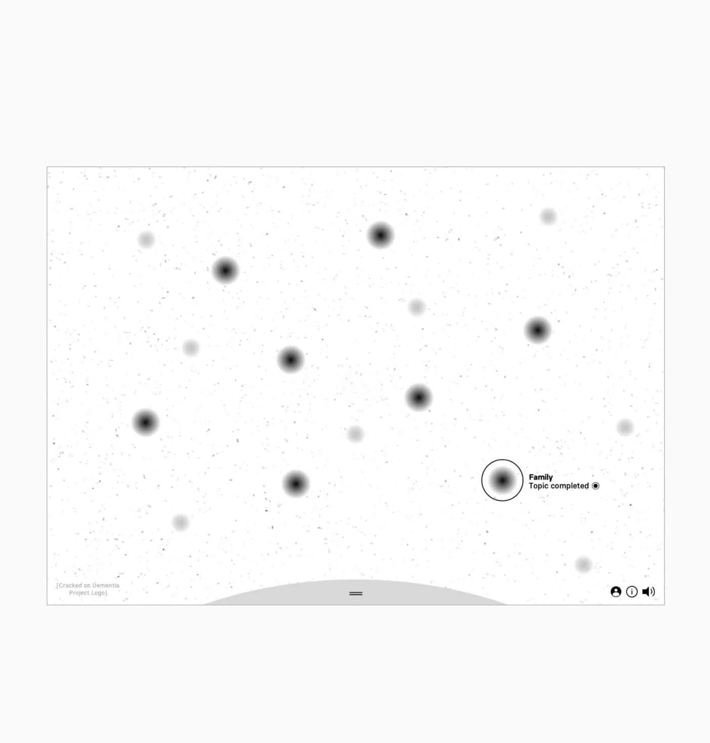
wireframe showing the idea behind the unique navigation
Wireframes to start defining the experience

Inspiring others to share their stories

The experience presents content in a number of ways and invites the learner to reflect on what they’ve seen and challenge their perceptions. Forge built a custom application backed by a headless CMS that allows the client to update content as needed.
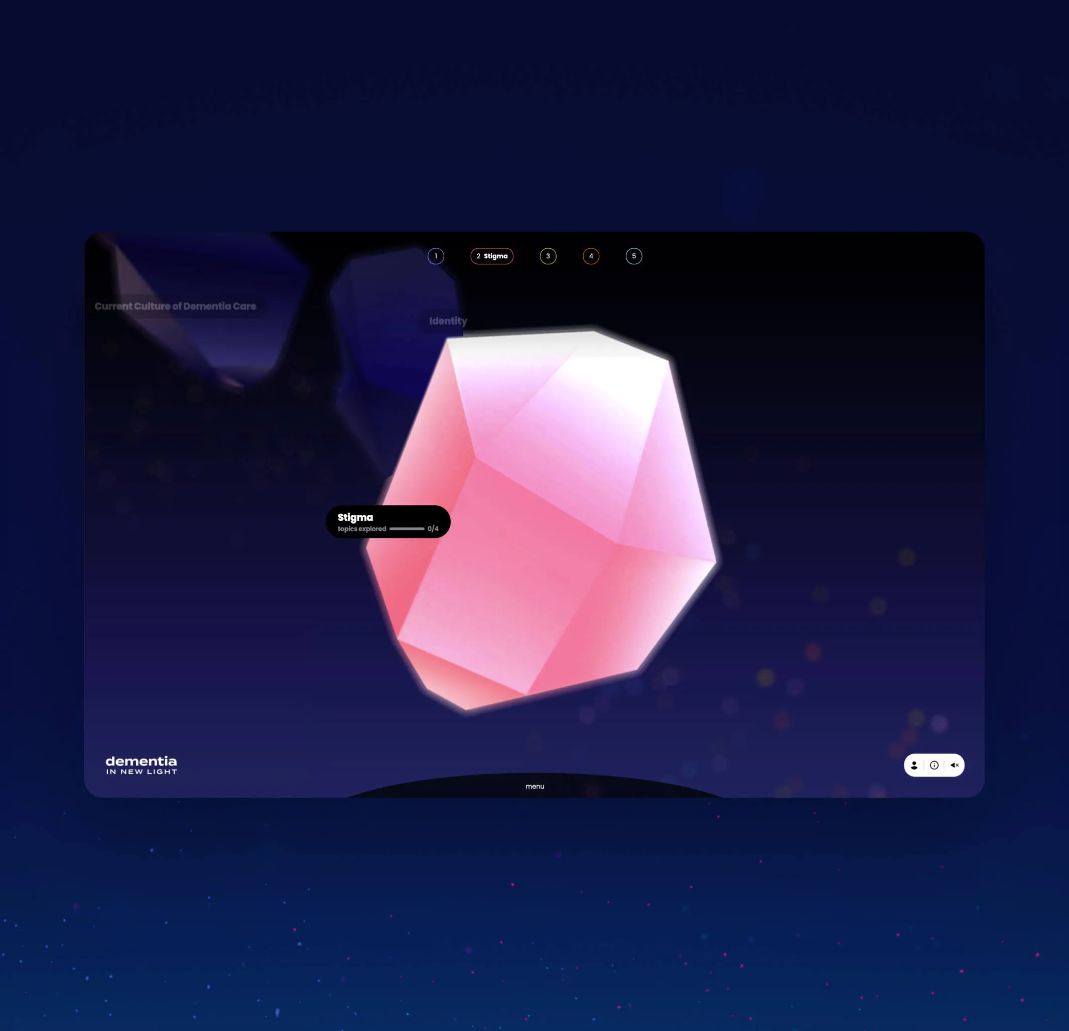
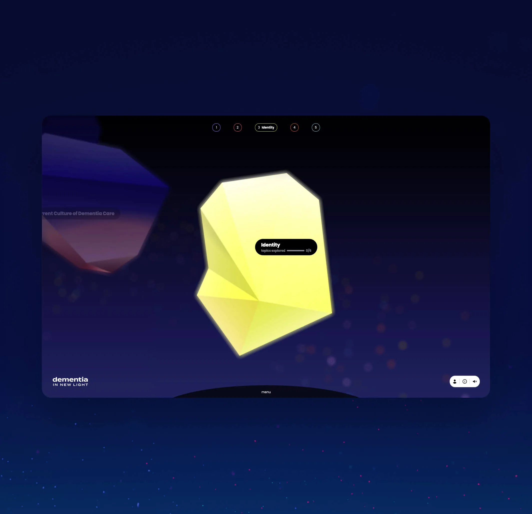
A close up of one of the topics in focus. The topic is shown as a crystal-like gem floating in space
Another close up of one of the topics in focus. The topic is shown as a crystal-like gem floating in space
Topics browser which acts as the main navigation
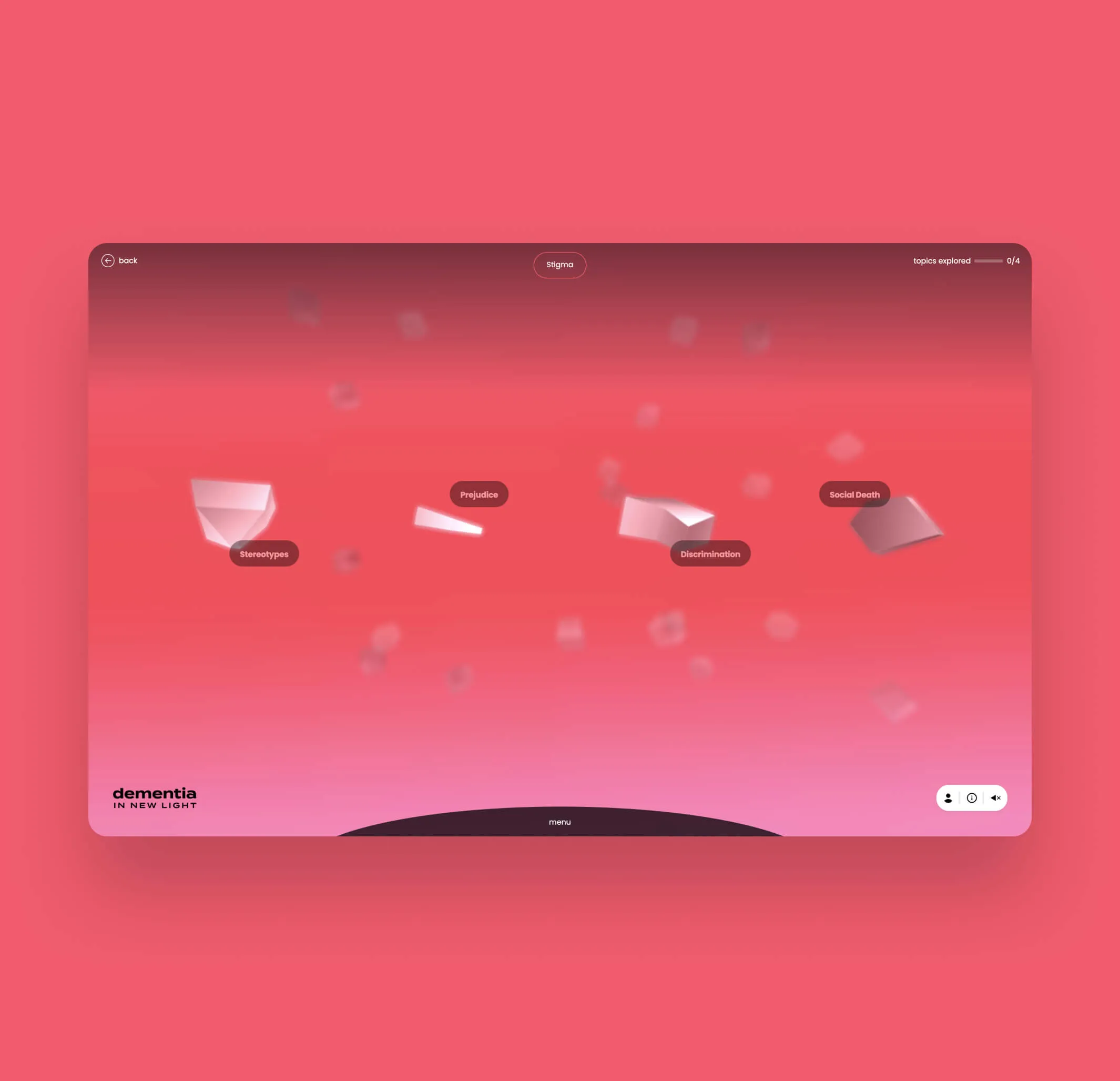
The stigma topic expanded, to show the sub topics. The topics are shown as crystal-like gems floating in space
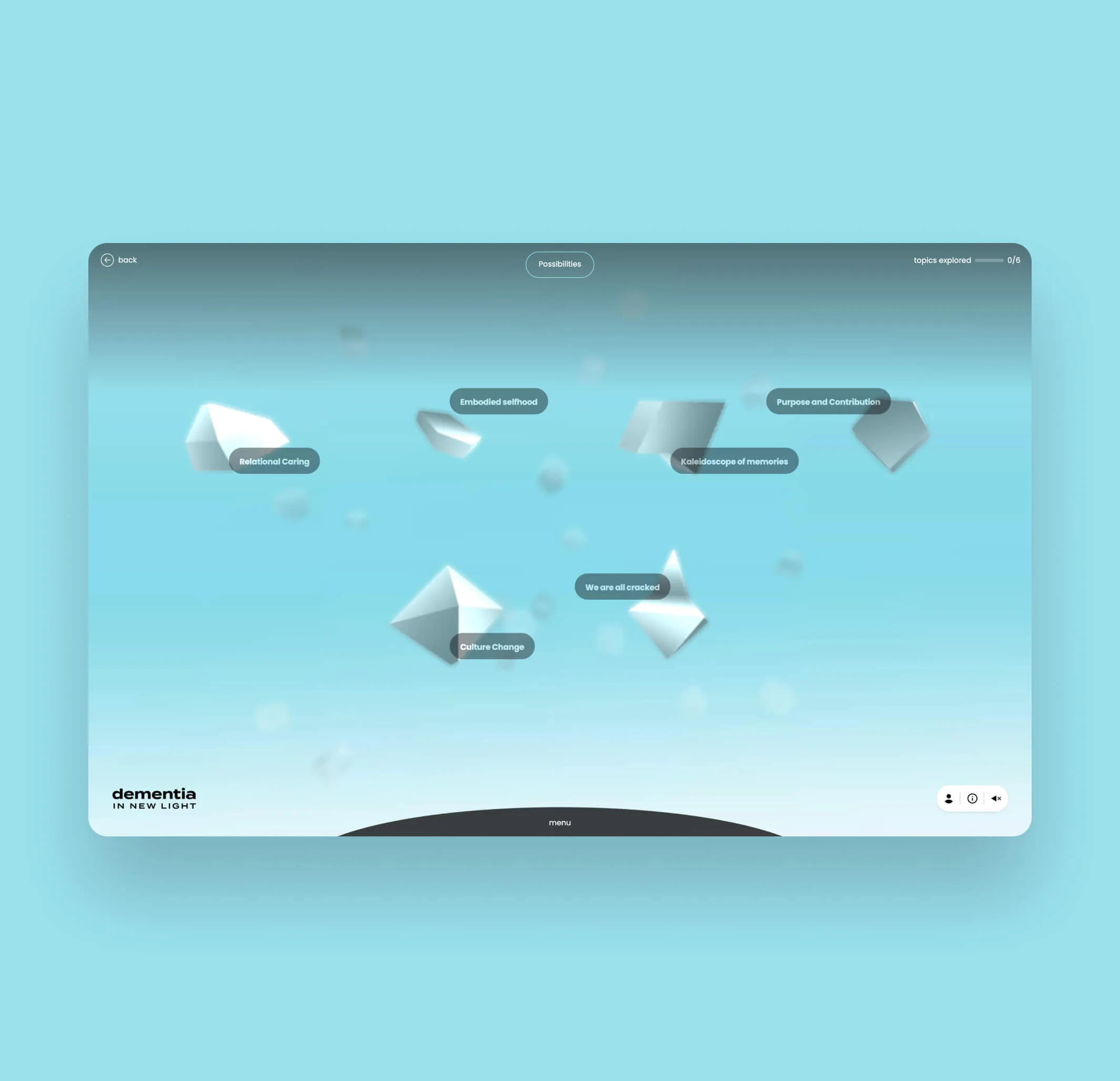
The Possibilities topic expanded, to show the sub topics. The topics are shown as crystal-like gems floating in space
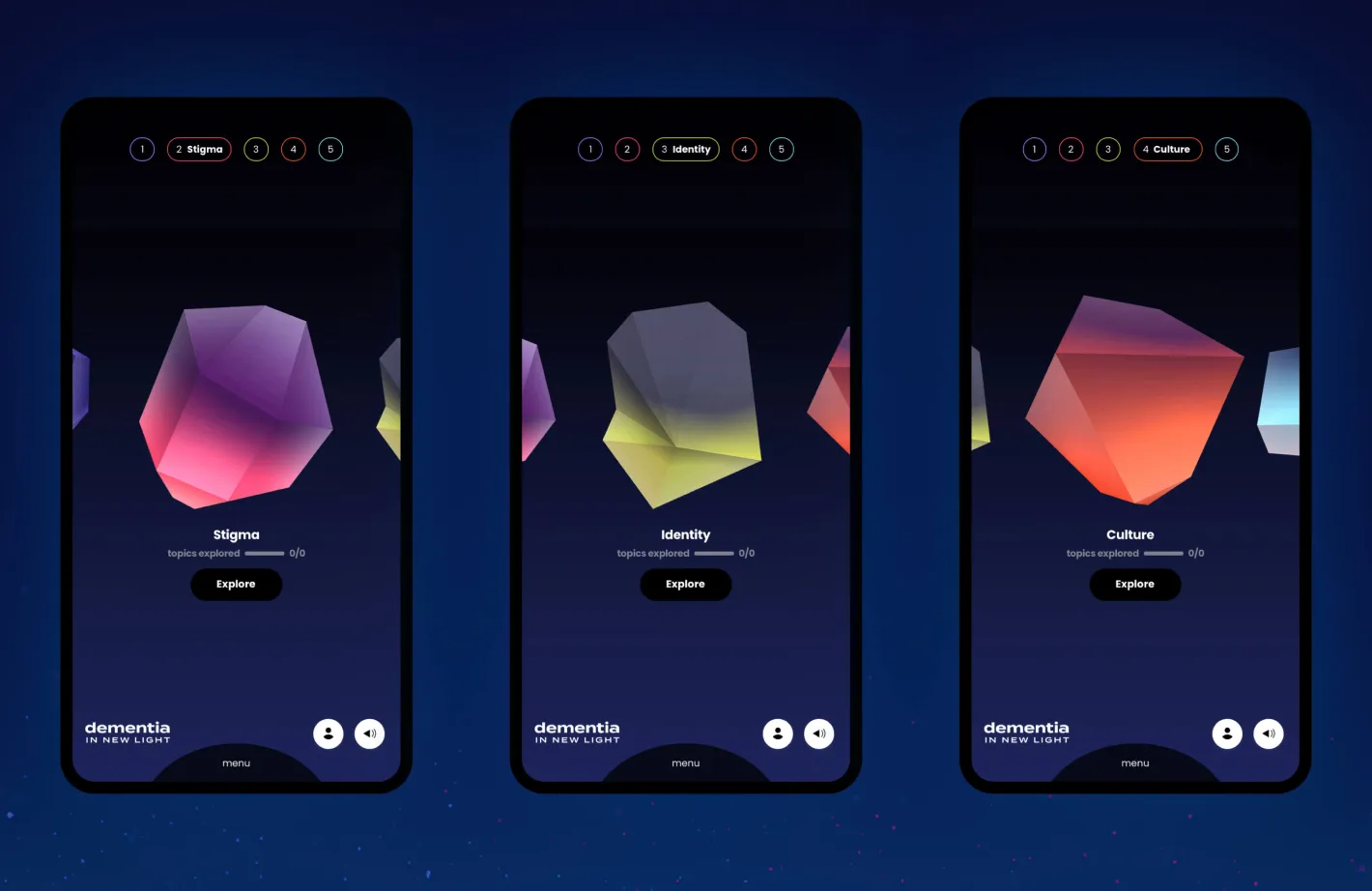
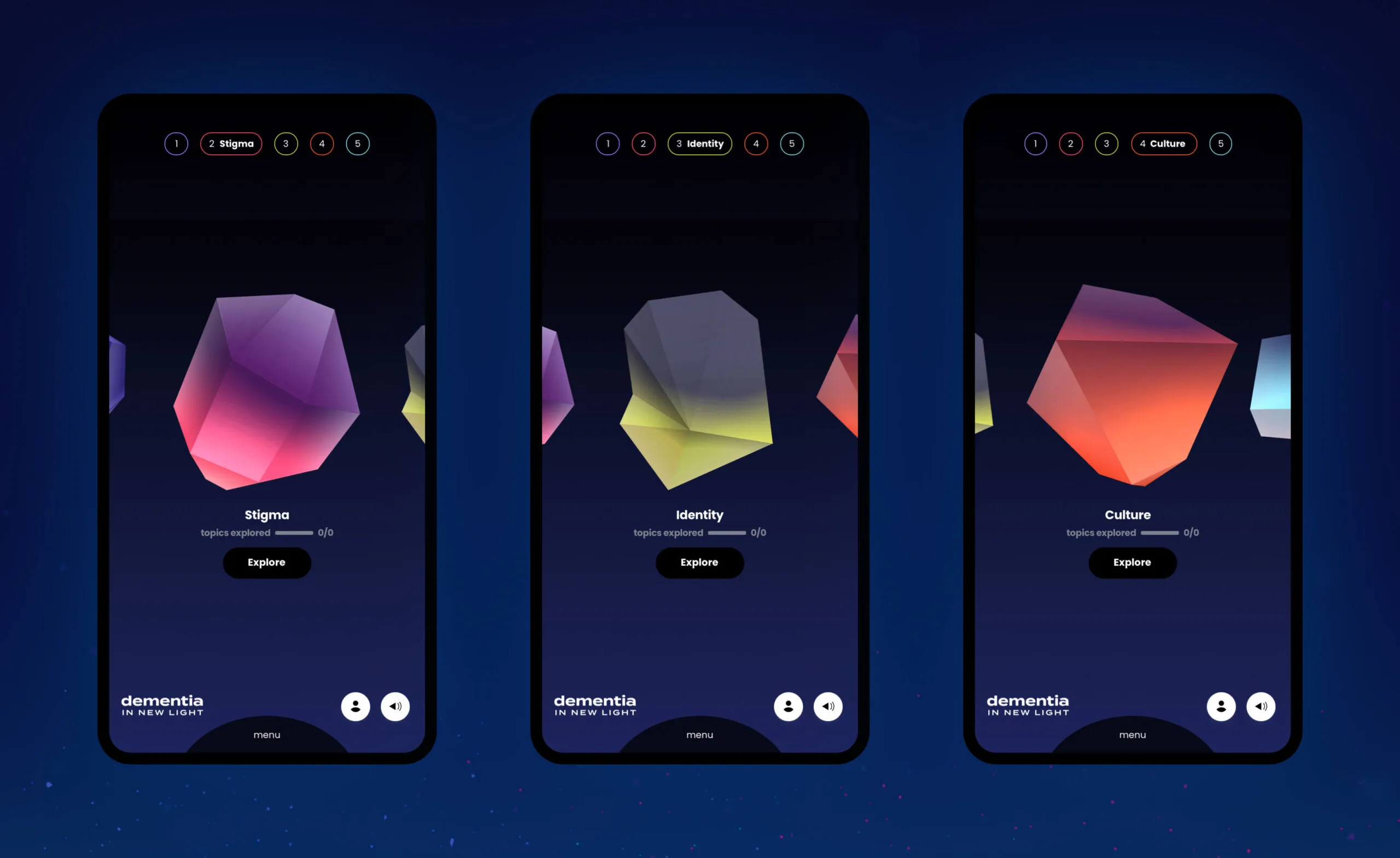
Three phone screens displaying abstract geometric shapes and topics related to dementia: Stigma, Identity, and Culture.

Shifting perspective through interactive storytelling

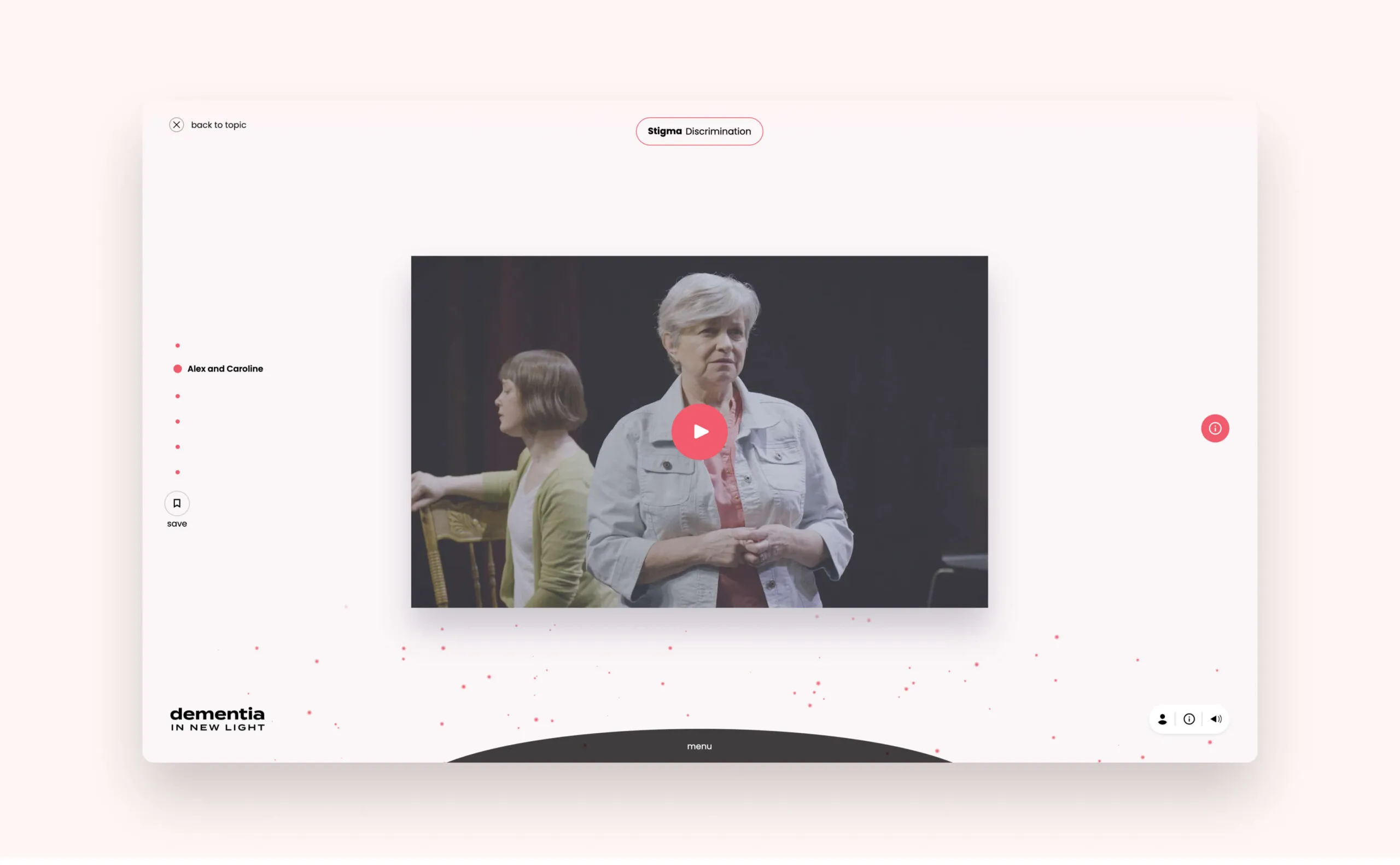
Learners are immersed through dynamic audio and visual learning moments while incorporating scenes from the original production. Learners can explore various topics surrounding dementia care and see things from the perspective of the person living with dementia and their families.

Illustration of a radio
Illustration of open eyes with eyebrows
Illustration of a bike wheel
Custom illustrations to help tell the stories
A desktop screen that shows what the video player looks like
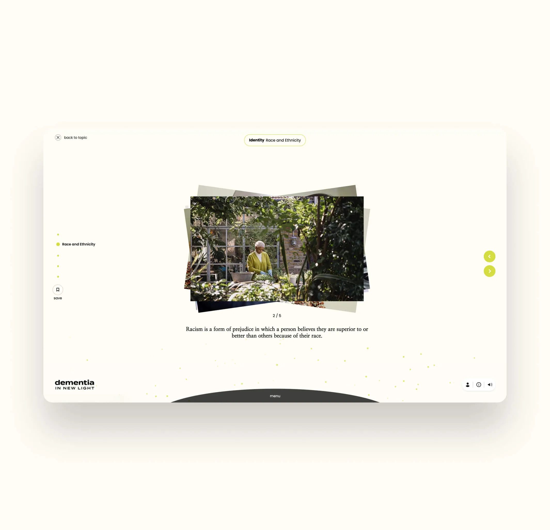
Learning modules to educate users about dementia
An image gallery is shown in one of the subtopics
A handwritten quote in one of the subtopics

Promoting engagement through tracked user progress

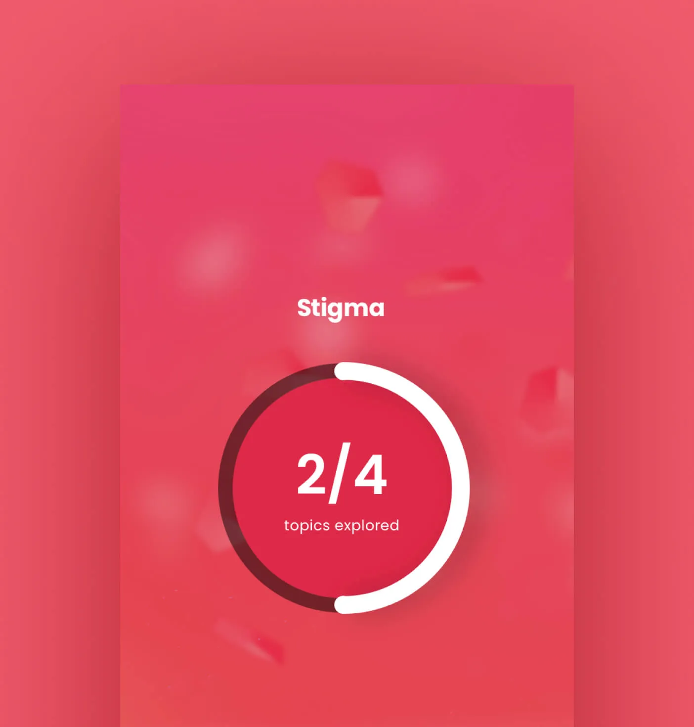
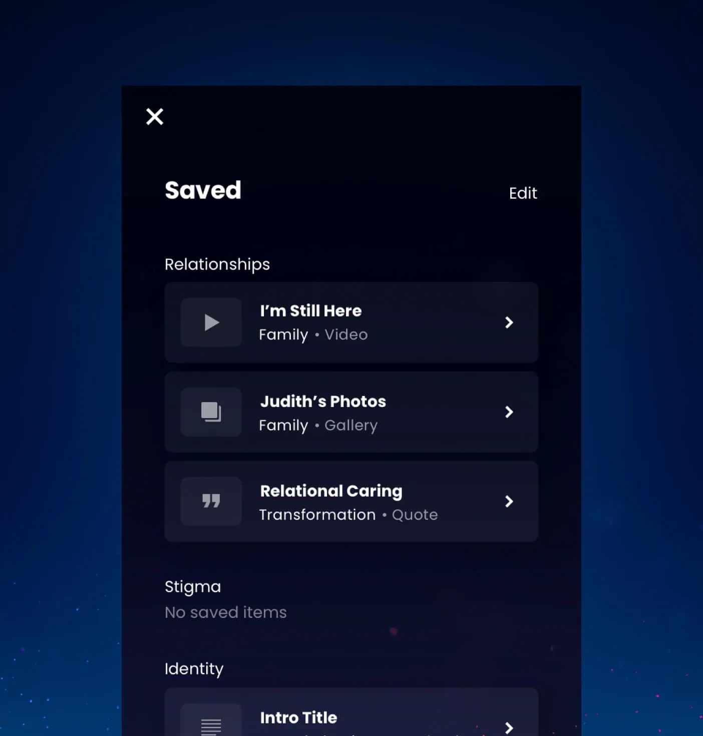
Learners have the ability to create personal accounts where engagement can be tracked and referenced throughout the experience, allowing them to take in content at their own pace and feel a sense of progress. Content can also be easily saved and referenced at any time.

A screen showing that the Stigma topic is half completed.
A screen showing learning modules the user has saved to their profile
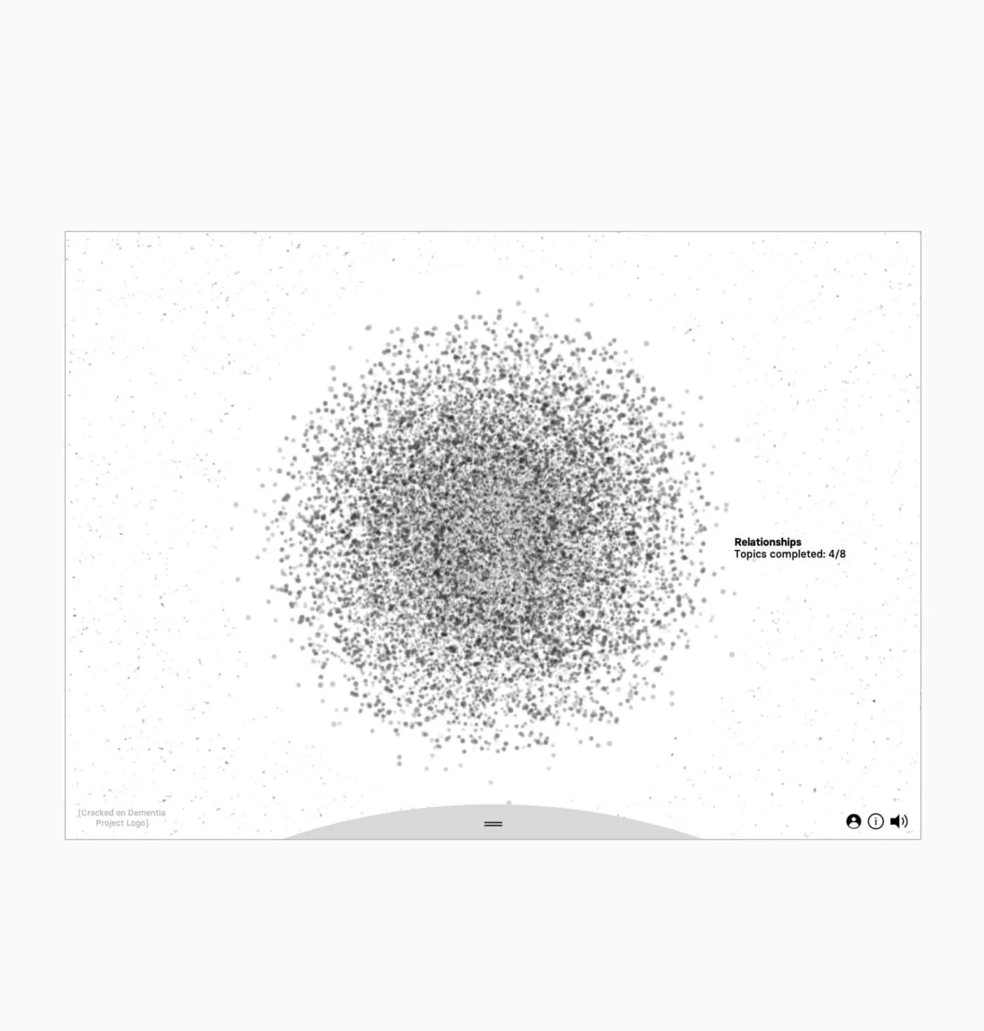
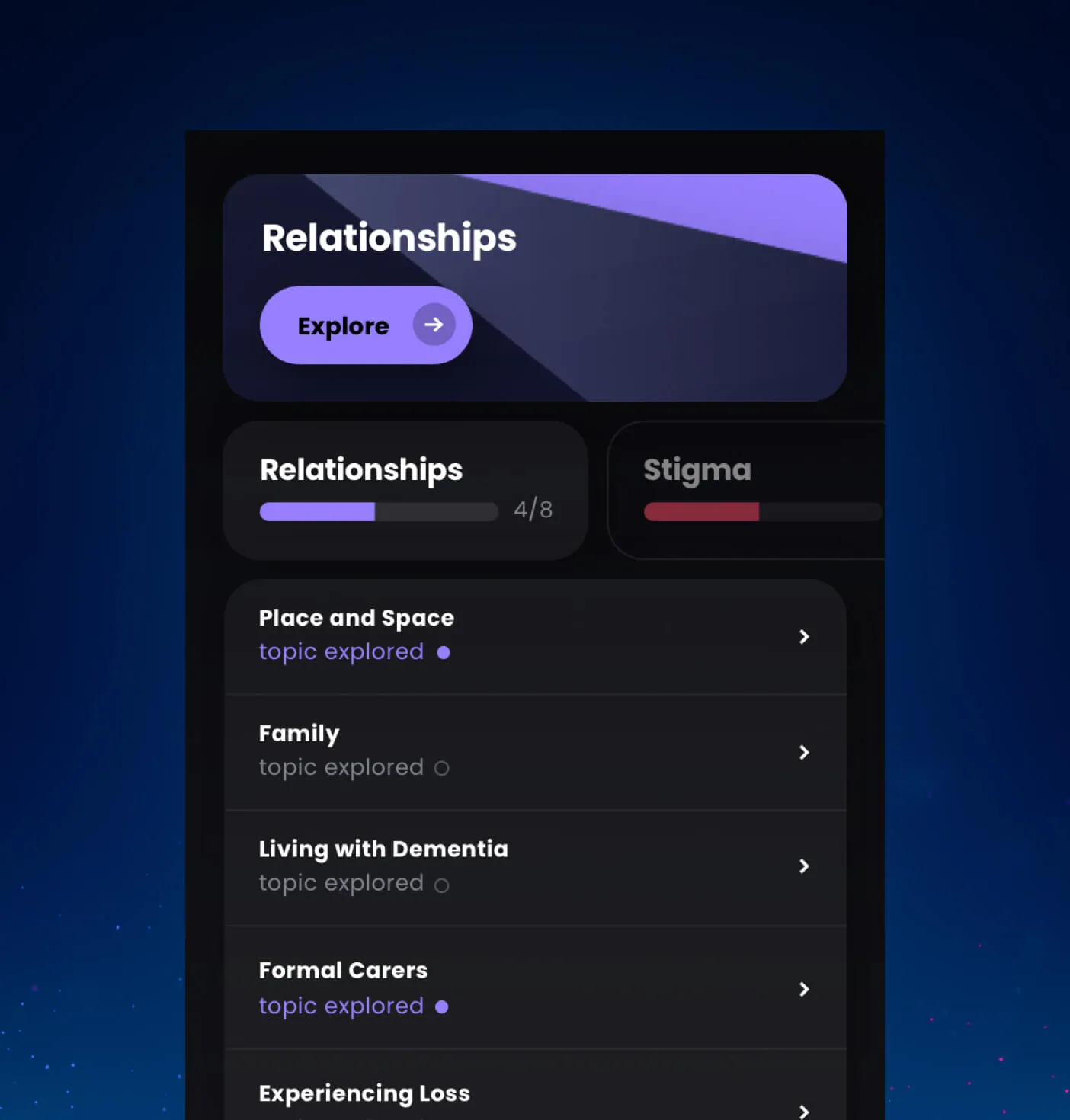
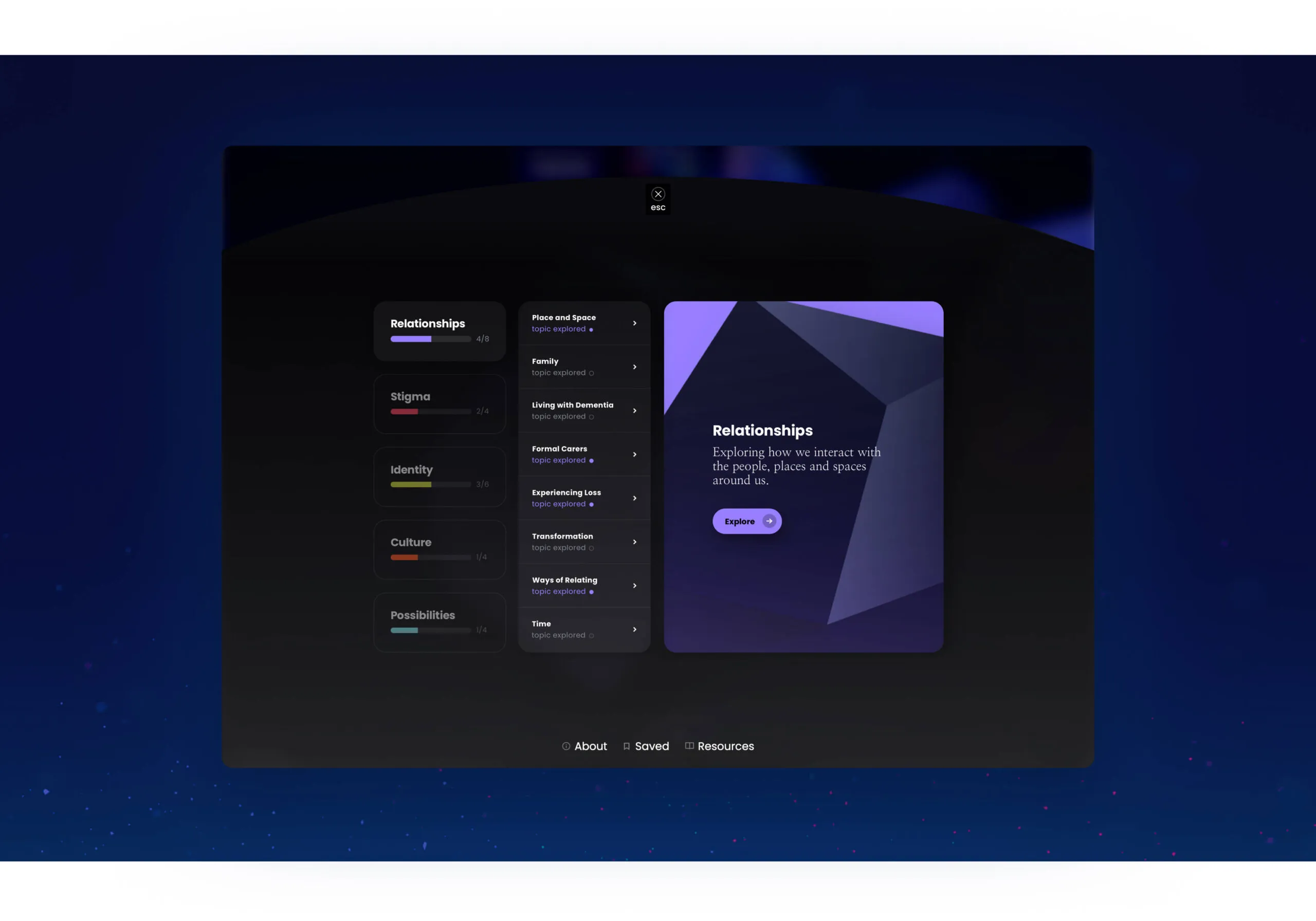
A screen showing the relationship topic with its sub topics and indicators to show which sections have been completed.
A playful display to keep track of your progress within the lesson plans
A desktop view of the Relationships topic, showing the sub topics and completion status of each topic.
  • 597K of people are living with dementia in Canada as of 2020
  • 61.8% of those living with dementia are women
Forge is a ‘dream team’! They developed an award-winning, multi-media digital learning experience about dementia-related stigma that deepens learners’ engagement. Despite the ever increasing complexities of its design and build, their team never disappointed – they model the very best of efficiency, ingenuity, and participatory design.
Pia Kontos, PhD, Senior Scientist, Professor
Audience in a dark theatre watching a brightly lit stage.

DesignThinkers 2023

designthinkers.com
Services Deliverables
  • Website

Developing a seamless digital conference experience

DesignThinkers is Canada’s largest design conference, organized by the Association of Registered Graphic Designers (RGD). Offering in-person and virtual experiences, DesignThinkers hosts annual conferences in Toronto and Vancouver, bringing together creatives and designers nationwide.

Features

WordPress

Custom theme

Schedule creation

Custom animations

Website based on Sid Lee’s branding

Exploring an open-source design approach

Each year features a theme focusing on industry trends and opportunities, with this year’s titled ‘Question Tomorrow’. Envisioned by Sid Lee, our design partner, all elements are largely open-source, free assets, and purposefully selected to support the direction of the conference. Working closely with Sid Lee and RGD, the development team at Forge brought the digital experience to life by implementing a refreshed theme into the website.

Pink sculpture of two dogs interacting on a base.
A broken clay tablet with cuneiform writing.
A blue bust of a man's head, broken in half.
Open-source illustrations
Laptop displaying RGD Designthinkers website with speaker profiles.

Future-proofing the codebase for years to come

We undertook a thorough analysis and modernization effort to update the legacy codebase to meet the latest web standards, guaranteeing the website would continue functioning for years. This optimization effort increased the longevity of the website’s codebase, ensuring that it can continue to adapt to changing business needs and technical environments.

One website, two cities – Vancouver and Toronto

Implementing industry best practices into WordPress

While implementing the refreshed design, the team at Forge improved the semantic code throughout the site by better defining different sections and making the front end more accessible. We enhanced the WordPress administration interface to make it more user-friendly, streamlining the content editing experience and providing greater flexibility to site administrators.

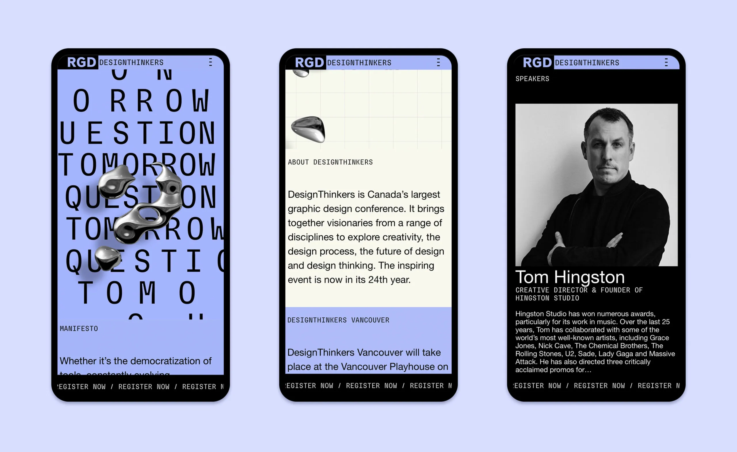
Three phone screens showing the homepage hero, the about section and a speaker profile.
Bold graphics to promote Canada’s largest Design Conference
  • 2.1K delegates attended in 2022

  • 48 speakers from 7 countries
  • 26 editions and counting in 22 years
  • no. 1 graphic design event in Canada
  • 2 cities visited per year
A finger interacts with a smartphone displaying the word A phone screen displays the word

Personalizing a flexible, mobile rewards platform

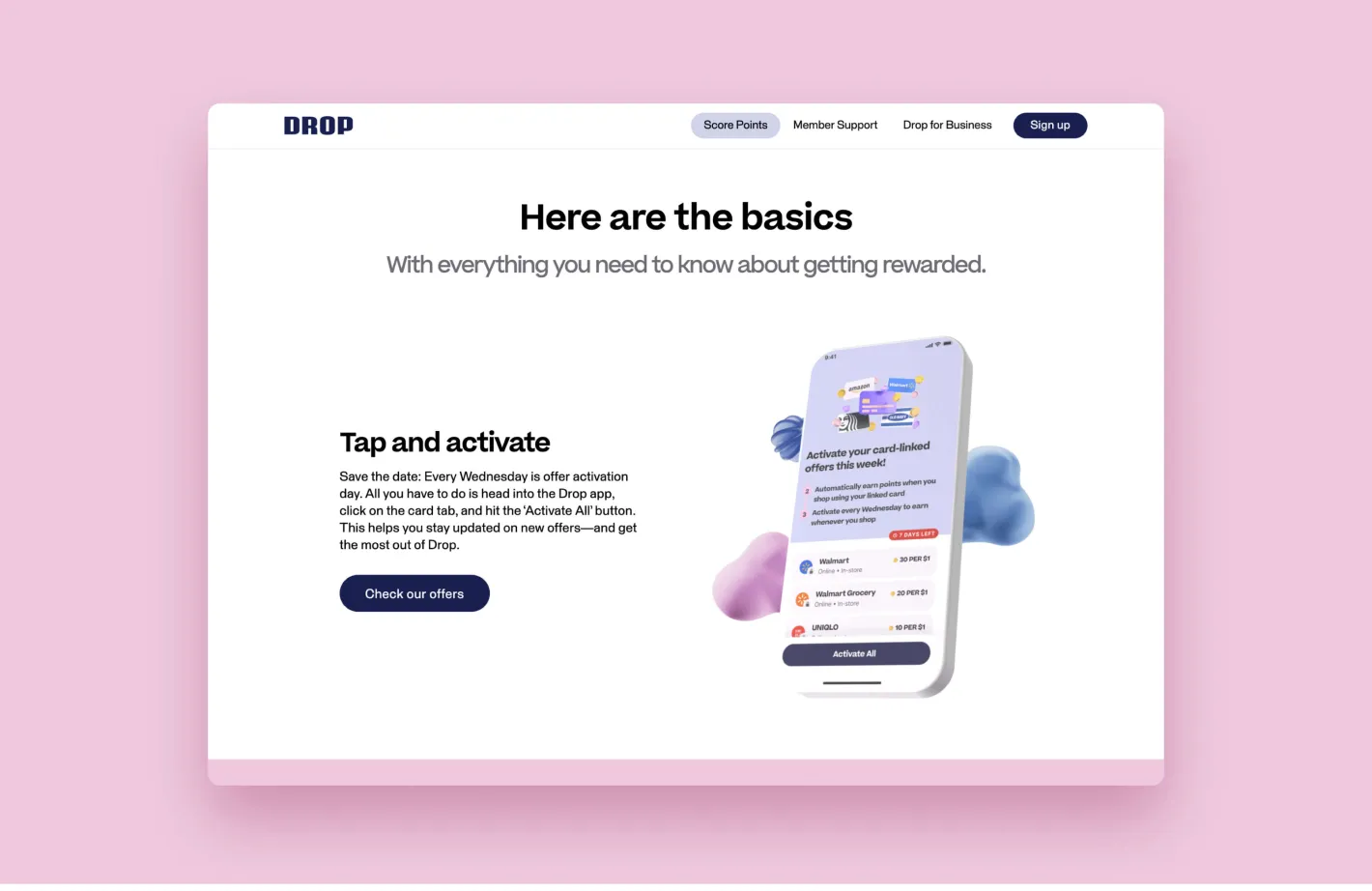
Drop, a free mobile rewards program, focuses on providing customers with a personalized and easy-to-use member experience. Drop members can earn and redeem points by shopping via the app, completing surveys and playing games. Looking to refresh their single-page web presence to better position the program, the Drop team worked closely with Forge to bring the website to life across multiple dynamic pages.

Features

WordPress CMS

HubSpot integration

Hot Jar integration

AppsFlyer integration

Google Tag Manager

Consumer-facing (B2C) website
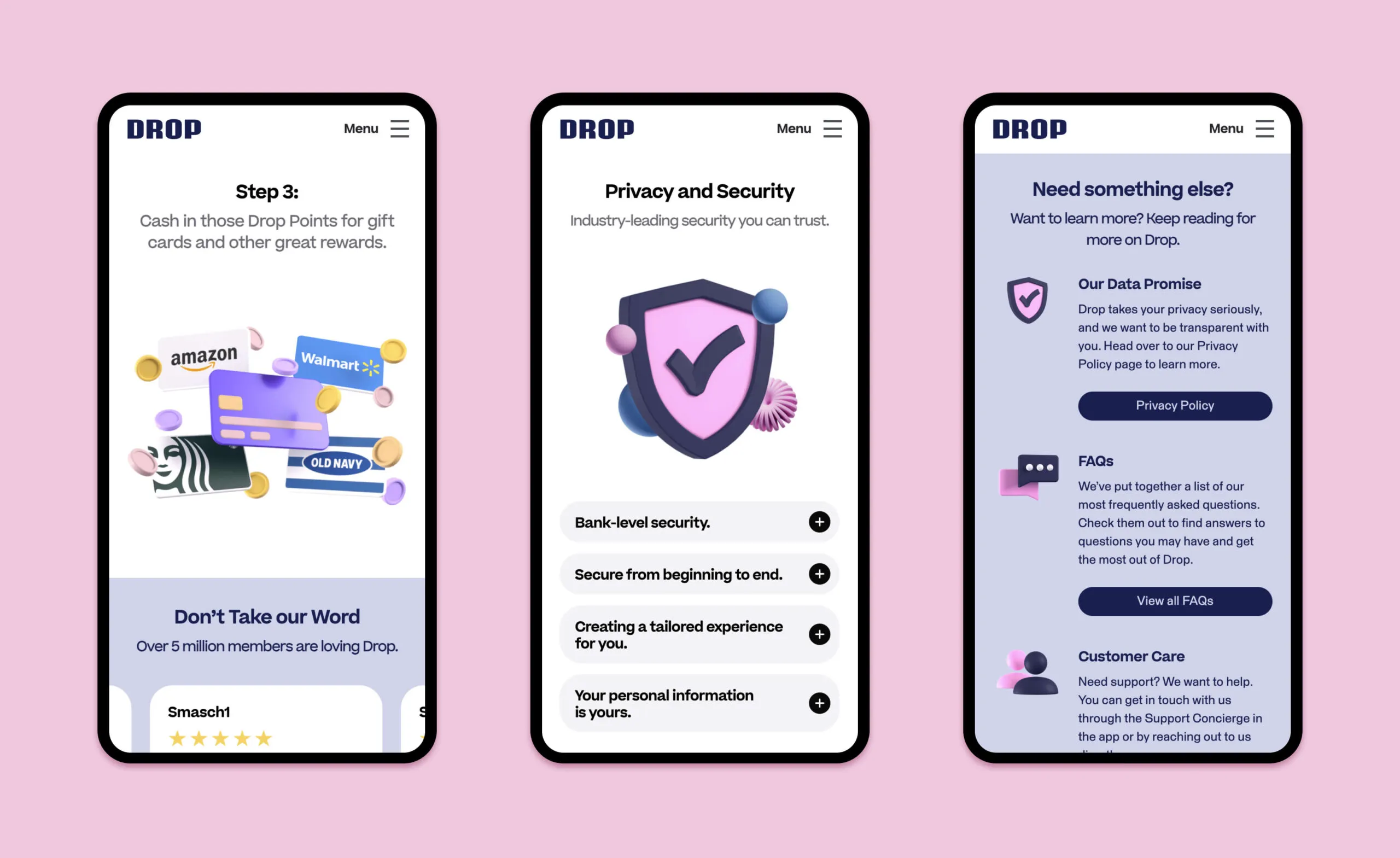
Drop app screens showing rewards, privacy, and customer care.
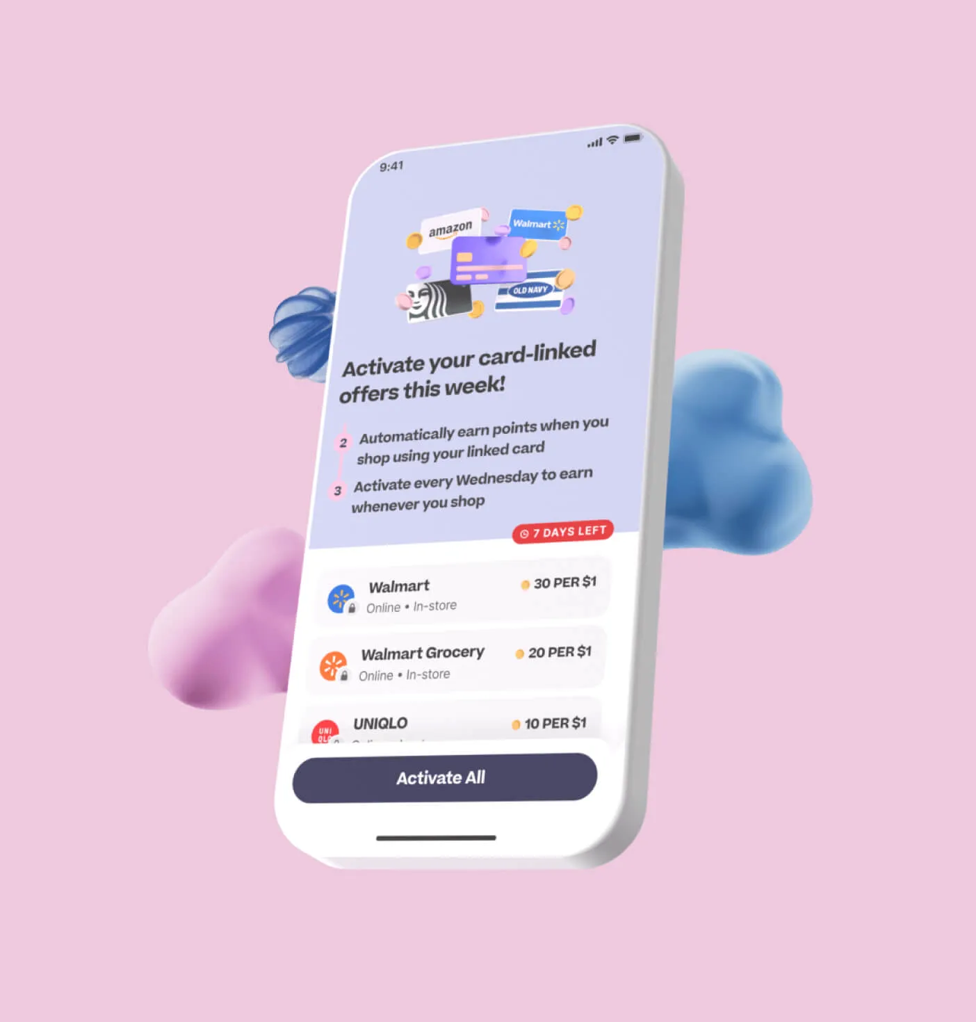
Phone screen showing card-linked offers for Walmart, Walmart Grocery, and Uniqlo.
3D illustration of a credit card with a security shield and checkmark.
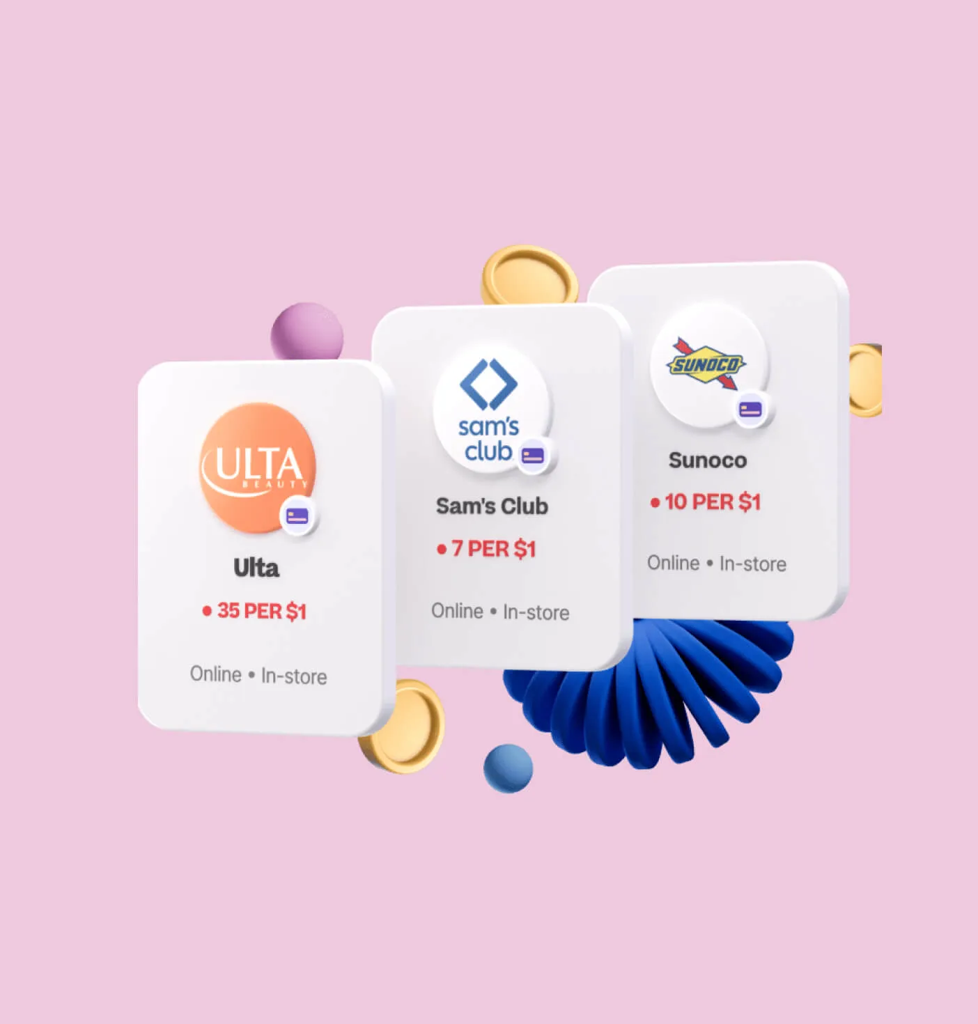
Three cards showing Ulta, Sam's Club, and Sunoco with rewards information.
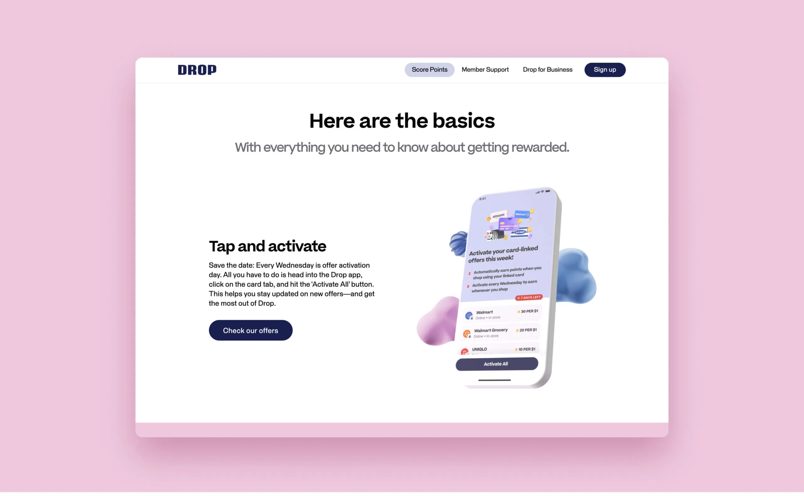
Drop app interface showing how to activate card-linked offers for rewards.
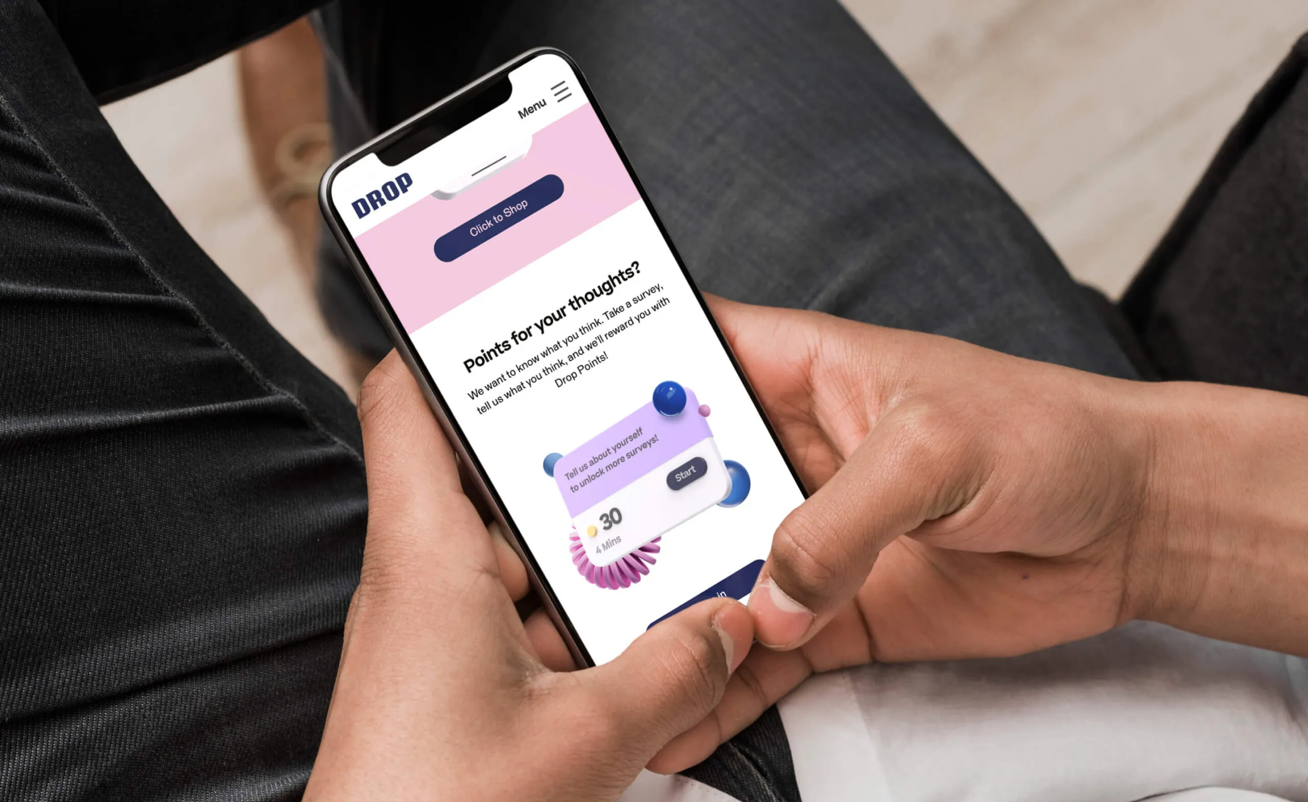
A person holds a smartphone displaying the Drop app, which offers points for completing surveys.

Reinforce brand value propositions

Aligning with the established branding, the team at Forge created a flexible design system that applied to both the consumer-facing and business-facing Drop websites, ensuring a consistent look and feel while targeting different audiences. The fully-responsive experience considered all screen sizes and included high accessibility standards in visual design and code.

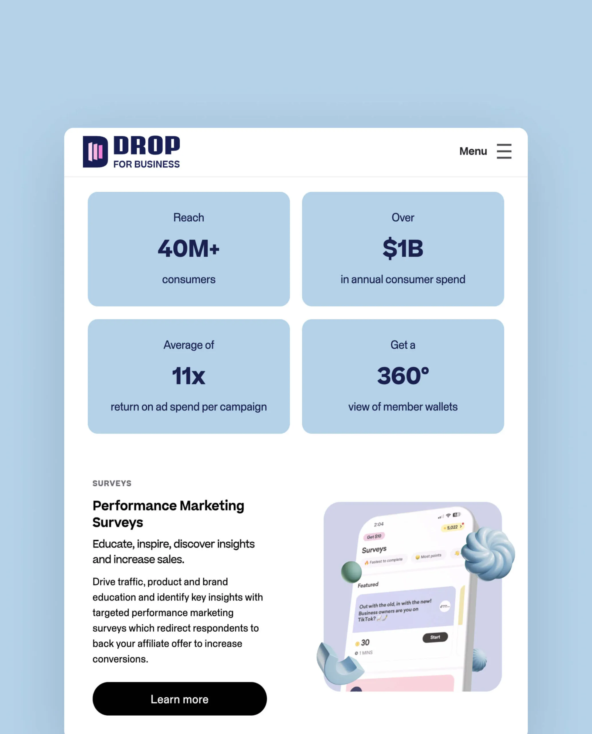
Drop for Business logo and marketing statistics.
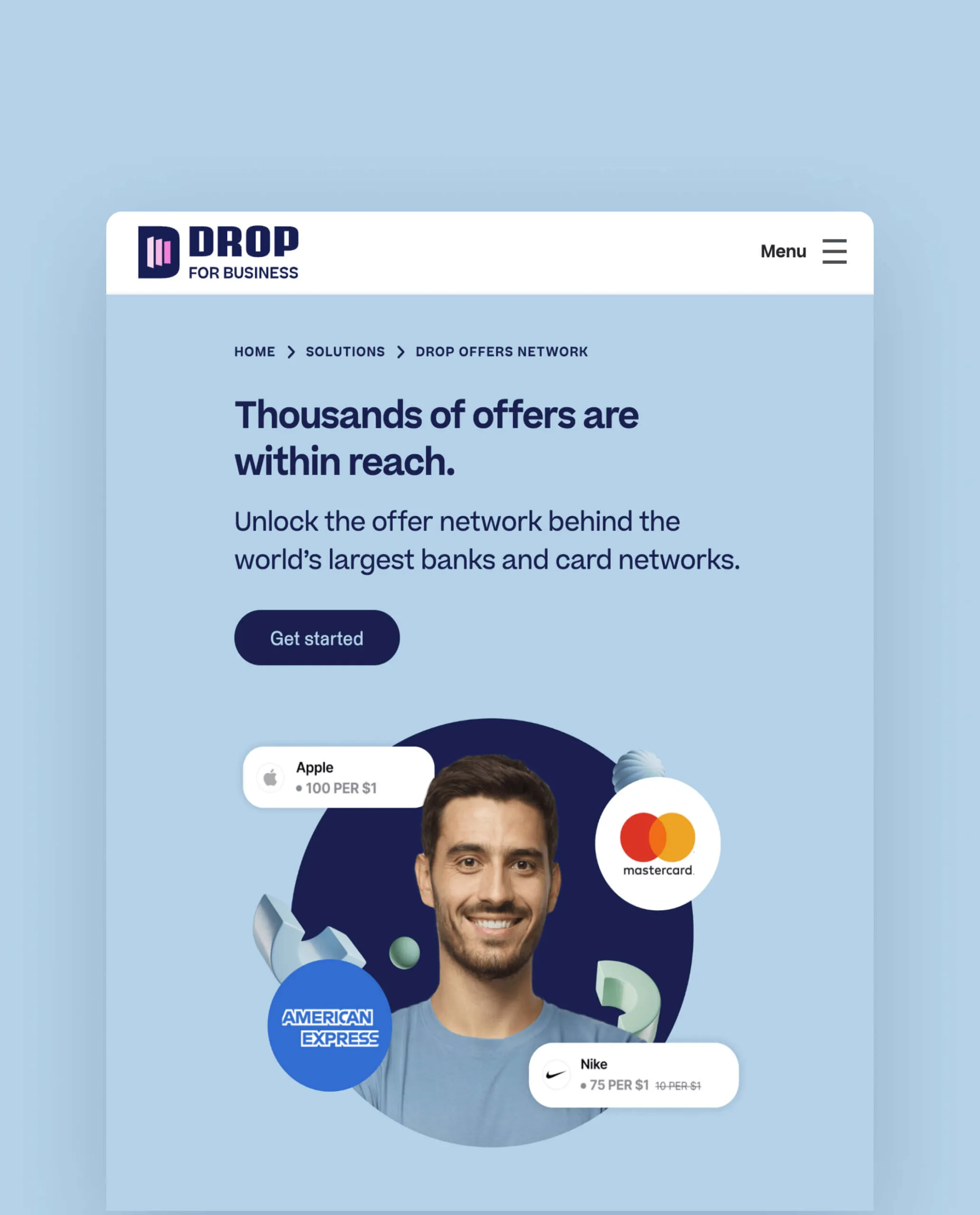
Drop for Business logo and marketing hero image with man and partner logos.
Business-facing (B2B) website
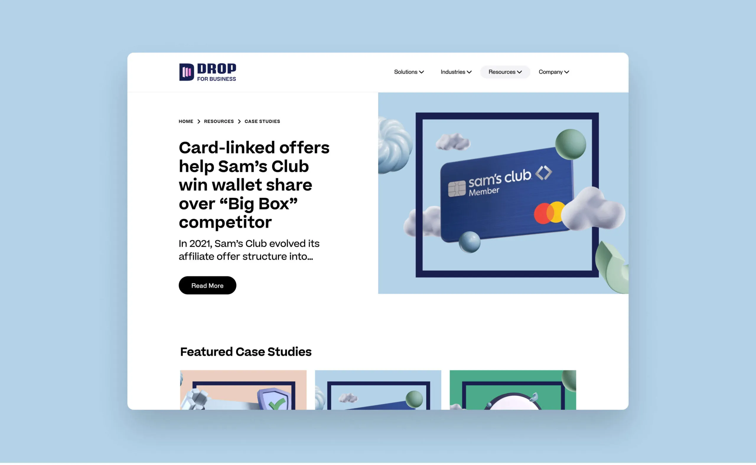
Drop for Business logo and a Sam's Club member card with colourful circles.
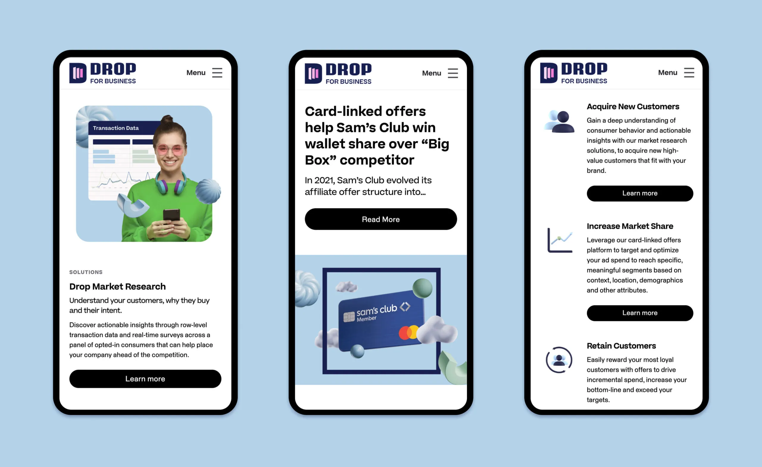
Drop for Business website showcasing solutions for acquiring, increasing, and retaining customers.
A child and adult have a telehealth appointment with a doctor on a tablet.

Winterberry Family Medicine

winterberrymedical.ca
Services Deliverables
  • Logo
  • Brand Guide
  • Illustration
  • Social Media
  • Signage
  • Stationery
  • Website
  • Marketing Materials
  • Motion Graphics
  • Placemaking

A fresh take on personal, caring family medicine

Winterberry is a dynamic, family-oriented medical clinic offering a wide variety of services through trusted in-person and virtual consultations. The Winterberry team approached Forge to revitalize and reposition their brand and website. The existing brand did not accurately represent the personalized care provided by the vibrant family practice team.

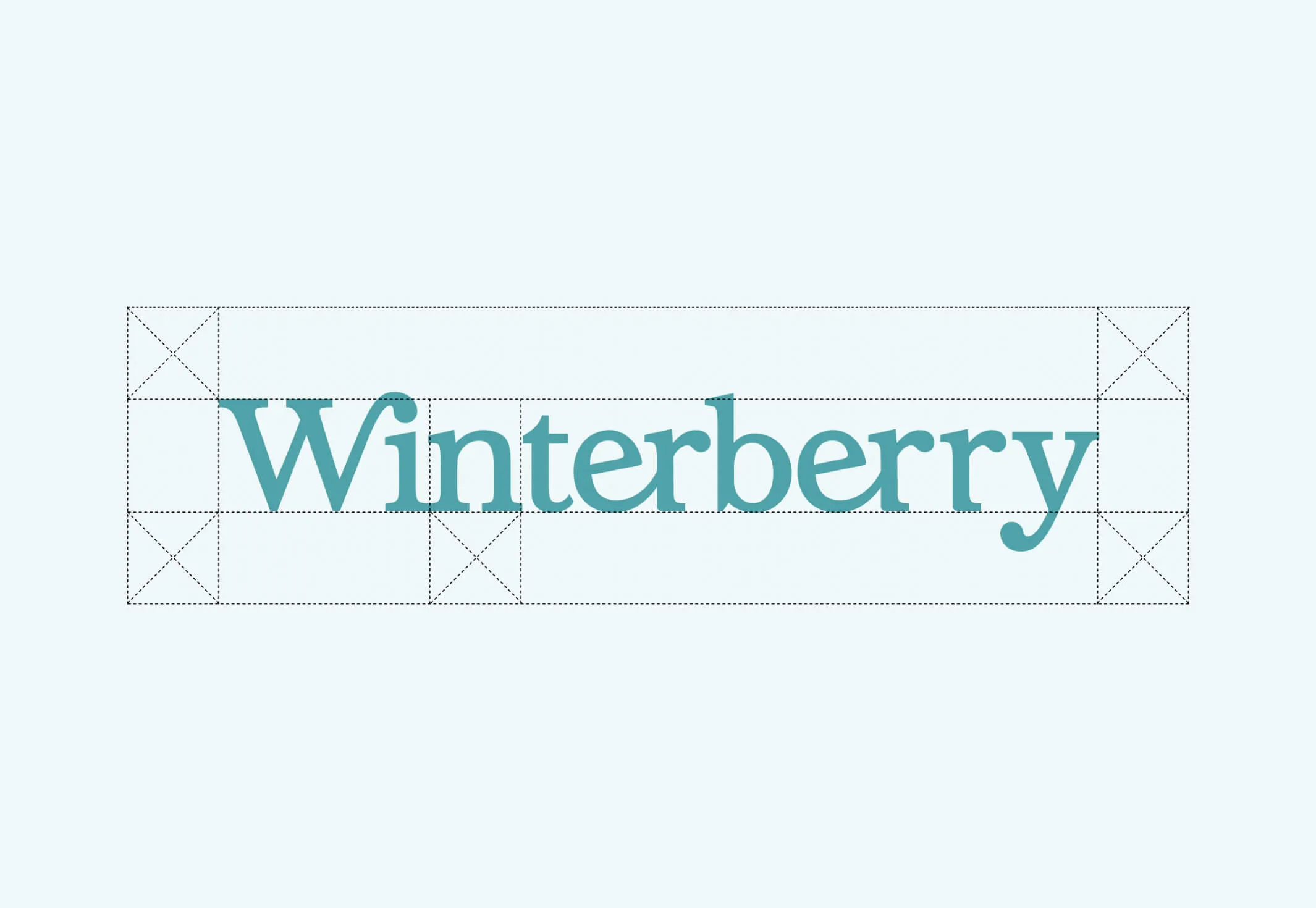
Logo design inspired by “berries”
An image showing the safe space around the Winterberry logo
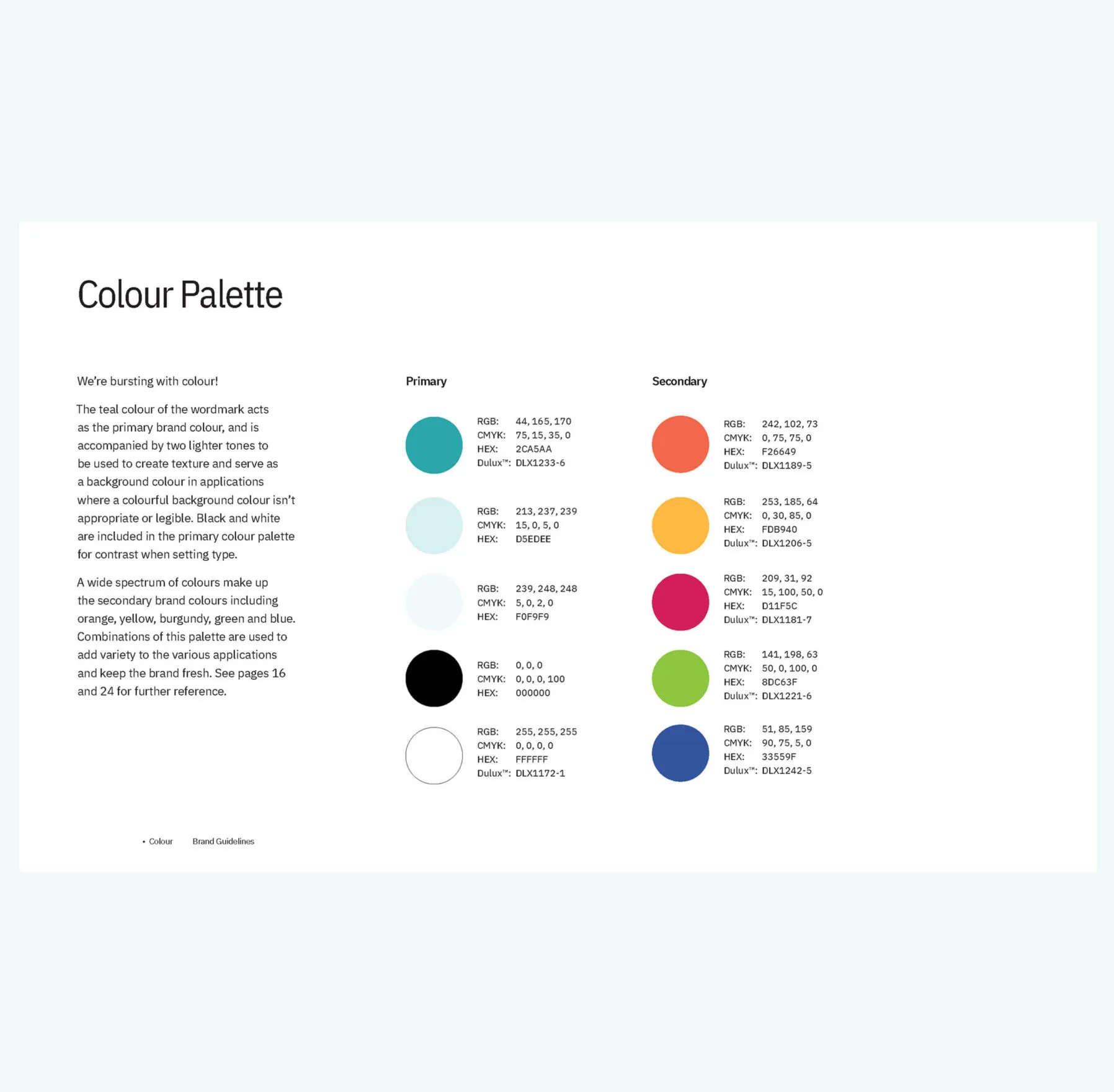
Colour palette for Winterberry brand: Teal, light teal, orange, yellow, cherry, lime, blue.
Our brand standards defined everything including the use of clear space and a bright colour palette to support the family-style medical practice
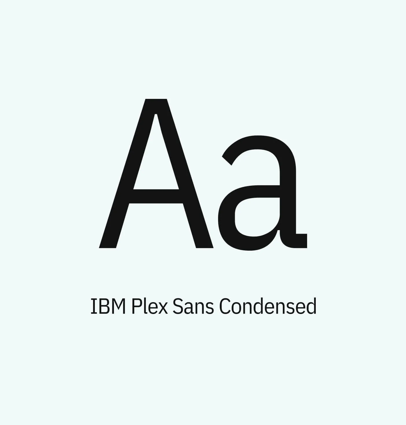
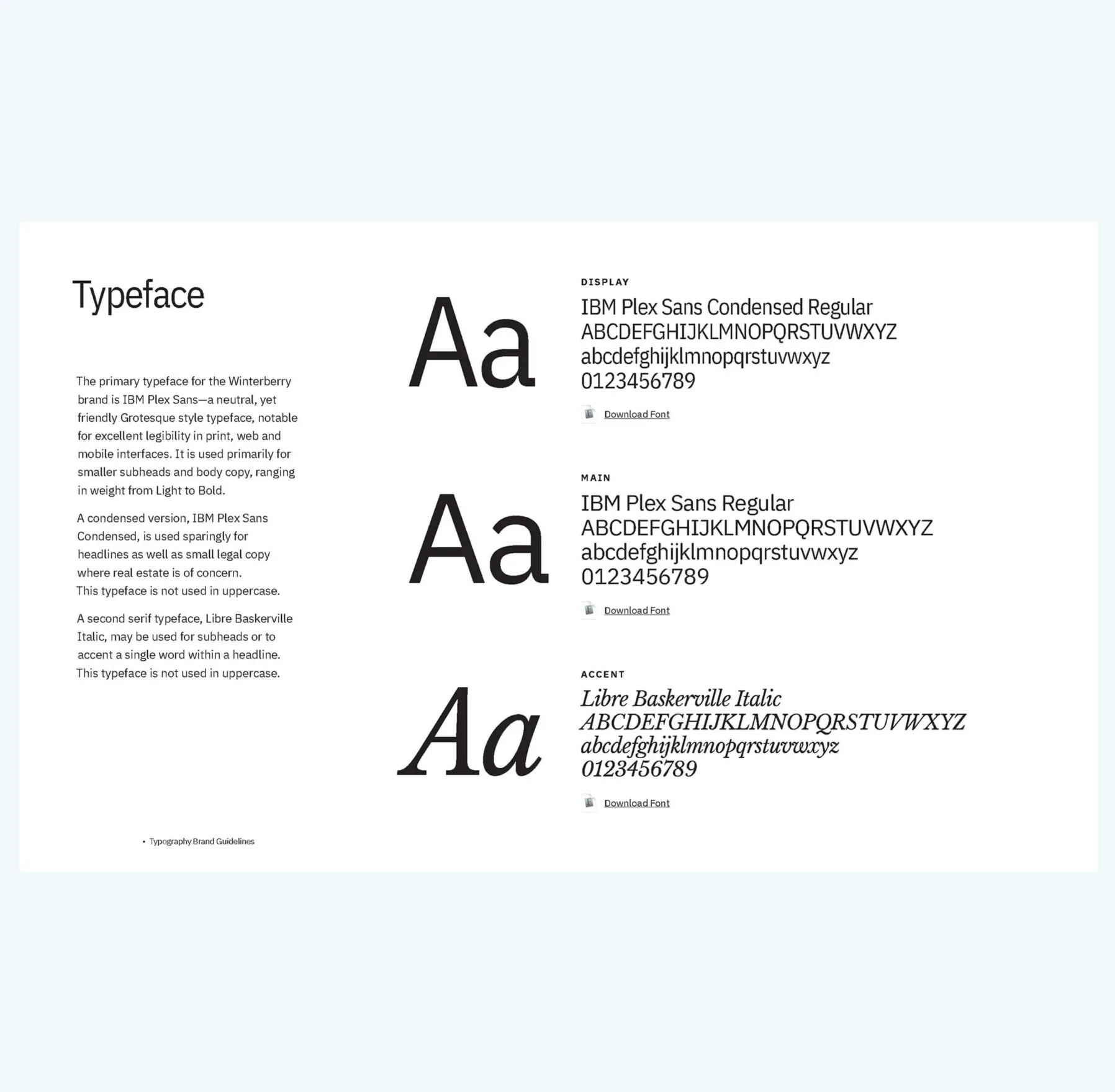
A letterform of the letter A for the font IBM Plex Sans Condensed.
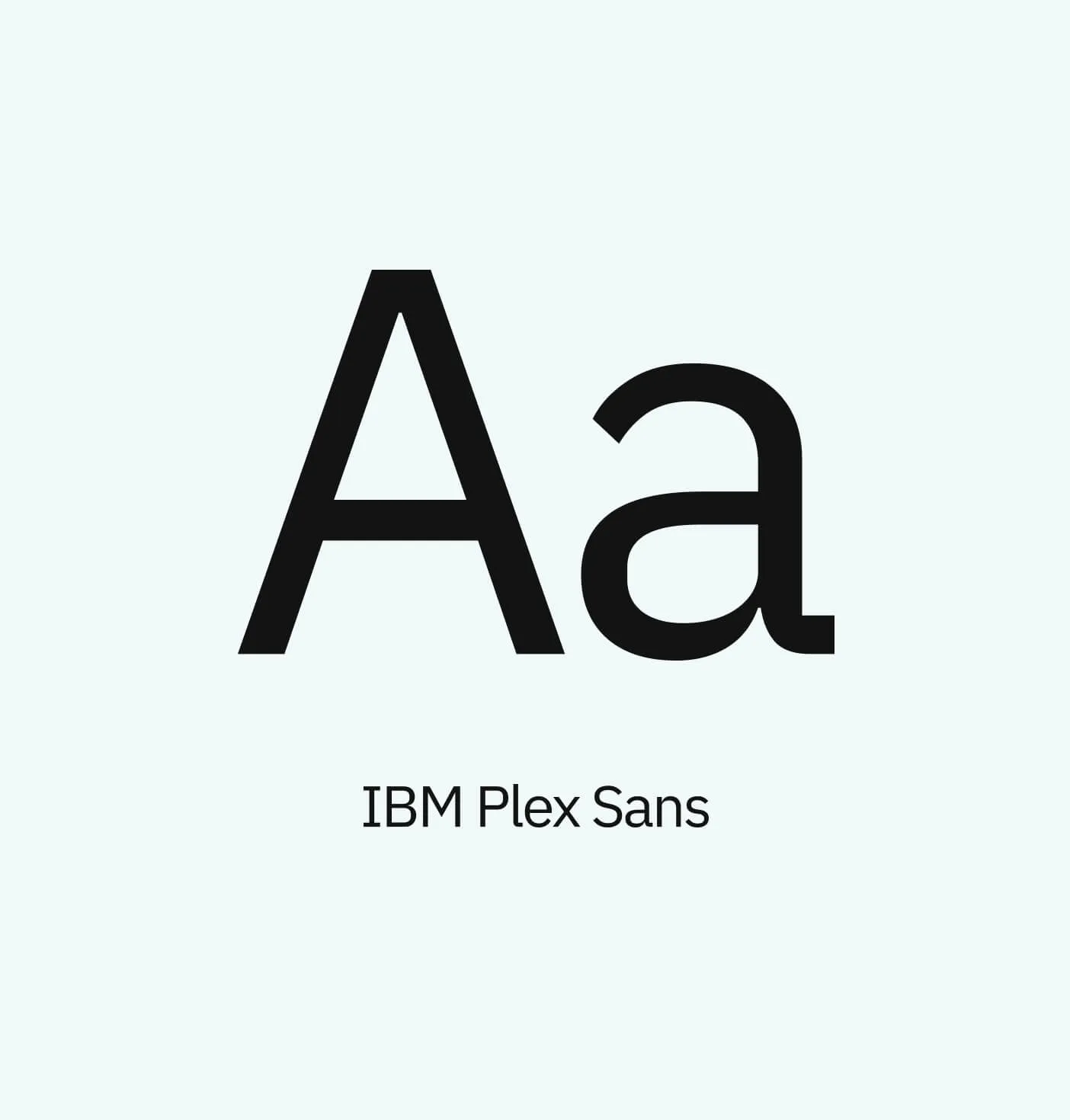
A letterform of the letter A for the font IBM Plex Sans.
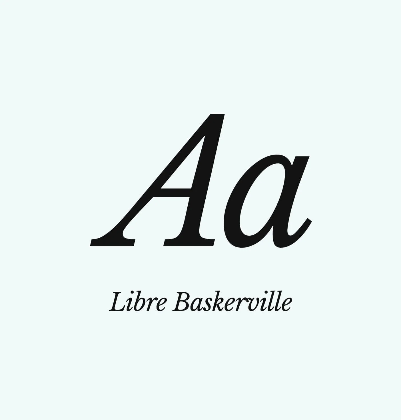
A letterform of the letter A for the font Libre Baskerville in italics.
Clean and modern typography to communicate clearly with all audiences

Redefining the healthcare experience

Forge met with Winterberry stakeholders to determine the existing brand’s pain points and developed a strategy to make the most of the reimagined brand. Playful illustration expresses the brand’s personality and allows the clinic to stand out from their competitors.

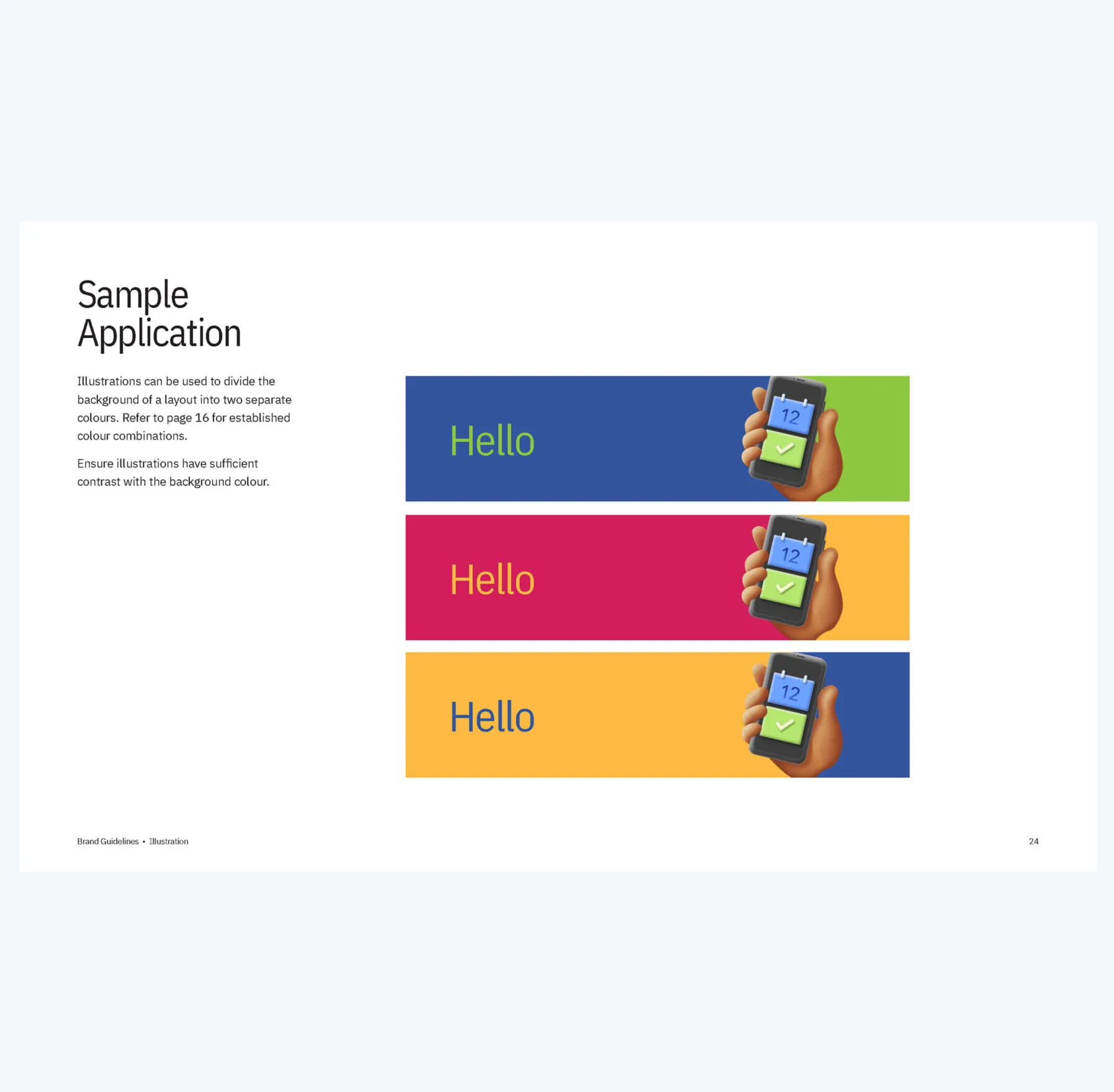
3D illustration of a hand holding a smartphone with a calendar icon and a checkmark.
Tablet displaying a list of doctors with stethoscopes.
3D icon of a document with a magnifying glass over it.
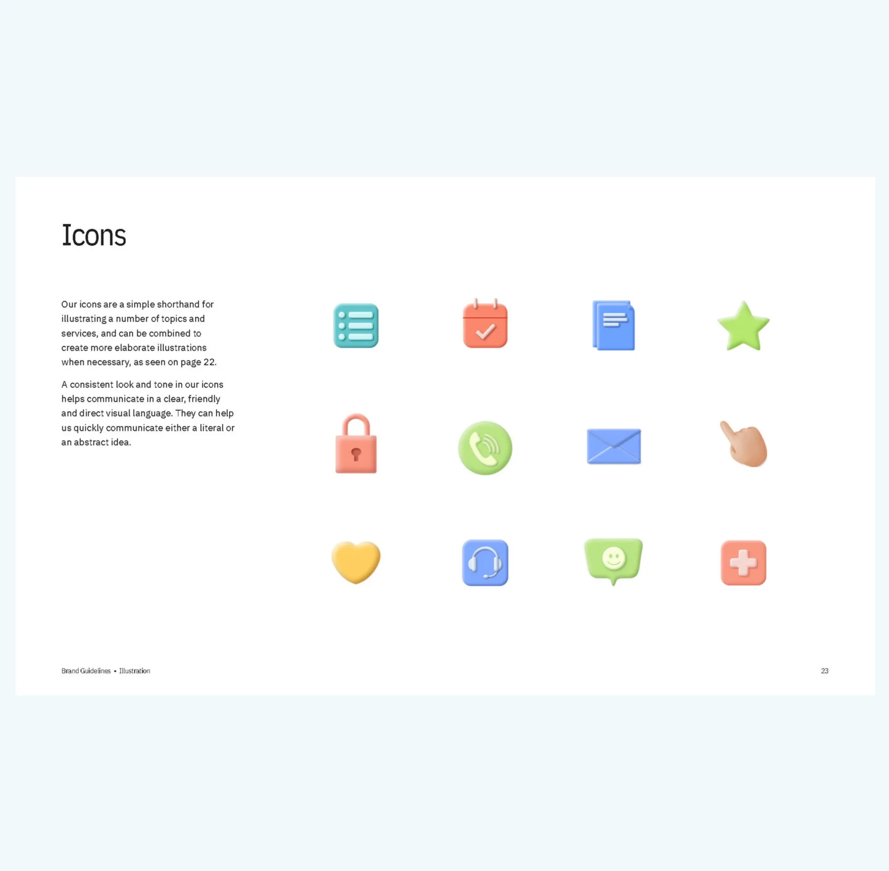
Custom illustrations were created to liven up the brand
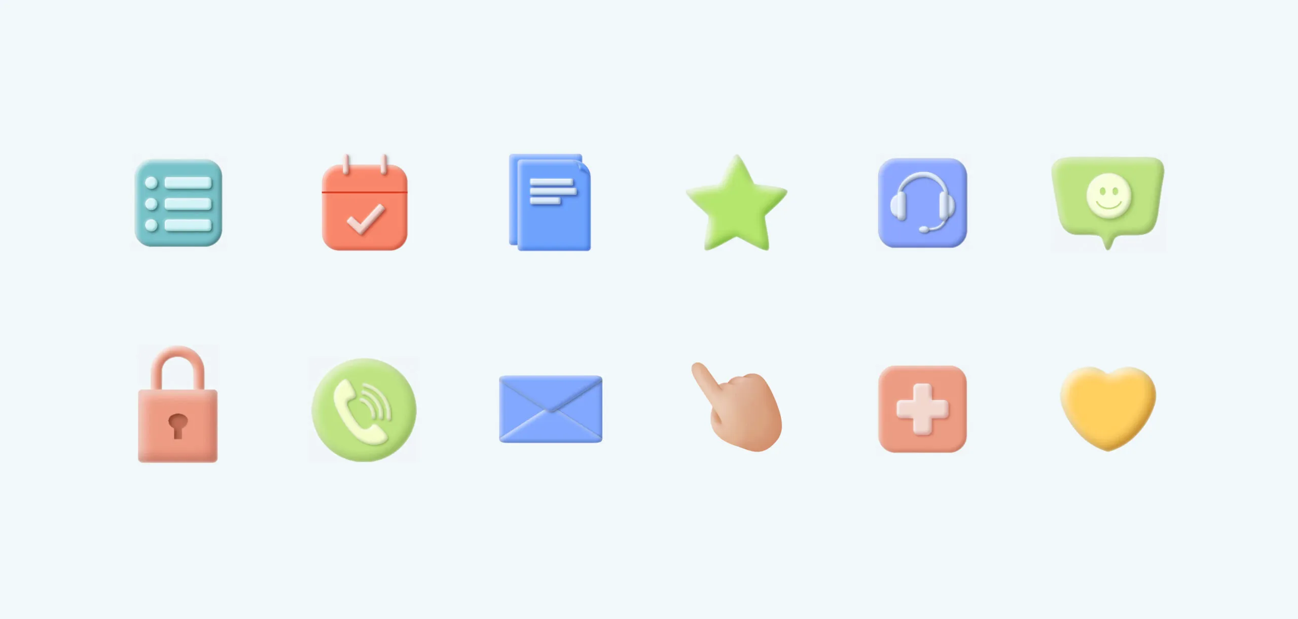
Collection of colourful 3D icons including calendar, chat, phone and heart
A matching icon set supports all brand visuals

Timely information for a thriving social network

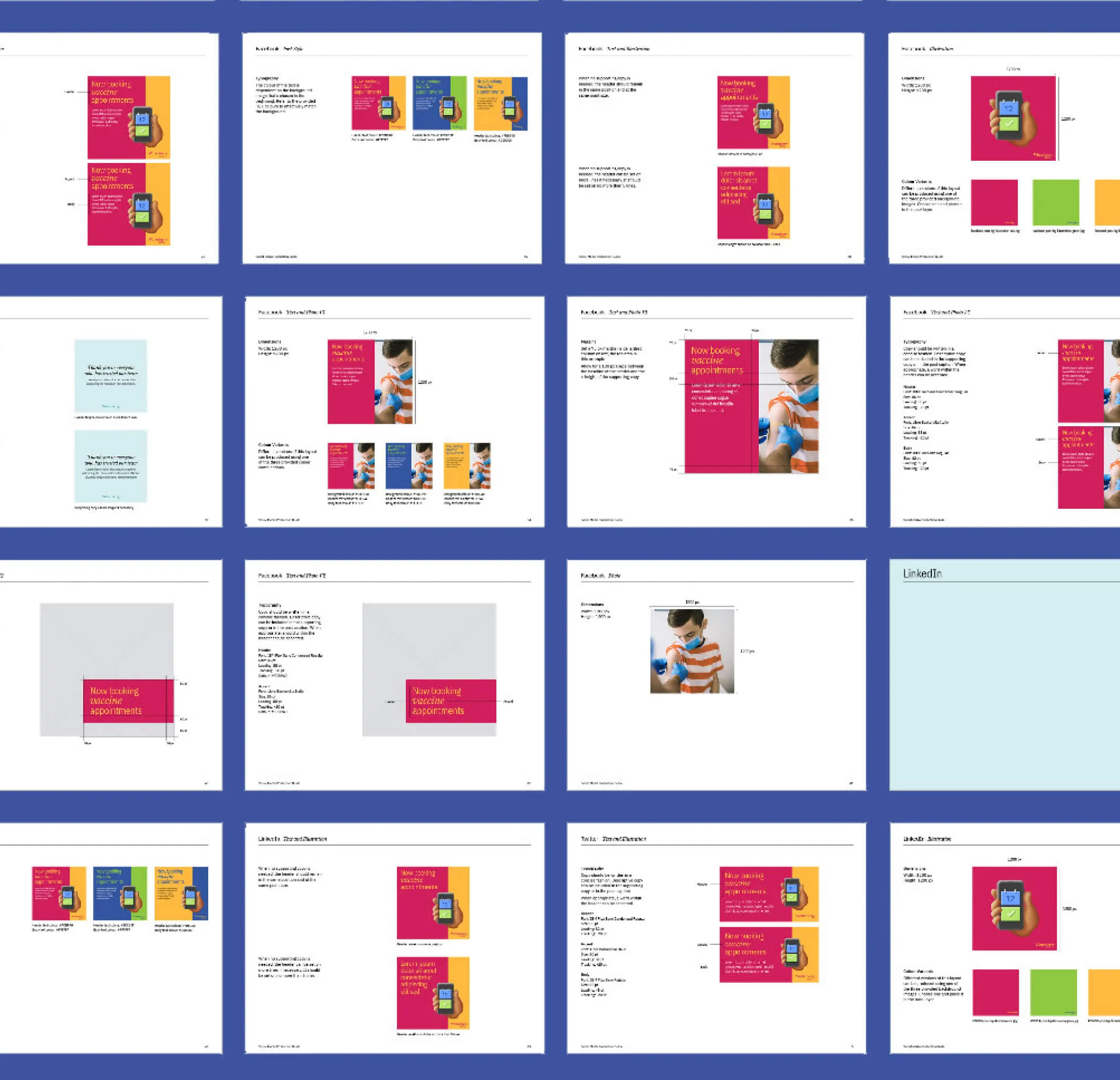
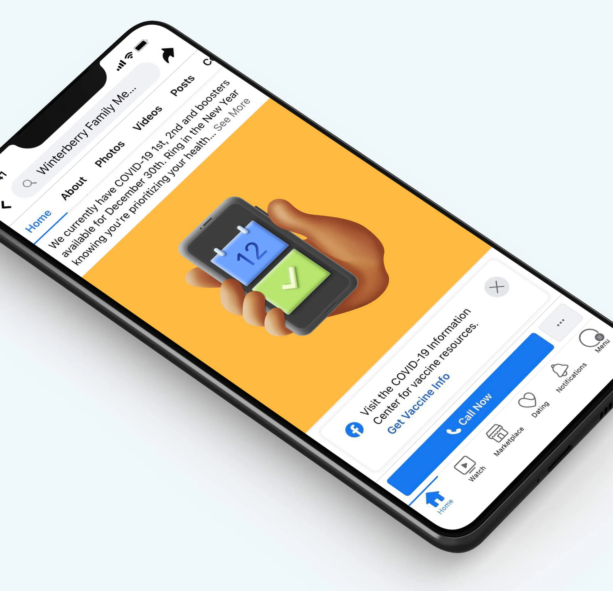
Communicating with existing patients through social media allows the Winterberry team to share frequent updates on current and immediate information regarding statistics, scheduling, healthcare tips, and more. A comprehensive social media production guide was created for the internal marketing team to easily create content in a consistent tone and voice.
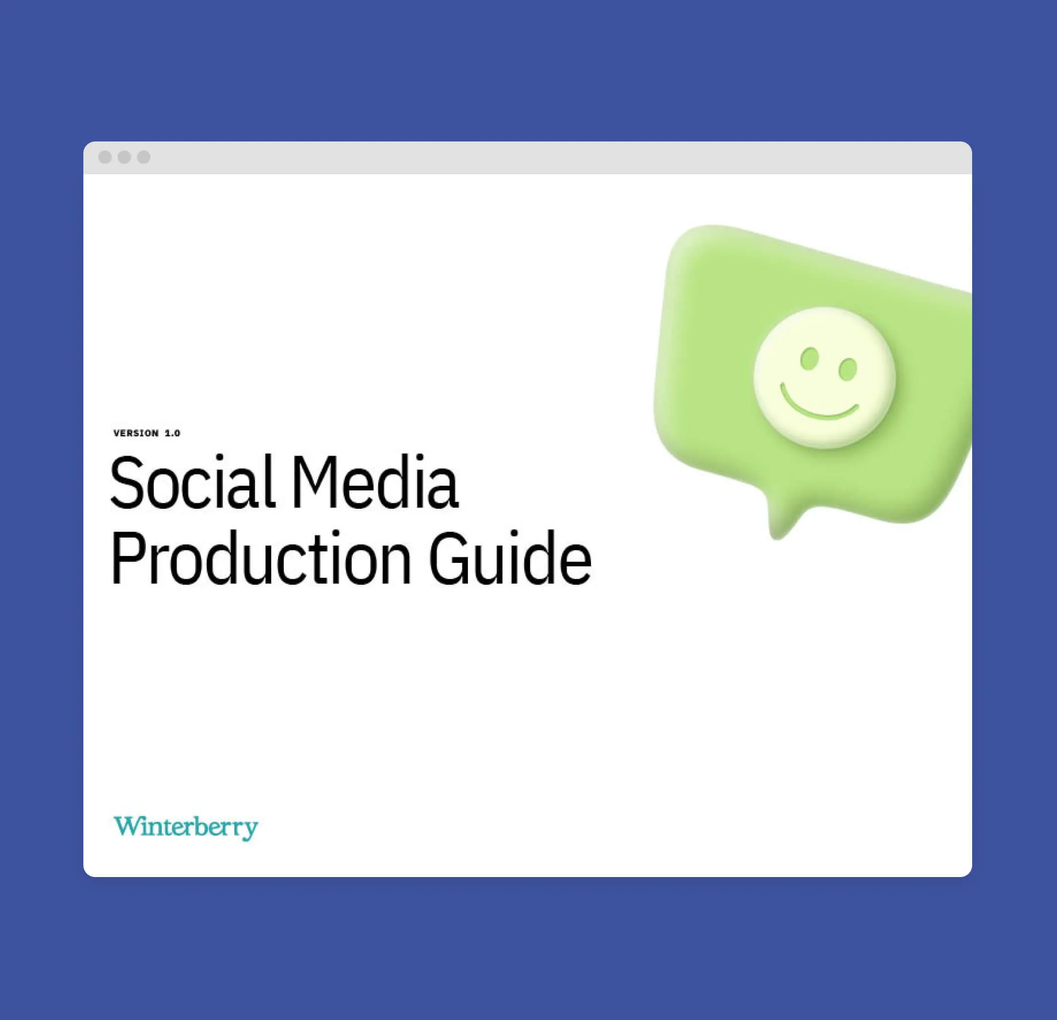
Social Media Production Guide by Winterberry with a smiley face icon.
A hand holds a phone with a green checkmark on screen, with text about booking vaccine appointments.
Social media production guide for use by in-house team
Facebook page for Winterberry Family Medicine showing COVID-19 vaccine information.
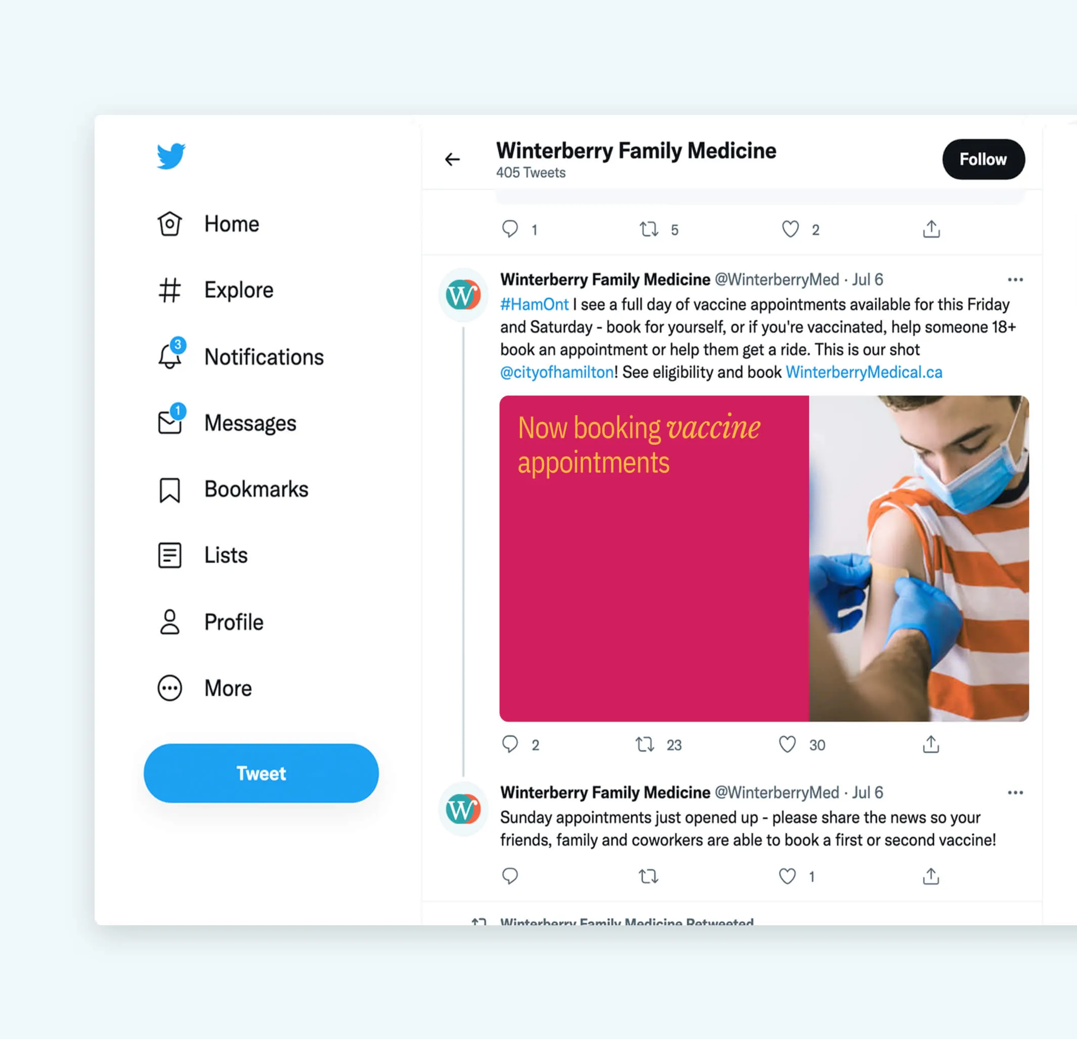
Twitter interface showing Winterberry Family Medicine's profile with tweets about vaccine appointments.
Social media graphics samples
A sense of trust and approachability

Ensuring the brand could be applied to various touchpoints and deliverables was crucial, as well as creating a welcoming environment that evokes the feeling of dependability and trust in all patients.
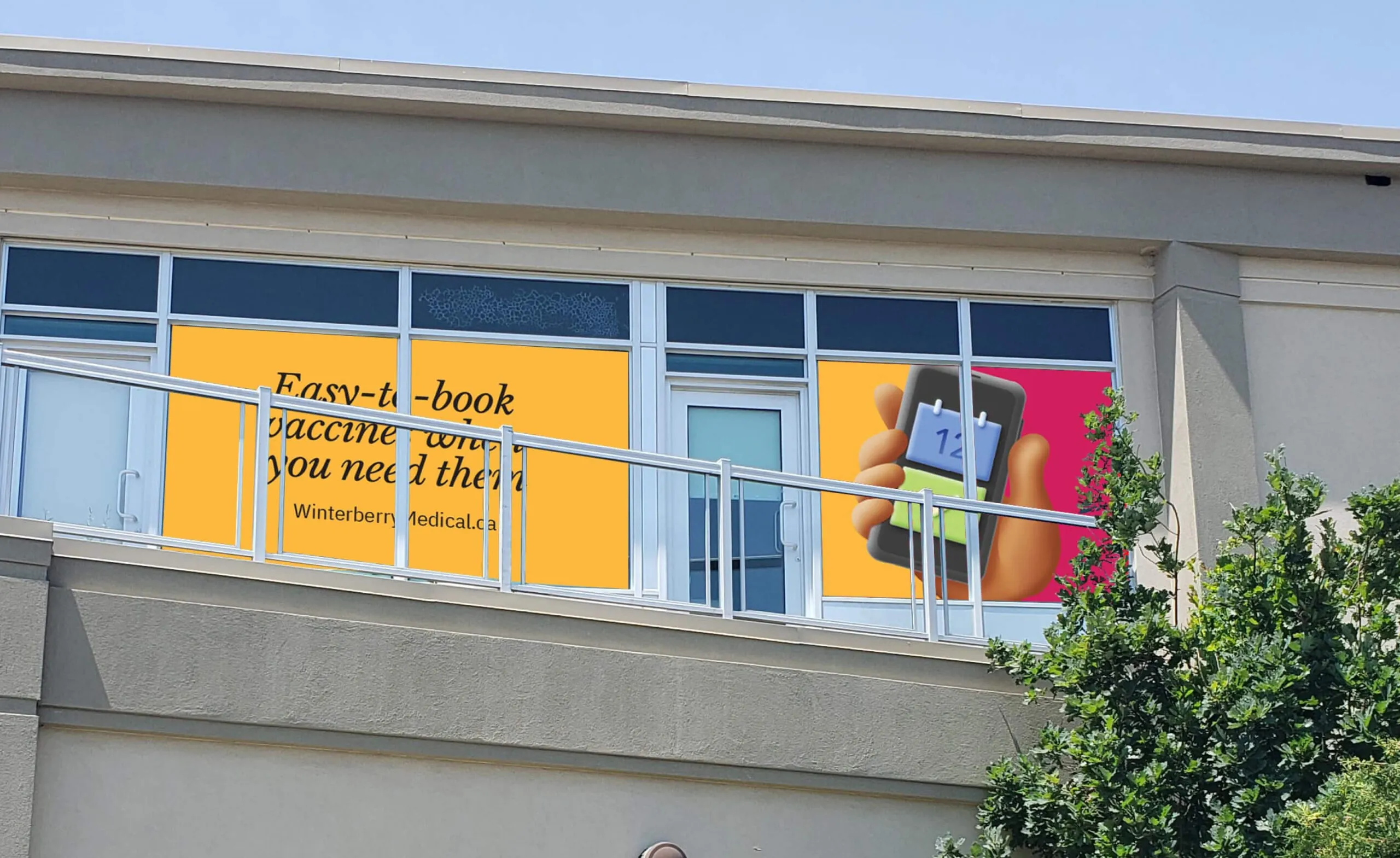
Window decal for Winterberry Medical showing
Window clings announced the new brand to the neighbourhood
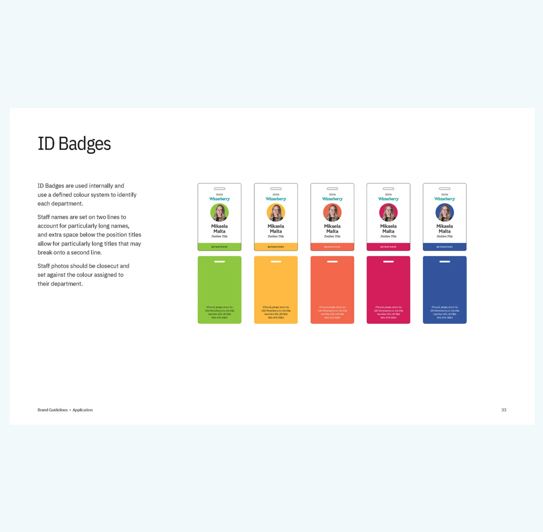
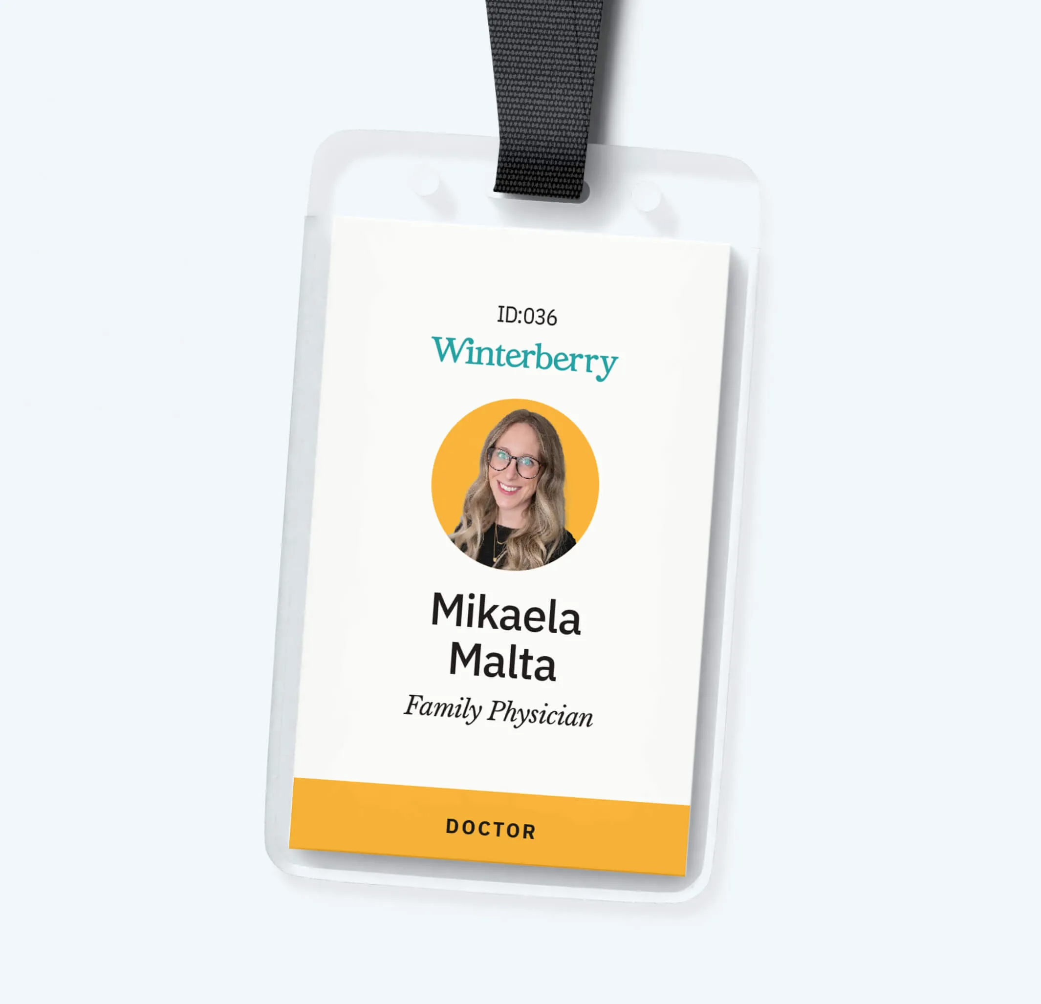
Mikaela Malta, Family Physician ID badge from Winterberry
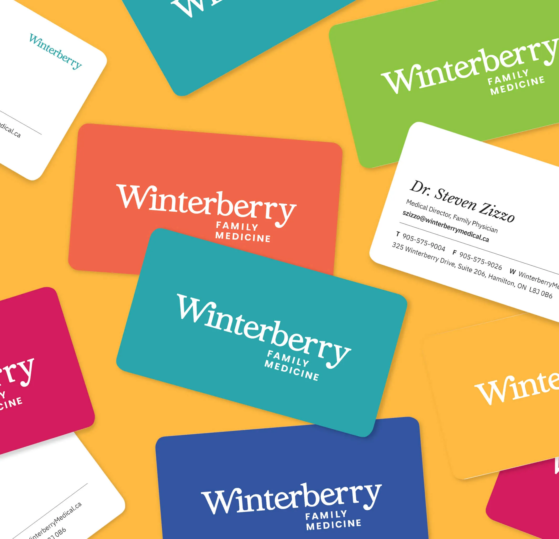
Business cards for Winterberry Family Medicine in various colours.
ID Badges for their team and stationery including colourful business cards

Shaping the online experience

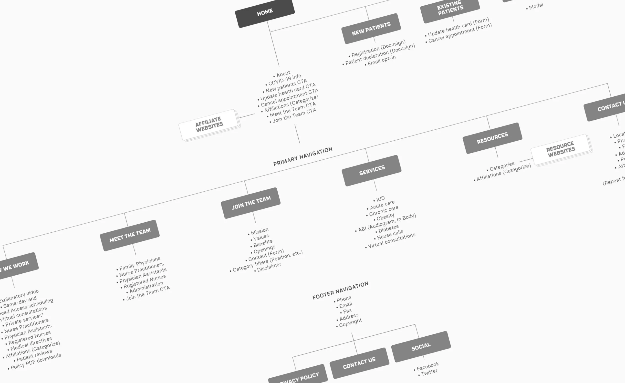
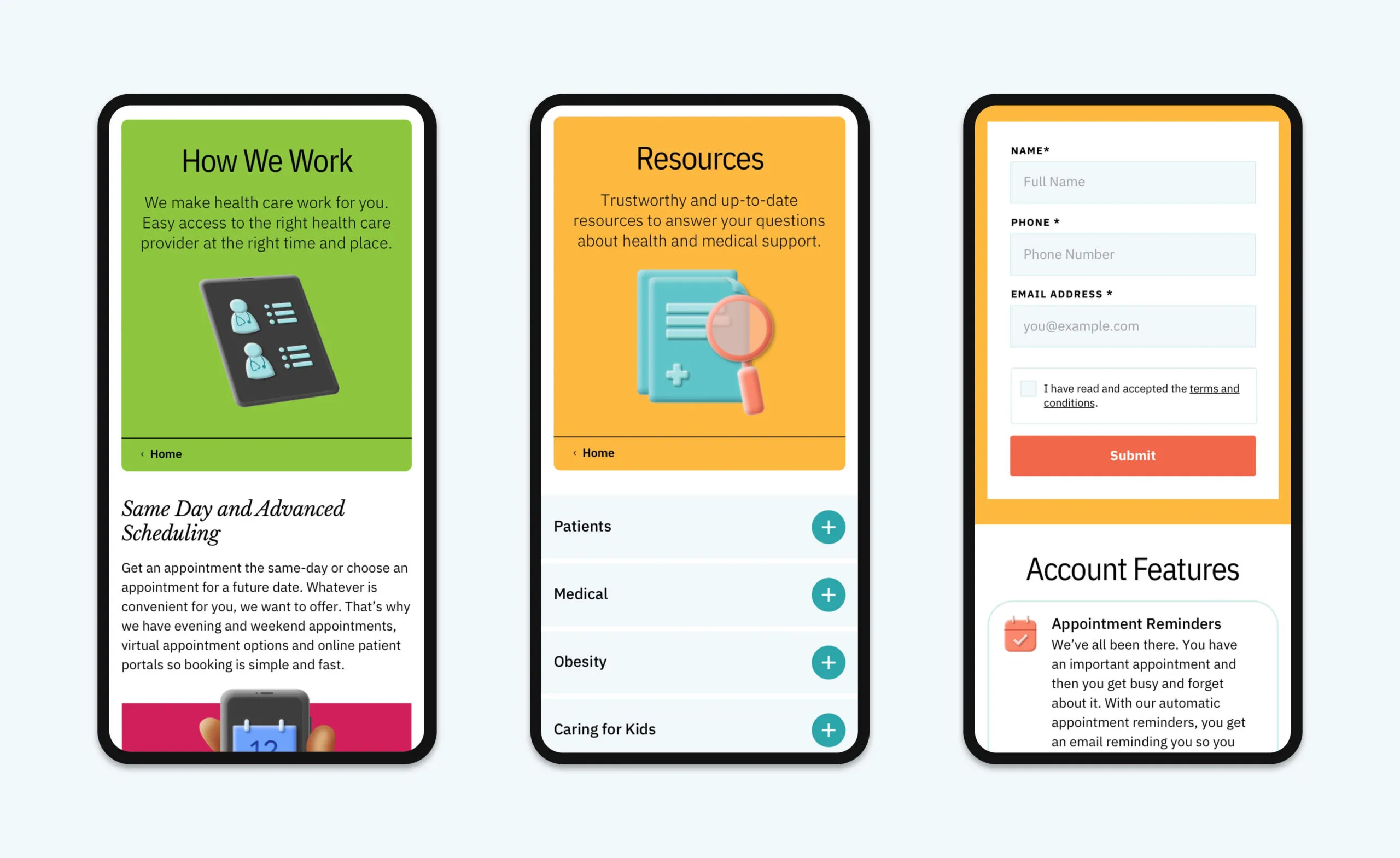
Content strategy sessions were held with the goal of optimizing information and ensuring users are presented with the most appropriate content with minimal effort. Before establishing a visual language, website architecture was established in order to improve communications and create a frictionless browsing experience.

Website sitemap showing navigation and content structure.
Sitemap for the new website
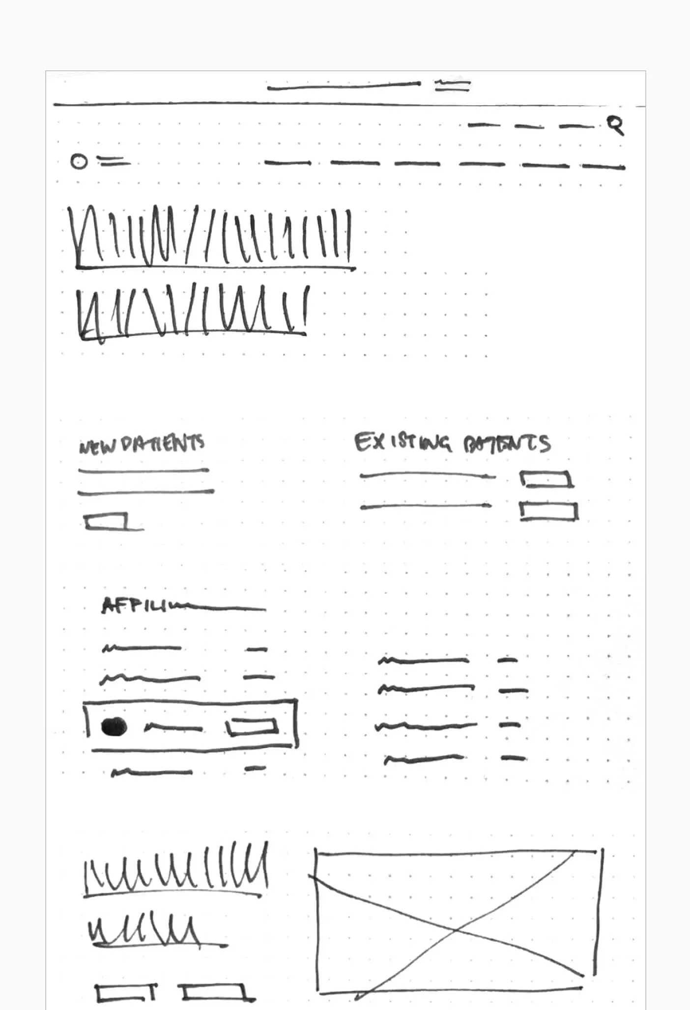
Wireframe sketch of a website with sections for new and existing patients, and a placeholder for an image.
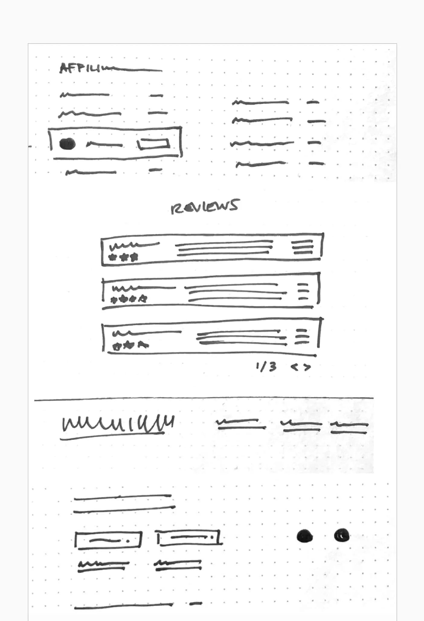
Wireframe sketch of a website with sections for affiliate links, reviews, and a footer.
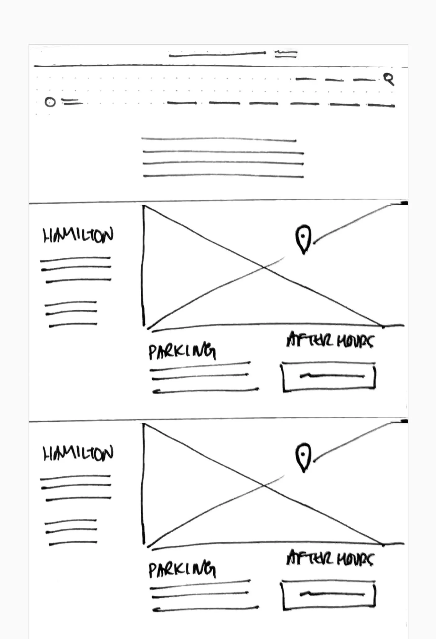
Wireframe sketch of a website layout with sections for
Hand sketched wireframes

Modern, progressive patient care

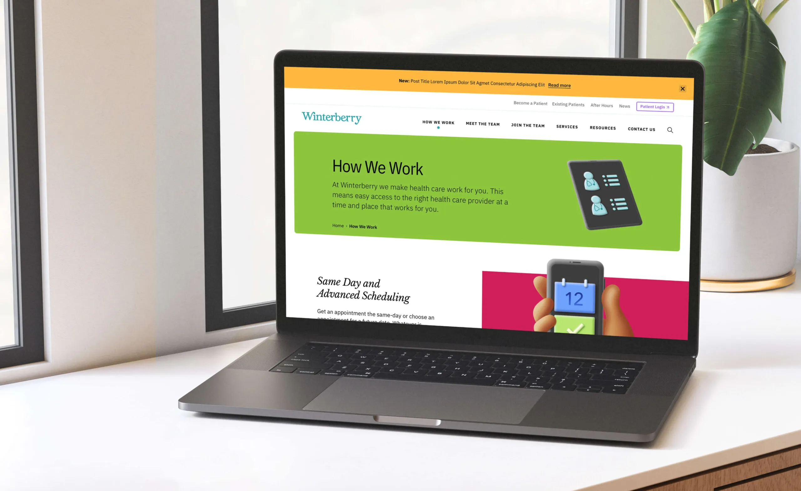
An overhauled website was created that is fully responsive, and ensures accessibility compliance for all user types. The brand’s vibrance is showcased throughout the website experience, representing the best of modern and progressive patient care.

Features

WordPress CMS

User account portal

Online appointment booking

Monthly newsletter

Google analytics

Custom icons

Device agnostic website design and development
Screenshots of a mobile app showing
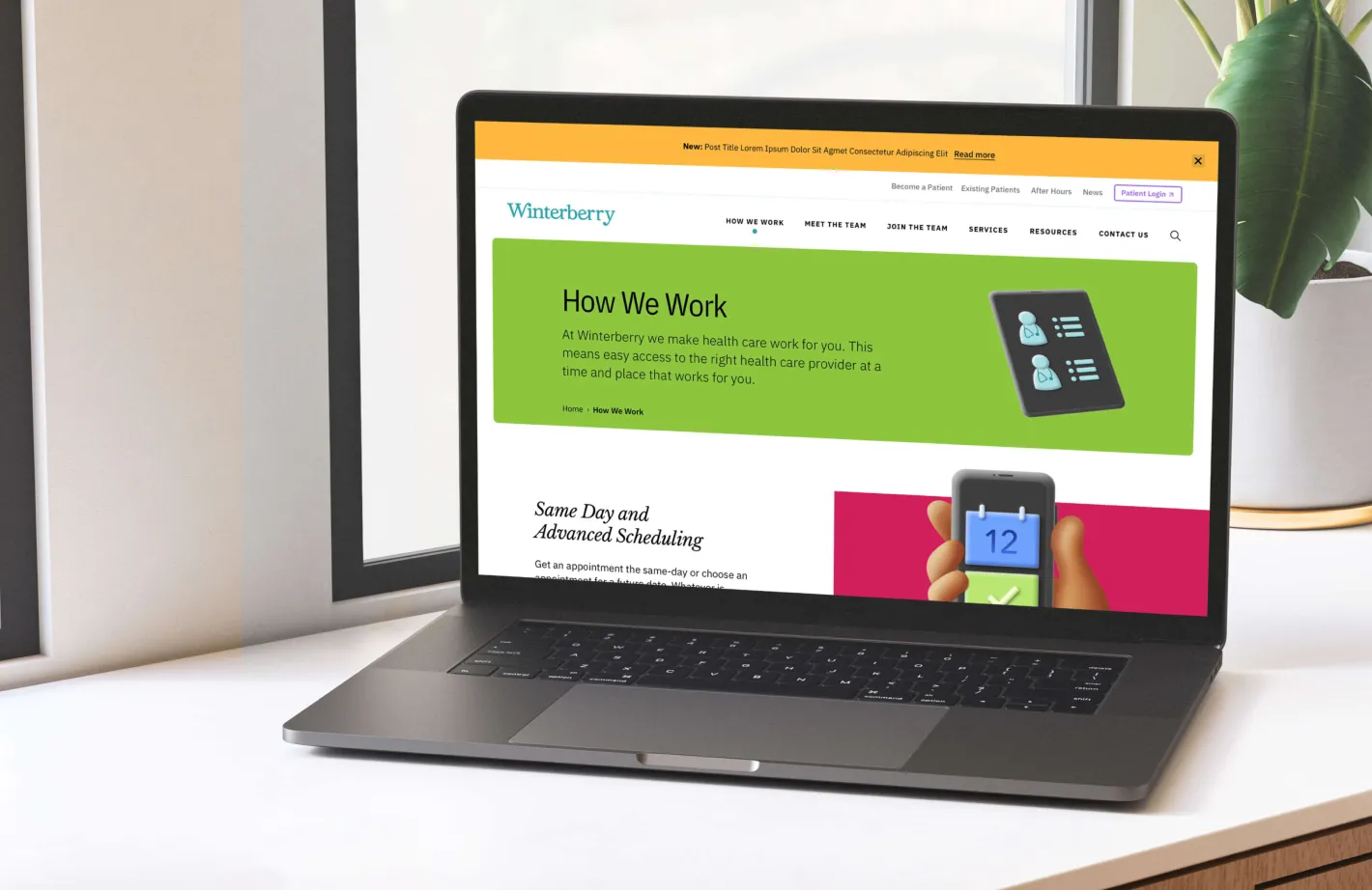
Laptop displaying the Winterberry website with
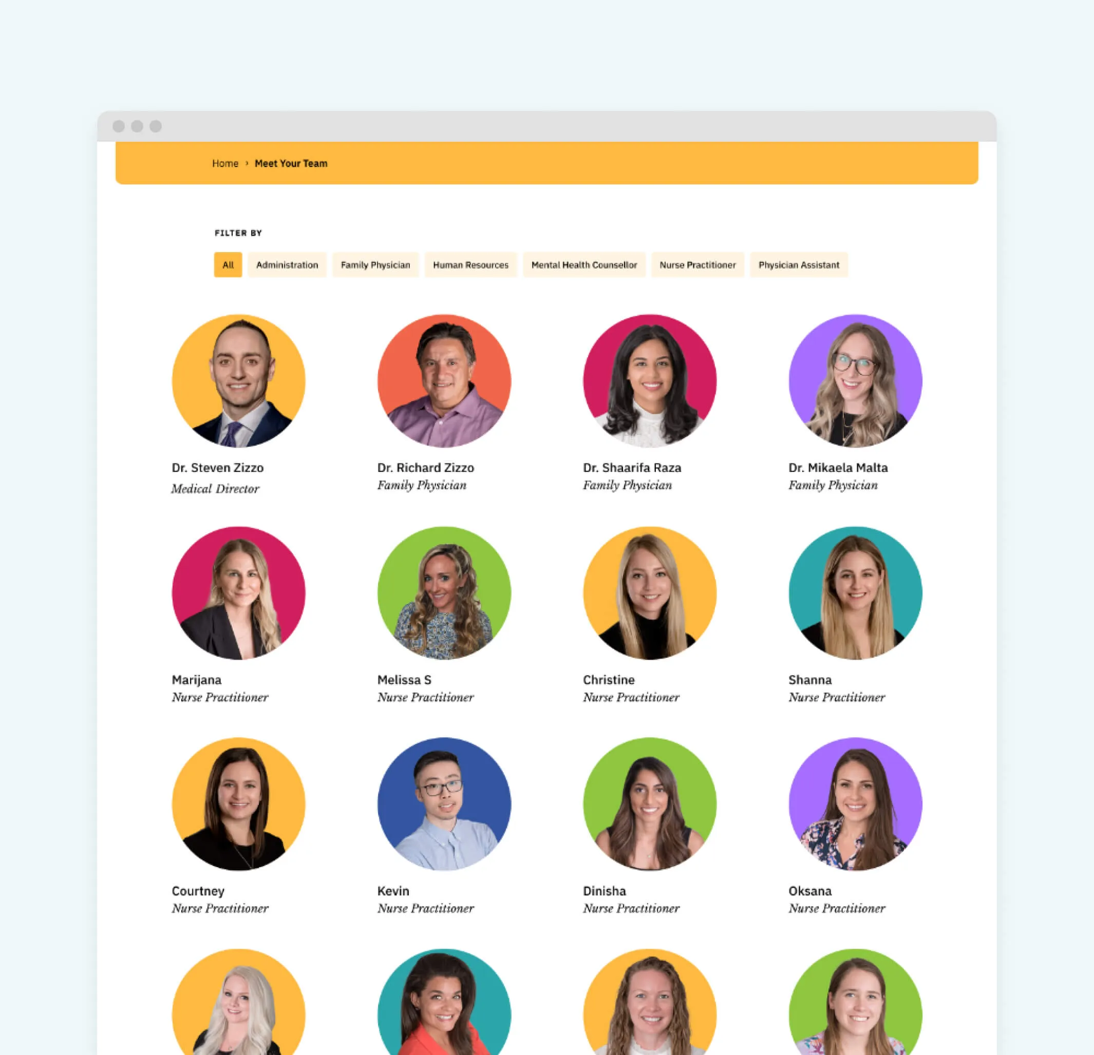
Team members of a medical practice, including doctors and nurse practitioners.
A woman with dark, wavy hair and a white lace top smiles.
  • 400% anticipated growth in patients over next 5 years
  • 10K+ current number of patients
Working with the Forge team quickly became one of the best parts of my week. The entire team made the process incredibly easy, stress-free and to be honest, fun. Their creativity and innovative ideas brought our vision to life in ways I couldn’t have imagined.
Sharon Ricci, Communications Director